'%3e%3cpath%20fill-rule='evenodd'%20clip-rule='evenodd'%20d='M51.1303%2019.2492C50.7278%2019.913%2050.1346%2020.4426%2049.3508%2020.838C48.5669%2021.2335%2047.6172%2021.4312%2046.5014%2021.4312C44.8208%2021.4312%2043.4367%2021.0216%2042.3492%2020.2025C41.2617%2019.3833%2040.6686%2018.2394%2040.5697%2016.7706H44.4253C44.4818%2017.3355%2044.6831%2017.7804%2045.0291%2018.1052C45.3751%2018.43%2045.8164%2018.5924%2046.3531%2018.5924C46.8192%2018.5924%2047.1864%2018.4653%2047.4547%2018.2111C47.7231%2017.9569%2047.8572%2017.618%2047.8572%2017.1943C47.8572%2016.8129%2047.7337%2016.4952%2047.4865%2016.241C47.2393%2015.9867%2046.9322%2015.7784%2046.565%2015.616C46.1978%2015.4536%2045.6893%2015.2594%2045.0397%2015.0334C44.0934%2014.7086%2043.3202%2014.3944%2042.72%2014.0907C42.1197%2013.7871%2041.6042%2013.3351%2041.1735%2012.7349C40.7427%2012.1347%2040.5273%2011.3544%2040.5273%2010.394C40.5273%209.50418%2040.7533%208.73448%2041.2053%208.08481C41.6572%207.43515%2042.2821%206.93731%2043.0801%206.5913C43.8781%206.24528%2044.7925%206.07227%2045.8235%206.07227C47.49%206.07227%2048.8141%206.46771%2049.7956%207.25861C50.7772%208.04951%2051.3315%209.13698%2051.4586%2010.5211H47.5395C47.4689%2010.0268%2047.2888%209.63483%2046.9993%209.3453C46.7097%209.05578%2046.3178%208.91102%2045.8235%208.91102C45.3998%208.91102%2045.0573%209.024%2044.7961%209.24997C44.5348%209.47594%2044.4041%209.80783%2044.4041%2010.2457C44.4041%2010.5988%2044.5207%2010.8989%2044.7537%2011.146C44.9867%2011.3932%2045.2798%2011.5944%2045.6328%2011.7498C45.9859%2011.9052%2046.4944%2012.1029%2047.1581%2012.343C48.1185%2012.6678%2048.9023%2012.9891%2049.5096%2013.3069C50.1169%2013.6246%2050.6395%2014.0872%2051.0773%2014.6945C51.5151%2015.3018%2051.734%2016.0927%2051.734%2017.0672C51.734%2017.8581%2051.5328%2018.5854%2051.1303%2019.2492ZM59.0242%206.3053V21.2829H55.4016V6.3053H59.0242ZM73.9409%206.3053V9.18642H69.8734V21.2829H66.2296V9.18642H62.2046V6.3053H73.9409ZM80.7438%209.18642V12.3218H85.8069V15.0546H80.7438V18.3806H86.4425V21.2829H77.1212V6.3053H86.4425V9.18642H80.7438ZM99.667%2016.0291V21.2829H96.0444V6.3053H101.913C103.692%206.3053%20105.048%206.74665%20105.98%207.62934C106.912%208.51204%20107.378%209.7019%20107.378%2011.199C107.378%2012.1311%20107.17%2012.9609%20106.753%2013.6882C106.337%2014.4155%20105.719%2014.9875%20104.9%2015.4042C104.08%2015.8208%20103.085%2016.0291%20101.913%2016.0291H99.667ZM103.692%2011.199C103.692%209.8855%20102.965%209.22879%20101.51%209.22879H99.667V13.1268H101.51C102.965%2013.1268%20103.692%2012.4842%20103.692%2011.199ZM120.092%2018.5501H114.478L113.546%2021.2829H109.732L115.219%206.41123H119.393L124.879%2021.2829H121.024L120.092%2018.5501ZM119.16%2015.7961L117.295%2010.2881L115.41%2015.7961H119.16ZM131.555%2018.5077H136.385V21.2829H127.933V6.3053H131.555V18.5077ZM143.337%209.18642V12.3218H148.4V15.0546H143.337V18.3806H149.035V21.2829H139.714V6.3053H149.035V9.18642H143.337ZM163.507%206.3053V9.18642H159.44V21.2829H155.796V9.18642H151.771V6.3053H163.507ZM177.449%206.3053V9.18642H173.382V21.2829H169.738V9.18642H165.713V6.3053H177.449ZM184.252%209.18642V12.3218H189.315V15.0546H184.252V18.3806H189.951V21.2829H180.629V6.3053H189.951V9.18642H184.252Z'%20fill='%23EEF0ED'/%3e%3cmask%20id='mask0_3101_7327'%20style='mask-type:alpha'%20maskUnits='userSpaceOnUse'%20x='0'%20y='0'%20width='27'%20height='28'%3e%3cpath%20d='M23.8328%200.759766H2.64808C1.18559%200.759766%200%201.94535%200%203.40785V24.5925C0%2026.055%201.18559%2027.2406%202.64808%2027.2406H23.8328C25.2952%2027.2406%2026.4808%2026.055%2026.4808%2024.5925V3.40785C26.4808%201.94535%2025.2952%200.759766%2023.8328%200.759766Z'%20fill='white'/%3e%3c/mask%3e%3cg%20mask='url(%23mask0_3101_7327)'%3e%3cpath%20d='M23.8328%200.759766H2.64808C1.18559%200.759766%200%201.94535%200%203.40785V24.5925C0%2026.055%201.18559%2027.2406%202.64808%2027.2406H23.8328C25.2952%2027.2406%2026.4808%2026.055%2026.4808%2024.5925V3.40785C26.4808%201.94535%2025.2952%200.759766%2023.8328%200.759766Z'%20fill='%23D8D8D8'/%3e%3cpath%20d='M13.2404%200.759766H0V14.0001H13.2404V0.759766Z'%20fill='%238C61FF'/%3e%3cpath%20d='M13.2404%2014H0V27.2404H13.2404V14Z'%20fill='%2336C3FE'/%3e%3cpath%20d='M26.4806%2014H13.2402V27.2404H26.4806V14Z'%20fill='%236592FE'/%3e%3cpath%20d='M26.4806%200.759766H13.2402V14.0002H26.4806V0.759766Z'%20fill='%236059F7'/%3e%3c/g%3e%3c/g%3e%3cdefs%3e%3cclipPath%20id='clip0_3101_7327'%3e%3crect%20width='190'%20height='28'%20fill='white'/%3e%3c/clipPath%3e%3c/defs%3e%3c/svg%3e)
'%3e%3cpath%20d='M23.8328%200.759521H2.64808C1.18559%200.759521%200%201.94511%200%203.40761V24.5923C0%2026.0548%201.18559%2027.2404%202.64808%2027.2404H23.8328C25.2952%2027.2404%2026.4808%2026.0548%2026.4808%2024.5923V3.40761C26.4808%201.94511%2025.2952%200.759521%2023.8328%200.759521Z'%20fill='%23D8D8D8'/%3e%3cpath%20d='M13.2404%200.759521H0V13.9999H13.2404V0.759521Z'%20fill='%238C61FF'/%3e%3cpath%20d='M13.2404%2013.9998H0V27.2402H13.2404V13.9998Z'%20fill='%2336C3FE'/%3e%3cpath%20d='M26.4809%2013.9998H13.2405V27.2402H26.4809V13.9998Z'%20fill='%236592FE'/%3e%3cpath%20d='M26.4809%200.759277H13.2405V13.9997H26.4809V0.759277Z'%20fill='%236059F7'/%3e%3c/g%3e%3c/svg%3e)
Interior Design's Emerging Triads: Minimalist Edition
09 Sep 2025 · 3 min readThe best minimalist interiors whisper, not shout. They rely on a careful selection of shades to create a sense of calm, purpose, and understated elegance, inviting a feeling of expansive tranquility. Color becomes less about decoration and more about defining space, light, and mood. The palettes an interior designer selects are pivotal in achieving this fine balance. They operate as the emotional bedrock of the design, shaping the way we experience the architecture of a room and its function. The following palettes offer a glimpse into the serene possibilities of emerging color triads in minimalist design, each a quiet revolution.
The "Star Citizen" palette suggests an interior that feels both grounded and aspirational. Imagine a living room bathed in the soft glow of a sunset reflected off a spacecraft window. Pure White walls recede, allowing accents of Pale Gold in the lighting fixtures to shimmer subtly. Light Steel Blue finds its place in plush, oversized seating, creating a sanctuary of calm. A single, strategically placed object in Burnt Orange draws the eye, acting as a focal point against the cool backdrop. Touches of Charcoal Gray ground the space, perhaps in the form of sleek, modern furniture, while the surprising depth of Deep Azure hints at the unseen possibilities beyond. This palette doesn't merely decorate; it constructs an environment, fostering a sense of limitless possibility within defined boundaries. It’s a sanctuary designed for contemplation and inspired dreaming, a space where the occupant is invited on a journey without ever leaving their home. The presence of Taupe Brown reminds of natural world, balancing modernity with a hint of necessary earthiness. Deep Crimson stands as a bold statement, a moment of pause. Dark Navy acts as anchor to complete the design.
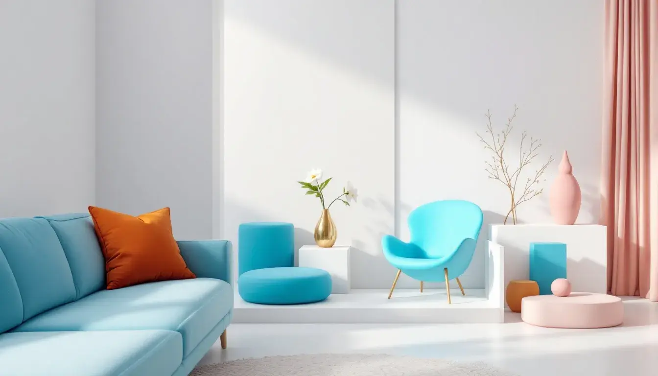
"Astrodrift" evokes the feeling of a solitary journey through the cosmos, a tranquil exploration of the self mirrored in a carefully curated interior. Off White walls and expansive windows flood the space with indirect light. Vivid Sky Blue upholstery provides moments of serene reflection. Medium Gray is woven into the textural elements, appearing for example on floor coverings made from natural fibres, adding subtle depth without overwhelming the senses. A single Bright Pink sculpture serves as a burst of unexpected joy, disrupting the otherwise muted harmony. Cool Gray accents, appearing in metal detailing, echo futuristic technologies, while Crimson Red provides a compelling focal point that is inviting and safe. The grounding Dark Navy brings balance to the room, suggesting the quiet mystery of deep space. This palette encourages a gentle detachment from the everyday, beckoning toward introspection and the pursuit of inner peace, creating a place for necessary escape.
The "Bold Contrast" palette plays with light and shadow, creating an interior that's both dynamic and composed. Pure White walls become a canvas for the ever-shifting play of daylight. Touches of Light Gray introduce soft textural differentiation, suggesting concrete or linen finishes. A strategically placed Golden Yellow object — perhaps a piece of art or a sculptural vase — invigorates the space with optimism. Teal Cyan accents appear sparingly, like reflections from a nearby body of water, bringing welcome change. Coral Pink warms the space, adding necessary humanity. Neutral Gray details in furniture offer moments of respite for the eye. The subtle presence of Deep Teal offers depth and a sense of groundedness, counterbalancing the lightness. Burnt Umber, introduces a layer of richness, adding a certain level of comforting and tactility. The drama of Bright Red enlivens the senses. Jet Black anchoring the space. The result is an interior that feels both invigorating and reassuring, a celebration of simple geometries and sophisticated contrasts.
"Linear UI" proposes an interior that feels precise, utilitarian, and quietly confident. Pale Yellow walls offer a warm, diffused light while avoiding sterile starkness. Mustard Yellow accents appear sparingly, perhaps in the framing of a doorway or the upholstery of a chair, providing a touch of understated elegance. Slate Gray provides a counterpoint, its neutral presence grounding the space and offering a feeling of permanence. Deep Gray introduces subtle shadows and textural depth, suggesting the unadorned beauty of raw materials. A hint of Olive Drab grounds the space. It’s a space dedicated to clarity and focus.
Counting the themes, we find 'cube' appears 3 times, 'vibrant' appears 1 time and 'thief' appears 0 times. The three most recurring colors are: cube, vibrant and thief.
Hex values that will be returned from cube:
For Star Citizen: #fcfcfc, #fad29f, #a2cad5
For Astrodrift: #eeeeee, #55adfa, #9f9f9f
For Bold Contrast: #ffffff, #bcbcbb, #e8ae0f
Dominant colours from each palette: Star Citizen: #0e1d27, #a2cad5 Astrodrift: #0f1d26, #eeeeee, #55adfa Bold Contrast: #ffffff, #1a1a1a Linear UI: #fcfcfc, #6c6c6c
Each of these palettes, in their own distinctive way, offer pathways to achieve the elusive harmony that lies the very heart of minimalist design. They demonstrate a restraint, suggesting a focus on experience rather than accumulation. From the cosmic serenity of "Astrodrift" to the understated confidence of "Linear UI", the minimalist aesthetic thrives not on absence, but on the mindful assembly of carefully chosen shades. They speak to a refined sense of beauty, hinting at a world of subtle pleasures and carefully considered moments.