'%3e%3cpath%20fill-rule='evenodd'%20clip-rule='evenodd'%20d='M51.1303%2019.2492C50.7278%2019.913%2050.1346%2020.4426%2049.3508%2020.838C48.5669%2021.2335%2047.6172%2021.4312%2046.5014%2021.4312C44.8208%2021.4312%2043.4367%2021.0216%2042.3492%2020.2025C41.2617%2019.3833%2040.6686%2018.2394%2040.5697%2016.7706H44.4253C44.4818%2017.3355%2044.6831%2017.7804%2045.0291%2018.1052C45.3751%2018.43%2045.8164%2018.5924%2046.3531%2018.5924C46.8192%2018.5924%2047.1864%2018.4653%2047.4547%2018.2111C47.7231%2017.9569%2047.8572%2017.618%2047.8572%2017.1943C47.8572%2016.8129%2047.7337%2016.4952%2047.4865%2016.241C47.2393%2015.9867%2046.9322%2015.7784%2046.565%2015.616C46.1978%2015.4536%2045.6893%2015.2594%2045.0397%2015.0334C44.0934%2014.7086%2043.3202%2014.3944%2042.72%2014.0907C42.1197%2013.7871%2041.6042%2013.3351%2041.1735%2012.7349C40.7427%2012.1347%2040.5273%2011.3544%2040.5273%2010.394C40.5273%209.50418%2040.7533%208.73448%2041.2053%208.08481C41.6572%207.43515%2042.2821%206.93731%2043.0801%206.5913C43.8781%206.24528%2044.7925%206.07227%2045.8235%206.07227C47.49%206.07227%2048.8141%206.46771%2049.7956%207.25861C50.7772%208.04951%2051.3315%209.13698%2051.4586%2010.5211H47.5395C47.4689%2010.0268%2047.2888%209.63483%2046.9993%209.3453C46.7097%209.05578%2046.3178%208.91102%2045.8235%208.91102C45.3998%208.91102%2045.0573%209.024%2044.7961%209.24997C44.5348%209.47594%2044.4041%209.80783%2044.4041%2010.2457C44.4041%2010.5988%2044.5207%2010.8989%2044.7537%2011.146C44.9867%2011.3932%2045.2798%2011.5944%2045.6328%2011.7498C45.9859%2011.9052%2046.4944%2012.1029%2047.1581%2012.343C48.1185%2012.6678%2048.9023%2012.9891%2049.5096%2013.3069C50.1169%2013.6246%2050.6395%2014.0872%2051.0773%2014.6945C51.5151%2015.3018%2051.734%2016.0927%2051.734%2017.0672C51.734%2017.8581%2051.5328%2018.5854%2051.1303%2019.2492ZM59.0242%206.3053V21.2829H55.4016V6.3053H59.0242ZM73.9409%206.3053V9.18642H69.8734V21.2829H66.2296V9.18642H62.2046V6.3053H73.9409ZM80.7438%209.18642V12.3218H85.8069V15.0546H80.7438V18.3806H86.4425V21.2829H77.1212V6.3053H86.4425V9.18642H80.7438ZM99.667%2016.0291V21.2829H96.0444V6.3053H101.913C103.692%206.3053%20105.048%206.74665%20105.98%207.62934C106.912%208.51204%20107.378%209.7019%20107.378%2011.199C107.378%2012.1311%20107.17%2012.9609%20106.753%2013.6882C106.337%2014.4155%20105.719%2014.9875%20104.9%2015.4042C104.08%2015.8208%20103.085%2016.0291%20101.913%2016.0291H99.667ZM103.692%2011.199C103.692%209.8855%20102.965%209.22879%20101.51%209.22879H99.667V13.1268H101.51C102.965%2013.1268%20103.692%2012.4842%20103.692%2011.199ZM120.092%2018.5501H114.478L113.546%2021.2829H109.732L115.219%206.41123H119.393L124.879%2021.2829H121.024L120.092%2018.5501ZM119.16%2015.7961L117.295%2010.2881L115.41%2015.7961H119.16ZM131.555%2018.5077H136.385V21.2829H127.933V6.3053H131.555V18.5077ZM143.337%209.18642V12.3218H148.4V15.0546H143.337V18.3806H149.035V21.2829H139.714V6.3053H149.035V9.18642H143.337ZM163.507%206.3053V9.18642H159.44V21.2829H155.796V9.18642H151.771V6.3053H163.507ZM177.449%206.3053V9.18642H173.382V21.2829H169.738V9.18642H165.713V6.3053H177.449ZM184.252%209.18642V12.3218H189.315V15.0546H184.252V18.3806H189.951V21.2829H180.629V6.3053H189.951V9.18642H184.252Z'%20fill='%23EEF0ED'/%3e%3cmask%20id='mask0_3101_7327'%20style='mask-type:alpha'%20maskUnits='userSpaceOnUse'%20x='0'%20y='0'%20width='27'%20height='28'%3e%3cpath%20d='M23.8328%200.759766H2.64808C1.18559%200.759766%200%201.94535%200%203.40785V24.5925C0%2026.055%201.18559%2027.2406%202.64808%2027.2406H23.8328C25.2952%2027.2406%2026.4808%2026.055%2026.4808%2024.5925V3.40785C26.4808%201.94535%2025.2952%200.759766%2023.8328%200.759766Z'%20fill='white'/%3e%3c/mask%3e%3cg%20mask='url(%23mask0_3101_7327)'%3e%3cpath%20d='M23.8328%200.759766H2.64808C1.18559%200.759766%200%201.94535%200%203.40785V24.5925C0%2026.055%201.18559%2027.2406%202.64808%2027.2406H23.8328C25.2952%2027.2406%2026.4808%2026.055%2026.4808%2024.5925V3.40785C26.4808%201.94535%2025.2952%200.759766%2023.8328%200.759766Z'%20fill='%23D8D8D8'/%3e%3cpath%20d='M13.2404%200.759766H0V14.0001H13.2404V0.759766Z'%20fill='%238C61FF'/%3e%3cpath%20d='M13.2404%2014H0V27.2404H13.2404V14Z'%20fill='%2336C3FE'/%3e%3cpath%20d='M26.4806%2014H13.2402V27.2404H26.4806V14Z'%20fill='%236592FE'/%3e%3cpath%20d='M26.4806%200.759766H13.2402V14.0002H26.4806V0.759766Z'%20fill='%236059F7'/%3e%3c/g%3e%3c/g%3e%3cdefs%3e%3cclipPath%20id='clip0_3101_7327'%3e%3crect%20width='190'%20height='28'%20fill='white'/%3e%3c/clipPath%3e%3c/defs%3e%3c/svg%3e)
'%3e%3cpath%20d='M23.8328%200.759521H2.64808C1.18559%200.759521%200%201.94511%200%203.40761V24.5923C0%2026.0548%201.18559%2027.2404%202.64808%2027.2404H23.8328C25.2952%2027.2404%2026.4808%2026.0548%2026.4808%2024.5923V3.40761C26.4808%201.94511%2025.2952%200.759521%2023.8328%200.759521Z'%20fill='%23D8D8D8'/%3e%3cpath%20d='M13.2404%200.759521H0V13.9999H13.2404V0.759521Z'%20fill='%238C61FF'/%3e%3cpath%20d='M13.2404%2013.9998H0V27.2402H13.2404V13.9998Z'%20fill='%2336C3FE'/%3e%3cpath%20d='M26.4809%2013.9998H13.2405V27.2402H26.4809V13.9998Z'%20fill='%236592FE'/%3e%3cpath%20d='M26.4809%200.759277H13.2405V13.9997H26.4809V0.759277Z'%20fill='%236059F7'/%3e%3c/g%3e%3c/svg%3e)
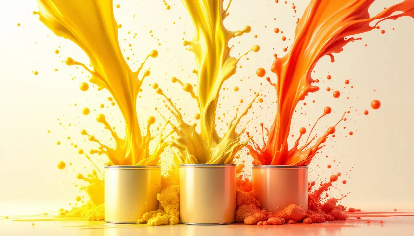
From Pale Yellow to Vivid Orange: A Brightness Shift in Marketing Palettes
09 Sep 2025 · 3 min readThe modern marketplace once whispered in hushed pastels. Now, it shouts from rooftops bathed in the glow of an unrelenting sun. The shift in marketing aesthetics, from gentle lemon hues to aggressive tangerines, isn't merely a stylistic tic; it mirrors a broader cultural hunger for immediacy, for bold pronouncements in an increasingly crowded and competitive landscape. Where subtlety once reigned supreme, confident declarations now clamor for attention. These palettes aren't just collections of colors; they're emotional barometers, reflecting—and shaping—the zeitgeist. The colors we choose to represent our ideas directly influence how those ideas reach consumers.
The Vibrant Spectrum 🌈 palette feels like a summer festival exploding on the screen. It grabs attention and refuses to let go. Imagine a tech start-up aiming to disrupt a stagnant industry, or a social media campaign designed to spark conversation – these are the scenarios where this vibrant collection truly shines. The kaleidoscopic feel is carefully orchestrated: Pure White offers crisp contrast, highlighting the electrifying energy between Lemon Yellow, Golden Yellow, and Sky Blue. Teal Green and Lavender Purple provide grounding counterpoints, preventing the experience from becoming overwhelming. Crimson Red shouts with confidence, while Deep Indigo hints at hidden depths. There’s a playful tension here, as though a serious message is trying to break free from a joyful exterior. It's not just bright, it's carefully crafted, a calculated risk designed for maximum impact. This palette whispers of digital innovation and demands to be noticed; each color plays its part to create a memorable and impactful message in a modern world. The strength this selection of colors offers is the promise of creative energy.
The Nodepay Palette 🎨 presents a striking and sophisticated vision, a world away from the exuberant joy of a rainbow. Instead, it opts for controlled vibrancy, a quiet confidence that speaks volumes. Here you can almost see how it translates into luxury branding, maybe for a fintech company aiming to project an image of stability and innovation. The tension between the shades immediately grounds and elevates a design. Imagine sleek interfaces where the Lemon Yellow and Vibrant Yellow subtly guide the user's eye, highlighting key information without shouting. Slate Gray offers a touch of industrial chic, while Dark Gray feels like the reassuring weight of competence. And the Midnight Blue? That's the promise of security and trustworthiness, the silent partner assuring you that your data – and your money – is safe. The overall feeling exudes sophisticated energy, a blend of creativity and control. All colors present in unison create an elevated message.
The Earthy Pop 🎨 palette presents a story of vibrant contradiction, a dance between grounded realism and unrestrained optimism. Imagine a modern brand for organic food, one that honors tradition while embracing the playful aesthetics of the present. Light Gray sets a calming foundation, providing the perfect backdrop for the explosion of color to come. Pale Yellow and Lime Green evoke feelings of freshness and growth, promising healthy sustenance. Magenta Pink injects a dose of playful energy, while a Burnt Orange feels like harvested fields under a setting sun. Even the Lavender Purple and Olive Brown feel perfectly in place, adding grounding tones to complete the picture. And while Crimson Red adds a dramatic punch it is tempered with Dark Gray, an assurance of quality and reliability. This palette speaks of authenticity with excitement, promising both nourishment and delight, it's an interesting dance between the old and new.
These selections, from the unbridled joy of full rainbows to carefully calibrated vibrancy and grounded optimism, showcase a multifaceted shift in the cultural landscape. It suggests a move away from the subtle and understated, towards bolder declarations of intent and value. The colors themselves become a language of feeling, speaking volumes about the brand's personality and vision. This vibrant trend mirrors a culture that continues to evolve with more intense sensations. The message is clear: in a world saturated with information, standing out demands emotional intelligence, confidence, and a willingness to embrace brightness in all its varied forms.