'%3e%3cpath%20fill-rule='evenodd'%20clip-rule='evenodd'%20d='M51.1303%2019.2492C50.7278%2019.913%2050.1346%2020.4426%2049.3508%2020.838C48.5669%2021.2335%2047.6172%2021.4312%2046.5014%2021.4312C44.8208%2021.4312%2043.4367%2021.0216%2042.3492%2020.2025C41.2617%2019.3833%2040.6686%2018.2394%2040.5697%2016.7706H44.4253C44.4818%2017.3355%2044.6831%2017.7804%2045.0291%2018.1052C45.3751%2018.43%2045.8164%2018.5924%2046.3531%2018.5924C46.8192%2018.5924%2047.1864%2018.4653%2047.4547%2018.2111C47.7231%2017.9569%2047.8572%2017.618%2047.8572%2017.1943C47.8572%2016.8129%2047.7337%2016.4952%2047.4865%2016.241C47.2393%2015.9867%2046.9322%2015.7784%2046.565%2015.616C46.1978%2015.4536%2045.6893%2015.2594%2045.0397%2015.0334C44.0934%2014.7086%2043.3202%2014.3944%2042.72%2014.0907C42.1197%2013.7871%2041.6042%2013.3351%2041.1735%2012.7349C40.7427%2012.1347%2040.5273%2011.3544%2040.5273%2010.394C40.5273%209.50418%2040.7533%208.73448%2041.2053%208.08481C41.6572%207.43515%2042.2821%206.93731%2043.0801%206.5913C43.8781%206.24528%2044.7925%206.07227%2045.8235%206.07227C47.49%206.07227%2048.8141%206.46771%2049.7956%207.25861C50.7772%208.04951%2051.3315%209.13698%2051.4586%2010.5211H47.5395C47.4689%2010.0268%2047.2888%209.63483%2046.9993%209.3453C46.7097%209.05578%2046.3178%208.91102%2045.8235%208.91102C45.3998%208.91102%2045.0573%209.024%2044.7961%209.24997C44.5348%209.47594%2044.4041%209.80783%2044.4041%2010.2457C44.4041%2010.5988%2044.5207%2010.8989%2044.7537%2011.146C44.9867%2011.3932%2045.2798%2011.5944%2045.6328%2011.7498C45.9859%2011.9052%2046.4944%2012.1029%2047.1581%2012.343C48.1185%2012.6678%2048.9023%2012.9891%2049.5096%2013.3069C50.1169%2013.6246%2050.6395%2014.0872%2051.0773%2014.6945C51.5151%2015.3018%2051.734%2016.0927%2051.734%2017.0672C51.734%2017.8581%2051.5328%2018.5854%2051.1303%2019.2492ZM59.0242%206.3053V21.2829H55.4016V6.3053H59.0242ZM73.9409%206.3053V9.18642H69.8734V21.2829H66.2296V9.18642H62.2046V6.3053H73.9409ZM80.7438%209.18642V12.3218H85.8069V15.0546H80.7438V18.3806H86.4425V21.2829H77.1212V6.3053H86.4425V9.18642H80.7438ZM99.667%2016.0291V21.2829H96.0444V6.3053H101.913C103.692%206.3053%20105.048%206.74665%20105.98%207.62934C106.912%208.51204%20107.378%209.7019%20107.378%2011.199C107.378%2012.1311%20107.17%2012.9609%20106.753%2013.6882C106.337%2014.4155%20105.719%2014.9875%20104.9%2015.4042C104.08%2015.8208%20103.085%2016.0291%20101.913%2016.0291H99.667ZM103.692%2011.199C103.692%209.8855%20102.965%209.22879%20101.51%209.22879H99.667V13.1268H101.51C102.965%2013.1268%20103.692%2012.4842%20103.692%2011.199ZM120.092%2018.5501H114.478L113.546%2021.2829H109.732L115.219%206.41123H119.393L124.879%2021.2829H121.024L120.092%2018.5501ZM119.16%2015.7961L117.295%2010.2881L115.41%2015.7961H119.16ZM131.555%2018.5077H136.385V21.2829H127.933V6.3053H131.555V18.5077ZM143.337%209.18642V12.3218H148.4V15.0546H143.337V18.3806H149.035V21.2829H139.714V6.3053H149.035V9.18642H143.337ZM163.507%206.3053V9.18642H159.44V21.2829H155.796V9.18642H151.771V6.3053H163.507ZM177.449%206.3053V9.18642H173.382V21.2829H169.738V9.18642H165.713V6.3053H177.449ZM184.252%209.18642V12.3218H189.315V15.0546H184.252V18.3806H189.951V21.2829H180.629V6.3053H189.951V9.18642H184.252Z'%20fill='%23EEF0ED'/%3e%3cmask%20id='mask0_3101_7327'%20style='mask-type:alpha'%20maskUnits='userSpaceOnUse'%20x='0'%20y='0'%20width='27'%20height='28'%3e%3cpath%20d='M23.8328%200.759766H2.64808C1.18559%200.759766%200%201.94535%200%203.40785V24.5925C0%2026.055%201.18559%2027.2406%202.64808%2027.2406H23.8328C25.2952%2027.2406%2026.4808%2026.055%2026.4808%2024.5925V3.40785C26.4808%201.94535%2025.2952%200.759766%2023.8328%200.759766Z'%20fill='white'/%3e%3c/mask%3e%3cg%20mask='url(%23mask0_3101_7327)'%3e%3cpath%20d='M23.8328%200.759766H2.64808C1.18559%200.759766%200%201.94535%200%203.40785V24.5925C0%2026.055%201.18559%2027.2406%202.64808%2027.2406H23.8328C25.2952%2027.2406%2026.4808%2026.055%2026.4808%2024.5925V3.40785C26.4808%201.94535%2025.2952%200.759766%2023.8328%200.759766Z'%20fill='%23D8D8D8'/%3e%3cpath%20d='M13.2404%200.759766H0V14.0001H13.2404V0.759766Z'%20fill='%238C61FF'/%3e%3cpath%20d='M13.2404%2014H0V27.2404H13.2404V14Z'%20fill='%2336C3FE'/%3e%3cpath%20d='M26.4806%2014H13.2402V27.2404H26.4806V14Z'%20fill='%236592FE'/%3e%3cpath%20d='M26.4806%200.759766H13.2402V14.0002H26.4806V0.759766Z'%20fill='%236059F7'/%3e%3c/g%3e%3c/g%3e%3cdefs%3e%3cclipPath%20id='clip0_3101_7327'%3e%3crect%20width='190'%20height='28'%20fill='white'/%3e%3c/clipPath%3e%3c/defs%3e%3c/svg%3e)
'%3e%3cpath%20d='M23.8328%200.759521H2.64808C1.18559%200.759521%200%201.94511%200%203.40761V24.5923C0%2026.0548%201.18559%2027.2404%202.64808%2027.2404H23.8328C25.2952%2027.2404%2026.4808%2026.0548%2026.4808%2024.5923V3.40761C26.4808%201.94511%2025.2952%200.759521%2023.8328%200.759521Z'%20fill='%23D8D8D8'/%3e%3cpath%20d='M13.2404%200.759521H0V13.9999H13.2404V0.759521Z'%20fill='%238C61FF'/%3e%3cpath%20d='M13.2404%2013.9998H0V27.2402H13.2404V13.9998Z'%20fill='%2336C3FE'/%3e%3cpath%20d='M26.4809%2013.9998H13.2405V27.2402H26.4809V13.9998Z'%20fill='%236592FE'/%3e%3cpath%20d='M26.4809%200.759277H13.2405V13.9997H26.4809V0.759277Z'%20fill='%236059F7'/%3e%3c/g%3e%3c/svg%3e)
From Black Void to Black Asphalt: Dominance of #1* Color in website Design
09 Sep 2025 · 3 min readThe allure of a website often resides in its subtle darkness, that gradual shift from a stark nothingness into something substantial. It is like the transition from a dreamless sleep to the first gleam of dawn, a slow reveal of form and function. Where once vibrant hues clamored for attention, we now witness a sophisticated settling into darker ranges. This isn't about gloom, but about grounding, about creating a digital space that feels secure, assured, and deeply intentional. This move to darker expressions is not a trend but a recalibration, a pursuit of visual serenity amid the ever-increasing clamor of the Internet. The deft employment of blacks and near-blacks brings focus, reduces distractions, and guides the user's gaze with quiet confidence. It is the design equivalent of lowering the lights in a bustling room, inviting intimacy and contemplation.
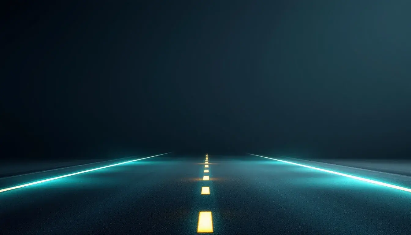
"Modern Teal" palette suggests a journey into the deep, beginning with the firm anchoring of Dark Slate. It's a palette that evokes the feeling of twilight over water, that moment when the sky deepens to reflect the secrets held beneath the surface. Silver Gray offers a whisper of reflection, like moonlight shimmering on the waves, preventing the depth from feeling oppressive. Seafoam Green provides a surprising pop of life, akin to an underwater garden swaying gently in the current. The inclusion of Muted Indigo and Dusty Blue expands emotional space, lending the user a feeling of trust, as if they are traversing a calm and controlled expanse. This palette isn't shouting for attention; it's slowly, surely, building trust. Imagine a website that uses the weight of Dark Slate as a resting point for text, allowing the brighter shades to highlight key interactive elements. The effect would be a smooth, understated, engaging path for the user, creating a memorable experience. This palette allows the audience to calmly assess and retain the information they were seeking. The shades are cool, but comfortable, creating an environment that invites the user to stay a while. The interplay between darkness and vibrancy keeps the design sharp but never jarring. It is a journey into the sleek future, with a nod to natural inspiration.
"Earthy Contrast" conjures the stillness of a shaded forest, the kind that provides respite from the glare of the sun. Dark Charcoal anchors the space, like rich soil underfoot, while Light Taupe speaks of sun-drenched clearings. Slate Gray and Muted Brown offer a subtle transition between darkness and light, resembling the gentle layering of shadows in a forest. Olive Drab is the echo of nature, giving the design a grounded essence, as if the site itself sprouted from the Earth. This palette offers a unique tactility, appealing to the senses in a way that feels both sophisticated and comfortable. This palette’s strengths lie in its capacity to create a visual experience that feels deeply rooted and reliable. The gentle shift from Dark Charcoal to Light Taupe guides the eye smoothly across the page. Instead of using a full-on black, the Dark Charcoal creates a softer landing. The visual impact is not jarring. Implementing this palette will draw the viewer into an immersive experience, inviting a deeper, prolonged engagement. The overall impression is one of steadfast grace.
The "Modern Palette" presents a curious blend, a mix of subtle depth balanced by moments of vibrancy. Dark Slate Gray speaks of urban landscapes after dusk, the sky a deep gray blue fading into the night. Dark Chestnut adds a touch of warmth, like the gentle glow of streetlights reflecting on the pavement. Dusty Silver provides a reflective sheen, capturing the glint of modernity. These colors are tempered by the sudden burst of Mustard Yellow and Turquoise Green, moments of unexpected brilliance amidst the concrete. The juxtaposition of these hues gives a feeling of confidence, a sophisticated blend that is both calming and invigorating. Imagine a website where Dark Slate Gray forms a dark, serious backdrop, letting the information take center stage. Then, the user is surprised by bursts of Turquoise or Mustard accents in unexpected places. This sudden shift of style allows a break from the monotony. Such a choice is visually powerful, guiding the eye to key elements and leaving a lasting impression. The experience is grounded, yet playful, creating a sense of trust and reliability. It’s a celebration of contrast, of finding beauty in the unexpected.
The move toward darker palettes online speaks to a deeper yearning for balance and respite. It's a recognition that the digital space should be more than just a frenetic exchange of information, and, instead, it should be a haven of visual clarity. By artfully employing dark foundations – be it through the sophisticated slate of "Modern Teal," the grounded charcoal of "Earthy Contrast," or the urban gray of "Modern Palette" – we cultivate a sense of authority and trust. This is the essence of digital design: transforming potentially chaotic space into something that is both calming and confidently purposeful. It is about making digital spaces feel not just functional, but beautifully, thoughtfully real.