'%3e%3cpath%20fill-rule='evenodd'%20clip-rule='evenodd'%20d='M51.1303%2019.2492C50.7278%2019.913%2050.1346%2020.4426%2049.3508%2020.838C48.5669%2021.2335%2047.6172%2021.4312%2046.5014%2021.4312C44.8208%2021.4312%2043.4367%2021.0216%2042.3492%2020.2025C41.2617%2019.3833%2040.6686%2018.2394%2040.5697%2016.7706H44.4253C44.4818%2017.3355%2044.6831%2017.7804%2045.0291%2018.1052C45.3751%2018.43%2045.8164%2018.5924%2046.3531%2018.5924C46.8192%2018.5924%2047.1864%2018.4653%2047.4547%2018.2111C47.7231%2017.9569%2047.8572%2017.618%2047.8572%2017.1943C47.8572%2016.8129%2047.7337%2016.4952%2047.4865%2016.241C47.2393%2015.9867%2046.9322%2015.7784%2046.565%2015.616C46.1978%2015.4536%2045.6893%2015.2594%2045.0397%2015.0334C44.0934%2014.7086%2043.3202%2014.3944%2042.72%2014.0907C42.1197%2013.7871%2041.6042%2013.3351%2041.1735%2012.7349C40.7427%2012.1347%2040.5273%2011.3544%2040.5273%2010.394C40.5273%209.50418%2040.7533%208.73448%2041.2053%208.08481C41.6572%207.43515%2042.2821%206.93731%2043.0801%206.5913C43.8781%206.24528%2044.7925%206.07227%2045.8235%206.07227C47.49%206.07227%2048.8141%206.46771%2049.7956%207.25861C50.7772%208.04951%2051.3315%209.13698%2051.4586%2010.5211H47.5395C47.4689%2010.0268%2047.2888%209.63483%2046.9993%209.3453C46.7097%209.05578%2046.3178%208.91102%2045.8235%208.91102C45.3998%208.91102%2045.0573%209.024%2044.7961%209.24997C44.5348%209.47594%2044.4041%209.80783%2044.4041%2010.2457C44.4041%2010.5988%2044.5207%2010.8989%2044.7537%2011.146C44.9867%2011.3932%2045.2798%2011.5944%2045.6328%2011.7498C45.9859%2011.9052%2046.4944%2012.1029%2047.1581%2012.343C48.1185%2012.6678%2048.9023%2012.9891%2049.5096%2013.3069C50.1169%2013.6246%2050.6395%2014.0872%2051.0773%2014.6945C51.5151%2015.3018%2051.734%2016.0927%2051.734%2017.0672C51.734%2017.8581%2051.5328%2018.5854%2051.1303%2019.2492ZM59.0242%206.3053V21.2829H55.4016V6.3053H59.0242ZM73.9409%206.3053V9.18642H69.8734V21.2829H66.2296V9.18642H62.2046V6.3053H73.9409ZM80.7438%209.18642V12.3218H85.8069V15.0546H80.7438V18.3806H86.4425V21.2829H77.1212V6.3053H86.4425V9.18642H80.7438ZM99.667%2016.0291V21.2829H96.0444V6.3053H101.913C103.692%206.3053%20105.048%206.74665%20105.98%207.62934C106.912%208.51204%20107.378%209.7019%20107.378%2011.199C107.378%2012.1311%20107.17%2012.9609%20106.753%2013.6882C106.337%2014.4155%20105.719%2014.9875%20104.9%2015.4042C104.08%2015.8208%20103.085%2016.0291%20101.913%2016.0291H99.667ZM103.692%2011.199C103.692%209.8855%20102.965%209.22879%20101.51%209.22879H99.667V13.1268H101.51C102.965%2013.1268%20103.692%2012.4842%20103.692%2011.199ZM120.092%2018.5501H114.478L113.546%2021.2829H109.732L115.219%206.41123H119.393L124.879%2021.2829H121.024L120.092%2018.5501ZM119.16%2015.7961L117.295%2010.2881L115.41%2015.7961H119.16ZM131.555%2018.5077H136.385V21.2829H127.933V6.3053H131.555V18.5077ZM143.337%209.18642V12.3218H148.4V15.0546H143.337V18.3806H149.035V21.2829H139.714V6.3053H149.035V9.18642H143.337ZM163.507%206.3053V9.18642H159.44V21.2829H155.796V9.18642H151.771V6.3053H163.507ZM177.449%206.3053V9.18642H173.382V21.2829H169.738V9.18642H165.713V6.3053H177.449ZM184.252%209.18642V12.3218H189.315V15.0546H184.252V18.3806H189.951V21.2829H180.629V6.3053H189.951V9.18642H184.252Z'%20fill='%23EEF0ED'/%3e%3cmask%20id='mask0_3101_7327'%20style='mask-type:alpha'%20maskUnits='userSpaceOnUse'%20x='0'%20y='0'%20width='27'%20height='28'%3e%3cpath%20d='M23.8328%200.759766H2.64808C1.18559%200.759766%200%201.94535%200%203.40785V24.5925C0%2026.055%201.18559%2027.2406%202.64808%2027.2406H23.8328C25.2952%2027.2406%2026.4808%2026.055%2026.4808%2024.5925V3.40785C26.4808%201.94535%2025.2952%200.759766%2023.8328%200.759766Z'%20fill='white'/%3e%3c/mask%3e%3cg%20mask='url(%23mask0_3101_7327)'%3e%3cpath%20d='M23.8328%200.759766H2.64808C1.18559%200.759766%200%201.94535%200%203.40785V24.5925C0%2026.055%201.18559%2027.2406%202.64808%2027.2406H23.8328C25.2952%2027.2406%2026.4808%2026.055%2026.4808%2024.5925V3.40785C26.4808%201.94535%2025.2952%200.759766%2023.8328%200.759766Z'%20fill='%23D8D8D8'/%3e%3cpath%20d='M13.2404%200.759766H0V14.0001H13.2404V0.759766Z'%20fill='%238C61FF'/%3e%3cpath%20d='M13.2404%2014H0V27.2404H13.2404V14Z'%20fill='%2336C3FE'/%3e%3cpath%20d='M26.4806%2014H13.2402V27.2404H26.4806V14Z'%20fill='%236592FE'/%3e%3cpath%20d='M26.4806%200.759766H13.2402V14.0002H26.4806V0.759766Z'%20fill='%236059F7'/%3e%3c/g%3e%3c/g%3e%3cdefs%3e%3cclipPath%20id='clip0_3101_7327'%3e%3crect%20width='190'%20height='28'%20fill='white'/%3e%3c/clipPath%3e%3c/defs%3e%3c/svg%3e)
'%3e%3cpath%20d='M23.8328%200.759521H2.64808C1.18559%200.759521%200%201.94511%200%203.40761V24.5923C0%2026.0548%201.18559%2027.2404%202.64808%2027.2404H23.8328C25.2952%2027.2404%2026.4808%2026.0548%2026.4808%2024.5923V3.40761C26.4808%201.94511%2025.2952%200.759521%2023.8328%200.759521Z'%20fill='%23D8D8D8'/%3e%3cpath%20d='M13.2404%200.759521H0V13.9999H13.2404V0.759521Z'%20fill='%238C61FF'/%3e%3cpath%20d='M13.2404%2013.9998H0V27.2402H13.2404V13.9998Z'%20fill='%2336C3FE'/%3e%3cpath%20d='M26.4809%2013.9998H13.2405V27.2402H26.4809V13.9998Z'%20fill='%236592FE'/%3e%3cpath%20d='M26.4809%200.759277H13.2405V13.9997H26.4809V0.759277Z'%20fill='%236059F7'/%3e%3c/g%3e%3c/svg%3e)
Color Moods and Suitable Rooms Crosswalk
09 Sep 2025 · 3 min readColor possesses an extraordinary ability to shape our perception of space, silently dictating how we feel within it. It is a language spoken not with words, but with hues—a visual poetry that transforms a room from mere shelter to an immersive experience. Selecting colors is akin to composing a melody, each shade a note that contributes to the overall harmony. The power to elicit tranquility, inspire creativity, or cultivate a sense of grounded comfort lies within the painter’s hand, ready to redefine the atmosphere of a room with a single brushstroke. Understanding the relationship between color palettes and desired moods is the key to unlocking spaces that truly resonate with our inner selves, environments crafted not simply for function, but for feeling. This is visual storytelling at its finest, a ballet of color and light transforming the ordinary into the extraordinary. Exploring palettes opens avenues and possibilities. From the quiet corner office designed for focus to the large family rooms built for connection, the right color scheme isn’t just decoration: it’s the foundation upon which we build memorable experiences.
"Space Hub," with its gradient ranging from pure white to deep space, offers a scheme that suggests the cosmos meeting the corporate. Pale gold hints at innovation, while sky blue evokes clarity of thought. Silver grey provides a measured elegance, like the gleam of brushed steel in a spacecraft. The palette doesn't shy away from strength; golden tan adds a touch of experienced warmth. Olive green nods towards nature, bridging the gap between the sterile environment and the vital life it supports. The steel blue speaks to the steady hand guiding the craft, a quiet confidence that inspires trust. Crimson red, like the distant flares of nebulae, acts as an accent, injecting energy. Burgundy wine deepens the experience, anchoring the space in substance. This is a palette for the serious professional, someone who values both innovation and reliability. Imagine this applied to a modern office: the crisp white setting a blank canvas for creative endeavors, the deeper blues inspiring focused work in quiet corners, and touches of crimson awakening collaborative spaces. It envisions a setting where ideas can launch. From the boardroom to the breakout area, Space Hub cultivates not only a focused work environment, but an atmosphere of sophisticated professionalism.
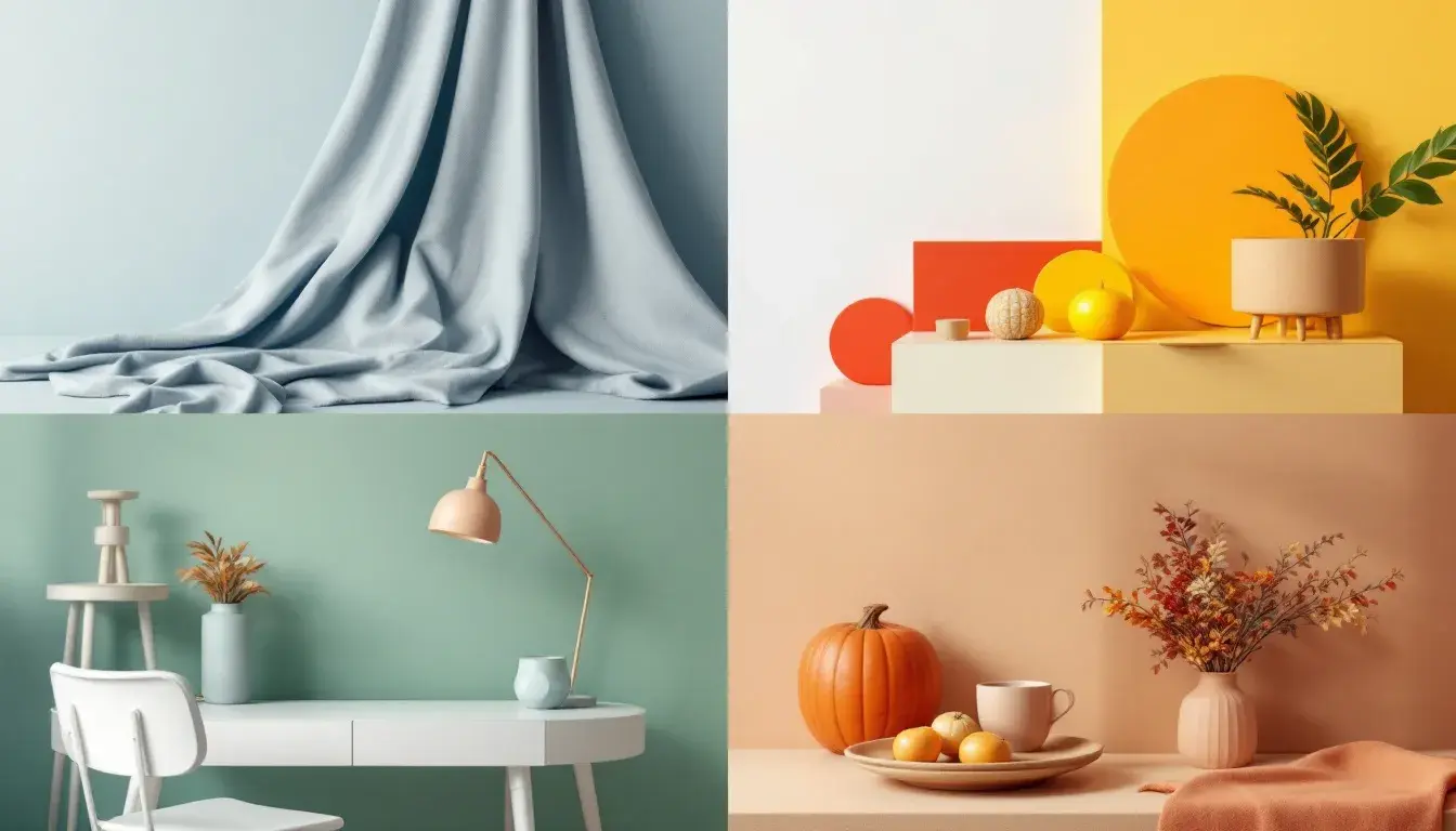
"Modern Contrast" offers a narrative of bold statements and restrained elegance. The grounding comes from pure white and deep charcoal, an axis of clean, sharp delineation that immediately commands attention. The appearance of neutral gray adds a layer of quiet consideration, allowing the eye to rest amidst the drama. On the richer side, golden yellow injects a spark of optimism, while dusty rose provides a contemporary twist, lending a subtle touch of sophistication. The impact of bright crimson captures the viewer's attention, demanding notice with its unapologetic hue. The dark maroon then deepens the scene and provides a sense of unwavering grounding. Azure blue offers a calming counterpart, bringing a sense of clarity and focus. Picture this palette gracing the walls of an office space, where the light interacts with the pale yellow in a naturally beneficial way. Imagine a living room with a pure white backdrop, enlivened by touches of crimson. A Modern Contrast space embraces the paradox of serenity and stimulation, making it perfect for cultivating a vibrant and dynamic atmosphere. It's a palette suited for both focused endeavors and lively interactions, a backdrop where innovation meets sophistication in a perfect balance.
"Earthy Serenity" presents a vision of connection and calm, rooted in the hues of the natural world. Pure white forms the foundation, a canvas of possibility and a tranquil presence. Mint green brings a delicate sense of freshness, suggesting new beginnings, while light beige acts as a gentle anchor, grounding the palette in the tactile comfort of soil and stone. A central pillar arrives in jade green, offering an element of understated sophistication, invoking the serenity of a forest glen. Forest green goes on to create a sense of verdant depth, suggesting lush growth and tranquility. Olive brown provides a grounding warmth, like sun-baked earth, while deep teal resonates with the calmness of deep waters. Picture this palette washing over a bedroom, where the light beige of the walls would blend seamlessly with the forest green accents and plush textures. Imagine a living room where mint green pillows and throws create a space with an instantly calming effect. This palette is for spaces designed to nurture; whether it's a space for rest, contemplation, or quiet connection. It suggests a departure from the digital world, bringing to mind a retreat from modern noise and a reminder of the beauty found in simplicity.
"Earthy Contrast" speaks of autumnal landscapes and cozy textures. The palette begins with off white, offering a warm and inviting foundation. Burnt orange injects playful energy, reminiscent of falling leaves in the sunlight. The arrival of dusty gray grounds the palette, like weathered stone against a rich earth, invoking reflection. Similarly, dark taupe creates an atmosphere of subtle sophistication, recalling the elegance of naturally aged elements. Rust orange deepens the palette, hinting at firesides and autumn harvest, while deep brown evokes the warmth of natural wood. The grounding anchor is deep black, providing a sense of solidity like twilight in the woods. Think of this palette transforming a living room where the walls create a backdrop of comfort, and muted sunlight paints the scene with inviting light. Consider the same look implemented in a bedroom, where soft textures would create a place of rest. It offers warmth without overwhelming intensity as it balances a sense of rustic charm with mature sophistication. Combining these hues is about forging connection, offering an inviting, calm, and mature setting for meaningful interaction.
Each palette offers a unique avenue to explore. From the sleek, serious atmosphere of "Space Hub" to the grounded warmth of "Earthy Contrast," the interplay of colors can transform spaces into havens of focus, inspiration, or relaxation. The key lies in understanding the story each palette tells. Through these unique avenues, carefully selected colors can transform the ordinary into the extraordinary, crafting environments that nurture our minds, soothe our souls, and cultivate a sense of belonging. Ultimately, the perfect palette is not simply a collection of colors, but a carefully chosen symphony designed to shape our experiences, redefine our perceptions, and enhance our overall quality of life.