'%3e%3cpath%20fill-rule='evenodd'%20clip-rule='evenodd'%20d='M51.1303%2019.2492C50.7278%2019.913%2050.1346%2020.4426%2049.3508%2020.838C48.5669%2021.2335%2047.6172%2021.4312%2046.5014%2021.4312C44.8208%2021.4312%2043.4367%2021.0216%2042.3492%2020.2025C41.2617%2019.3833%2040.6686%2018.2394%2040.5697%2016.7706H44.4253C44.4818%2017.3355%2044.6831%2017.7804%2045.0291%2018.1052C45.3751%2018.43%2045.8164%2018.5924%2046.3531%2018.5924C46.8192%2018.5924%2047.1864%2018.4653%2047.4547%2018.2111C47.7231%2017.9569%2047.8572%2017.618%2047.8572%2017.1943C47.8572%2016.8129%2047.7337%2016.4952%2047.4865%2016.241C47.2393%2015.9867%2046.9322%2015.7784%2046.565%2015.616C46.1978%2015.4536%2045.6893%2015.2594%2045.0397%2015.0334C44.0934%2014.7086%2043.3202%2014.3944%2042.72%2014.0907C42.1197%2013.7871%2041.6042%2013.3351%2041.1735%2012.7349C40.7427%2012.1347%2040.5273%2011.3544%2040.5273%2010.394C40.5273%209.50418%2040.7533%208.73448%2041.2053%208.08481C41.6572%207.43515%2042.2821%206.93731%2043.0801%206.5913C43.8781%206.24528%2044.7925%206.07227%2045.8235%206.07227C47.49%206.07227%2048.8141%206.46771%2049.7956%207.25861C50.7772%208.04951%2051.3315%209.13698%2051.4586%2010.5211H47.5395C47.4689%2010.0268%2047.2888%209.63483%2046.9993%209.3453C46.7097%209.05578%2046.3178%208.91102%2045.8235%208.91102C45.3998%208.91102%2045.0573%209.024%2044.7961%209.24997C44.5348%209.47594%2044.4041%209.80783%2044.4041%2010.2457C44.4041%2010.5988%2044.5207%2010.8989%2044.7537%2011.146C44.9867%2011.3932%2045.2798%2011.5944%2045.6328%2011.7498C45.9859%2011.9052%2046.4944%2012.1029%2047.1581%2012.343C48.1185%2012.6678%2048.9023%2012.9891%2049.5096%2013.3069C50.1169%2013.6246%2050.6395%2014.0872%2051.0773%2014.6945C51.5151%2015.3018%2051.734%2016.0927%2051.734%2017.0672C51.734%2017.8581%2051.5328%2018.5854%2051.1303%2019.2492ZM59.0242%206.3053V21.2829H55.4016V6.3053H59.0242ZM73.9409%206.3053V9.18642H69.8734V21.2829H66.2296V9.18642H62.2046V6.3053H73.9409ZM80.7438%209.18642V12.3218H85.8069V15.0546H80.7438V18.3806H86.4425V21.2829H77.1212V6.3053H86.4425V9.18642H80.7438ZM99.667%2016.0291V21.2829H96.0444V6.3053H101.913C103.692%206.3053%20105.048%206.74665%20105.98%207.62934C106.912%208.51204%20107.378%209.7019%20107.378%2011.199C107.378%2012.1311%20107.17%2012.9609%20106.753%2013.6882C106.337%2014.4155%20105.719%2014.9875%20104.9%2015.4042C104.08%2015.8208%20103.085%2016.0291%20101.913%2016.0291H99.667ZM103.692%2011.199C103.692%209.8855%20102.965%209.22879%20101.51%209.22879H99.667V13.1268H101.51C102.965%2013.1268%20103.692%2012.4842%20103.692%2011.199ZM120.092%2018.5501H114.478L113.546%2021.2829H109.732L115.219%206.41123H119.393L124.879%2021.2829H121.024L120.092%2018.5501ZM119.16%2015.7961L117.295%2010.2881L115.41%2015.7961H119.16ZM131.555%2018.5077H136.385V21.2829H127.933V6.3053H131.555V18.5077ZM143.337%209.18642V12.3218H148.4V15.0546H143.337V18.3806H149.035V21.2829H139.714V6.3053H149.035V9.18642H143.337ZM163.507%206.3053V9.18642H159.44V21.2829H155.796V9.18642H151.771V6.3053H163.507ZM177.449%206.3053V9.18642H173.382V21.2829H169.738V9.18642H165.713V6.3053H177.449ZM184.252%209.18642V12.3218H189.315V15.0546H184.252V18.3806H189.951V21.2829H180.629V6.3053H189.951V9.18642H184.252Z'%20fill='%23EEF0ED'/%3e%3cmask%20id='mask0_3101_7327'%20style='mask-type:alpha'%20maskUnits='userSpaceOnUse'%20x='0'%20y='0'%20width='27'%20height='28'%3e%3cpath%20d='M23.8328%200.759766H2.64808C1.18559%200.759766%200%201.94535%200%203.40785V24.5925C0%2026.055%201.18559%2027.2406%202.64808%2027.2406H23.8328C25.2952%2027.2406%2026.4808%2026.055%2026.4808%2024.5925V3.40785C26.4808%201.94535%2025.2952%200.759766%2023.8328%200.759766Z'%20fill='white'/%3e%3c/mask%3e%3cg%20mask='url(%23mask0_3101_7327)'%3e%3cpath%20d='M23.8328%200.759766H2.64808C1.18559%200.759766%200%201.94535%200%203.40785V24.5925C0%2026.055%201.18559%2027.2406%202.64808%2027.2406H23.8328C25.2952%2027.2406%2026.4808%2026.055%2026.4808%2024.5925V3.40785C26.4808%201.94535%2025.2952%200.759766%2023.8328%200.759766Z'%20fill='%23D8D8D8'/%3e%3cpath%20d='M13.2404%200.759766H0V14.0001H13.2404V0.759766Z'%20fill='%238C61FF'/%3e%3cpath%20d='M13.2404%2014H0V27.2404H13.2404V14Z'%20fill='%2336C3FE'/%3e%3cpath%20d='M26.4806%2014H13.2402V27.2404H26.4806V14Z'%20fill='%236592FE'/%3e%3cpath%20d='M26.4806%200.759766H13.2402V14.0002H26.4806V0.759766Z'%20fill='%236059F7'/%3e%3c/g%3e%3c/g%3e%3cdefs%3e%3cclipPath%20id='clip0_3101_7327'%3e%3crect%20width='190'%20height='28'%20fill='white'/%3e%3c/clipPath%3e%3c/defs%3e%3c/svg%3e)
'%3e%3cpath%20d='M23.8328%200.759521H2.64808C1.18559%200.759521%200%201.94511%200%203.40761V24.5923C0%2026.0548%201.18559%2027.2404%202.64808%2027.2404H23.8328C25.2952%2027.2404%2026.4808%2026.0548%2026.4808%2024.5923V3.40761C26.4808%201.94511%2025.2952%200.759521%2023.8328%200.759521Z'%20fill='%23D8D8D8'/%3e%3cpath%20d='M13.2404%200.759521H0V13.9999H13.2404V0.759521Z'%20fill='%238C61FF'/%3e%3cpath%20d='M13.2404%2013.9998H0V27.2402H13.2404V13.9998Z'%20fill='%2336C3FE'/%3e%3cpath%20d='M26.4809%2013.9998H13.2405V27.2402H26.4809V13.9998Z'%20fill='%236592FE'/%3e%3cpath%20d='M26.4809%200.759277H13.2405V13.9997H26.4809V0.759277Z'%20fill='%236059F7'/%3e%3c/g%3e%3c/svg%3e)
Travel Industry Color Preferences: A Seasonal Breakdown
08 Sep 2025 · 3 min readThe allure of travel lies not just in destinations reached but in the emotions stirred – anticipation of a journey, the immersion in a new culture, the lingering nostalgia of a place left behind. Color, the silent language of perception, shapes these emotions. Imagine a brochure promising a sun-drenched Italian summer, rendered in muted greys. The disconnect is immediate. Travel, at its best, is a visceral awakening, a symphony of sensations, and the colors we associate with it must ring true. They must whisper promises of adventure, rest, discovery, romance. They hint at the experiences awaiting, from the cool shadows of ancient ruins to the explosion of flavors in a bustling marketplace, from the quiet solitude of a snow-covered peak to the vibrant hum of a tropical beach. They are the heralds of our journeys, painting the dreams that propel us outward. If poorly aligned it can evoke the wrong feel. Color helps set the stage for the memories we collect, like carefully chosen frames for the photographs we’ll cherish long after our return.
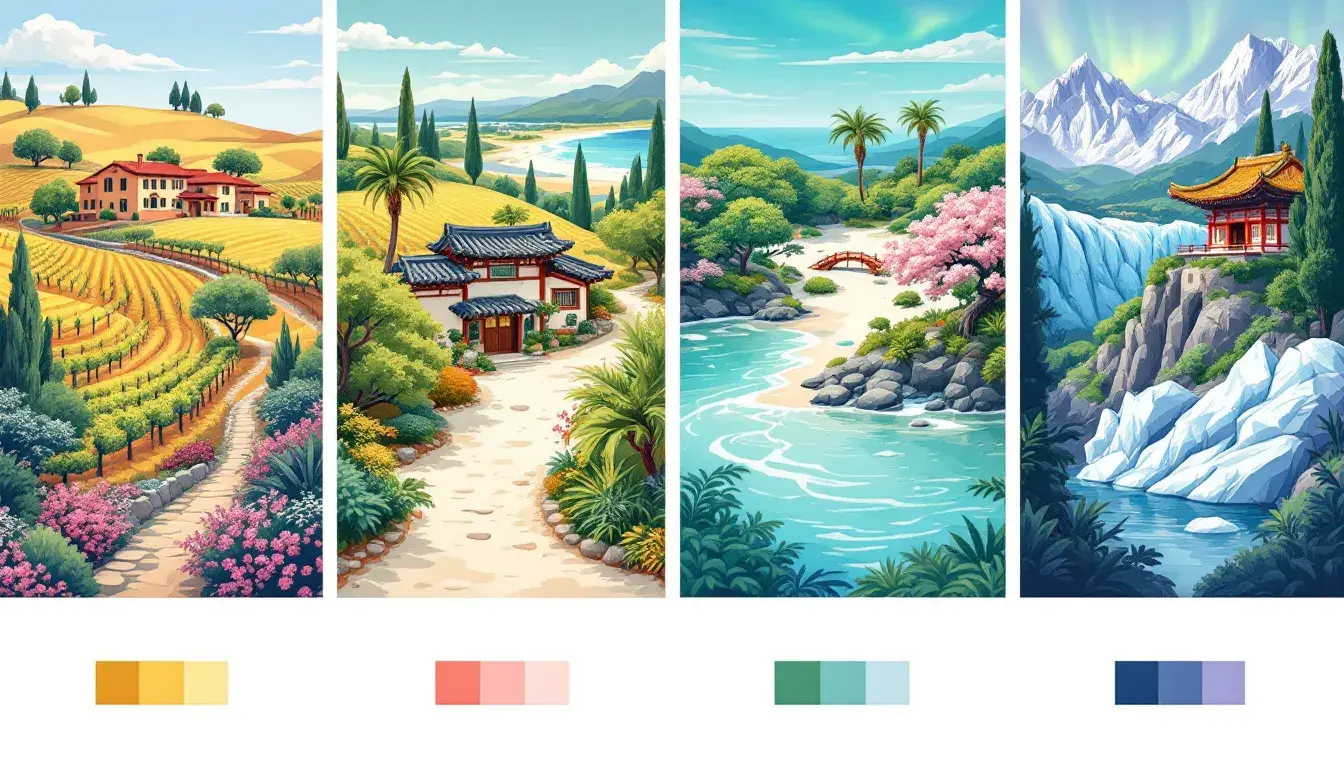
Elegant Travel whispers of bespoke adventures and curated experiences. It's the color palette of a luxurious train journey through the Swiss Alps, or a private tour of a Tuscan vineyard during harvest season. The Pure White evokes the crisp linen of a luxury hotel suite, while a touch of Golden Yellow hints at the warmth of afternoon sun bathing a historical plaza. Grayish Taupe grounds the palette, reminiscent of ancient stone walls whispering stories of centuries past. Then, the Coral Red appears, a rich accent suggesting exotic spices mingling in a Moroccan bazaar, or the fiery sunsets witnessed from a cliffside villa overlooking the Mediterranean. Olive Drab, subtle and sophisticated, conjures images of rolling hills dotted with olive groves. Consider the possibilities where Brick Red speaks with the rustic charm of terracotta rooftops in a sun-drenched village, and the Deep Black anchors the experience creating an aura of exclusivity and sophisticated refinement. This harmonious blend of warm tones speaks to travelers who seek authenticity wrapped in comfort, seeking experiences beyond the ordinary. It's the color of whispered secrets, of journeys meticulously planned, and memories carefully crafted. This palette is tailored to those who believe travel is not merely about seeing places but about feeling them in their soul.
Coastal Escape is the bottled essence of seaside serenity. Think of sun-kissed skin and salty breezes captured in a visual breath. Vibrant Turquoise channels the mesmerizing allure of crystalline waters lapping against pristine shores. The Golden Amber evokes the glint of sunlight dancing on the sand, warming the skin and spirit. Grayish Green whispers of sea grasses swaying gently in the breeze, adding an element of tranquility and undisturbed nature. A touch of Deep Azure alludes to the vast expanse of the open ocean, beckoning exploration and adventure. And Dark Teal, cool and calming, hints at the mysterious depths beneath the waves. It's a palette for those who seek respite from the everyday and a dive into the rejuvenating embrace of coastal landscapes. Imagine travel brochures enticing you with images of sun-dappled beaches, the whisper of waves crashing against the shore, and the scent of salt-tinged air. This evokes a mood of relaxed contentment, like the soft caress of a summer breeze across sun-warmed skin. It’s a journey designed for those seeking tranquility.
Vibrant Korea captures the dynamic spirit of a nation where ancient traditions embrace modern innovation. Pale Peach whispers of delicate blossoms gracing temple gardens and the gentle blush of sunrise over mountain peaks. Chartreuse Green bursts forth, reflecting the lush rice paddies carpeting the countryside, symbolizing abundance and tranquility. Emerald Green evokes the verdant forests cloaking the peninsula, hinting at hidden temples and serene landscapes. In turn, Slate Gray adds a touch of urban sophistication, reminiscent of the sleek skyscrapers piercing the Seoul skyline. Lastly, Dark Moss Green grounds the palette, mirroring the tranquil moss gardens in ancient palaces, a contemplative pause amidst the bustle. The palette is ideal for appealing to those wanting to experience that beautiful country’s vibrancy. Think of travel pamphlets bursting with images of bustling street food markets, tranquil zen gardens, and the neon-lit streets of Seoul. This palette communicates adventure and discovery.
Anchorage Palette evokes the serene beauty of Alaska's expansive landscapes, a sense of stillness and wonder. Light Grayish White mirrors the vast, snow-covered terrains illuminated by the soft glow of the Arctic sun. Sky Blue portrays the crystal-clear waters reflecting the majestic, snow-capped mountains. Vivid Sapphire suggests the mysterious depths of the glaciers and the clear, boundless sky overhead. Deep Raspberry provides an unexpected warmth reminiscent of the aurora borealis dancing across the horizon. That unique vibrant color provides a warmth in such a cold landscape. And lastly, the Onyx communicates the strong foundations of the ancient terrains, whispering a sense the timelessness in a harsh, unforgettable environment. This palette is tailored for those who resonate with the call of the wild, inviting them to experience the profound tranquility and raw power. It suggests quiet cruises through Glacier Bay, where icebergs calve into the sea, a gentle reminder that we should be in touch with nature.
Travel is more than just movement; it’s an experience woven from emotions, memories, and sensory impressions. The colors presented reflect the profound influence that a carefully curated color story can hold. Ranging from the tailored opulence of Elegant Travel, to the beach side essence of Coastal Escape, from the energetic Vibrant Korea to the stillness of Anchorage Palette, these palettes suggest that color is never merely decorative, and rather it’s foundational. Color breathes a feeling, whether that’s a whisper of extravagance, the serenity of crashing waves, or the call to untamed landscapes. The subtle language of color, therefore, becomes a guide to the adventures that await, painting the canvas for the memories we gather in the far corners of the world.