'%3e%3cpath%20fill-rule='evenodd'%20clip-rule='evenodd'%20d='M51.1303%2019.2492C50.7278%2019.913%2050.1346%2020.4426%2049.3508%2020.838C48.5669%2021.2335%2047.6172%2021.4312%2046.5014%2021.4312C44.8208%2021.4312%2043.4367%2021.0216%2042.3492%2020.2025C41.2617%2019.3833%2040.6686%2018.2394%2040.5697%2016.7706H44.4253C44.4818%2017.3355%2044.6831%2017.7804%2045.0291%2018.1052C45.3751%2018.43%2045.8164%2018.5924%2046.3531%2018.5924C46.8192%2018.5924%2047.1864%2018.4653%2047.4547%2018.2111C47.7231%2017.9569%2047.8572%2017.618%2047.8572%2017.1943C47.8572%2016.8129%2047.7337%2016.4952%2047.4865%2016.241C47.2393%2015.9867%2046.9322%2015.7784%2046.565%2015.616C46.1978%2015.4536%2045.6893%2015.2594%2045.0397%2015.0334C44.0934%2014.7086%2043.3202%2014.3944%2042.72%2014.0907C42.1197%2013.7871%2041.6042%2013.3351%2041.1735%2012.7349C40.7427%2012.1347%2040.5273%2011.3544%2040.5273%2010.394C40.5273%209.50418%2040.7533%208.73448%2041.2053%208.08481C41.6572%207.43515%2042.2821%206.93731%2043.0801%206.5913C43.8781%206.24528%2044.7925%206.07227%2045.8235%206.07227C47.49%206.07227%2048.8141%206.46771%2049.7956%207.25861C50.7772%208.04951%2051.3315%209.13698%2051.4586%2010.5211H47.5395C47.4689%2010.0268%2047.2888%209.63483%2046.9993%209.3453C46.7097%209.05578%2046.3178%208.91102%2045.8235%208.91102C45.3998%208.91102%2045.0573%209.024%2044.7961%209.24997C44.5348%209.47594%2044.4041%209.80783%2044.4041%2010.2457C44.4041%2010.5988%2044.5207%2010.8989%2044.7537%2011.146C44.9867%2011.3932%2045.2798%2011.5944%2045.6328%2011.7498C45.9859%2011.9052%2046.4944%2012.1029%2047.1581%2012.343C48.1185%2012.6678%2048.9023%2012.9891%2049.5096%2013.3069C50.1169%2013.6246%2050.6395%2014.0872%2051.0773%2014.6945C51.5151%2015.3018%2051.734%2016.0927%2051.734%2017.0672C51.734%2017.8581%2051.5328%2018.5854%2051.1303%2019.2492ZM59.0242%206.3053V21.2829H55.4016V6.3053H59.0242ZM73.9409%206.3053V9.18642H69.8734V21.2829H66.2296V9.18642H62.2046V6.3053H73.9409ZM80.7438%209.18642V12.3218H85.8069V15.0546H80.7438V18.3806H86.4425V21.2829H77.1212V6.3053H86.4425V9.18642H80.7438ZM99.667%2016.0291V21.2829H96.0444V6.3053H101.913C103.692%206.3053%20105.048%206.74665%20105.98%207.62934C106.912%208.51204%20107.378%209.7019%20107.378%2011.199C107.378%2012.1311%20107.17%2012.9609%20106.753%2013.6882C106.337%2014.4155%20105.719%2014.9875%20104.9%2015.4042C104.08%2015.8208%20103.085%2016.0291%20101.913%2016.0291H99.667ZM103.692%2011.199C103.692%209.8855%20102.965%209.22879%20101.51%209.22879H99.667V13.1268H101.51C102.965%2013.1268%20103.692%2012.4842%20103.692%2011.199ZM120.092%2018.5501H114.478L113.546%2021.2829H109.732L115.219%206.41123H119.393L124.879%2021.2829H121.024L120.092%2018.5501ZM119.16%2015.7961L117.295%2010.2881L115.41%2015.7961H119.16ZM131.555%2018.5077H136.385V21.2829H127.933V6.3053H131.555V18.5077ZM143.337%209.18642V12.3218H148.4V15.0546H143.337V18.3806H149.035V21.2829H139.714V6.3053H149.035V9.18642H143.337ZM163.507%206.3053V9.18642H159.44V21.2829H155.796V9.18642H151.771V6.3053H163.507ZM177.449%206.3053V9.18642H173.382V21.2829H169.738V9.18642H165.713V6.3053H177.449ZM184.252%209.18642V12.3218H189.315V15.0546H184.252V18.3806H189.951V21.2829H180.629V6.3053H189.951V9.18642H184.252Z'%20fill='%23EEF0ED'/%3e%3cmask%20id='mask0_3101_7327'%20style='mask-type:alpha'%20maskUnits='userSpaceOnUse'%20x='0'%20y='0'%20width='27'%20height='28'%3e%3cpath%20d='M23.8328%200.759766H2.64808C1.18559%200.759766%200%201.94535%200%203.40785V24.5925C0%2026.055%201.18559%2027.2406%202.64808%2027.2406H23.8328C25.2952%2027.2406%2026.4808%2026.055%2026.4808%2024.5925V3.40785C26.4808%201.94535%2025.2952%200.759766%2023.8328%200.759766Z'%20fill='white'/%3e%3c/mask%3e%3cg%20mask='url(%23mask0_3101_7327)'%3e%3cpath%20d='M23.8328%200.759766H2.64808C1.18559%200.759766%200%201.94535%200%203.40785V24.5925C0%2026.055%201.18559%2027.2406%202.64808%2027.2406H23.8328C25.2952%2027.2406%2026.4808%2026.055%2026.4808%2024.5925V3.40785C26.4808%201.94535%2025.2952%200.759766%2023.8328%200.759766Z'%20fill='%23D8D8D8'/%3e%3cpath%20d='M13.2404%200.759766H0V14.0001H13.2404V0.759766Z'%20fill='%238C61FF'/%3e%3cpath%20d='M13.2404%2014H0V27.2404H13.2404V14Z'%20fill='%2336C3FE'/%3e%3cpath%20d='M26.4806%2014H13.2402V27.2404H26.4806V14Z'%20fill='%236592FE'/%3e%3cpath%20d='M26.4806%200.759766H13.2402V14.0002H26.4806V0.759766Z'%20fill='%236059F7'/%3e%3c/g%3e%3c/g%3e%3cdefs%3e%3cclipPath%20id='clip0_3101_7327'%3e%3crect%20width='190'%20height='28'%20fill='white'/%3e%3c/clipPath%3e%3c/defs%3e%3c/svg%3e)
'%3e%3cpath%20d='M23.8328%200.759521H2.64808C1.18559%200.759521%200%201.94511%200%203.40761V24.5923C0%2026.0548%201.18559%2027.2404%202.64808%2027.2404H23.8328C25.2952%2027.2404%2026.4808%2026.0548%2026.4808%2024.5923V3.40761C26.4808%201.94511%2025.2952%200.759521%2023.8328%200.759521Z'%20fill='%23D8D8D8'/%3e%3cpath%20d='M13.2404%200.759521H0V13.9999H13.2404V0.759521Z'%20fill='%238C61FF'/%3e%3cpath%20d='M13.2404%2013.9998H0V27.2402H13.2404V13.9998Z'%20fill='%2336C3FE'/%3e%3cpath%20d='M26.4809%2013.9998H13.2405V27.2402H26.4809V13.9998Z'%20fill='%236592FE'/%3e%3cpath%20d='M26.4809%200.759277H13.2405V13.9997H26.4809V0.759277Z'%20fill='%236059F7'/%3e%3c/g%3e%3c/svg%3e)
The Coolest Summer Palettes: Ranking Trends by 'Coolness'
05 Sep 2025 · 2 min readThe pursuit of coolness is a summer ritual. It isn't just about escaping the heat; it’s about embracing a state of mind, a visual impression that whispers effortless style and refreshing ease. Color, of course, is instrumental. It sets the stage, paints the scene, and defines the mood. Gone are the days of simple, singular tones. Instead, a carefully curated palette speaks volumes, narrating tales of breezy afternoons, sun-drenched escapes, and the tranquil bliss of slowing down. We're not just looking at colors; we're stepping into distinct atmospheres, each carrying its own unique take on the season's chill. Summer coolness is a sensory experience - a visual antidote to the season's intensity. Like a chilled drink perspiring softly, or linen billowing in the breeze, these assembled tones capture the feeling of respite.
With Earthy Blues, the summer's high-spirited hues find grounding. The palette speaks of aged landscapes and quiet afternoons, an escape from hyperstimulation. Pale Gray emerges as a cloud-soft backdrop, providing a subtle canvas against which the other shades play. Light Slate Blue hints at vast summer skies, drawing in the distant horizon into a tangible sense of place. Mustard Yellow adds a touch of the sun's warmth that isn't overwhelming. Dusty Rose echoes the shades visible right before nightfall, when the day's heat has finally dispersed. And lastly, the robust Dark Indigo delivers a sense of shelter, like the dark coolness of a cave during the season's midday peak. It's a palette that seems at home against the aged wood of a cottage or within the neutral tones of a contemporary minimalist scene, a blend of understated beauty and natural ease. This is not the summer of flashing lights or neon hues, but one of restrained enjoyment, a return to natural rhythms and grounded experience. It suggests summer afternoons spent in the shade of a tree, flipping through a worn book, the sun dappling through the leaves.
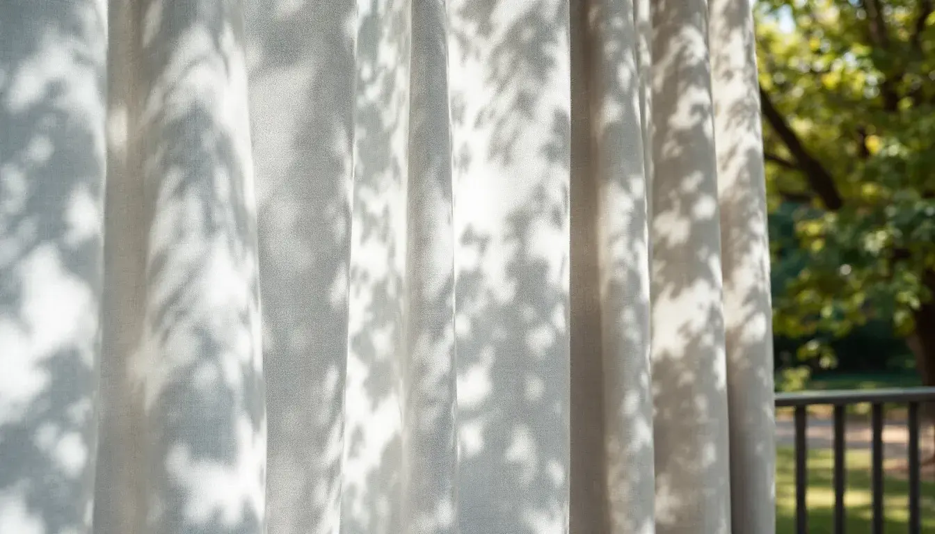
Home Light offers a bright, airy take on summer sophistication. It moves beyond the expected blues and greens, embracing playful contrasts while holding onto a sense of serenity. Steel Gray offers a sturdy, reliable anchor, reminiscent of the stones lining a sun-warmed patio. Then comes, Electric Blue. It’s the flash of the pool water as you dive in, a jolt of energy, yet contained, controlled. Bright Salmon pops with a subtle vibrancy, reminiscent of a sunset viewed through sheer curtains. Meanwhile, Russet Brown whispers of woven textures and comfortable shade – think of a worn wooden chair or the intricate pattern of woven blinds filtering the bright light. Finally, Deep Charcoal adds a grounding darkness, hinting at the cool refuge of shadows lengthening across a room at dusk. This combination of tones doesn't evoke overt flashiness; it speaks of a calm confidence. It's an invitation to a space where summer light is celebrated, and relaxation is intentional. It imagines summer interiors: simple lines, natural materials, and an overall sense of airy openness. Each color complements the others to enhance an atmosphere of comfortable, unshowy sophistication.
Modern Hues presents a sophisticated twist, where coolness comes not from obvious, vibrant hues but from carefully selected tonal depths. Pale Gray acts as a soft, diffused light, creating a gently muted setting. Muted Teal brings to mind reflections in still waters, a submerged sense of tranquility. At the same time, Deep Violet offers a touch of intrigue, like twilight deepening into night. Dark Slate contributes to an atmosphere of serene composure, like the stones lining a calm summer lake. At its base is Dark Charcoal. Solid and dependable, it offers a sense of permanence, like that of old stone buildings. In the end, this pairing is about creating balance, a place to unwind in the summer. In its own way, it sets a relaxing, somewhat intellectual tone appropriate for introspective, creative personalities. This palette isn't loud or showy; instead, it whispers of refined artistic sensibilities finding quiet expression.
The "coolest" palette, by virtue of colors carrying the "cool" descriptor and its dominant coolness, is Earthy Blues; it embraces the quiet strength of nature, suggesting landscapes and contemplative moments. Home Light, while also "Cool dominant," follows by evoking summer interiors filled with calm confidence and airy sophistication. Modern Hues brings up the rear, evoking stillness and creativity with toned-down shades. Each option, however, offers a distinct way to beat the heat. The real takeaway here is that summer's coolest mood isn't achieved by seeking the most vibrant or flashy shades, but by meticulously curating a personal atmosphere defined by rest.