'%3e%3cpath%20fill-rule='evenodd'%20clip-rule='evenodd'%20d='M51.1303%2019.2492C50.7278%2019.913%2050.1346%2020.4426%2049.3508%2020.838C48.5669%2021.2335%2047.6172%2021.4312%2046.5014%2021.4312C44.8208%2021.4312%2043.4367%2021.0216%2042.3492%2020.2025C41.2617%2019.3833%2040.6686%2018.2394%2040.5697%2016.7706H44.4253C44.4818%2017.3355%2044.6831%2017.7804%2045.0291%2018.1052C45.3751%2018.43%2045.8164%2018.5924%2046.3531%2018.5924C46.8192%2018.5924%2047.1864%2018.4653%2047.4547%2018.2111C47.7231%2017.9569%2047.8572%2017.618%2047.8572%2017.1943C47.8572%2016.8129%2047.7337%2016.4952%2047.4865%2016.241C47.2393%2015.9867%2046.9322%2015.7784%2046.565%2015.616C46.1978%2015.4536%2045.6893%2015.2594%2045.0397%2015.0334C44.0934%2014.7086%2043.3202%2014.3944%2042.72%2014.0907C42.1197%2013.7871%2041.6042%2013.3351%2041.1735%2012.7349C40.7427%2012.1347%2040.5273%2011.3544%2040.5273%2010.394C40.5273%209.50418%2040.7533%208.73448%2041.2053%208.08481C41.6572%207.43515%2042.2821%206.93731%2043.0801%206.5913C43.8781%206.24528%2044.7925%206.07227%2045.8235%206.07227C47.49%206.07227%2048.8141%206.46771%2049.7956%207.25861C50.7772%208.04951%2051.3315%209.13698%2051.4586%2010.5211H47.5395C47.4689%2010.0268%2047.2888%209.63483%2046.9993%209.3453C46.7097%209.05578%2046.3178%208.91102%2045.8235%208.91102C45.3998%208.91102%2045.0573%209.024%2044.7961%209.24997C44.5348%209.47594%2044.4041%209.80783%2044.4041%2010.2457C44.4041%2010.5988%2044.5207%2010.8989%2044.7537%2011.146C44.9867%2011.3932%2045.2798%2011.5944%2045.6328%2011.7498C45.9859%2011.9052%2046.4944%2012.1029%2047.1581%2012.343C48.1185%2012.6678%2048.9023%2012.9891%2049.5096%2013.3069C50.1169%2013.6246%2050.6395%2014.0872%2051.0773%2014.6945C51.5151%2015.3018%2051.734%2016.0927%2051.734%2017.0672C51.734%2017.8581%2051.5328%2018.5854%2051.1303%2019.2492ZM59.0242%206.3053V21.2829H55.4016V6.3053H59.0242ZM73.9409%206.3053V9.18642H69.8734V21.2829H66.2296V9.18642H62.2046V6.3053H73.9409ZM80.7438%209.18642V12.3218H85.8069V15.0546H80.7438V18.3806H86.4425V21.2829H77.1212V6.3053H86.4425V9.18642H80.7438ZM99.667%2016.0291V21.2829H96.0444V6.3053H101.913C103.692%206.3053%20105.048%206.74665%20105.98%207.62934C106.912%208.51204%20107.378%209.7019%20107.378%2011.199C107.378%2012.1311%20107.17%2012.9609%20106.753%2013.6882C106.337%2014.4155%20105.719%2014.9875%20104.9%2015.4042C104.08%2015.8208%20103.085%2016.0291%20101.913%2016.0291H99.667ZM103.692%2011.199C103.692%209.8855%20102.965%209.22879%20101.51%209.22879H99.667V13.1268H101.51C102.965%2013.1268%20103.692%2012.4842%20103.692%2011.199ZM120.092%2018.5501H114.478L113.546%2021.2829H109.732L115.219%206.41123H119.393L124.879%2021.2829H121.024L120.092%2018.5501ZM119.16%2015.7961L117.295%2010.2881L115.41%2015.7961H119.16ZM131.555%2018.5077H136.385V21.2829H127.933V6.3053H131.555V18.5077ZM143.337%209.18642V12.3218H148.4V15.0546H143.337V18.3806H149.035V21.2829H139.714V6.3053H149.035V9.18642H143.337ZM163.507%206.3053V9.18642H159.44V21.2829H155.796V9.18642H151.771V6.3053H163.507ZM177.449%206.3053V9.18642H173.382V21.2829H169.738V9.18642H165.713V6.3053H177.449ZM184.252%209.18642V12.3218H189.315V15.0546H184.252V18.3806H189.951V21.2829H180.629V6.3053H189.951V9.18642H184.252Z'%20fill='%23EEF0ED'/%3e%3cmask%20id='mask0_3101_7327'%20style='mask-type:alpha'%20maskUnits='userSpaceOnUse'%20x='0'%20y='0'%20width='27'%20height='28'%3e%3cpath%20d='M23.8328%200.759766H2.64808C1.18559%200.759766%200%201.94535%200%203.40785V24.5925C0%2026.055%201.18559%2027.2406%202.64808%2027.2406H23.8328C25.2952%2027.2406%2026.4808%2026.055%2026.4808%2024.5925V3.40785C26.4808%201.94535%2025.2952%200.759766%2023.8328%200.759766Z'%20fill='white'/%3e%3c/mask%3e%3cg%20mask='url(%23mask0_3101_7327)'%3e%3cpath%20d='M23.8328%200.759766H2.64808C1.18559%200.759766%200%201.94535%200%203.40785V24.5925C0%2026.055%201.18559%2027.2406%202.64808%2027.2406H23.8328C25.2952%2027.2406%2026.4808%2026.055%2026.4808%2024.5925V3.40785C26.4808%201.94535%2025.2952%200.759766%2023.8328%200.759766Z'%20fill='%23D8D8D8'/%3e%3cpath%20d='M13.2404%200.759766H0V14.0001H13.2404V0.759766Z'%20fill='%238C61FF'/%3e%3cpath%20d='M13.2404%2014H0V27.2404H13.2404V14Z'%20fill='%2336C3FE'/%3e%3cpath%20d='M26.4806%2014H13.2402V27.2404H26.4806V14Z'%20fill='%236592FE'/%3e%3cpath%20d='M26.4806%200.759766H13.2402V14.0002H26.4806V0.759766Z'%20fill='%236059F7'/%3e%3c/g%3e%3c/g%3e%3cdefs%3e%3cclipPath%20id='clip0_3101_7327'%3e%3crect%20width='190'%20height='28'%20fill='white'/%3e%3c/clipPath%3e%3c/defs%3e%3c/svg%3e)
'%3e%3cpath%20d='M23.8328%200.759521H2.64808C1.18559%200.759521%200%201.94511%200%203.40761V24.5923C0%2026.0548%201.18559%2027.2404%202.64808%2027.2404H23.8328C25.2952%2027.2404%2026.4808%2026.0548%2026.4808%2024.5923V3.40761C26.4808%201.94511%2025.2952%200.759521%2023.8328%200.759521Z'%20fill='%23D8D8D8'/%3e%3cpath%20d='M13.2404%200.759521H0V13.9999H13.2404V0.759521Z'%20fill='%238C61FF'/%3e%3cpath%20d='M13.2404%2013.9998H0V27.2402H13.2404V13.9998Z'%20fill='%2336C3FE'/%3e%3cpath%20d='M26.4809%2013.9998H13.2405V27.2402H26.4809V13.9998Z'%20fill='%236592FE'/%3e%3cpath%20d='M26.4809%200.759277H13.2405V13.9997H26.4809V0.759277Z'%20fill='%236059F7'/%3e%3c/g%3e%3c/svg%3e)
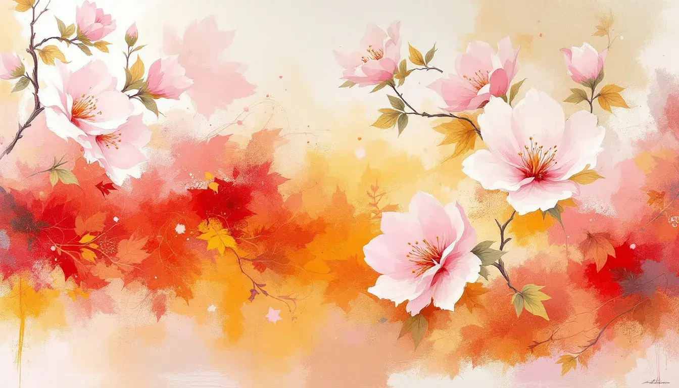
Seasonal Color Shifts: From Cheerful Spring to Cozy Autumn
05 Sep 2025 · 2 min readThe shift from the effervescent energy of spring to the comforting embrace of autumn is a transformation painted in colors. Spring bursts forth with the eagerness of new life, a visual symphony of awakening, while autumn slows to a pensive stroll through fiery landscapes. These palettes capture not just hues, but feelings – the crisp promise of a new beginning versus the gentle acceptance of letting go. Color, in this context, is more than decoration; it's a language we instinctively understand, one that dictates our moods, influences our choices, and shapes our experiences. A carefully constructed color story can transport us to a sun-drenched meadow or a crackling fireside, regardless of the season outside our window. This ability to evoke specific emotions and atmospheres through color is what makes it a powerful tool for expression and connection.
The "Vibrant Spectrum" hints at the initial thrill of springtime’s arrival. It evokes the gentle reawakening of nature, rendered in softened tones. The dance between Turquoise Green and Dusty Lavender suggests a garden freshly rained upon, while the grounding presence of Forest Green whispers of the returning earth. The lightest Off White acts as a canvas, allowing each of the bolder shades to shine – mirroring the fresh, uncluttered feeling of spring cleaning and renewal. Royal Blue adds a depth and certainty, a reminder of the clear skies that promise warmer days ahead. This combination isn't about shouting; it’s about the quiet confidence of a season sure of its beauty. It's a palette that belongs in spaces meant for mindful contemplation, studios dedicated to innovation, or perhaps gracing the pages of designs which are meant to signal new technologies or fresh ideas. Consider a workspace bathed in muted sunlight where strategic Royal Blue accents encourage focused thinking. The overall feeling is one of optimism – a visual reminder that growth and possibility are always on the horizon. This palette isn’t a stark proclamation of change but a gentle invitation to embrace the unfolding beauty around us, like the subtle unfurling of leaves on a tree branch. One can almost feel the cool spring air circulating. Its particular character is that of early promise, not yet the full bloom of summer, but the excitement of what's to come.
"Vibrant Contrast" presents a more complex narrative of springtime. Here we see an exploration of opposing forces, a visual representation of the season’s inherent duality. Light Mauve lends a soft, almost romantic sensibility, while Seafoam Green introduces a refreshing, aquatic quality capturing the vitality of new blooms. Indigo Purple brings a touch of sophistication and mystery, hinting at the magic that unfolds beneath the surface of the earth. The boldness of Onyx creates a grounding counterpoint, reminding us that even in the season of rebirth, there is a sturdy strength and quiet confidence in the familiar rhythms. Charcoal Gray adds a layer of grounded modernity. This pairing of strong and subtle shades mirrors the season of transition, with its sunny days and unexpected showers, its blooming flowers and sprouting leaves. This palette would feel at home in a space designed for interaction— where ideas are shared, and creativity flourishes. Imagine a design studio brimming with natural light, Onyx accents grounding each artist's creations. Or perhaps a website that balances elegance and informality, Light Mauve accents providing contrast as the user explores. This palette invites us to embrace complexity, and to delight in the unexpected beauty. The balance of darks and vibrant colors brings a feeling of sophistication – more than just an announcement; this palette expresses a confident command.
The "Vibrant Growth" palette resonates with the full bloom of late spring, nearly hinting at the lushness of summer. Its array of greens, from Bright Chartreuse to Deep Sea Green, emphasizes the dominant role of foliage and the earth's capacity for regeneration. Light Lime Green speaks of fresh sprouts and tender shoots, while the subdued richness of Deep Olive suggests maturity and groundedness. Dark Cranberry injects an unexpected touch of warmth and sophistication, hinting at the first fruits of the season. This palette is reminiscent of a flourishing garden. It suits environments designed for creativity and collaboration, offering a space where innovation and growth are cultivated. Imagine a studio space with walls painted in Deep Sea Green, punctuated by Bright Chartreuse accents. This would foster a sense of vitality and forward momentum. The overall effect is one of richness and sophistication – a celebration of continuous growth and abundant life. Rather than suggesting quiet confidence this palette speaks directly to the boldness of fresh new life. It represents the promise of further growth, not only the beginnings.
While the warmth and depth of autumn colors are not visibly demonstrated here, the spring palettes present many ideas about renewal, energy, and fresh starts. A comparison can be tentatively drawn between the boldness of Dark Cranberry that hints as the cozy, muted colors often associated with the arrival of fall, or the sophisticated interplay of tones in "Vibrant Contrast" which reminds one of the layering of warm tones in autumn design. The two palettes with 'Spring' in their themes outnumber those with connotations of 'Autumn.', highlighting the abundance of fresh starts compared to the muted ending of cycles. Both have their inherent importance. Colors, as we have seen, are storytellers – their tones and hues evoke experiences, influence reactions and build relationships with feeling.