'%3e%3cpath%20fill-rule='evenodd'%20clip-rule='evenodd'%20d='M51.1303%2019.2492C50.7278%2019.913%2050.1346%2020.4426%2049.3508%2020.838C48.5669%2021.2335%2047.6172%2021.4312%2046.5014%2021.4312C44.8208%2021.4312%2043.4367%2021.0216%2042.3492%2020.2025C41.2617%2019.3833%2040.6686%2018.2394%2040.5697%2016.7706H44.4253C44.4818%2017.3355%2044.6831%2017.7804%2045.0291%2018.1052C45.3751%2018.43%2045.8164%2018.5924%2046.3531%2018.5924C46.8192%2018.5924%2047.1864%2018.4653%2047.4547%2018.2111C47.7231%2017.9569%2047.8572%2017.618%2047.8572%2017.1943C47.8572%2016.8129%2047.7337%2016.4952%2047.4865%2016.241C47.2393%2015.9867%2046.9322%2015.7784%2046.565%2015.616C46.1978%2015.4536%2045.6893%2015.2594%2045.0397%2015.0334C44.0934%2014.7086%2043.3202%2014.3944%2042.72%2014.0907C42.1197%2013.7871%2041.6042%2013.3351%2041.1735%2012.7349C40.7427%2012.1347%2040.5273%2011.3544%2040.5273%2010.394C40.5273%209.50418%2040.7533%208.73448%2041.2053%208.08481C41.6572%207.43515%2042.2821%206.93731%2043.0801%206.5913C43.8781%206.24528%2044.7925%206.07227%2045.8235%206.07227C47.49%206.07227%2048.8141%206.46771%2049.7956%207.25861C50.7772%208.04951%2051.3315%209.13698%2051.4586%2010.5211H47.5395C47.4689%2010.0268%2047.2888%209.63483%2046.9993%209.3453C46.7097%209.05578%2046.3178%208.91102%2045.8235%208.91102C45.3998%208.91102%2045.0573%209.024%2044.7961%209.24997C44.5348%209.47594%2044.4041%209.80783%2044.4041%2010.2457C44.4041%2010.5988%2044.5207%2010.8989%2044.7537%2011.146C44.9867%2011.3932%2045.2798%2011.5944%2045.6328%2011.7498C45.9859%2011.9052%2046.4944%2012.1029%2047.1581%2012.343C48.1185%2012.6678%2048.9023%2012.9891%2049.5096%2013.3069C50.1169%2013.6246%2050.6395%2014.0872%2051.0773%2014.6945C51.5151%2015.3018%2051.734%2016.0927%2051.734%2017.0672C51.734%2017.8581%2051.5328%2018.5854%2051.1303%2019.2492ZM59.0242%206.3053V21.2829H55.4016V6.3053H59.0242ZM73.9409%206.3053V9.18642H69.8734V21.2829H66.2296V9.18642H62.2046V6.3053H73.9409ZM80.7438%209.18642V12.3218H85.8069V15.0546H80.7438V18.3806H86.4425V21.2829H77.1212V6.3053H86.4425V9.18642H80.7438ZM99.667%2016.0291V21.2829H96.0444V6.3053H101.913C103.692%206.3053%20105.048%206.74665%20105.98%207.62934C106.912%208.51204%20107.378%209.7019%20107.378%2011.199C107.378%2012.1311%20107.17%2012.9609%20106.753%2013.6882C106.337%2014.4155%20105.719%2014.9875%20104.9%2015.4042C104.08%2015.8208%20103.085%2016.0291%20101.913%2016.0291H99.667ZM103.692%2011.199C103.692%209.8855%20102.965%209.22879%20101.51%209.22879H99.667V13.1268H101.51C102.965%2013.1268%20103.692%2012.4842%20103.692%2011.199ZM120.092%2018.5501H114.478L113.546%2021.2829H109.732L115.219%206.41123H119.393L124.879%2021.2829H121.024L120.092%2018.5501ZM119.16%2015.7961L117.295%2010.2881L115.41%2015.7961H119.16ZM131.555%2018.5077H136.385V21.2829H127.933V6.3053H131.555V18.5077ZM143.337%209.18642V12.3218H148.4V15.0546H143.337V18.3806H149.035V21.2829H139.714V6.3053H149.035V9.18642H143.337ZM163.507%206.3053V9.18642H159.44V21.2829H155.796V9.18642H151.771V6.3053H163.507ZM177.449%206.3053V9.18642H173.382V21.2829H169.738V9.18642H165.713V6.3053H177.449ZM184.252%209.18642V12.3218H189.315V15.0546H184.252V18.3806H189.951V21.2829H180.629V6.3053H189.951V9.18642H184.252Z'%20fill='%23EEF0ED'/%3e%3cmask%20id='mask0_3101_7327'%20style='mask-type:alpha'%20maskUnits='userSpaceOnUse'%20x='0'%20y='0'%20width='27'%20height='28'%3e%3cpath%20d='M23.8328%200.759766H2.64808C1.18559%200.759766%200%201.94535%200%203.40785V24.5925C0%2026.055%201.18559%2027.2406%202.64808%2027.2406H23.8328C25.2952%2027.2406%2026.4808%2026.055%2026.4808%2024.5925V3.40785C26.4808%201.94535%2025.2952%200.759766%2023.8328%200.759766Z'%20fill='white'/%3e%3c/mask%3e%3cg%20mask='url(%23mask0_3101_7327)'%3e%3cpath%20d='M23.8328%200.759766H2.64808C1.18559%200.759766%200%201.94535%200%203.40785V24.5925C0%2026.055%201.18559%2027.2406%202.64808%2027.2406H23.8328C25.2952%2027.2406%2026.4808%2026.055%2026.4808%2024.5925V3.40785C26.4808%201.94535%2025.2952%200.759766%2023.8328%200.759766Z'%20fill='%23D8D8D8'/%3e%3cpath%20d='M13.2404%200.759766H0V14.0001H13.2404V0.759766Z'%20fill='%238C61FF'/%3e%3cpath%20d='M13.2404%2014H0V27.2404H13.2404V14Z'%20fill='%2336C3FE'/%3e%3cpath%20d='M26.4806%2014H13.2402V27.2404H26.4806V14Z'%20fill='%236592FE'/%3e%3cpath%20d='M26.4806%200.759766H13.2402V14.0002H26.4806V0.759766Z'%20fill='%236059F7'/%3e%3c/g%3e%3c/g%3e%3cdefs%3e%3cclipPath%20id='clip0_3101_7327'%3e%3crect%20width='190'%20height='28'%20fill='white'/%3e%3c/clipPath%3e%3c/defs%3e%3c/svg%3e)
'%3e%3cpath%20d='M23.8328%200.759521H2.64808C1.18559%200.759521%200%201.94511%200%203.40761V24.5923C0%2026.0548%201.18559%2027.2404%202.64808%2027.2404H23.8328C25.2952%2027.2404%2026.4808%2026.0548%2026.4808%2024.5923V3.40761C26.4808%201.94511%2025.2952%200.759521%2023.8328%200.759521Z'%20fill='%23D8D8D8'/%3e%3cpath%20d='M13.2404%200.759521H0V13.9999H13.2404V0.759521Z'%20fill='%238C61FF'/%3e%3cpath%20d='M13.2404%2013.9998H0V27.2402H13.2404V13.9998Z'%20fill='%2336C3FE'/%3e%3cpath%20d='M26.4809%2013.9998H13.2405V27.2402H26.4809V13.9998Z'%20fill='%236592FE'/%3e%3cpath%20d='M26.4809%200.759277H13.2405V13.9997H26.4809V0.759277Z'%20fill='%236059F7'/%3e%3c/g%3e%3c/svg%3e)
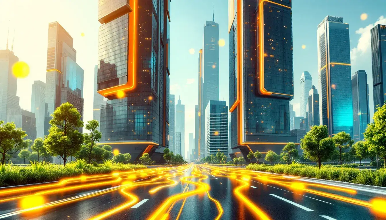
Dominant Industry Colors of September 2025
05 Sep 2025 · 3 min readThe chromatic landscape of industry is ever-shifting, a restless ocean of trends and aesthetic preferences that reflects not only the present but also whispers of the future. As we gaze towards September 2025, what colors will dominate the worlds of technology, finance, and marketing? These aren't just superficial choices; they are subtle indicators of deeper cultural currents, of the aspirations and anxieties that shape our professional lives. The colors we choose to represent our industries become a language spoken fluently, understood instinctively by clients, employees, and competitors alike. They are the visual shorthand for innovation, stability, and creativity, capable of transforming the perception of a brand or even an entire sector. Color paints the tone of conversation, from serious boardroom debates to the frenetic energy of a startup launch. These palette selections represent more than just hues; they foreshadow the mood of the months to come. They are signals, predictions cast in the potent language of color.
The Lime Agency evokes the feeling of fresh, sustainable growth, like shoots pushing their way through the earth, reaching for sunlight. The bright lime in opposition to deep charcoal creates a sense of energetic immediacy, suggesting a company that is both innovative and grounded. It is a palette for the disruptor, the brand that doesn't just adapt to change but actively shapes it. Imagine this palette gracing the website of a cutting-edge marketing firm; the pure white and pale green create a sense of openness and transparency, suggesting honesty and reliability. The medium gray and dark gray serve as balancing elements; they provide stability and structure that keeps the exuberance of the light shade from feeling chaotic. Olive green hints at a pragmatic approach, a knowledge of the deep roots of any successful strategy. The feeling is vibrant and alive, perfectly suited for industries that require constant reinvention and a bold response to any challenge. The bright lime shouts louder than the others, demanding attention with its cheerful disposition. It declares itself as a visual stimulant, ideal for a company that embraces dynamic thinking and cultivates fresh ideas. The overall effect is both modern and timeless, suggesting innovation deeply rooted in experience. This combination says, clearly, "we know what we are doing, and we are not afraid to do it differently". It's a palette that speaks to a new generation of consumers, accustomed to authenticity and suspicious of tired formulas. It's a flag for companies that value creativity, sustainability, and a forward-thinking attitude.
The impact of Tech Yellow is one of measured optimism, like stepping into data with clarity. This palette steers away from fleeting trends, instead opting for a sense of established progress. The light gray and bright yellow work together to create an atmosphere of intellectual vitality. The deep blue paired with sky blue suggests both depth of knowledge and expansive vision. Pale gold adds a touch of sophistication, reflecting a company that values both tradition and innovation. It is a palette for institutions that aim to inspire trust and confidence, like financial firms or well-established technology companies. Slate Blue adds a hint of seriousness, reminding us that these are domains where precision and responsibility are key. Imagine it applied to the website of a tech company specializing in cybersecurity; the overall effect is one of controlled power and sophisticated reliability. Olive Brown adds depth, indicating endurance. Bright Yellow pops out the most, capturing attention without becoming overwhelming. The balanced combination promises a blend of creativity and efficiency. Dark Charcoal anchors the scheme, symbolizing stability and a dependable presence. The use of these color stories speaks to a company that values long-term relationships and proven results. It isn't trying to dazzle with fleeting trends; rather, it seeks to establish a permanent sense of conviction with its customers.
The name Corporate Modern hints at a dynamic tension between structure and innovation, like a skyscraper with an avant-garde art installation in its lobby. The dusty gray serves as a grounding force, suggesting reliability and experience, while bold orange introduces a sense of energy and enthusiasm. The fiery red adds a touch of urgency, reflecting the fast-paced nature of modern business. It's a palette that captures the ambitious spirit of today’s most successful corporations. The dark teal conveys a sense of efficiency, hinting at streamlining processes. The feeling is one of quiet confidence, perfectly suited for organizations that value both tradition and forward-thinking strategies. The midnight blue serves as an anchor, providing stability and hinting at lasting presence. Imagine this palette adorning the walls of a modern conference room; the overall effect is one of professionalism and thoughtful sophistication. Bold Orange radiates the most, promising an energetic atmosphere. Fiery Red provides momentum, drawing your eye. The carefully considered combination speaks to a company that values innovation, strategy, and a considered approach to success. It’s not about chasing every trend; it’s about building something lasting, a monument to ambition and careful planning.
As September 2025 approaches, it's clear that the industries of technology, finance, and marketing are leaning towards palettes that evoke a sense of confident stability, with flashes of energetic innovation. The color choices point to organizations seeking to ground themselves with lasting confidence, while retaining the flexibility to adapt to a constantly changing world. The palettes offer different approaches, but they share the underlying theme of balance: grounding tradition and bold innovation. It paints a picture of sectors looking to inspire both trust and excitement, offering a visual promise of both solid service and innovative thinking. These colors will paint the tone of meetings, inform the design of websites, and subtly influence the decisions of consumers.