'%3e%3cpath%20fill-rule='evenodd'%20clip-rule='evenodd'%20d='M51.1303%2019.2492C50.7278%2019.913%2050.1346%2020.4426%2049.3508%2020.838C48.5669%2021.2335%2047.6172%2021.4312%2046.5014%2021.4312C44.8208%2021.4312%2043.4367%2021.0216%2042.3492%2020.2025C41.2617%2019.3833%2040.6686%2018.2394%2040.5697%2016.7706H44.4253C44.4818%2017.3355%2044.6831%2017.7804%2045.0291%2018.1052C45.3751%2018.43%2045.8164%2018.5924%2046.3531%2018.5924C46.8192%2018.5924%2047.1864%2018.4653%2047.4547%2018.2111C47.7231%2017.9569%2047.8572%2017.618%2047.8572%2017.1943C47.8572%2016.8129%2047.7337%2016.4952%2047.4865%2016.241C47.2393%2015.9867%2046.9322%2015.7784%2046.565%2015.616C46.1978%2015.4536%2045.6893%2015.2594%2045.0397%2015.0334C44.0934%2014.7086%2043.3202%2014.3944%2042.72%2014.0907C42.1197%2013.7871%2041.6042%2013.3351%2041.1735%2012.7349C40.7427%2012.1347%2040.5273%2011.3544%2040.5273%2010.394C40.5273%209.50418%2040.7533%208.73448%2041.2053%208.08481C41.6572%207.43515%2042.2821%206.93731%2043.0801%206.5913C43.8781%206.24528%2044.7925%206.07227%2045.8235%206.07227C47.49%206.07227%2048.8141%206.46771%2049.7956%207.25861C50.7772%208.04951%2051.3315%209.13698%2051.4586%2010.5211H47.5395C47.4689%2010.0268%2047.2888%209.63483%2046.9993%209.3453C46.7097%209.05578%2046.3178%208.91102%2045.8235%208.91102C45.3998%208.91102%2045.0573%209.024%2044.7961%209.24997C44.5348%209.47594%2044.4041%209.80783%2044.4041%2010.2457C44.4041%2010.5988%2044.5207%2010.8989%2044.7537%2011.146C44.9867%2011.3932%2045.2798%2011.5944%2045.6328%2011.7498C45.9859%2011.9052%2046.4944%2012.1029%2047.1581%2012.343C48.1185%2012.6678%2048.9023%2012.9891%2049.5096%2013.3069C50.1169%2013.6246%2050.6395%2014.0872%2051.0773%2014.6945C51.5151%2015.3018%2051.734%2016.0927%2051.734%2017.0672C51.734%2017.8581%2051.5328%2018.5854%2051.1303%2019.2492ZM59.0242%206.3053V21.2829H55.4016V6.3053H59.0242ZM73.9409%206.3053V9.18642H69.8734V21.2829H66.2296V9.18642H62.2046V6.3053H73.9409ZM80.7438%209.18642V12.3218H85.8069V15.0546H80.7438V18.3806H86.4425V21.2829H77.1212V6.3053H86.4425V9.18642H80.7438ZM99.667%2016.0291V21.2829H96.0444V6.3053H101.913C103.692%206.3053%20105.048%206.74665%20105.98%207.62934C106.912%208.51204%20107.378%209.7019%20107.378%2011.199C107.378%2012.1311%20107.17%2012.9609%20106.753%2013.6882C106.337%2014.4155%20105.719%2014.9875%20104.9%2015.4042C104.08%2015.8208%20103.085%2016.0291%20101.913%2016.0291H99.667ZM103.692%2011.199C103.692%209.8855%20102.965%209.22879%20101.51%209.22879H99.667V13.1268H101.51C102.965%2013.1268%20103.692%2012.4842%20103.692%2011.199ZM120.092%2018.5501H114.478L113.546%2021.2829H109.732L115.219%206.41123H119.393L124.879%2021.2829H121.024L120.092%2018.5501ZM119.16%2015.7961L117.295%2010.2881L115.41%2015.7961H119.16ZM131.555%2018.5077H136.385V21.2829H127.933V6.3053H131.555V18.5077ZM143.337%209.18642V12.3218H148.4V15.0546H143.337V18.3806H149.035V21.2829H139.714V6.3053H149.035V9.18642H143.337ZM163.507%206.3053V9.18642H159.44V21.2829H155.796V9.18642H151.771V6.3053H163.507ZM177.449%206.3053V9.18642H173.382V21.2829H169.738V9.18642H165.713V6.3053H177.449ZM184.252%209.18642V12.3218H189.315V15.0546H184.252V18.3806H189.951V21.2829H180.629V6.3053H189.951V9.18642H184.252Z'%20fill='%23EEF0ED'/%3e%3cmask%20id='mask0_3101_7327'%20style='mask-type:alpha'%20maskUnits='userSpaceOnUse'%20x='0'%20y='0'%20width='27'%20height='28'%3e%3cpath%20d='M23.8328%200.759766H2.64808C1.18559%200.759766%200%201.94535%200%203.40785V24.5925C0%2026.055%201.18559%2027.2406%202.64808%2027.2406H23.8328C25.2952%2027.2406%2026.4808%2026.055%2026.4808%2024.5925V3.40785C26.4808%201.94535%2025.2952%200.759766%2023.8328%200.759766Z'%20fill='white'/%3e%3c/mask%3e%3cg%20mask='url(%23mask0_3101_7327)'%3e%3cpath%20d='M23.8328%200.759766H2.64808C1.18559%200.759766%200%201.94535%200%203.40785V24.5925C0%2026.055%201.18559%2027.2406%202.64808%2027.2406H23.8328C25.2952%2027.2406%2026.4808%2026.055%2026.4808%2024.5925V3.40785C26.4808%201.94535%2025.2952%200.759766%2023.8328%200.759766Z'%20fill='%23D8D8D8'/%3e%3cpath%20d='M13.2404%200.759766H0V14.0001H13.2404V0.759766Z'%20fill='%238C61FF'/%3e%3cpath%20d='M13.2404%2014H0V27.2404H13.2404V14Z'%20fill='%2336C3FE'/%3e%3cpath%20d='M26.4806%2014H13.2402V27.2404H26.4806V14Z'%20fill='%236592FE'/%3e%3cpath%20d='M26.4806%200.759766H13.2402V14.0002H26.4806V0.759766Z'%20fill='%236059F7'/%3e%3c/g%3e%3c/g%3e%3cdefs%3e%3cclipPath%20id='clip0_3101_7327'%3e%3crect%20width='190'%20height='28'%20fill='white'/%3e%3c/clipPath%3e%3c/defs%3e%3c/svg%3e)
'%3e%3cpath%20d='M23.8328%200.759521H2.64808C1.18559%200.759521%200%201.94511%200%203.40761V24.5923C0%2026.0548%201.18559%2027.2404%202.64808%2027.2404H23.8328C25.2952%2027.2404%2026.4808%2026.0548%2026.4808%2024.5923V3.40761C26.4808%201.94511%2025.2952%200.759521%2023.8328%200.759521Z'%20fill='%23D8D8D8'/%3e%3cpath%20d='M13.2404%200.759521H0V13.9999H13.2404V0.759521Z'%20fill='%238C61FF'/%3e%3cpath%20d='M13.2404%2013.9998H0V27.2402H13.2404V13.9998Z'%20fill='%2336C3FE'/%3e%3cpath%20d='M26.4809%2013.9998H13.2405V27.2402H26.4809V13.9998Z'%20fill='%236592FE'/%3e%3cpath%20d='M26.4809%200.759277H13.2405V13.9997H26.4809V0.759277Z'%20fill='%236059F7'/%3e%3c/g%3e%3c/svg%3e)
Coastal Harmony
05 Sep 2025 · 3 min readThe allure of the coast is siren-like, a constant beckoning to a world washed in salt and sunlight. But how to capture that feeling, that sensory immersion, beyond the postcard? It's in the subtle grades of blues, the umber of the sand, the bleached white of weathered wood, and the silver shimmer on rippling water. A successful "Coastal Harmony" isn't just about mimicking a scene; it's about distilling the emotion of the sea – the expansive calmness, the invigorating freshness, the comforting presence of the shore. Colors become a language to translate the experience to any space, any surface. A thoughtful color story, expertly woven, will always suggest the restorative power of standing at the water's edge.
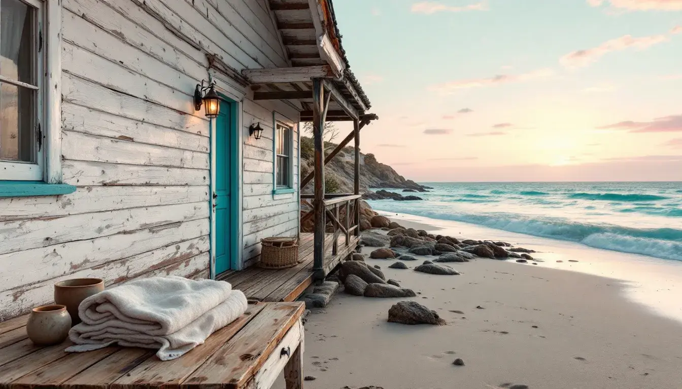
This "Balanced Palette" quietly speaks of driftwood and sea glass. There's a dusky rose, like the reflection of sunrise on wet sand, playing against a muted grey that evokes aged stones. The centerpiece, a vibrant teal, hints at the deeper hues of the ocean current, a refreshing counterpoint to the surrounding earthiness. Complemented by a somber teal and dark indigo, the feeling is less about bright seaside spectacle and more about the secluded cove. Picture a weathered beach house, open to the sea breeze, furnished with linen slipcovers and pottery. Imagine the quiet satisfaction of watching the tide roll in on a cool spring evening. It's the feeling of being gently restored to yourself by the rhythm of the waves.
With "Coastal Calm" a serene narrative unfolds. The light gray sets the stage, like a fog rolling in over the dunes, soft and enveloping. Steel blue adds depth but remains subdued, echoing the muted tones of the sea on a cloudy day. Only the bright cyan hints at the sun breaking through, a flash of brilliance on the water's surface. Khaki green grounds the palette, like sea grass swaying in the wind, while the dark grey provides a shadow-like contrast, deepening the overall sense of quietude. This combination doesn't shout "beach vacation"; it whispers of early morning walks on a deserted shore. It feels like the cool, smooth texture of a pebble found nestled beneath the waves. It suggests a sanctuary, a place to breathe deeply and let the world drift away.
Color palettes are never just combinations of hues; they are narratives woven in light and shadow. Each color evokes a specific feeling, a sensory memory, an invitation to a particular experience. The "Balanced Palette" offers solace in the quietude of a secluded coast, while "Coastal Calm" beckons to the serene hush of a foggy morning by the sea. Selecting colors with intent transforms a simply decorated interior into a space for emotional immersion of the coast and its calming essence.
Accumulating Hex Value Counts and Optimal Color Harmony:
After analyzing the given palettes and their application to "Coastal Harmony," focusing on the 'cube' color sections (which are empty), let's consider only the 'thief' section. By iterating through palettes where "interior_design_styles" includes "Coastal", the following color harmonies are selected (as 'cube' is empty): "Balanced Palette" and "Coastal Calm".
- Balanced Palette:
#c98d80,#8b8a88,#069d92,#436368,#243a5a - Coastal Calm:
#e5eaeb,#859ba1,#2dadc5,#7d7b6b,#2c2e29
Let's count each hex value based on those two palettes:
#c98d80: 1#8b8a88: 1#069d92: 1#436368: 1#243a5a: 1#e5eaeb: 1#859ba1: 1#2dadc5: 1#7d7b6b: 1#2c2e29: 1
In this scenario, because all individual hex values only appear once, randomly select the top five colors and assign these five colors as the optimal “Coastal” color harmony extracted from the provided palettes:
Optimal set: #c98d80, #8b8a88, #069d92, #436368, #243a5a. These values originate from the “Balanced Palette."