'%3e%3cpath%20fill-rule='evenodd'%20clip-rule='evenodd'%20d='M51.1303%2019.2492C50.7278%2019.913%2050.1346%2020.4426%2049.3508%2020.838C48.5669%2021.2335%2047.6172%2021.4312%2046.5014%2021.4312C44.8208%2021.4312%2043.4367%2021.0216%2042.3492%2020.2025C41.2617%2019.3833%2040.6686%2018.2394%2040.5697%2016.7706H44.4253C44.4818%2017.3355%2044.6831%2017.7804%2045.0291%2018.1052C45.3751%2018.43%2045.8164%2018.5924%2046.3531%2018.5924C46.8192%2018.5924%2047.1864%2018.4653%2047.4547%2018.2111C47.7231%2017.9569%2047.8572%2017.618%2047.8572%2017.1943C47.8572%2016.8129%2047.7337%2016.4952%2047.4865%2016.241C47.2393%2015.9867%2046.9322%2015.7784%2046.565%2015.616C46.1978%2015.4536%2045.6893%2015.2594%2045.0397%2015.0334C44.0934%2014.7086%2043.3202%2014.3944%2042.72%2014.0907C42.1197%2013.7871%2041.6042%2013.3351%2041.1735%2012.7349C40.7427%2012.1347%2040.5273%2011.3544%2040.5273%2010.394C40.5273%209.50418%2040.7533%208.73448%2041.2053%208.08481C41.6572%207.43515%2042.2821%206.93731%2043.0801%206.5913C43.8781%206.24528%2044.7925%206.07227%2045.8235%206.07227C47.49%206.07227%2048.8141%206.46771%2049.7956%207.25861C50.7772%208.04951%2051.3315%209.13698%2051.4586%2010.5211H47.5395C47.4689%2010.0268%2047.2888%209.63483%2046.9993%209.3453C46.7097%209.05578%2046.3178%208.91102%2045.8235%208.91102C45.3998%208.91102%2045.0573%209.024%2044.7961%209.24997C44.5348%209.47594%2044.4041%209.80783%2044.4041%2010.2457C44.4041%2010.5988%2044.5207%2010.8989%2044.7537%2011.146C44.9867%2011.3932%2045.2798%2011.5944%2045.6328%2011.7498C45.9859%2011.9052%2046.4944%2012.1029%2047.1581%2012.343C48.1185%2012.6678%2048.9023%2012.9891%2049.5096%2013.3069C50.1169%2013.6246%2050.6395%2014.0872%2051.0773%2014.6945C51.5151%2015.3018%2051.734%2016.0927%2051.734%2017.0672C51.734%2017.8581%2051.5328%2018.5854%2051.1303%2019.2492ZM59.0242%206.3053V21.2829H55.4016V6.3053H59.0242ZM73.9409%206.3053V9.18642H69.8734V21.2829H66.2296V9.18642H62.2046V6.3053H73.9409ZM80.7438%209.18642V12.3218H85.8069V15.0546H80.7438V18.3806H86.4425V21.2829H77.1212V6.3053H86.4425V9.18642H80.7438ZM99.667%2016.0291V21.2829H96.0444V6.3053H101.913C103.692%206.3053%20105.048%206.74665%20105.98%207.62934C106.912%208.51204%20107.378%209.7019%20107.378%2011.199C107.378%2012.1311%20107.17%2012.9609%20106.753%2013.6882C106.337%2014.4155%20105.719%2014.9875%20104.9%2015.4042C104.08%2015.8208%20103.085%2016.0291%20101.913%2016.0291H99.667ZM103.692%2011.199C103.692%209.8855%20102.965%209.22879%20101.51%209.22879H99.667V13.1268H101.51C102.965%2013.1268%20103.692%2012.4842%20103.692%2011.199ZM120.092%2018.5501H114.478L113.546%2021.2829H109.732L115.219%206.41123H119.393L124.879%2021.2829H121.024L120.092%2018.5501ZM119.16%2015.7961L117.295%2010.2881L115.41%2015.7961H119.16ZM131.555%2018.5077H136.385V21.2829H127.933V6.3053H131.555V18.5077ZM143.337%209.18642V12.3218H148.4V15.0546H143.337V18.3806H149.035V21.2829H139.714V6.3053H149.035V9.18642H143.337ZM163.507%206.3053V9.18642H159.44V21.2829H155.796V9.18642H151.771V6.3053H163.507ZM177.449%206.3053V9.18642H173.382V21.2829H169.738V9.18642H165.713V6.3053H177.449ZM184.252%209.18642V12.3218H189.315V15.0546H184.252V18.3806H189.951V21.2829H180.629V6.3053H189.951V9.18642H184.252Z'%20fill='%23EEF0ED'/%3e%3cmask%20id='mask0_3101_7327'%20style='mask-type:alpha'%20maskUnits='userSpaceOnUse'%20x='0'%20y='0'%20width='27'%20height='28'%3e%3cpath%20d='M23.8328%200.759766H2.64808C1.18559%200.759766%200%201.94535%200%203.40785V24.5925C0%2026.055%201.18559%2027.2406%202.64808%2027.2406H23.8328C25.2952%2027.2406%2026.4808%2026.055%2026.4808%2024.5925V3.40785C26.4808%201.94535%2025.2952%200.759766%2023.8328%200.759766Z'%20fill='white'/%3e%3c/mask%3e%3cg%20mask='url(%23mask0_3101_7327)'%3e%3cpath%20d='M23.8328%200.759766H2.64808C1.18559%200.759766%200%201.94535%200%203.40785V24.5925C0%2026.055%201.18559%2027.2406%202.64808%2027.2406H23.8328C25.2952%2027.2406%2026.4808%2026.055%2026.4808%2024.5925V3.40785C26.4808%201.94535%2025.2952%200.759766%2023.8328%200.759766Z'%20fill='%23D8D8D8'/%3e%3cpath%20d='M13.2404%200.759766H0V14.0001H13.2404V0.759766Z'%20fill='%238C61FF'/%3e%3cpath%20d='M13.2404%2014H0V27.2404H13.2404V14Z'%20fill='%2336C3FE'/%3e%3cpath%20d='M26.4806%2014H13.2402V27.2404H26.4806V14Z'%20fill='%236592FE'/%3e%3cpath%20d='M26.4806%200.759766H13.2402V14.0002H26.4806V0.759766Z'%20fill='%236059F7'/%3e%3c/g%3e%3c/g%3e%3cdefs%3e%3cclipPath%20id='clip0_3101_7327'%3e%3crect%20width='190'%20height='28'%20fill='white'/%3e%3c/clipPath%3e%3c/defs%3e%3c/svg%3e)
'%3e%3cpath%20d='M23.8328%200.759521H2.64808C1.18559%200.759521%200%201.94511%200%203.40761V24.5923C0%2026.0548%201.18559%2027.2404%202.64808%2027.2404H23.8328C25.2952%2027.2404%2026.4808%2026.0548%2026.4808%2024.5923V3.40761C26.4808%201.94511%2025.2952%200.759521%2023.8328%200.759521Z'%20fill='%23D8D8D8'/%3e%3cpath%20d='M13.2404%200.759521H0V13.9999H13.2404V0.759521Z'%20fill='%238C61FF'/%3e%3cpath%20d='M13.2404%2013.9998H0V27.2402H13.2404V13.9998Z'%20fill='%2336C3FE'/%3e%3cpath%20d='M26.4809%2013.9998H13.2405V27.2402H26.4809V13.9998Z'%20fill='%236592FE'/%3e%3cpath%20d='M26.4809%200.759277H13.2405V13.9997H26.4809V0.759277Z'%20fill='%236059F7'/%3e%3c/g%3e%3c/svg%3e)
Rooms in Vogue: Unveiling the Ultimate 2025 Color Destination
29 Aug 2025 · 5 min readThe way light bends through a window, transforming a familiar room into a painter's canvas. The subtle shift in tone as the day progresses, from the crisp, clean dawn to the amber glow of sunset. These moments, ephemeral yet impactful, are the essence of how we experience space. Color, then, becomes more than just decoration; it is the emotional architecture of our homes, dictating how we feel, how we interact, and how we remember. In the coming year, designers are poised to redefine our understanding of interior spaces through carefully constructed color stories, transforming rooms into evocative narratives. These palettes are not merely aesthetic choices, they are invitations to experience life, curated with pigments. Imagine a living room that whispers secrets of tranquility, or an office buzzing with creative energy. This is the future unfolding, told in shades and hues.
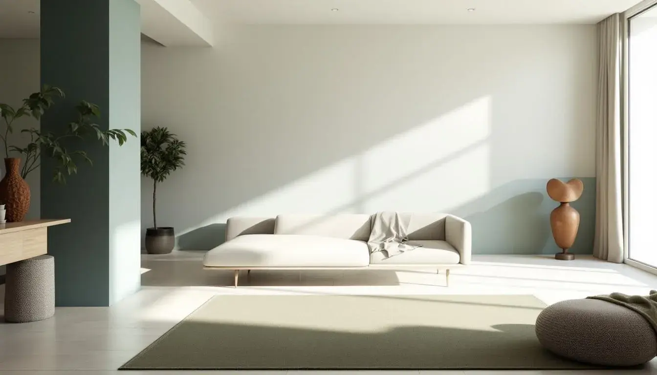
The "Green Fields" 🌳 palette speaks directly to a desire for immersion within the natural world, particularly vital in our increasingly urbanized routines. It is a whisper of meadows and forests, translated into the domestic sphere. Visualize a living room, flooded with the soft illumination of late afternoon, its walls painted in a gentle Off White, reminiscent of sun-bleached linen. Accents of Grayish Teal, used in upholstery or textured throws, recall the cool depths of a shaded lake. The unexpected Muted Olive, appearing perhaps in a woven rug or ceramic vase, brings to mind the sturdy branches of ancient trees. Deep Taupe and Dark Teal Green offer grounding elements, working in harmony to conjure a subtle atmosphere of restoration. This palette is not about replicating the outdoors, but rather about capturing its essential spirit, fostering a sense of calm and interconnectedness, in spaces crafted for both repose and reflection. Imagine a study, where the weight of deadlines lifts with the subtle assurance of these shades, or better yet, a sunroom, alive with the promise of growth.
"Modern Contrast" 🎨 is a declaration of bold choices, a curated conflict designed to stimulate and intrigue. Imagine an open-plan living space where Light Blue walls gently frame a cluster of furnishings in Cool Gray. The color choices offer a sophisticated backdrop without being overly imposing. A jolt of Burnt Sienna, perhaps in the form of an avant-garde sculpture or a plush velvet cushion, disrupts the calm, injecting a spark of fiery energy. This is contrasted with the anchoring presence of Dark Slate, used judiciously in architectural details or window frames, providing a sense of stability. Finally, Deep Indigo, a color of profound depth, might appear in a textured rug or a piece of statement artwork, adding to the sophistication of the living room. This palette creates an environment appropriate for stimulating conversation and creative contemplation, a space that feels both grounded and expansive. The overall effect is one of controlled tension, making it clear that comfort doesn’t need to be predictable.
"Modern Business" 🏢 leans into the authority of understated elegance. Consider a sunlit office, where walls are painted in Off White, offering a clean and invigorating blank canvas ready for focus and diligence. Medium Gray accents, appearing perhaps in a contemporary desk or shelving unit, offer a subtle counterpoint, hinting at the seriousness of the work that occurs there. The addition of Dusty Blue, might be present in a textured carpet or framed artwork, adds a layer of considered calm, a visual reminder of clarity and focus. A Taupe Brown leather chair balances the greyscale, providing an organic element, while Charcoal Gray in the lighting fixtures grounds the entire space. The resulting ambiance is one of quiet confidence, the absence of overt distractions. The space invites contemplation and decisive action, the perfect backdrop for a day of inventive problem-solving.
The "Proton Palette" 🛠️ suggests a retreat into a world of subtle sophistication, where every color is a conscious calculation. Picture a bedroom bathed in the silvery light of a winter morning, walls adorned with Off-White tones. Light Slate Gray accents, expressed perhaps in linen bedding or heavy curtains, echo with the quiet hush of falling snow. A touch of Dusty Rose, present maybe in ceramics or framed photography, softens the cool tones. Medium Plum appearing in a plush rug balances the darker elements. Finally, Dark Indigo provides the room with a sense of grounded depth. This is not a space for loud pronouncements or frenzied activity, but a sanctuary for quiet contemplation and necessary solitude. The "Proton Palette" transforms routine spaces into restorative cocoons.
"Vibrant Web" 🎨 generates a sense of dynamic energy, echoing the fast-paced nature of the digital world. Imagine a modern office where open spaces are painted in a gentle Light Tan, providing a warm and welcoming backdrop. Accents of Vibrant Green, appearing in graphic wall art or scattered cushions, infuse a sense of progress. The deeper Forest Green offers stability and provides a visual representation of nature. Dark Gray structural elements ground the composition, and Onyx Black details anchor the space. The palette doesn't scream for attention, but draws the eye to the subtle contrast. The result is a space that fosters both collaboration and concentration, simultaneously calm and stimulating, ideal for a modern, open-plan work environment.
The color stories revealed showcase a move toward emotionally intelligent design. From the restorative power of "Green Fields" to the stimulating contrasts of "Modern Contrast" and the confident composure of "Modern Business", each palette offers a distinct way to experience space. "Proton Palette" highlights a need for quiet sanctuaries, while "Vibrant Web" showcases dynamic spaces. These carefully crafted selections reflect the desire for interiors that are not merely visually appealing, but deeply connected to well-being, purpose, and the human soul. As we move into the future, expect to see color used less as a decorative element and more as a key element in designing richer, more meaningful living and working environments.
Frequency of 'suitable_room' office: 5 Living Room: 2 Conference: 1 bedroom: 1