'%3e%3cpath%20fill-rule='evenodd'%20clip-rule='evenodd'%20d='M51.1303%2019.2492C50.7278%2019.913%2050.1346%2020.4426%2049.3508%2020.838C48.5669%2021.2335%2047.6172%2021.4312%2046.5014%2021.4312C44.8208%2021.4312%2043.4367%2021.0216%2042.3492%2020.2025C41.2617%2019.3833%2040.6686%2018.2394%2040.5697%2016.7706H44.4253C44.4818%2017.3355%2044.6831%2017.7804%2045.0291%2018.1052C45.3751%2018.43%2045.8164%2018.5924%2046.3531%2018.5924C46.8192%2018.5924%2047.1864%2018.4653%2047.4547%2018.2111C47.7231%2017.9569%2047.8572%2017.618%2047.8572%2017.1943C47.8572%2016.8129%2047.7337%2016.4952%2047.4865%2016.241C47.2393%2015.9867%2046.9322%2015.7784%2046.565%2015.616C46.1978%2015.4536%2045.6893%2015.2594%2045.0397%2015.0334C44.0934%2014.7086%2043.3202%2014.3944%2042.72%2014.0907C42.1197%2013.7871%2041.6042%2013.3351%2041.1735%2012.7349C40.7427%2012.1347%2040.5273%2011.3544%2040.5273%2010.394C40.5273%209.50418%2040.7533%208.73448%2041.2053%208.08481C41.6572%207.43515%2042.2821%206.93731%2043.0801%206.5913C43.8781%206.24528%2044.7925%206.07227%2045.8235%206.07227C47.49%206.07227%2048.8141%206.46771%2049.7956%207.25861C50.7772%208.04951%2051.3315%209.13698%2051.4586%2010.5211H47.5395C47.4689%2010.0268%2047.2888%209.63483%2046.9993%209.3453C46.7097%209.05578%2046.3178%208.91102%2045.8235%208.91102C45.3998%208.91102%2045.0573%209.024%2044.7961%209.24997C44.5348%209.47594%2044.4041%209.80783%2044.4041%2010.2457C44.4041%2010.5988%2044.5207%2010.8989%2044.7537%2011.146C44.9867%2011.3932%2045.2798%2011.5944%2045.6328%2011.7498C45.9859%2011.9052%2046.4944%2012.1029%2047.1581%2012.343C48.1185%2012.6678%2048.9023%2012.9891%2049.5096%2013.3069C50.1169%2013.6246%2050.6395%2014.0872%2051.0773%2014.6945C51.5151%2015.3018%2051.734%2016.0927%2051.734%2017.0672C51.734%2017.8581%2051.5328%2018.5854%2051.1303%2019.2492ZM59.0242%206.3053V21.2829H55.4016V6.3053H59.0242ZM73.9409%206.3053V9.18642H69.8734V21.2829H66.2296V9.18642H62.2046V6.3053H73.9409ZM80.7438%209.18642V12.3218H85.8069V15.0546H80.7438V18.3806H86.4425V21.2829H77.1212V6.3053H86.4425V9.18642H80.7438ZM99.667%2016.0291V21.2829H96.0444V6.3053H101.913C103.692%206.3053%20105.048%206.74665%20105.98%207.62934C106.912%208.51204%20107.378%209.7019%20107.378%2011.199C107.378%2012.1311%20107.17%2012.9609%20106.753%2013.6882C106.337%2014.4155%20105.719%2014.9875%20104.9%2015.4042C104.08%2015.8208%20103.085%2016.0291%20101.913%2016.0291H99.667ZM103.692%2011.199C103.692%209.8855%20102.965%209.22879%20101.51%209.22879H99.667V13.1268H101.51C102.965%2013.1268%20103.692%2012.4842%20103.692%2011.199ZM120.092%2018.5501H114.478L113.546%2021.2829H109.732L115.219%206.41123H119.393L124.879%2021.2829H121.024L120.092%2018.5501ZM119.16%2015.7961L117.295%2010.2881L115.41%2015.7961H119.16ZM131.555%2018.5077H136.385V21.2829H127.933V6.3053H131.555V18.5077ZM143.337%209.18642V12.3218H148.4V15.0546H143.337V18.3806H149.035V21.2829H139.714V6.3053H149.035V9.18642H143.337ZM163.507%206.3053V9.18642H159.44V21.2829H155.796V9.18642H151.771V6.3053H163.507ZM177.449%206.3053V9.18642H173.382V21.2829H169.738V9.18642H165.713V6.3053H177.449ZM184.252%209.18642V12.3218H189.315V15.0546H184.252V18.3806H189.951V21.2829H180.629V6.3053H189.951V9.18642H184.252Z'%20fill='%23EEF0ED'/%3e%3cmask%20id='mask0_3101_7327'%20style='mask-type:alpha'%20maskUnits='userSpaceOnUse'%20x='0'%20y='0'%20width='27'%20height='28'%3e%3cpath%20d='M23.8328%200.759766H2.64808C1.18559%200.759766%200%201.94535%200%203.40785V24.5925C0%2026.055%201.18559%2027.2406%202.64808%2027.2406H23.8328C25.2952%2027.2406%2026.4808%2026.055%2026.4808%2024.5925V3.40785C26.4808%201.94535%2025.2952%200.759766%2023.8328%200.759766Z'%20fill='white'/%3e%3c/mask%3e%3cg%20mask='url(%23mask0_3101_7327)'%3e%3cpath%20d='M23.8328%200.759766H2.64808C1.18559%200.759766%200%201.94535%200%203.40785V24.5925C0%2026.055%201.18559%2027.2406%202.64808%2027.2406H23.8328C25.2952%2027.2406%2026.4808%2026.055%2026.4808%2024.5925V3.40785C26.4808%201.94535%2025.2952%200.759766%2023.8328%200.759766Z'%20fill='%23D8D8D8'/%3e%3cpath%20d='M13.2404%200.759766H0V14.0001H13.2404V0.759766Z'%20fill='%238C61FF'/%3e%3cpath%20d='M13.2404%2014H0V27.2404H13.2404V14Z'%20fill='%2336C3FE'/%3e%3cpath%20d='M26.4806%2014H13.2402V27.2404H26.4806V14Z'%20fill='%236592FE'/%3e%3cpath%20d='M26.4806%200.759766H13.2402V14.0002H26.4806V0.759766Z'%20fill='%236059F7'/%3e%3c/g%3e%3c/g%3e%3cdefs%3e%3cclipPath%20id='clip0_3101_7327'%3e%3crect%20width='190'%20height='28'%20fill='white'/%3e%3c/clipPath%3e%3c/defs%3e%3c/svg%3e)
'%3e%3cpath%20d='M23.8328%200.759521H2.64808C1.18559%200.759521%200%201.94511%200%203.40761V24.5923C0%2026.0548%201.18559%2027.2404%202.64808%2027.2404H23.8328C25.2952%2027.2404%2026.4808%2026.0548%2026.4808%2024.5923V3.40761C26.4808%201.94511%2025.2952%200.759521%2023.8328%200.759521Z'%20fill='%23D8D8D8'/%3e%3cpath%20d='M13.2404%200.759521H0V13.9999H13.2404V0.759521Z'%20fill='%238C61FF'/%3e%3cpath%20d='M13.2404%2013.9998H0V27.2402H13.2404V13.9998Z'%20fill='%2336C3FE'/%3e%3cpath%20d='M26.4809%2013.9998H13.2405V27.2402H26.4809V13.9998Z'%20fill='%236592FE'/%3e%3cpath%20d='M26.4809%200.759277H13.2405V13.9997H26.4809V0.759277Z'%20fill='%236059F7'/%3e%3c/g%3e%3c/svg%3e)
From January to August: Tracking Color Palette Evolution Through the Year
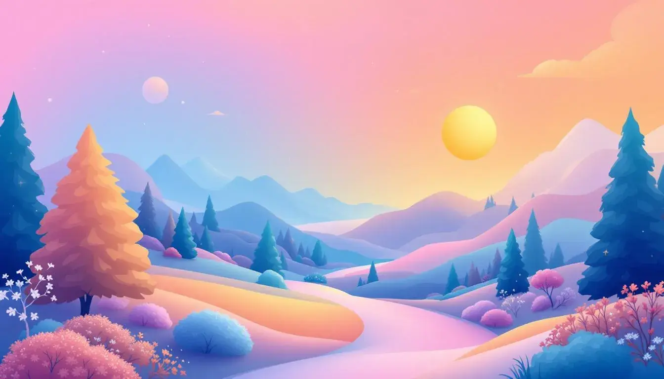
29 Aug 2025 · 2 min readFrom January's hushed, snow-dusted landscapes to August's sun-drenched fields, the shifting seasons paint the world in a constantly evolving spectrum. Color, far from being a mere aesthetic preference, becomes a silent narrator, whispering tales of transformation and growth. Observing the subtle shifts in palettes chosen throughout the year is akin to reading nature's diary, each shade echoing a mood, a memory, a moment in time. Website design, a mirror reflecting our collective consciousness, is particularly sensitive to these seasonal cues. The colors we gravitate towards in the dead of winter differ drastically from those that beckon us during the height of summer. Understanding this ebb and flow allows us to create digital experiences that feel not just current, but deeply connected to the rhythms of our lives.
The Mercedes Palette, arriving in August, speaks of confident luxury tempered by earthier undertones. Pure White presents a blank canvas, a sense of clarity that allows the other shades to truly sing. Olive Green suggests late-summer landscapes, fields ripening under the August sun. Pale Silver brings to mind sleek metal, cool and refined. Then comes Vivid Coral, a surprisingly playful splash of energy, like the last burst of brilliant blooms before autumn's arrival. Burnt Sienna hints at the changing foliage, a subtle prelude to the fiery hues that lie ahead. Dark Gray and Dark Charcoal provide a grounding, sophisticated base, while Dark Violet adds a touch of unexpected mystery. Bright Red and Deep Burgundy, rich and intense, evoke images of fine wines and the final harvests. The pulse of Pure White and the grounding nature of Dark Charcoal suggest a smooth, uncluttered design aesthetic, one that prioritizes user experience alongside high-end imagery. Consider this palette for websites looking to convey quality, reliability, and enduring appeal, perhaps for artisanal goods with a touch of the contemporary.
The Trint Colors palette, another arrival in August, bursts forth with a bold, almost electric energy, reflecting the heightened activity and sun-drenched days of late summer. Pure White again offers a clean foundation, allowing the other colors to pop with maximum impact. Vivid Yellow mirrors the intense sunlight, an invitation to create something vibrant and engaging. Light Gray acts as a subtle counterpoint, providing a resting place for the eye amidst the chromatic excitement. Khaki Green hints at the lingering greenery of summer, while Teal Blue offers a refreshing splash of coolness, like a dip in a clear pool. Olive Drab adds further depth and complements the teal. Steel Blue introduces a note of professionalism that can be paired with Crimson Red for a visual punch. The presence of Jet Black adds a grounding element. Websites embracing this palette seek to make a statement, capturing attention with a sense of forward motion and creativity. Think digital platforms for innovative start-ups, or media outlets eager to showcase cutting-edge content with visual flair.
The Lafayette Palette, appearing in August, weaves a tapestry of sophistication and approachability. Pure White provides a versatile backdrop to the other colors. Bright Yellow radiates warmth and optimism, a reflection of sun-drenched days. Stone Gray brings a grounding calmness reminiscent of weathered stone under a clear, blue sky. Golden Tan evokes images of late summer fields, while Teal Blue adds a cooling, aquatic touch. Magenta Plum brings a hint of drama and sophistication, like the last roses blooming in the evening light. Burnt Sienna suggests the very beginnings of autumnal change, the first whispers of cooler weather. Dark Taupe offers sturdy steadiness. Deep Indigo brings a sense of mystery and depth, while Jet Black gives solidity. This palette would lend itself beautifully to websites that seek to evoke a sense of trust and established expertise, perhaps for institutions that value both tradition and innovation. Think cultural organizations, or brands that wish to project an aura of quiet confidence and timeless appeal.
The Point Four palette, also gracing August with its presence, presents a unique blend of nature-inspired hues and bold, futuristic accents. Pure White acts as a pristine anchor, ensuring the other shades retain their vibrancy. Pale Yellow is like the delicate glow of late-afternoon sun, just before it dips below the horizon. Neutral Gray lends a quiet sophistication. Emerald Green grounds the palette in nature, reminiscent of verdant forests at the height of summer. Electric Blue injects a shot of otherworldly energy, a glimpse into the digital frontier. Slate Gray offers a smooth, neutral transition, while Burnt Orange captures the essence of late-summer sunsets. Olive Drab nods to the richness of plant life. Deep Blue introduces a touch of contemplative depth, while Jet Black adds a grounding foundation. A website leveraging this palette might aim to appeal to an audience that values both natural beauty and cutting-edge technology. Imagine brands that promote eco-friendly innovation, or platforms that explore the intersection of art, science, and nature.
As the months progress, from January's crystalline chill to August's golden warmth, each palette captures a unique mood, reflecting the visual and emotional landscape of its time. The shift towards brighter, more energetic tones in the summer months speaks to our innate desire for connection and activity during the warmer seasons. The August palettes, in particular, mark a moment of transition, blending the vibrant energy of summer with subtle hints of the earthier tones that will define autumn. By understanding these seasonal shifts in color preference, we can craft digital experiences that feel not just visually appealing, but deeply resonant with the spirit of the year. The considered application of color, viewed through the lens of time, cultivates an atmosphere where every digital interaction becomes part of a larger, more meaningful narrative.