'%3e%3cpath%20fill-rule='evenodd'%20clip-rule='evenodd'%20d='M51.1303%2019.2492C50.7278%2019.913%2050.1346%2020.4426%2049.3508%2020.838C48.5669%2021.2335%2047.6172%2021.4312%2046.5014%2021.4312C44.8208%2021.4312%2043.4367%2021.0216%2042.3492%2020.2025C41.2617%2019.3833%2040.6686%2018.2394%2040.5697%2016.7706H44.4253C44.4818%2017.3355%2044.6831%2017.7804%2045.0291%2018.1052C45.3751%2018.43%2045.8164%2018.5924%2046.3531%2018.5924C46.8192%2018.5924%2047.1864%2018.4653%2047.4547%2018.2111C47.7231%2017.9569%2047.8572%2017.618%2047.8572%2017.1943C47.8572%2016.8129%2047.7337%2016.4952%2047.4865%2016.241C47.2393%2015.9867%2046.9322%2015.7784%2046.565%2015.616C46.1978%2015.4536%2045.6893%2015.2594%2045.0397%2015.0334C44.0934%2014.7086%2043.3202%2014.3944%2042.72%2014.0907C42.1197%2013.7871%2041.6042%2013.3351%2041.1735%2012.7349C40.7427%2012.1347%2040.5273%2011.3544%2040.5273%2010.394C40.5273%209.50418%2040.7533%208.73448%2041.2053%208.08481C41.6572%207.43515%2042.2821%206.93731%2043.0801%206.5913C43.8781%206.24528%2044.7925%206.07227%2045.8235%206.07227C47.49%206.07227%2048.8141%206.46771%2049.7956%207.25861C50.7772%208.04951%2051.3315%209.13698%2051.4586%2010.5211H47.5395C47.4689%2010.0268%2047.2888%209.63483%2046.9993%209.3453C46.7097%209.05578%2046.3178%208.91102%2045.8235%208.91102C45.3998%208.91102%2045.0573%209.024%2044.7961%209.24997C44.5348%209.47594%2044.4041%209.80783%2044.4041%2010.2457C44.4041%2010.5988%2044.5207%2010.8989%2044.7537%2011.146C44.9867%2011.3932%2045.2798%2011.5944%2045.6328%2011.7498C45.9859%2011.9052%2046.4944%2012.1029%2047.1581%2012.343C48.1185%2012.6678%2048.9023%2012.9891%2049.5096%2013.3069C50.1169%2013.6246%2050.6395%2014.0872%2051.0773%2014.6945C51.5151%2015.3018%2051.734%2016.0927%2051.734%2017.0672C51.734%2017.8581%2051.5328%2018.5854%2051.1303%2019.2492ZM59.0242%206.3053V21.2829H55.4016V6.3053H59.0242ZM73.9409%206.3053V9.18642H69.8734V21.2829H66.2296V9.18642H62.2046V6.3053H73.9409ZM80.7438%209.18642V12.3218H85.8069V15.0546H80.7438V18.3806H86.4425V21.2829H77.1212V6.3053H86.4425V9.18642H80.7438ZM99.667%2016.0291V21.2829H96.0444V6.3053H101.913C103.692%206.3053%20105.048%206.74665%20105.98%207.62934C106.912%208.51204%20107.378%209.7019%20107.378%2011.199C107.378%2012.1311%20107.17%2012.9609%20106.753%2013.6882C106.337%2014.4155%20105.719%2014.9875%20104.9%2015.4042C104.08%2015.8208%20103.085%2016.0291%20101.913%2016.0291H99.667ZM103.692%2011.199C103.692%209.8855%20102.965%209.22879%20101.51%209.22879H99.667V13.1268H101.51C102.965%2013.1268%20103.692%2012.4842%20103.692%2011.199ZM120.092%2018.5501H114.478L113.546%2021.2829H109.732L115.219%206.41123H119.393L124.879%2021.2829H121.024L120.092%2018.5501ZM119.16%2015.7961L117.295%2010.2881L115.41%2015.7961H119.16ZM131.555%2018.5077H136.385V21.2829H127.933V6.3053H131.555V18.5077ZM143.337%209.18642V12.3218H148.4V15.0546H143.337V18.3806H149.035V21.2829H139.714V6.3053H149.035V9.18642H143.337ZM163.507%206.3053V9.18642H159.44V21.2829H155.796V9.18642H151.771V6.3053H163.507ZM177.449%206.3053V9.18642H173.382V21.2829H169.738V9.18642H165.713V6.3053H177.449ZM184.252%209.18642V12.3218H189.315V15.0546H184.252V18.3806H189.951V21.2829H180.629V6.3053H189.951V9.18642H184.252Z'%20fill='%23EEF0ED'/%3e%3cmask%20id='mask0_3101_7327'%20style='mask-type:alpha'%20maskUnits='userSpaceOnUse'%20x='0'%20y='0'%20width='27'%20height='28'%3e%3cpath%20d='M23.8328%200.759766H2.64808C1.18559%200.759766%200%201.94535%200%203.40785V24.5925C0%2026.055%201.18559%2027.2406%202.64808%2027.2406H23.8328C25.2952%2027.2406%2026.4808%2026.055%2026.4808%2024.5925V3.40785C26.4808%201.94535%2025.2952%200.759766%2023.8328%200.759766Z'%20fill='white'/%3e%3c/mask%3e%3cg%20mask='url(%23mask0_3101_7327)'%3e%3cpath%20d='M23.8328%200.759766H2.64808C1.18559%200.759766%200%201.94535%200%203.40785V24.5925C0%2026.055%201.18559%2027.2406%202.64808%2027.2406H23.8328C25.2952%2027.2406%2026.4808%2026.055%2026.4808%2024.5925V3.40785C26.4808%201.94535%2025.2952%200.759766%2023.8328%200.759766Z'%20fill='%23D8D8D8'/%3e%3cpath%20d='M13.2404%200.759766H0V14.0001H13.2404V0.759766Z'%20fill='%238C61FF'/%3e%3cpath%20d='M13.2404%2014H0V27.2404H13.2404V14Z'%20fill='%2336C3FE'/%3e%3cpath%20d='M26.4806%2014H13.2402V27.2404H26.4806V14Z'%20fill='%236592FE'/%3e%3cpath%20d='M26.4806%200.759766H13.2402V14.0002H26.4806V0.759766Z'%20fill='%236059F7'/%3e%3c/g%3e%3c/g%3e%3cdefs%3e%3cclipPath%20id='clip0_3101_7327'%3e%3crect%20width='190'%20height='28'%20fill='white'/%3e%3c/clipPath%3e%3c/defs%3e%3c/svg%3e)
'%3e%3cpath%20d='M23.8328%200.759521H2.64808C1.18559%200.759521%200%201.94511%200%203.40761V24.5923C0%2026.0548%201.18559%2027.2404%202.64808%2027.2404H23.8328C25.2952%2027.2404%2026.4808%2026.0548%2026.4808%2024.5923V3.40761C26.4808%201.94511%2025.2952%200.759521%2023.8328%200.759521Z'%20fill='%23D8D8D8'/%3e%3cpath%20d='M13.2404%200.759521H0V13.9999H13.2404V0.759521Z'%20fill='%238C61FF'/%3e%3cpath%20d='M13.2404%2013.9998H0V27.2402H13.2404V13.9998Z'%20fill='%2336C3FE'/%3e%3cpath%20d='M26.4809%2013.9998H13.2405V27.2402H26.4809V13.9998Z'%20fill='%236592FE'/%3e%3cpath%20d='M26.4809%200.759277H13.2405V13.9997H26.4809V0.759277Z'%20fill='%236059F7'/%3e%3c/g%3e%3c/svg%3e)
Charcoal Chic: The Dominance of #121212 in Modern Branding
29 Aug 2025 · 3 min readThe pull of deepest charcoal, specifically shade #121212, in today's visual landscape is undeniable. It’s a gravitation toward something grounded, a quiet authority that speaks volumes without shouting. Its allure rests not just in its saturation, but also in its capacity to act as a silent stage, allowing other colors to dance atop it. Consider the ways shadows can breathe life into architecture, how a dark canvas makes jewels gleam brighter, or the visual relief offered by negative space; that is the power of deep charcoal. It offers a sense of luxurious calm, that we are noticing within industries as broad as technology and couture. Brands are deploying it consciously for a refined modernity that eschews fleeting trends, opting for something classic with staying power. Far from being monolithic, this 'Deep Ebony' offers endless possibility for expression. It serves as a steadfast foundation, against which personality blooms. It is a move towards lasting sophistication rather than momentary flash.
'Modern Contrast' captures the essence of contemporary design with the quiet assurance of 'Deep Ebony'. Here, 'Dusty Silver' whispers of polished surfaces, while 'Emerald Green' injects a vital, organic energy. 'Steel Blue' hints at technological precision, and 'Slate Gray' contributes a steadying presence. The deep charcoal anchors it all, offering a striking framework around which these quieter elements can flourish. Think of luxury watch design, where the darkest metals meet vibrant complications. Or a streamlined website, its user experience built in the balance between dark backgrounds and engaging content. The palette communicates a sense of considered restraint, appropriate for brands that consider themselves leaders. It suggests stability, integrity, and a forward-thinking vision. The overall effect is one of intelligent design, ready for both formal and informal situations. Its sophisticated color story creates atmospheres of trust and competence.
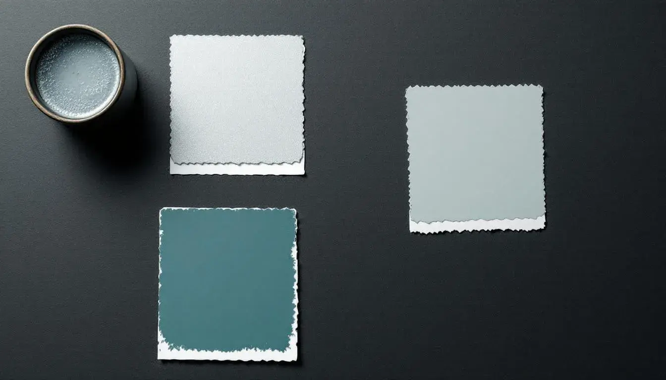
'Modern Harmony' seeks a visual balance, where 'Dark Charcoal' plays a supporting rather than starring role. 'Ecru' brings a gentle tactility, 'Steel Blue' evokes a calming atmosphere, and 'Smokey Gray' contributes a muted depth. A sophisticated 'Vivid Blue' offers a pop of memorable color, but rests carefully against the darker tones. Consider the branding of a financial institution, where trustworthiness is as important as innovation. This would be a palette capable of projecting confidence. Even a technology company seeking a refined, not overly flashy, look could find value here. The absence of bright tones allows the personality of the company to shine through. Its understated sophistication speaks volumes of the brand's own sense of assurance in its offerings. Overall, it is a versatile color story, suitable for multiple projects and environments.
'Modern Mix', while lacking pure charcoal, illustrates a world where its influence nevertheless lingers. The gentle 'Off White' provides a luminous foundation, 'Dusty Mauve' lends a whisper of understated romance, and 'Light Indigo' speaks of thoughtful insight. 'Russet Brown' grounds the palette in something earthy, while 'Dark Indigo' gestures towards the inky depths of charcoal itself. Imagine a creative agency, communicating both artistic sensitivity and strategic thinking. This color collection is a story of balanced color that doesn't need pure 'Deep Ebony' to tell its story. Instead, it creates a comforting atmosphere that is both modern and timeless. The colors are all at once calm, casual, and creative.
'Elegant Noir' is the most confident expression of the 'Deep Ebony' trend: 'Onyx Black' at its darkest. 'Creamy Beige' hints at aged paper, the smooth surfaces of expensive stone, while 'Neutral Grey' provides a comforting balance. The 'Dusty Rose' adds a subtle level of romance, and provides a strong color for contrast with the darkness. 'Dark Crimson' speaks of quiet desire. Consider the packaging for a luxury perfume, where the 'Onyx Black' cardboard is accented by rose gold lettering. Or the website for a high-end fashion brand, where images of clothing are displayed against a dark background. The feel is one of exclusivity and discernment. It evokes the feeling of old world glamour meeting modern refinement. This would be a palette perfect for brands selling status and elegance.
From cool authority, to quiet support, these colors demonstrate how essential deep charcoal tones have become in shaping current visual language. Its strength is its adaptability. It supports brighter accents, gives definition to subtle tints, and helps create a consistent brand vision. The fact that 80% of the palettes featuring 'Branding' as a project include '#121212' in their cube HEX_VALUES underscores its relevance in modern design. It's not simply a color, but a framework—a grounding force upon which brands are building new, elegant, and lasting impressions. Its versatility makes it a canvas for innovation. Its staying power speaks of enduring sophistication.