'%3e%3cpath%20fill-rule='evenodd'%20clip-rule='evenodd'%20d='M51.1303%2019.2492C50.7278%2019.913%2050.1346%2020.4426%2049.3508%2020.838C48.5669%2021.2335%2047.6172%2021.4312%2046.5014%2021.4312C44.8208%2021.4312%2043.4367%2021.0216%2042.3492%2020.2025C41.2617%2019.3833%2040.6686%2018.2394%2040.5697%2016.7706H44.4253C44.4818%2017.3355%2044.6831%2017.7804%2045.0291%2018.1052C45.3751%2018.43%2045.8164%2018.5924%2046.3531%2018.5924C46.8192%2018.5924%2047.1864%2018.4653%2047.4547%2018.2111C47.7231%2017.9569%2047.8572%2017.618%2047.8572%2017.1943C47.8572%2016.8129%2047.7337%2016.4952%2047.4865%2016.241C47.2393%2015.9867%2046.9322%2015.7784%2046.565%2015.616C46.1978%2015.4536%2045.6893%2015.2594%2045.0397%2015.0334C44.0934%2014.7086%2043.3202%2014.3944%2042.72%2014.0907C42.1197%2013.7871%2041.6042%2013.3351%2041.1735%2012.7349C40.7427%2012.1347%2040.5273%2011.3544%2040.5273%2010.394C40.5273%209.50418%2040.7533%208.73448%2041.2053%208.08481C41.6572%207.43515%2042.2821%206.93731%2043.0801%206.5913C43.8781%206.24528%2044.7925%206.07227%2045.8235%206.07227C47.49%206.07227%2048.8141%206.46771%2049.7956%207.25861C50.7772%208.04951%2051.3315%209.13698%2051.4586%2010.5211H47.5395C47.4689%2010.0268%2047.2888%209.63483%2046.9993%209.3453C46.7097%209.05578%2046.3178%208.91102%2045.8235%208.91102C45.3998%208.91102%2045.0573%209.024%2044.7961%209.24997C44.5348%209.47594%2044.4041%209.80783%2044.4041%2010.2457C44.4041%2010.5988%2044.5207%2010.8989%2044.7537%2011.146C44.9867%2011.3932%2045.2798%2011.5944%2045.6328%2011.7498C45.9859%2011.9052%2046.4944%2012.1029%2047.1581%2012.343C48.1185%2012.6678%2048.9023%2012.9891%2049.5096%2013.3069C50.1169%2013.6246%2050.6395%2014.0872%2051.0773%2014.6945C51.5151%2015.3018%2051.734%2016.0927%2051.734%2017.0672C51.734%2017.8581%2051.5328%2018.5854%2051.1303%2019.2492ZM59.0242%206.3053V21.2829H55.4016V6.3053H59.0242ZM73.9409%206.3053V9.18642H69.8734V21.2829H66.2296V9.18642H62.2046V6.3053H73.9409ZM80.7438%209.18642V12.3218H85.8069V15.0546H80.7438V18.3806H86.4425V21.2829H77.1212V6.3053H86.4425V9.18642H80.7438ZM99.667%2016.0291V21.2829H96.0444V6.3053H101.913C103.692%206.3053%20105.048%206.74665%20105.98%207.62934C106.912%208.51204%20107.378%209.7019%20107.378%2011.199C107.378%2012.1311%20107.17%2012.9609%20106.753%2013.6882C106.337%2014.4155%20105.719%2014.9875%20104.9%2015.4042C104.08%2015.8208%20103.085%2016.0291%20101.913%2016.0291H99.667ZM103.692%2011.199C103.692%209.8855%20102.965%209.22879%20101.51%209.22879H99.667V13.1268H101.51C102.965%2013.1268%20103.692%2012.4842%20103.692%2011.199ZM120.092%2018.5501H114.478L113.546%2021.2829H109.732L115.219%206.41123H119.393L124.879%2021.2829H121.024L120.092%2018.5501ZM119.16%2015.7961L117.295%2010.2881L115.41%2015.7961H119.16ZM131.555%2018.5077H136.385V21.2829H127.933V6.3053H131.555V18.5077ZM143.337%209.18642V12.3218H148.4V15.0546H143.337V18.3806H149.035V21.2829H139.714V6.3053H149.035V9.18642H143.337ZM163.507%206.3053V9.18642H159.44V21.2829H155.796V9.18642H151.771V6.3053H163.507ZM177.449%206.3053V9.18642H173.382V21.2829H169.738V9.18642H165.713V6.3053H177.449ZM184.252%209.18642V12.3218H189.315V15.0546H184.252V18.3806H189.951V21.2829H180.629V6.3053H189.951V9.18642H184.252Z'%20fill='%23EEF0ED'/%3e%3cmask%20id='mask0_3101_7327'%20style='mask-type:alpha'%20maskUnits='userSpaceOnUse'%20x='0'%20y='0'%20width='27'%20height='28'%3e%3cpath%20d='M23.8328%200.759766H2.64808C1.18559%200.759766%200%201.94535%200%203.40785V24.5925C0%2026.055%201.18559%2027.2406%202.64808%2027.2406H23.8328C25.2952%2027.2406%2026.4808%2026.055%2026.4808%2024.5925V3.40785C26.4808%201.94535%2025.2952%200.759766%2023.8328%200.759766Z'%20fill='white'/%3e%3c/mask%3e%3cg%20mask='url(%23mask0_3101_7327)'%3e%3cpath%20d='M23.8328%200.759766H2.64808C1.18559%200.759766%200%201.94535%200%203.40785V24.5925C0%2026.055%201.18559%2027.2406%202.64808%2027.2406H23.8328C25.2952%2027.2406%2026.4808%2026.055%2026.4808%2024.5925V3.40785C26.4808%201.94535%2025.2952%200.759766%2023.8328%200.759766Z'%20fill='%23D8D8D8'/%3e%3cpath%20d='M13.2404%200.759766H0V14.0001H13.2404V0.759766Z'%20fill='%238C61FF'/%3e%3cpath%20d='M13.2404%2014H0V27.2404H13.2404V14Z'%20fill='%2336C3FE'/%3e%3cpath%20d='M26.4806%2014H13.2402V27.2404H26.4806V14Z'%20fill='%236592FE'/%3e%3cpath%20d='M26.4806%200.759766H13.2402V14.0002H26.4806V0.759766Z'%20fill='%236059F7'/%3e%3c/g%3e%3c/g%3e%3cdefs%3e%3cclipPath%20id='clip0_3101_7327'%3e%3crect%20width='190'%20height='28'%20fill='white'/%3e%3c/clipPath%3e%3c/defs%3e%3c/svg%3e)
'%3e%3cpath%20d='M23.8328%200.759521H2.64808C1.18559%200.759521%200%201.94511%200%203.40761V24.5923C0%2026.0548%201.18559%2027.2404%202.64808%2027.2404H23.8328C25.2952%2027.2404%2026.4808%2026.0548%2026.4808%2024.5923V3.40761C26.4808%201.94511%2025.2952%200.759521%2023.8328%200.759521Z'%20fill='%23D8D8D8'/%3e%3cpath%20d='M13.2404%200.759521H0V13.9999H13.2404V0.759521Z'%20fill='%238C61FF'/%3e%3cpath%20d='M13.2404%2013.9998H0V27.2402H13.2404V13.9998Z'%20fill='%2336C3FE'/%3e%3cpath%20d='M26.4809%2013.9998H13.2405V27.2402H26.4809V13.9998Z'%20fill='%236592FE'/%3e%3cpath%20d='M26.4809%200.759277H13.2405V13.9997H26.4809V0.759277Z'%20fill='%236059F7'/%3e%3c/g%3e%3c/svg%3e)
Top Industries: Which Sectors Are Leaning On These Palettes?
28 Aug 2025 · 3 min readThe modern workspace, once strictly a landscape of gray cubicles, now hums with the quiet revolution of considered color. No longer an afterthought, color palettes now shape the very experience of work, influencing mood, productivity, and brand identity with surprising potency. From the cool detachment of tech startups to the energized focus of financial institutions, the language of color speaks volumes about an industry's values, its aspirations, and its understanding of the human spirit. These curated schemes are not mere decoration. They are psychological landscapes, crafted with intent, designed to foster connection and inspire progress. The right blend can speak of innovation, hint at stability, or whisper of untold possibilities.
The Lottie Colors palette dances with a youthful vibrance, a playground of shades tempered just enough for the professional sphere. Imagine a collaborative workspace filled with natural light, punctuated by accents of Seafoam Green, a calming presence that promotes creativity and balanced thinking. This isn't the sterile environment of yesterday. Coral Red bursts forth as an invitation to bold ideas and courageous experimentation. Deep Blue provides a grounding force, a symbol of reliability and technological prowess upon which innovation can stand. Light Beige softens the edges, lending a sense of approachability and warmth, counteracting the cool detachment often associated with the tech world. Even the Dark Charcoal serves as a sophisticated anchor, reinforcing the seriousness of purpose that underlies all imaginative exploration. Think of it as a design studio where imagination meets engineering; the colors suggest a culture that values playfulness alongside ambition, and where collaboration is not just encouraged but seems to organically flourish. This palette feels right at home within companies that see themselves as disruptors and innovators, spaces where the typical corporate trappings are set aside in favor of a more human-centric, creative environment. It suggests a future where work feels less like a duty and more like a collaborative game; playful, inventive and boundlessly explorative.
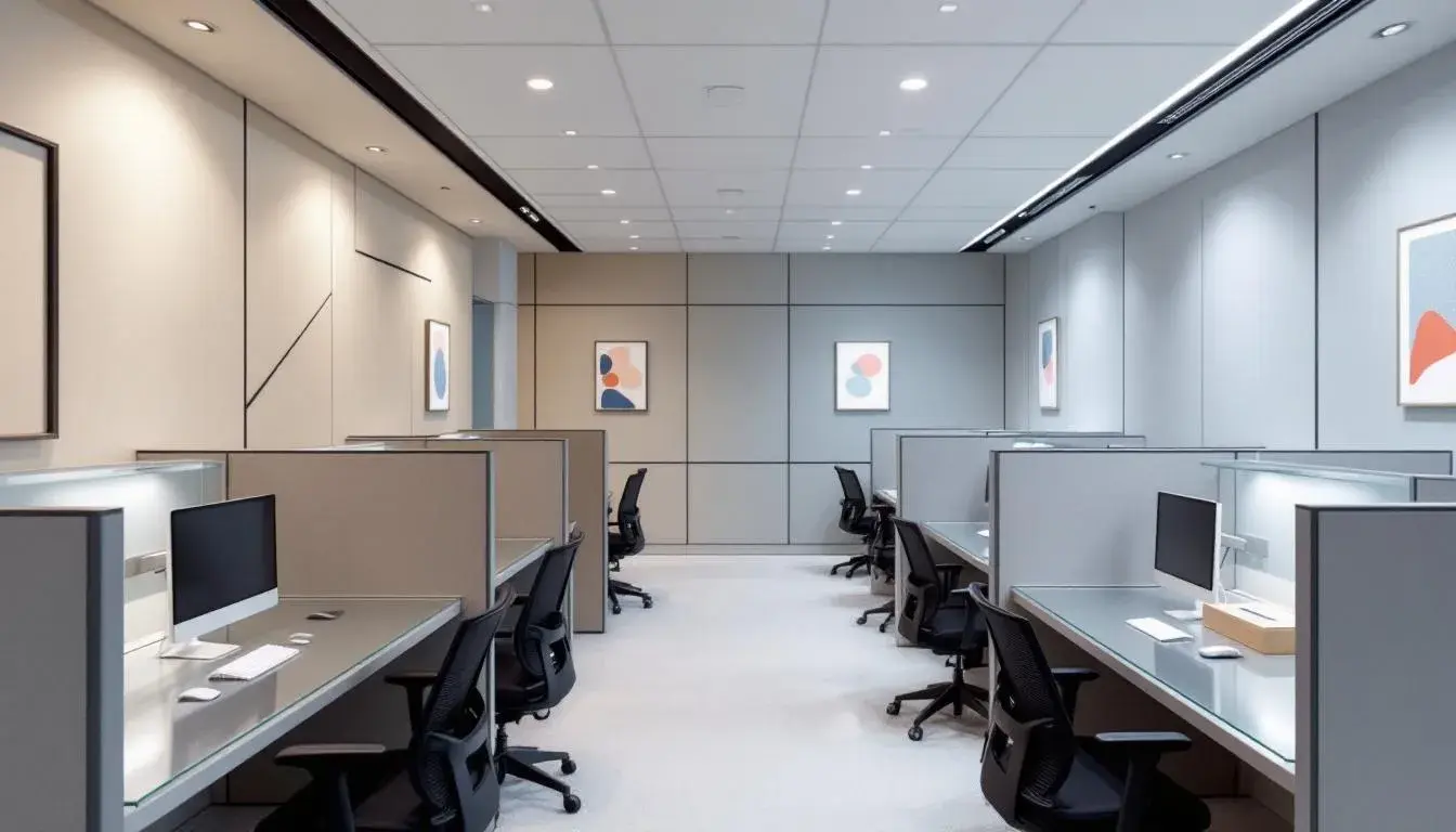
The Tech Palette whispers of precision and trust, a careful arrangement designed for clarity. Off-White sets a tone of considered quiet, a gentle backdrop that invites focused attention. It's the subtle shimmer of confidence, a dependable assurance. Slate Gray brings depth and sophistication, a visual marker of experience and well-reasoned strategy. The careful inclusion of Burnt Sienna adds a spark of human energy, a suggestion of warmth and creativity that keeps the palette engaging and grounded. It prevents the scheme from feeling overly clinical, offering an unexpected note of innovative thinking. Neutral Gray delivers a refined sense of balance and pragmatism. Deep Indigo rounds out the composition with steadfast assurance, hinting at analytical thought and foresight, essential for the complexities of finance and technology. This palette would feel comfortable in a high-powered brokerage office, where calm minds make big decisions, or within a software development studio, where clear communication fuels progress. The emphasis here is on reliability, clear-headedness, and confident forward motion. It's a palette designed to cultivate belief in the integrity and proficiency of the industries that embrace it: a visualization of technological precision and well-structured financial planning.
Tech Horizon presents a study in contrasts, where cool sophistication meets bursts of forward-thinking energy. Off White forms the backbone, offering a sense of polished professionalism and clarity. Dusty Gray and Mauve Gray add layers of understated refinement setting the stage for moments of inventive possibility. Anchoring the overall composition with a balanced sophistication, creating an environment of confident progress. Fiery Orange breaks through the cool-toned calm to provide a flicker of inspiration, a constant reminder to approach new challenges with passionate consideration. Electric Blue mirrors this excitement, hinting to solutions beyond the current technical paradigms. This palette comes alive in spaces created for open communication and strategic thinking; in conference rooms where ideas are taken from creation to implementation, or in a modern start-up geared for efficient growth. The composition suggests a company that embraces both analytical rigor and unconventional thinking: an atmosphere where stability meets sudden spark.
A sense of assertive grace unfolds within Data Rails, a palette that balances confident control with moments of surprising visual delight. The first impression is one of assured, yet approachable composure. Light Blush provides a welcoming invitation, while Seafoam Green whispers of forward motion and imaginative solutions. Bright Magenta makes a sudden forceful statement, boldly hinting at the creative heart pumping beneath the composed surface. Charcoal Gray and Very Dark Blue offer an grounding foundation of stability and knowledge. Imagine collaborative workspaces within a data center where teams come together to dissect complex systems and plan innovative infrastructure. The palette suggests an environment that appreciates innovative thinking and controlled execution where individuality is welcomed as an empowering asset. Projects that flourish underneath the Data Rails palette take on a sense of confident beauty, a sophisticated synthesis of logic and innovative vision.
Modern Dashboard unfolds with an air of sophisticated efficiency. Lightest Gray provides a clean, uncluttered canvas, a backdrop for clear communication and confident decision-making. Neutral Gray adds depth and dimension, hinting at the analytical rigor that anchors all progress. Dusty Mauve then introduces a note of unexpected creativity, a whisper of the human imagination behind data-driven strategy. Purple Majesty elevates the tone, suggesting inspired innovative thinking and futuristic ingenuity. Olive Drab provides a grounding element. Envision a modern data analytics firm. As teams decipher complex algorithms they are immersed in an setting of sophisticated comfort enhancing thought and creativity. The palette hints at innovative results driven by collaboration, making it ideal for boardrooms and data labs where confident leadership is essential.
These color palettes reveal far more than aesthetic preferences. They unveil a shift toward human-centric design within industries often perceived as detached or clinical. The rise of "Lottie Colors" suggests a yearning for playfulness and collaboration, a desire to redefine work as an engaging, creative pursuit suited to open work spaces. Conversely, the grounded certainty of the "Tech Palette" speaks to an enduring need for trust and stability, especially within the finance and technology sectors. "Tech Horizon", in turn, proposes a balanced approach, blending cool confidence with bursts of innovation, a constant reminder that progress requires both analytical rigor and imaginative leaps. Each palette speaks to the specific needs and aspirations of the industries that embrace them, shaping not only the visual landscape but also the very culture of work.