'%3e%3cpath%20fill-rule='evenodd'%20clip-rule='evenodd'%20d='M51.1303%2019.2492C50.7278%2019.913%2050.1346%2020.4426%2049.3508%2020.838C48.5669%2021.2335%2047.6172%2021.4312%2046.5014%2021.4312C44.8208%2021.4312%2043.4367%2021.0216%2042.3492%2020.2025C41.2617%2019.3833%2040.6686%2018.2394%2040.5697%2016.7706H44.4253C44.4818%2017.3355%2044.6831%2017.7804%2045.0291%2018.1052C45.3751%2018.43%2045.8164%2018.5924%2046.3531%2018.5924C46.8192%2018.5924%2047.1864%2018.4653%2047.4547%2018.2111C47.7231%2017.9569%2047.8572%2017.618%2047.8572%2017.1943C47.8572%2016.8129%2047.7337%2016.4952%2047.4865%2016.241C47.2393%2015.9867%2046.9322%2015.7784%2046.565%2015.616C46.1978%2015.4536%2045.6893%2015.2594%2045.0397%2015.0334C44.0934%2014.7086%2043.3202%2014.3944%2042.72%2014.0907C42.1197%2013.7871%2041.6042%2013.3351%2041.1735%2012.7349C40.7427%2012.1347%2040.5273%2011.3544%2040.5273%2010.394C40.5273%209.50418%2040.7533%208.73448%2041.2053%208.08481C41.6572%207.43515%2042.2821%206.93731%2043.0801%206.5913C43.8781%206.24528%2044.7925%206.07227%2045.8235%206.07227C47.49%206.07227%2048.8141%206.46771%2049.7956%207.25861C50.7772%208.04951%2051.3315%209.13698%2051.4586%2010.5211H47.5395C47.4689%2010.0268%2047.2888%209.63483%2046.9993%209.3453C46.7097%209.05578%2046.3178%208.91102%2045.8235%208.91102C45.3998%208.91102%2045.0573%209.024%2044.7961%209.24997C44.5348%209.47594%2044.4041%209.80783%2044.4041%2010.2457C44.4041%2010.5988%2044.5207%2010.8989%2044.7537%2011.146C44.9867%2011.3932%2045.2798%2011.5944%2045.6328%2011.7498C45.9859%2011.9052%2046.4944%2012.1029%2047.1581%2012.343C48.1185%2012.6678%2048.9023%2012.9891%2049.5096%2013.3069C50.1169%2013.6246%2050.6395%2014.0872%2051.0773%2014.6945C51.5151%2015.3018%2051.734%2016.0927%2051.734%2017.0672C51.734%2017.8581%2051.5328%2018.5854%2051.1303%2019.2492ZM59.0242%206.3053V21.2829H55.4016V6.3053H59.0242ZM73.9409%206.3053V9.18642H69.8734V21.2829H66.2296V9.18642H62.2046V6.3053H73.9409ZM80.7438%209.18642V12.3218H85.8069V15.0546H80.7438V18.3806H86.4425V21.2829H77.1212V6.3053H86.4425V9.18642H80.7438ZM99.667%2016.0291V21.2829H96.0444V6.3053H101.913C103.692%206.3053%20105.048%206.74665%20105.98%207.62934C106.912%208.51204%20107.378%209.7019%20107.378%2011.199C107.378%2012.1311%20107.17%2012.9609%20106.753%2013.6882C106.337%2014.4155%20105.719%2014.9875%20104.9%2015.4042C104.08%2015.8208%20103.085%2016.0291%20101.913%2016.0291H99.667ZM103.692%2011.199C103.692%209.8855%20102.965%209.22879%20101.51%209.22879H99.667V13.1268H101.51C102.965%2013.1268%20103.692%2012.4842%20103.692%2011.199ZM120.092%2018.5501H114.478L113.546%2021.2829H109.732L115.219%206.41123H119.393L124.879%2021.2829H121.024L120.092%2018.5501ZM119.16%2015.7961L117.295%2010.2881L115.41%2015.7961H119.16ZM131.555%2018.5077H136.385V21.2829H127.933V6.3053H131.555V18.5077ZM143.337%209.18642V12.3218H148.4V15.0546H143.337V18.3806H149.035V21.2829H139.714V6.3053H149.035V9.18642H143.337ZM163.507%206.3053V9.18642H159.44V21.2829H155.796V9.18642H151.771V6.3053H163.507ZM177.449%206.3053V9.18642H173.382V21.2829H169.738V9.18642H165.713V6.3053H177.449ZM184.252%209.18642V12.3218H189.315V15.0546H184.252V18.3806H189.951V21.2829H180.629V6.3053H189.951V9.18642H184.252Z'%20fill='%23EEF0ED'/%3e%3cmask%20id='mask0_3101_7327'%20style='mask-type:alpha'%20maskUnits='userSpaceOnUse'%20x='0'%20y='0'%20width='27'%20height='28'%3e%3cpath%20d='M23.8328%200.759766H2.64808C1.18559%200.759766%200%201.94535%200%203.40785V24.5925C0%2026.055%201.18559%2027.2406%202.64808%2027.2406H23.8328C25.2952%2027.2406%2026.4808%2026.055%2026.4808%2024.5925V3.40785C26.4808%201.94535%2025.2952%200.759766%2023.8328%200.759766Z'%20fill='white'/%3e%3c/mask%3e%3cg%20mask='url(%23mask0_3101_7327)'%3e%3cpath%20d='M23.8328%200.759766H2.64808C1.18559%200.759766%200%201.94535%200%203.40785V24.5925C0%2026.055%201.18559%2027.2406%202.64808%2027.2406H23.8328C25.2952%2027.2406%2026.4808%2026.055%2026.4808%2024.5925V3.40785C26.4808%201.94535%2025.2952%200.759766%2023.8328%200.759766Z'%20fill='%23D8D8D8'/%3e%3cpath%20d='M13.2404%200.759766H0V14.0001H13.2404V0.759766Z'%20fill='%238C61FF'/%3e%3cpath%20d='M13.2404%2014H0V27.2404H13.2404V14Z'%20fill='%2336C3FE'/%3e%3cpath%20d='M26.4806%2014H13.2402V27.2404H26.4806V14Z'%20fill='%236592FE'/%3e%3cpath%20d='M26.4806%200.759766H13.2402V14.0002H26.4806V0.759766Z'%20fill='%236059F7'/%3e%3c/g%3e%3c/g%3e%3cdefs%3e%3cclipPath%20id='clip0_3101_7327'%3e%3crect%20width='190'%20height='28'%20fill='white'/%3e%3c/clipPath%3e%3c/defs%3e%3c/svg%3e)
'%3e%3cpath%20d='M23.8328%200.759521H2.64808C1.18559%200.759521%200%201.94511%200%203.40761V24.5923C0%2026.0548%201.18559%2027.2404%202.64808%2027.2404H23.8328C25.2952%2027.2404%2026.4808%2026.0548%2026.4808%2024.5923V3.40761C26.4808%201.94511%2025.2952%200.759521%2023.8328%200.759521Z'%20fill='%23D8D8D8'/%3e%3cpath%20d='M13.2404%200.759521H0V13.9999H13.2404V0.759521Z'%20fill='%238C61FF'/%3e%3cpath%20d='M13.2404%2013.9998H0V27.2402H13.2404V13.9998Z'%20fill='%2336C3FE'/%3e%3cpath%20d='M26.4809%2013.9998H13.2405V27.2402H26.4809V13.9998Z'%20fill='%236592FE'/%3e%3cpath%20d='M26.4809%200.759277H13.2405V13.9997H26.4809V0.759277Z'%20fill='%236059F7'/%3e%3c/g%3e%3c/svg%3e)
The Power of Calmness: 'Calm' as Top Mood Descriptor
28 Aug 2025 · 3 min readThe pursuit of stillness in a world saturated with stimulation has become less a luxury and more a necessity. Color, often overlooked, wields astonishing power in sculpting our emotional landscape. It can quiet the mind, soothe the spirit, and ultimately, foster a sense of inner peace. More than simple aesthetics, these palettes represent a conscious effort to curate serenity, offering visual pathways to a calmer existence. In bedrooms and boardrooms, on screens and in hand, the gentle nudge of the right color can make all the difference. The following palettes offer a guide, demonstrating how considered color choices work to cultivate calm, wherever – and however – it is needed most.
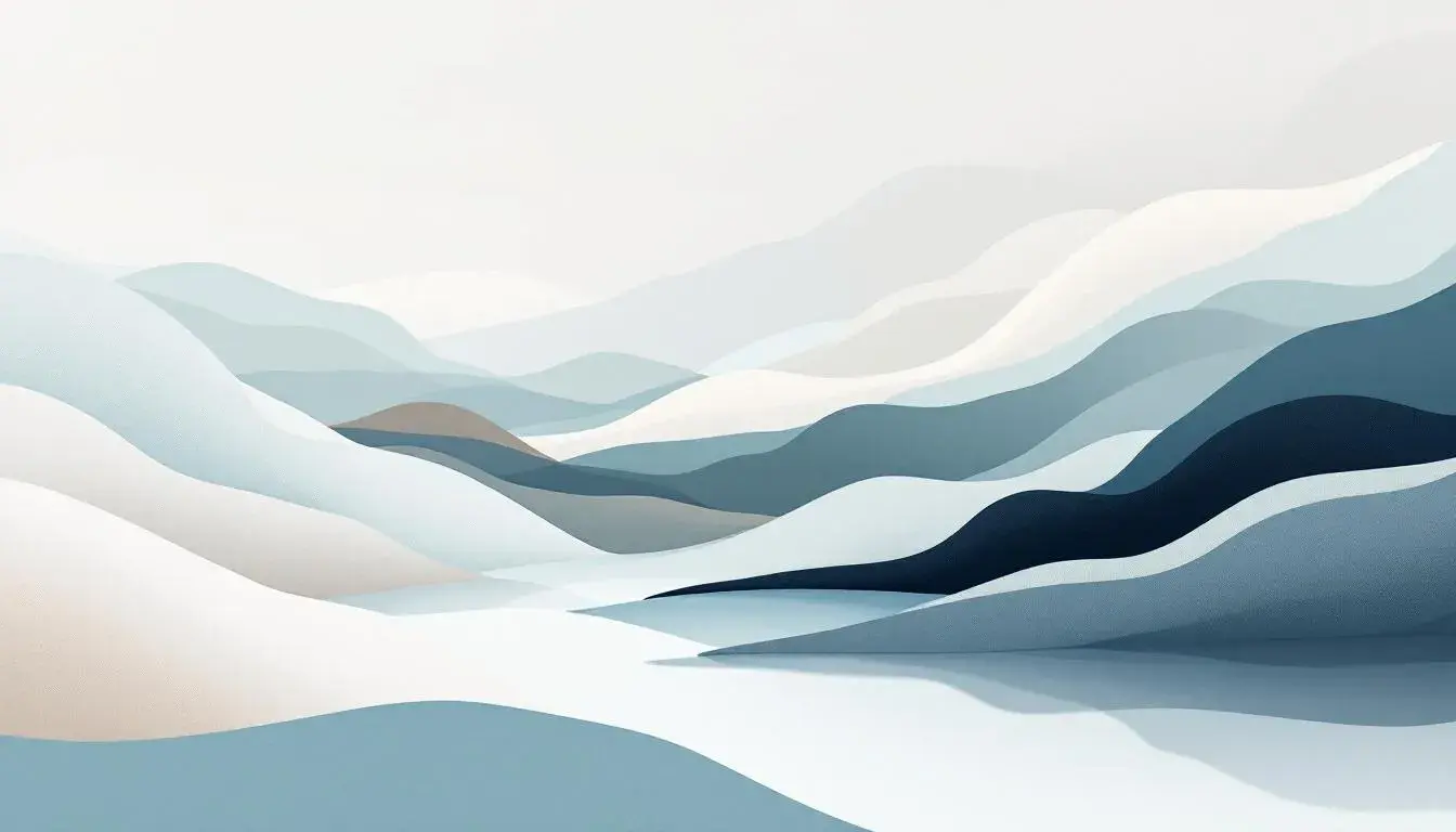
Imagine sinking into the plush embrace of sea air, a sensory tableau that washes away stress. The Coastal Escape palette captures this feeling effortlessly. Off White, reminiscent of sun-kissed sand, anchors the experience, while the Light Teal and Steel Blue evoke the gentle rhythm of ocean waves. Beige Brown adds a grounding earthiness, like driftwood warmed by the sun, and Dark Olive introduces a touch of nature's resilience, mirroring the hardy coastal flora. The palette suggests endless blue horizons where worries dissipate like sea mist. It is a spectrum fitted for contemplative spaces, bedrooms intended for restful sleep, or living rooms where conversations flow with the ease of tides. Envision this quiet elegance extending to digital interfaces, transforming bustling websites into tranquil portals, or gracing brochures advertising wellness retreats, each promising a return to the self. This palette is an invitation to exhale.
The name, Elegant Sophistication, suggests a sense of composed grace--the kind that quiets a room the moment you walk in. Light Gray, Soft Gray, and Pale Gray create a foundation of understated beauty, like the soft gleam of polished silver under subdued light. These colors do not shout; they whisper of timeless style and considered taste. Neutral Gray then provides grounding, a centering force amidst gentle variance. Deep Charcoal offers dramatic depth, like a dark wood accent in a spacious study. The effect is one of refined restraint, ideally designed for spaces meant for thoughtful discourse or quiet contemplation. It calls to mind executive suites where important decisions are made with measured thought, or private libraries bathed in the soft glow of the late afternoon sun. Visually, the palette possesses the power to bring sophistication to luxury brand design or provide a sense of stability to financial institutions’ web presence. It brings to life a mood where every element is carefully chosen, promoting an atmosphere ideal for introspection.
Cool Serenity encapsulates the restorative power of a still winter morning. Light Cyan and Bright Cyan capture the glistening clarity of ice crystals and freshly fallen snow. Neutral Gray then softens the sharp glare of winter, bringing a sense of depth and dimension. The Steel Blue and Deep Teal offer anchoring assurance and visual stability, like the deep waters beneath frozen surfaces. It is a palette designed to evoke clarity. Imagine spaces crafted to promote focus and productivity, like a tech startup aiming to foster innovative solutions, or a modern home office built for flow. Its gentle coolness can translate into digital spaces too, websites for healthcare platforms designed to reassure patients, or branding for technology companies seeking to establish a reputation of competence. This range of tones inspires peace and clear thought.
Structured Harmony is about creating equilibrium through careful arrangement. The Cool Gray functions as a blank canvas, a calm backdrop against which focused thought can flourish. Vibrant Blue injects a spark of creativity without overwhelming the senses, like a stroke of inspiration. Teal Blue brings balance between boldness and serenity, a steady presence and thoughtful confidence. Slate Gray offers nuanced stability, a counterpoint to the brights. Deep Charcoal offers firm grounding, much like firm architecture. It is a range suited for spaces of measured deliberation -- executive offices where composure under pressure is key, for instance, or minimalist bedrooms designed as havens of rest. These colors, carefully considered, would enhance branding for tech consultancies, or instill confidence on informational web design projects.
With Earthy Harmony comes a sense of grounded reassurance that mirrors nature's gentle embrace. Light Beige embodies the warmth of sun-drenched meadows. Soft Green suggests the quiet growth of new leaves in the forest. Olive Drab hints at the richness of soil underfoot. Neutral Gray whispers of weathered stone, and Dark Hunter Green suggests the depth and protection of a shaded forest floor. Picture tranquil spaces designed for relaxation -- spas where one sheds stress, bedrooms intended for deep rest, or living rooms welcoming easy conversation. The palette suits brands aligned with wellness and organic philosophies, lending a natural appeal to digital platforms or a sense of trustworthiness. It invites a return to simplicity and ease.
These collections present a clear message: in a world of loud distraction, the conscious choice of calm-inducing colors offers an accessible path to quietude. By embracing these palettes, we invite stability, peace, and a deeper connection to our surroundings, fostering not just visual delight, but genuinely restorative experiences. Each one is a tool to creating spaces where the mind can settle, and the spirit finds respite. They exemplify the considerable power of color when carefully considered and thoughtfully applied.