Spring Cleaning: Top Colors for Spring-Themed Palettes
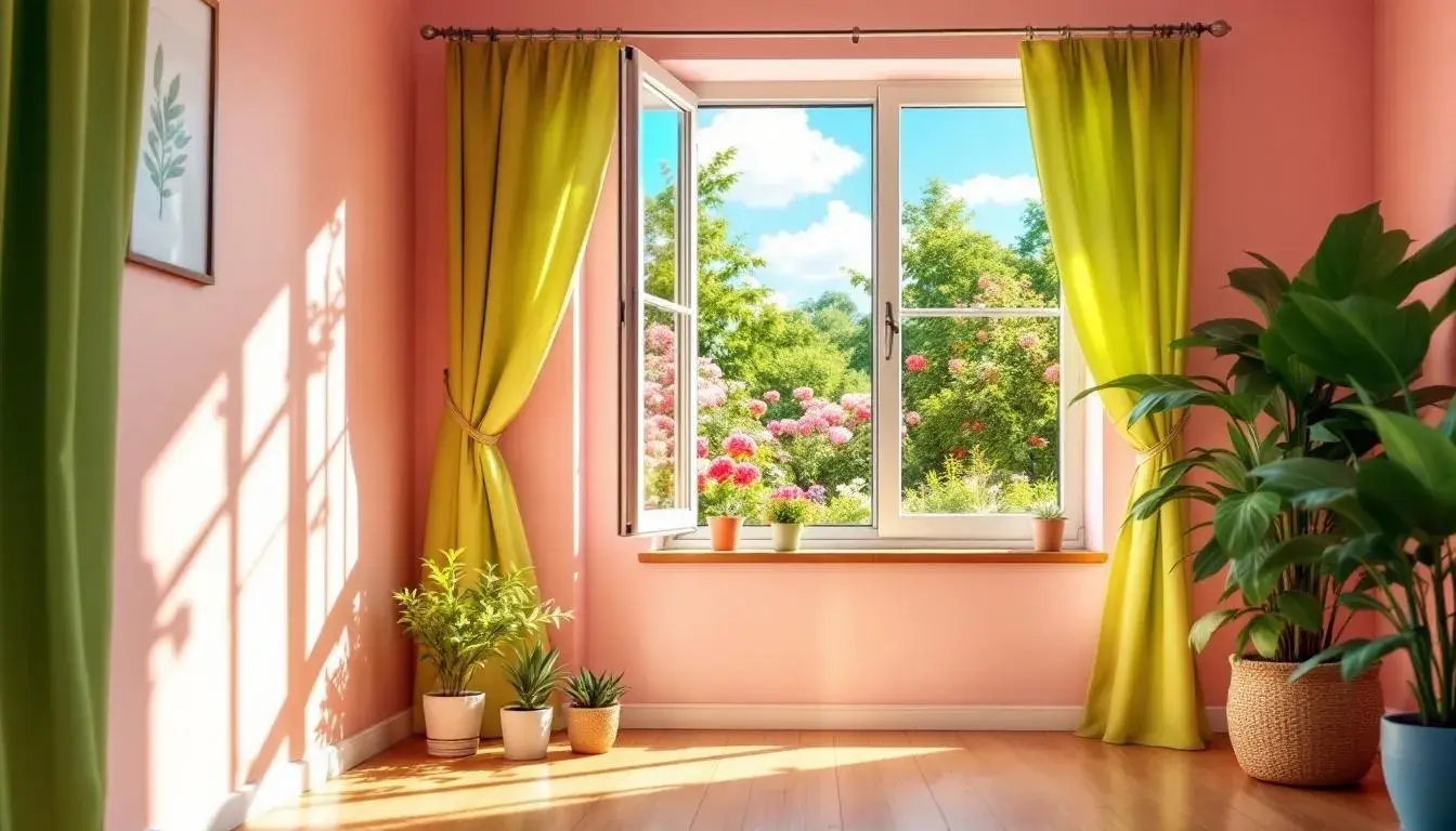
28 Aug 2025 · 3 min readSpring cleaning. The phrase conjures images of sunlight flooding through newly opened windows, the crisp scent of lemon, and the satisfying feeling of lightness after decluttering. But before the elbow grease, before the donations pile up, there’s a crucial first step: envisioning the refreshed space. Color is the soul of renewal, and thoughtfully chosen palettes set the stage for a transformation that feels both invigorating and deeply personal. A shift in color can alter mood entirely, turning a space from stale to sanctuary. These palettes are not just about what's trendy, but what truly resonates with the spirit of spring: growth, optimism and a serene sense of calm. Let's explore the palettes that speak to these key feelings.
The Vibrant Contrast palette 🎨 feels like a gust of fresh air rifling through a newly cleaned room. Imagine crisp Pure White walls reflecting the energizing Sky Blue of a clear morning. The grounding Neutral Gray offers a steady counterpoint, preventing the cheerfulness from becoming overwhelming. Lime Green suggests new growth, the first delicate shoots pushing through the earth. There's an excitement here, a promise of brighter days fostered by the Teal Green, as bold as a freshly painted garden fence. A touch of Vibrant Purple brings a subtle creative spark, reminiscent of crocuses bravely pushing up through the snow, while Brick Red grounds the scheme, giving depth. Even deeper, a Deep Indigo adds an element of serene steadiness, like twilight beginning to fall. A jolt of Bright Red demands attention, and Dark Charcoal grounds the scheme for a grounded, polished feeling. This palette says: "Out with the old, in with the bold," creating a space that is both stimulating and serene, ready for reinvention. It suggests an interior that is not simply cleaned, but re-energized with the promise of vibrant days to come. As a whole, the overall sentiment speaks to fresh beginnings.
With the Vibrant Palette 🎨, visualizing a calming space becomes easy. Envision walls brushed with Off White, acting as tranquil backdrops. The Seafoam Green feels like a breath of sea air, invigorating and refreshing. Introduce Light Periwinkle for a whisper of calm, like the gentle murmur of a flowing stream. In this scheme, Intense Blue anchors the palette, evoking a sense of steadiness, like sturdy branches reaching toward the sky. Dark Olive acts as a grounding tone, like soil freshly turned, promising growth and resilience. This palette creates an atmosphere of optimistic focus. Imagine a meticulously organized office space, subtly accented with these tones – a sanctuary for clear thinking and creative flow. The overall effect? A space revitalized, not just tidy, but spiritually renewed and equipped with a vision of newness. This palette brings a sense of refined energy to any space.
The Vibrant Fusion palette 🎨 presents a sophisticated take on spring revitalization. Picture walls gently washed with Off White, a soft canvas upon which the other tones can play. The Mauve Pink blooms like a subtle floral arrangement, adding a touch of warmth without being overwhelming. Its Steel Blue resonates with a sense of calm, like water reflecting the sky. Russet Brown contributes an earthen stability, ensuring the room feels grounded and welcoming, even amidst the energetic feel of spring cleaning. The Vibrant Indigo, provides the final touch, an undertone that brings richness. This palette evokes the feeling of a lovingly curated home, a space where order and beauty coexist, reflecting a soul at peace. The feeling is not just of a room that is clean, but of a home ready to breathe and receive the warmth of the season.
With Vibrant Spectrum 🌈, imagine painting your space with the coolness of Steel Blue. The Light Gray feels like a blank page, ready for new adventures, a sense of anticipation. The Mauve Gray is the perfect tone for calmness and tranquility. The scheme is completed with Russet Brown, which brings a sense of comfort and stability, while Deep Sapphire is a grounding tone.
The Electric Eden palette 🎨 makes you feel as though you are walking through an enchanted, clean forest. Can you see the Emerald Green of the leaves, freshly washed by spring showers? The Lavender Blue in this scheme has a tranquil effect, like the sky. Imagine the Slate Gray of the smooth rocks. The whole place feels as though a deep breath has been taken. In this palette, the Deep Blue offers a contrast. Meanwhile the Dark Gray completes the scheme.
These palettes, though distinct, share a thread: they view spring cleaning not as a chore, but as a ceremony of renewal. Vibrant Contrast delivers the energetic punch needed to catalyze change. Vibrant Palette offers a serene blueprint for a calm, focused environment. Vibrant Fusion inspires mindful rediscovery of the beauty within the everyday. Finally, Electric Eden's tones create an enchanted space. Each palette, in its unique way, invites us to transform our spaces into reflections of our aspirations, celebrating the season’s promise of rebirth and growth. The colors show how spring cleaning can be elevated from a mundane task to an act of creative and emotional reinvention.