'%3e%3cpath%20fill-rule='evenodd'%20clip-rule='evenodd'%20d='M51.1303%2019.2492C50.7278%2019.913%2050.1346%2020.4426%2049.3508%2020.838C48.5669%2021.2335%2047.6172%2021.4312%2046.5014%2021.4312C44.8208%2021.4312%2043.4367%2021.0216%2042.3492%2020.2025C41.2617%2019.3833%2040.6686%2018.2394%2040.5697%2016.7706H44.4253C44.4818%2017.3355%2044.6831%2017.7804%2045.0291%2018.1052C45.3751%2018.43%2045.8164%2018.5924%2046.3531%2018.5924C46.8192%2018.5924%2047.1864%2018.4653%2047.4547%2018.2111C47.7231%2017.9569%2047.8572%2017.618%2047.8572%2017.1943C47.8572%2016.8129%2047.7337%2016.4952%2047.4865%2016.241C47.2393%2015.9867%2046.9322%2015.7784%2046.565%2015.616C46.1978%2015.4536%2045.6893%2015.2594%2045.0397%2015.0334C44.0934%2014.7086%2043.3202%2014.3944%2042.72%2014.0907C42.1197%2013.7871%2041.6042%2013.3351%2041.1735%2012.7349C40.7427%2012.1347%2040.5273%2011.3544%2040.5273%2010.394C40.5273%209.50418%2040.7533%208.73448%2041.2053%208.08481C41.6572%207.43515%2042.2821%206.93731%2043.0801%206.5913C43.8781%206.24528%2044.7925%206.07227%2045.8235%206.07227C47.49%206.07227%2048.8141%206.46771%2049.7956%207.25861C50.7772%208.04951%2051.3315%209.13698%2051.4586%2010.5211H47.5395C47.4689%2010.0268%2047.2888%209.63483%2046.9993%209.3453C46.7097%209.05578%2046.3178%208.91102%2045.8235%208.91102C45.3998%208.91102%2045.0573%209.024%2044.7961%209.24997C44.5348%209.47594%2044.4041%209.80783%2044.4041%2010.2457C44.4041%2010.5988%2044.5207%2010.8989%2044.7537%2011.146C44.9867%2011.3932%2045.2798%2011.5944%2045.6328%2011.7498C45.9859%2011.9052%2046.4944%2012.1029%2047.1581%2012.343C48.1185%2012.6678%2048.9023%2012.9891%2049.5096%2013.3069C50.1169%2013.6246%2050.6395%2014.0872%2051.0773%2014.6945C51.5151%2015.3018%2051.734%2016.0927%2051.734%2017.0672C51.734%2017.8581%2051.5328%2018.5854%2051.1303%2019.2492ZM59.0242%206.3053V21.2829H55.4016V6.3053H59.0242ZM73.9409%206.3053V9.18642H69.8734V21.2829H66.2296V9.18642H62.2046V6.3053H73.9409ZM80.7438%209.18642V12.3218H85.8069V15.0546H80.7438V18.3806H86.4425V21.2829H77.1212V6.3053H86.4425V9.18642H80.7438ZM99.667%2016.0291V21.2829H96.0444V6.3053H101.913C103.692%206.3053%20105.048%206.74665%20105.98%207.62934C106.912%208.51204%20107.378%209.7019%20107.378%2011.199C107.378%2012.1311%20107.17%2012.9609%20106.753%2013.6882C106.337%2014.4155%20105.719%2014.9875%20104.9%2015.4042C104.08%2015.8208%20103.085%2016.0291%20101.913%2016.0291H99.667ZM103.692%2011.199C103.692%209.8855%20102.965%209.22879%20101.51%209.22879H99.667V13.1268H101.51C102.965%2013.1268%20103.692%2012.4842%20103.692%2011.199ZM120.092%2018.5501H114.478L113.546%2021.2829H109.732L115.219%206.41123H119.393L124.879%2021.2829H121.024L120.092%2018.5501ZM119.16%2015.7961L117.295%2010.2881L115.41%2015.7961H119.16ZM131.555%2018.5077H136.385V21.2829H127.933V6.3053H131.555V18.5077ZM143.337%209.18642V12.3218H148.4V15.0546H143.337V18.3806H149.035V21.2829H139.714V6.3053H149.035V9.18642H143.337ZM163.507%206.3053V9.18642H159.44V21.2829H155.796V9.18642H151.771V6.3053H163.507ZM177.449%206.3053V9.18642H173.382V21.2829H169.738V9.18642H165.713V6.3053H177.449ZM184.252%209.18642V12.3218H189.315V15.0546H184.252V18.3806H189.951V21.2829H180.629V6.3053H189.951V9.18642H184.252Z'%20fill='%23EEF0ED'/%3e%3cmask%20id='mask0_3101_7327'%20style='mask-type:alpha'%20maskUnits='userSpaceOnUse'%20x='0'%20y='0'%20width='27'%20height='28'%3e%3cpath%20d='M23.8328%200.759766H2.64808C1.18559%200.759766%200%201.94535%200%203.40785V24.5925C0%2026.055%201.18559%2027.2406%202.64808%2027.2406H23.8328C25.2952%2027.2406%2026.4808%2026.055%2026.4808%2024.5925V3.40785C26.4808%201.94535%2025.2952%200.759766%2023.8328%200.759766Z'%20fill='white'/%3e%3c/mask%3e%3cg%20mask='url(%23mask0_3101_7327)'%3e%3cpath%20d='M23.8328%200.759766H2.64808C1.18559%200.759766%200%201.94535%200%203.40785V24.5925C0%2026.055%201.18559%2027.2406%202.64808%2027.2406H23.8328C25.2952%2027.2406%2026.4808%2026.055%2026.4808%2024.5925V3.40785C26.4808%201.94535%2025.2952%200.759766%2023.8328%200.759766Z'%20fill='%23D8D8D8'/%3e%3cpath%20d='M13.2404%200.759766H0V14.0001H13.2404V0.759766Z'%20fill='%238C61FF'/%3e%3cpath%20d='M13.2404%2014H0V27.2404H13.2404V14Z'%20fill='%2336C3FE'/%3e%3cpath%20d='M26.4806%2014H13.2402V27.2404H26.4806V14Z'%20fill='%236592FE'/%3e%3cpath%20d='M26.4806%200.759766H13.2402V14.0002H26.4806V0.759766Z'%20fill='%236059F7'/%3e%3c/g%3e%3c/g%3e%3cdefs%3e%3cclipPath%20id='clip0_3101_7327'%3e%3crect%20width='190'%20height='28'%20fill='white'/%3e%3c/clipPath%3e%3c/defs%3e%3c/svg%3e)
'%3e%3cpath%20d='M23.8328%200.759521H2.64808C1.18559%200.759521%200%201.94511%200%203.40761V24.5923C0%2026.0548%201.18559%2027.2404%202.64808%2027.2404H23.8328C25.2952%2027.2404%2026.4808%2026.0548%2026.4808%2024.5923V3.40761C26.4808%201.94511%2025.2952%200.759521%2023.8328%200.759521Z'%20fill='%23D8D8D8'/%3e%3cpath%20d='M13.2404%200.759521H0V13.9999H13.2404V0.759521Z'%20fill='%238C61FF'/%3e%3cpath%20d='M13.2404%2013.9998H0V27.2402H13.2404V13.9998Z'%20fill='%2336C3FE'/%3e%3cpath%20d='M26.4809%2013.9998H13.2405V27.2402H26.4809V13.9998Z'%20fill='%236592FE'/%3e%3cpath%20d='M26.4809%200.759277H13.2405V13.9997H26.4809V0.759277Z'%20fill='%236059F7'/%3e%3c/g%3e%3c/svg%3e)
From 'Off White' to 'Jet Black': The Brightness Swing in Minimalist Design
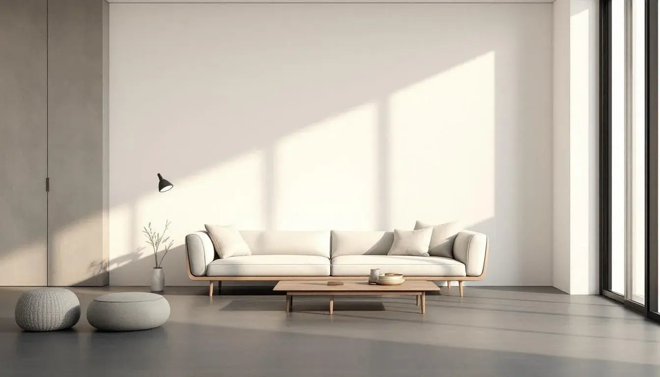
28 Aug 2025 · 5 min readThe shift within minimalist design—that gradual drift from the almost-white to the definitively dark—mirrors a larger cultural conversation about presence and absence, noise and silence. What starts as a whisper of cream can deepen into a profound hush of charcoal, each color holding its own weight in the narrative. This isn't merely about visual preference; it’s about the very stories spaces tell, the feelings they cradle, and the experiences they shape. Imagine a gallery, once pristine and echoing, now softened by shadows, the art breathing in a different, perhaps more intimate light. Think of the stark white kitchen warming up with the grounding effect of near-blacks, inviting connection. The palettes below venture into the conversation to see how a turn to darkness can redefine our sense of a space, our sense of calm, and quiet. And how color can be a language of both presence and absence
The "UJAT Portal" 🏛️ palette evokes a hushed academic environment. Think of leather-bound books lining shelves, the muted clink of ceramic mugs on wooden desks, and the focused energy humming in a space devoted to study. Light Beige suggests aged parchment, while Grayish Green hints at the calming presence of nature filtering through a window. Deep Forest Green, Dark Olive Brown, and Charcoal Gray provide depth, grounding the palette and allowing the lighter elements to breathe. The story this palette tells is one of quiet contemplation, intellectual pursuit, and the comforting weight of knowledge accumulated over time. This palette doesn't offer stark contrasts or bold pronouncements. Instead, it invites you into a world of subtle gradations, where the shift from light to dark is gradual and comforting. It whispers of hushed debates, of discoveries made in quiet solitude, of spaces designed not to distract but to nurture focus. It's a palette that understands the power of restraint, favoring layered neutrals over jarring contrasts. In the context of minimalist design, the "UJAT Portal" palette suggests a move away from sterile purity and toward a richness that celebrates imperfection and the beauty of the natural world. Imagine a minimalist office space clad in these colors. The Dark Olive Brown infuses warmth into a room, while Charcoal Gray elements ground the whole with solidity. Such a space is for deep, undisturbed work, where the surroundings assist concentration and foster creativity.
"Coastal Escape" 🏖️ whispers of sun-bleached driftwood, the gentle crash of waves, and the cool caress of a sea breeze. Off White suggests the soft glow of morning light on sand, while Light Teal and Steel Blue echo the shifting hues of the ocean. Beige Brown hints at the warm tones of weathered cliffs, and Dark Olive anchors the palette with a grounding touch of earth. This palette speaks of relaxation, tranquility, and the restorative power of nature. Picture a quiet cottage overlooking the sea, furnished with simple, functional pieces. Sunlight streams through linen curtains, casting shadows on whitewashed walls. The air smells of salt and pine. Such a space isn't about making a statement; it's about creating a sanctuary, a place to escape the noise and chaos of the modern world. "Coastal Escape" understands the power of negative space, allowing the natural beauty of the surroundings to take center stage. The minimalism that this palette embodies is not about emptiness, but about intentionality. The choice of each color is deliberate, designed to evoke a feeling of calm and connection to the natural world. It moves toward a more muted expression—the deep tones tempered by the openness of the lighter shades. The drift from the bright to subdued here is about fostering a personal connection, not broadcasting perfection, but reflecting the calm found in nature.
"Lottie Colors" 🎨 proposes a lively spin on minimalist conventions. Light Beige offers a comforting backdrop, while Seafoam Green injects a breath of fresh air. Coral Red dares to add a pop of playful energy. Deep Blue provides depth and grounding, and Dark Charcoal anchors the palette with its rich intensity. This assembly tells a story of creativity, imagination, and the joy of self-expression. Imagine a vibrant artist's studio, filled with colorful canvases, playful prototypes, and tools of inspiration. Sunlight pours in through large windows, illuminating every corner of the room. Such a space isn't afraid to embrace imperfection and whimsy. It celebrates individuality and the courage to break the rules. "Lottie Colors" defies the notion that minimalism must be sterile or cold. It demonstrates that simplicity can also be joyful, expressive, and full of life. The darks offset the lightness. The palette embraces richness while retaining clarity. The result is an atmosphere that feels both invigorating and grounded, sparking creativity without feeling overwhelming. A shift to these colors, deployed sparingly, brings an edge to a modern space. Suddenly, there's an opportunity to play in what once was a muted room. This feels current and intentional.
The "Vibrant Spectrum" 🌈 offers a twist on the familiar. Off White provides a soft and receptive space, while Aqua Teal injects a breath of invigorating coolness. Slate Gray lends a touch of quiet sophistication. Intense Blue offers depth and drama, and Olive Drab grounds the palette with a natural, organic feel. This speaks of energy, creativity, and the power of visual storytelling. Imagine a bustling design studio, filled with mood boards, prototypes, and works in progress. Sunlight streams through floor-to-ceiling windows, illuminating every corner of the space. This is a place where ideas are born, where boundaries are pushed, and where beauty is created. "Vibrant Spectrum" demonstrates that minimalism doesn't have to shy away from bold color choices. It illustrates that simplicity can be a canvas for creativity, allowing individual elements to shine. The darker shades temper the lighter ones, preventing the palette from becoming overwhelming. The result is a space that feels both dynamic and grounded, inspiring creativity. One can easily picture a bright, exciting, yet uncluttered space. The shift here is toward spaces that aren't afraid to express personality.
"Legal Palette" ⚖️ presents a study in somber restraint. Light Beige, Burnt Sienna, and Olive Drab evoke the hushed atmosphere of polished wood conference rooms. Slate Gray conjures the weighty silence of official documents, while Deep Gray underscores a sense of solemn authority. This color expression tells a story of established institutions, of precision, and reasoned deliberation. The absence of bright tones or visual flourishes speaks of a commitment to order and seriousness of purpose. Picture a stately law office, its walls lined with framed diplomas and antique maps. Sunlight filters through heavy drapes, casting shadows on the elegant furnishings. Such a space isn't designed to inspire creativity or playfulness. The emphasis is on conveying confidence, stability, and respect for the law. "Legal Palette" underscores the link between color and perception. It is associated with trust and legitimacy. In the context of minimalist design, "Legal Palette" suggests a return to the core tenet: a space of essential elements where form follows function. Spaces are stripped to only feature a select few items necessary for work.
"Tech UI" 💻 takes on a modern, energetic feel, with Light Grayish White providing a clean, uncluttered base. Steel Gray adds a touch of understated sophistication, while Mauve Gray offers an element of subtle visual interest. Burnt Orange introduces a spark of playful energy, and Vivid Blue injects a jolt of vibrant modernity. The tale is one of innovation, progress, and the ever-evolving digital landscape. Picture a sleek, contemporary tech hub, where collaboration and innovation intersect. Natural light floods the room, creating an uplifting atmosphere. This is a space where creativity knows no bounds. "Tech UI" rejects the notion that minimalist design must be devoid of personality. It proves that simplicity can be exciting, dynamic, and full of promise. The palette has an interesting push and pull - the darks are offset by the brightness, resulting in a balanced palette that excites. A shift to these colors creates spaces that don't feel afraid to express individuality, or to display its creative edge.
As we trace this play of lightness and darkness across these palettes, a theme appears: the ongoing redefinition of minimalism itself. It’s a move away from strictness and toward self expression. These palettes highlight a key aspect - they highlight the value of intentional decision-making with color. Whether it's the soothing tones of "Coastal Escape", the vibrancy of "Lottie Colors," or the grounded nature of the "Legal Palette". These approaches give us permission to view minimalist design not as a rigid dogma but as a flexible framework. One that encourages personality - where individual expression finds its ideal form. It is a continuing and very interesting evolution.