'%3e%3cpath%20fill-rule='evenodd'%20clip-rule='evenodd'%20d='M51.1303%2019.2492C50.7278%2019.913%2050.1346%2020.4426%2049.3508%2020.838C48.5669%2021.2335%2047.6172%2021.4312%2046.5014%2021.4312C44.8208%2021.4312%2043.4367%2021.0216%2042.3492%2020.2025C41.2617%2019.3833%2040.6686%2018.2394%2040.5697%2016.7706H44.4253C44.4818%2017.3355%2044.6831%2017.7804%2045.0291%2018.1052C45.3751%2018.43%2045.8164%2018.5924%2046.3531%2018.5924C46.8192%2018.5924%2047.1864%2018.4653%2047.4547%2018.2111C47.7231%2017.9569%2047.8572%2017.618%2047.8572%2017.1943C47.8572%2016.8129%2047.7337%2016.4952%2047.4865%2016.241C47.2393%2015.9867%2046.9322%2015.7784%2046.565%2015.616C46.1978%2015.4536%2045.6893%2015.2594%2045.0397%2015.0334C44.0934%2014.7086%2043.3202%2014.3944%2042.72%2014.0907C42.1197%2013.7871%2041.6042%2013.3351%2041.1735%2012.7349C40.7427%2012.1347%2040.5273%2011.3544%2040.5273%2010.394C40.5273%209.50418%2040.7533%208.73448%2041.2053%208.08481C41.6572%207.43515%2042.2821%206.93731%2043.0801%206.5913C43.8781%206.24528%2044.7925%206.07227%2045.8235%206.07227C47.49%206.07227%2048.8141%206.46771%2049.7956%207.25861C50.7772%208.04951%2051.3315%209.13698%2051.4586%2010.5211H47.5395C47.4689%2010.0268%2047.2888%209.63483%2046.9993%209.3453C46.7097%209.05578%2046.3178%208.91102%2045.8235%208.91102C45.3998%208.91102%2045.0573%209.024%2044.7961%209.24997C44.5348%209.47594%2044.4041%209.80783%2044.4041%2010.2457C44.4041%2010.5988%2044.5207%2010.8989%2044.7537%2011.146C44.9867%2011.3932%2045.2798%2011.5944%2045.6328%2011.7498C45.9859%2011.9052%2046.4944%2012.1029%2047.1581%2012.343C48.1185%2012.6678%2048.9023%2012.9891%2049.5096%2013.3069C50.1169%2013.6246%2050.6395%2014.0872%2051.0773%2014.6945C51.5151%2015.3018%2051.734%2016.0927%2051.734%2017.0672C51.734%2017.8581%2051.5328%2018.5854%2051.1303%2019.2492ZM59.0242%206.3053V21.2829H55.4016V6.3053H59.0242ZM73.9409%206.3053V9.18642H69.8734V21.2829H66.2296V9.18642H62.2046V6.3053H73.9409ZM80.7438%209.18642V12.3218H85.8069V15.0546H80.7438V18.3806H86.4425V21.2829H77.1212V6.3053H86.4425V9.18642H80.7438ZM99.667%2016.0291V21.2829H96.0444V6.3053H101.913C103.692%206.3053%20105.048%206.74665%20105.98%207.62934C106.912%208.51204%20107.378%209.7019%20107.378%2011.199C107.378%2012.1311%20107.17%2012.9609%20106.753%2013.6882C106.337%2014.4155%20105.719%2014.9875%20104.9%2015.4042C104.08%2015.8208%20103.085%2016.0291%20101.913%2016.0291H99.667ZM103.692%2011.199C103.692%209.8855%20102.965%209.22879%20101.51%209.22879H99.667V13.1268H101.51C102.965%2013.1268%20103.692%2012.4842%20103.692%2011.199ZM120.092%2018.5501H114.478L113.546%2021.2829H109.732L115.219%206.41123H119.393L124.879%2021.2829H121.024L120.092%2018.5501ZM119.16%2015.7961L117.295%2010.2881L115.41%2015.7961H119.16ZM131.555%2018.5077H136.385V21.2829H127.933V6.3053H131.555V18.5077ZM143.337%209.18642V12.3218H148.4V15.0546H143.337V18.3806H149.035V21.2829H139.714V6.3053H149.035V9.18642H143.337ZM163.507%206.3053V9.18642H159.44V21.2829H155.796V9.18642H151.771V6.3053H163.507ZM177.449%206.3053V9.18642H173.382V21.2829H169.738V9.18642H165.713V6.3053H177.449ZM184.252%209.18642V12.3218H189.315V15.0546H184.252V18.3806H189.951V21.2829H180.629V6.3053H189.951V9.18642H184.252Z'%20fill='%23EEF0ED'/%3e%3cmask%20id='mask0_3101_7327'%20style='mask-type:alpha'%20maskUnits='userSpaceOnUse'%20x='0'%20y='0'%20width='27'%20height='28'%3e%3cpath%20d='M23.8328%200.759766H2.64808C1.18559%200.759766%200%201.94535%200%203.40785V24.5925C0%2026.055%201.18559%2027.2406%202.64808%2027.2406H23.8328C25.2952%2027.2406%2026.4808%2026.055%2026.4808%2024.5925V3.40785C26.4808%201.94535%2025.2952%200.759766%2023.8328%200.759766Z'%20fill='white'/%3e%3c/mask%3e%3cg%20mask='url(%23mask0_3101_7327)'%3e%3cpath%20d='M23.8328%200.759766H2.64808C1.18559%200.759766%200%201.94535%200%203.40785V24.5925C0%2026.055%201.18559%2027.2406%202.64808%2027.2406H23.8328C25.2952%2027.2406%2026.4808%2026.055%2026.4808%2024.5925V3.40785C26.4808%201.94535%2025.2952%200.759766%2023.8328%200.759766Z'%20fill='%23D8D8D8'/%3e%3cpath%20d='M13.2404%200.759766H0V14.0001H13.2404V0.759766Z'%20fill='%238C61FF'/%3e%3cpath%20d='M13.2404%2014H0V27.2404H13.2404V14Z'%20fill='%2336C3FE'/%3e%3cpath%20d='M26.4806%2014H13.2402V27.2404H26.4806V14Z'%20fill='%236592FE'/%3e%3cpath%20d='M26.4806%200.759766H13.2402V14.0002H26.4806V0.759766Z'%20fill='%236059F7'/%3e%3c/g%3e%3c/g%3e%3cdefs%3e%3cclipPath%20id='clip0_3101_7327'%3e%3crect%20width='190'%20height='28'%20fill='white'/%3e%3c/clipPath%3e%3c/defs%3e%3c/svg%3e)
'%3e%3cpath%20d='M23.8328%200.759521H2.64808C1.18559%200.759521%200%201.94511%200%203.40761V24.5923C0%2026.0548%201.18559%2027.2404%202.64808%2027.2404H23.8328C25.2952%2027.2404%2026.4808%2026.0548%2026.4808%2024.5923V3.40761C26.4808%201.94511%2025.2952%200.759521%2023.8328%200.759521Z'%20fill='%23D8D8D8'/%3e%3cpath%20d='M13.2404%200.759521H0V13.9999H13.2404V0.759521Z'%20fill='%238C61FF'/%3e%3cpath%20d='M13.2404%2013.9998H0V27.2402H13.2404V13.9998Z'%20fill='%2336C3FE'/%3e%3cpath%20d='M26.4809%2013.9998H13.2405V27.2402H26.4809V13.9998Z'%20fill='%236592FE'/%3e%3cpath%20d='M26.4809%200.759277H13.2405V13.9997H26.4809V0.759277Z'%20fill='%236059F7'/%3e%3c/g%3e%3c/svg%3e)
From Burgundy to Teal: Reimagining Autumn Color Schemes
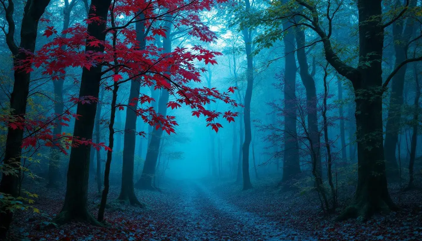
28 Aug 2025 · 3 min readAutumn, a season often painted in fiery reds and golden yellows, holds a far broader spectrum of possibilities. It is a time of transition, a space between vibrancy and stillness, light and shadow—a perfect moment to rethink the accepted aesthetic. Imagine the crisp rustle of leaves underfoot, not just in shades of burnt orange, but echoing the deep, tranquil blues of twilight or the quiet luxury of aged stone. This is not merely about swapping one hue for another; it’s about capturing the soul of autumn, where the air itself holds a certain weight, a promise of introspection and cozy stillness. It is this spirit we seek to capture, setting aside the expected visual language for one that speaks of quiet strength and unexpected beauty. Can we find autumn in the cool embrace of Teal, or the secretive depths of Burgundy? Let us explore.
The palette named Bold Contrast 🎨 dares to defy seasonal expectations, presenting autumn through a different lens. Sky Blue, the color of a late autumn afternoon, when the sun dips below the horizon, casting a cool light across the fields. Crimson flares unexpectedly, like a sudden burst of heat from a dying ember. Granite Gray grounds the composition, reminiscent of the stone walls that stand firm against the shifting seasons. Maroon and Dark Slate provide a sense of depth, like the shadows lengthening across the earth. Instead of the predictable warmth, there's a play of shadow and light, a dance between cool detachment and smoldering passion. It offers a vision of autumn suited for those drawn to urban landscapes, to the brisk energy of city life paired with the subtle shifts of nature’s rhythm, a power meeting where the air crackles with creative electricity. It’s for boardrooms where groundbreaking ideas are born, spaces that reflect the dynamism of the season without relying on cliché. Imagine a gallery exhibiting avant-garde art, the walls painted in a muted gray, punctuated by bursts of Maroon and Sky Blue in the installations. Or the focused glow of a modern office where the backdrop breathes fresh energy.
Mystic Depths 🌌 captures the subtle drama of autumn’s transition. It is a palette that speaks of secret gardens and hidden pathways, favoring mystery over the bright declarations of summer. Pale Gold evokes the last rays of sunlight glinting off fallen leaves, while Teal Tint hints at the cool embrace of twilight descending. Stone Gray, the color of ancient rocks and weathered paths, creates a grounding presence. Crimson Rust, a whisper of dying embers, and Dark Maroon, the color of shadows deepening in the forest, complete the story. This is not the flamboyant autumn of postcard images, but the quiet, contemplative season felt in the chill air. This palette’s strengths lie in creating sheltered, introspective environments. Visualise the velvet curtains in an atmospheric cinema, the low lighting casting long shadows across comfortable seats, creating an immersive escape. A reading room with walls painted in Stone Gray, illuminated by lamps casting warm Pale Gold and Teal Tint. These are spaces removed from the frenetic pace of modern life, offering instead a sense of timelessness and poetic escape, where the boundaries between inner and outer worlds blur, and the imagination takes flight.
Vibrant Palette 🎨 refuses to let autumn fade into muted tones. Instead, it captures the season's spirit through a kaleidoscope of jewel-like colors that hum with energy. Khaki Gold hints at the lingering warmth of summer sunsets, while Crimson Red, a powerful statement, echoes the vibrant foliage on display. Dusty Plum, Dark Violet, and Deep Aubergine represent the depths of the autumn nights. This is the autumn of festivals, of harvest celebrations, and communal gatherings. It brings to mind bustling marketplaces filled with colorful displays of fruits, vegetables, and handcrafted wares, or intimate celebrations of life that glow with warmth and laughter. Imagine a stylish gathering in a loft, where exposed brick walls are softened by velvet furniture in Deep Aubergine and Dark Violet. Bold splashes of Crimson Red adorn the walls, making space for lively conversations. Alternatively the backdrop could grace a high-end boutique, where the rich tones of the interior create a sense of luxurious abundance, inviting customers to discover the treasures within. This palette is not about quiet contemplation; it's about reveling in the richness and beauty of the season’s closing act.
The Corporate Education 🏢 palette presents a more subdued interpretation of autumn. Light Silver offers a cool, calming foundation, reminiscent of overcast skies. Cool Gray adds a touch of sophistication. A grounded perspective is given by Olive Drab and Dark Brown. The addition of Dark Navy Blue lends a sense of depth, like the twilight sky deepening into night. This palette lends itself to spaces that require clarity and focus. Imagine a spacious library, bathed in the soft glow of diffused light. The walls would be painted in Light Silver and Cool Gray, creating a sense of quiet concentration. Or perhaps a modern office, where clean lines and minimalist decor promote productivity and collaborative work. The subtle variations in tone reflect the subtle shifts in atmosphere as the season progresses, creating a sense of connection to the natural world, without distracting from the task at hand. This is autumn interpreted for those who value structure, intellect, and the pursuit of knowledge.
These explorations reveal the surprising versatility of autumn, proving it is not confined to fiery hues. Bold Contrast subverts expectations, offering a modern twist. Mystic Depths whispers of quiet beauty, creating evocative, immersive spaces. Vibrant Palette celebrates autumn with joyful exuberance. Corporate Education finds peace of mind in cool neutral shades. Each palette expands our understanding of autumn, inviting fresh interpretations. In refusing the expected, we discover new emotional depths and creative pathways, proving the season is as boundless as our imagination.