'%3e%3cpath%20fill-rule='evenodd'%20clip-rule='evenodd'%20d='M51.1303%2019.2492C50.7278%2019.913%2050.1346%2020.4426%2049.3508%2020.838C48.5669%2021.2335%2047.6172%2021.4312%2046.5014%2021.4312C44.8208%2021.4312%2043.4367%2021.0216%2042.3492%2020.2025C41.2617%2019.3833%2040.6686%2018.2394%2040.5697%2016.7706H44.4253C44.4818%2017.3355%2044.6831%2017.7804%2045.0291%2018.1052C45.3751%2018.43%2045.8164%2018.5924%2046.3531%2018.5924C46.8192%2018.5924%2047.1864%2018.4653%2047.4547%2018.2111C47.7231%2017.9569%2047.8572%2017.618%2047.8572%2017.1943C47.8572%2016.8129%2047.7337%2016.4952%2047.4865%2016.241C47.2393%2015.9867%2046.9322%2015.7784%2046.565%2015.616C46.1978%2015.4536%2045.6893%2015.2594%2045.0397%2015.0334C44.0934%2014.7086%2043.3202%2014.3944%2042.72%2014.0907C42.1197%2013.7871%2041.6042%2013.3351%2041.1735%2012.7349C40.7427%2012.1347%2040.5273%2011.3544%2040.5273%2010.394C40.5273%209.50418%2040.7533%208.73448%2041.2053%208.08481C41.6572%207.43515%2042.2821%206.93731%2043.0801%206.5913C43.8781%206.24528%2044.7925%206.07227%2045.8235%206.07227C47.49%206.07227%2048.8141%206.46771%2049.7956%207.25861C50.7772%208.04951%2051.3315%209.13698%2051.4586%2010.5211H47.5395C47.4689%2010.0268%2047.2888%209.63483%2046.9993%209.3453C46.7097%209.05578%2046.3178%208.91102%2045.8235%208.91102C45.3998%208.91102%2045.0573%209.024%2044.7961%209.24997C44.5348%209.47594%2044.4041%209.80783%2044.4041%2010.2457C44.4041%2010.5988%2044.5207%2010.8989%2044.7537%2011.146C44.9867%2011.3932%2045.2798%2011.5944%2045.6328%2011.7498C45.9859%2011.9052%2046.4944%2012.1029%2047.1581%2012.343C48.1185%2012.6678%2048.9023%2012.9891%2049.5096%2013.3069C50.1169%2013.6246%2050.6395%2014.0872%2051.0773%2014.6945C51.5151%2015.3018%2051.734%2016.0927%2051.734%2017.0672C51.734%2017.8581%2051.5328%2018.5854%2051.1303%2019.2492ZM59.0242%206.3053V21.2829H55.4016V6.3053H59.0242ZM73.9409%206.3053V9.18642H69.8734V21.2829H66.2296V9.18642H62.2046V6.3053H73.9409ZM80.7438%209.18642V12.3218H85.8069V15.0546H80.7438V18.3806H86.4425V21.2829H77.1212V6.3053H86.4425V9.18642H80.7438ZM99.667%2016.0291V21.2829H96.0444V6.3053H101.913C103.692%206.3053%20105.048%206.74665%20105.98%207.62934C106.912%208.51204%20107.378%209.7019%20107.378%2011.199C107.378%2012.1311%20107.17%2012.9609%20106.753%2013.6882C106.337%2014.4155%20105.719%2014.9875%20104.9%2015.4042C104.08%2015.8208%20103.085%2016.0291%20101.913%2016.0291H99.667ZM103.692%2011.199C103.692%209.8855%20102.965%209.22879%20101.51%209.22879H99.667V13.1268H101.51C102.965%2013.1268%20103.692%2012.4842%20103.692%2011.199ZM120.092%2018.5501H114.478L113.546%2021.2829H109.732L115.219%206.41123H119.393L124.879%2021.2829H121.024L120.092%2018.5501ZM119.16%2015.7961L117.295%2010.2881L115.41%2015.7961H119.16ZM131.555%2018.5077H136.385V21.2829H127.933V6.3053H131.555V18.5077ZM143.337%209.18642V12.3218H148.4V15.0546H143.337V18.3806H149.035V21.2829H139.714V6.3053H149.035V9.18642H143.337ZM163.507%206.3053V9.18642H159.44V21.2829H155.796V9.18642H151.771V6.3053H163.507ZM177.449%206.3053V9.18642H173.382V21.2829H169.738V9.18642H165.713V6.3053H177.449ZM184.252%209.18642V12.3218H189.315V15.0546H184.252V18.3806H189.951V21.2829H180.629V6.3053H189.951V9.18642H184.252Z'%20fill='%23EEF0ED'/%3e%3cmask%20id='mask0_3101_7327'%20style='mask-type:alpha'%20maskUnits='userSpaceOnUse'%20x='0'%20y='0'%20width='27'%20height='28'%3e%3cpath%20d='M23.8328%200.759766H2.64808C1.18559%200.759766%200%201.94535%200%203.40785V24.5925C0%2026.055%201.18559%2027.2406%202.64808%2027.2406H23.8328C25.2952%2027.2406%2026.4808%2026.055%2026.4808%2024.5925V3.40785C26.4808%201.94535%2025.2952%200.759766%2023.8328%200.759766Z'%20fill='white'/%3e%3c/mask%3e%3cg%20mask='url(%23mask0_3101_7327)'%3e%3cpath%20d='M23.8328%200.759766H2.64808C1.18559%200.759766%200%201.94535%200%203.40785V24.5925C0%2026.055%201.18559%2027.2406%202.64808%2027.2406H23.8328C25.2952%2027.2406%2026.4808%2026.055%2026.4808%2024.5925V3.40785C26.4808%201.94535%2025.2952%200.759766%2023.8328%200.759766Z'%20fill='%23D8D8D8'/%3e%3cpath%20d='M13.2404%200.759766H0V14.0001H13.2404V0.759766Z'%20fill='%238C61FF'/%3e%3cpath%20d='M13.2404%2014H0V27.2404H13.2404V14Z'%20fill='%2336C3FE'/%3e%3cpath%20d='M26.4806%2014H13.2402V27.2404H26.4806V14Z'%20fill='%236592FE'/%3e%3cpath%20d='M26.4806%200.759766H13.2402V14.0002H26.4806V0.759766Z'%20fill='%236059F7'/%3e%3c/g%3e%3c/g%3e%3cdefs%3e%3cclipPath%20id='clip0_3101_7327'%3e%3crect%20width='190'%20height='28'%20fill='white'/%3e%3c/clipPath%3e%3c/defs%3e%3c/svg%3e)
'%3e%3cpath%20d='M23.8328%200.759521H2.64808C1.18559%200.759521%200%201.94511%200%203.40761V24.5923C0%2026.0548%201.18559%2027.2404%202.64808%2027.2404H23.8328C25.2952%2027.2404%2026.4808%2026.0548%2026.4808%2024.5923V3.40761C26.4808%201.94511%2025.2952%200.759521%2023.8328%200.759521Z'%20fill='%23D8D8D8'/%3e%3cpath%20d='M13.2404%200.759521H0V13.9999H13.2404V0.759521Z'%20fill='%238C61FF'/%3e%3cpath%20d='M13.2404%2013.9998H0V27.2402H13.2404V13.9998Z'%20fill='%2336C3FE'/%3e%3cpath%20d='M26.4809%2013.9998H13.2405V27.2402H26.4809V13.9998Z'%20fill='%236592FE'/%3e%3cpath%20d='M26.4809%200.759277H13.2405V13.9997H26.4809V0.759277Z'%20fill='%236059F7'/%3e%3c/g%3e%3c/svg%3e)
Corporate Core: Decoding Dominant Colors in 'Business' Palettes 💼
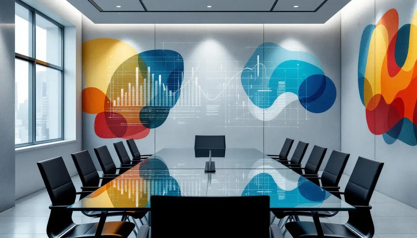
28 Aug 2025 · 4 min readColor has always whispered of intention. The colors chosen to project any image – from the suit in the boardroom to the website splashed across a screen – subtly dictate perception. They suggest authority, innovation, creativity, sometimes all at once. A carefully considered color palette speaks volumes, often more than words themselves. It's the silent partner dictating first impressions, shaping confidence, and establishing trust. In the workspaces where deals are struck and ideas take flight, where brands begin and visions blossom, the power of color is not just aesthetic; it’s strategic. We explore how selecting the right hues can frame the narrative and dictate outcomes.
The palette of "Steel Confidence" projects a scene of considered strength. It evokes a sense of calm capability, akin to the feeling one might have standing on a skyscraper balcony, watching the city unfold with cool detachment. The Light Azure airiness dances with the grounding presence of Dark Evergreen, while Pale Denim suggests reliable craftsmanship. Deep Indigo contributes a dependable depth, like a well-tailored suit ready for any encounter. This balance is a masterclass in measured aspiration, and could easily paint the walls of a startup aiming to disrupt the financial sector, where innovation must equally inspire trust. Imagine this range on a pitch deck, or even subtly interwoven through a company's branding — the quiet authority projected suggests a company that has considered every possibility and is ready to deliver, without overselling. The Lush Forest tone adds an unexpected organic element to this range, a reminder of considered growth and sustainable practices, something many corporations attempt to project. These shades project a business ready to build lasting relationships, rooted as much in integrity as innovation.
"Steel Strength," a sibling to "Steel Confidence," steers towards a more direct, grounded presence. Honey Gold hints at the return of resources and successful growth, while Smoky Slate gives quiet gravitas. Cherry Blaze might punctuate with a bold statement of intent, a flash of dynamism against the sturdier notes. Ebony Shadow roots the palette deeply, reinforcing the impression of stability and power. Dark Indigo adds measured depth, and feels at home in a setting of production, progress, and dependable results. Consider a construction company aiming to appear traditional yet safety-led. This palette would frame the narrative perfectly, where the bright flash of Cherry Blaze evokes high-vis gear, while Honey Gold is akin to gilded achievements. These hues tell a story of steadfast effort, of blueprints becoming reality, of businesses building the skylines around them.
"Trint Colors" offers a more vivacious approach suitable for the world of startups and fast moving organizations. It's a palette that pulses with potential energy. Bright Yellow immediately draws the eye, giving a feeling of innovation. Aqua Blue adds a necessary element of calm and clarity which is essential for fast growth, while Rust Red introduces depth and passion. The Off White suggests an openness, inviting collaboration. Then, Dark Charcoal anchors the scheme, providing a sense of stability, as the company grows. This palette might be used to paint the visual landscape of an innovative tech company presenting a solution, for the bright colors invite thoughts of problem solving, and ease of use. It tells of streamlined interfaces, fast responses, and seamless integrations. It's a declaration of intent: to be seen not just as effective, but as exciting. By balancing the energetic with the grounding, it suggests an ability to adapt and thrive.
"Modern Philanthropy" whispers promises of a better tomorrow, with a palette that brings to mind transparency and trust. Canary Yellow shines like a spotlight on progress, while Sky Blue evokes open communication. Soft Gray gives a grounding presence that feels both contemporary and classic, giving the impression of safety and tradition, while Near Black makes the more playful notes stand out against a stronger foundation. Dark Sienna represents commitment to the future of growth, and lends an earthly touch to a palette focused on technological advancement. Imagine a report issued by a charity: these could be the colors of hope. A non-profit organization dedicated to social uplift could adopt this aesthetic to demonstrate their commitment to their stakeholders and the world at large. It's a color selection that acknowledges the complexities of modern challenges, promising a path forward, not just with innovation, but with empathy.
"Modern Tech" suggests focused innovation. Steel Blue has a sense of cool efficiency, speaking to precision and considered decisions, while Slate Gray offers balance. Dark Violet lends depth and inspires innovation, drawing the viewer towards the mysterious, and beyond the known. Night Black presents stability, offering an image of a corporation you can trust and depend on, while Dark Crimson offers just a touch of passion and forward drive. With this palette, a cybersecurity firm could tell a visual narrative, of algorithms and firewalls protecting digital kingdoms. It's an atmosphere conducive to deep thought, one that blends technical understanding with imagination, inspiring employees to push boundaries, to create the systems to protect the world from harm. These are colors that invite concentration, signaling that innovation is not just about speed, but security.
"Digital Dusk" evokes a calm and innovative atmosphere, somewhere between thoughtful work and the quiet comfort of home. Dusty Rose lends warmth and openness, inviting viewers to trust the brand. Light Gray offers calm and balance, while Taupe lends an organic element to this technological palette. The palette is set against an Ebony backdrop, highlighting the gentler shades, giving the feeling of transparency and honesty. Imagine a technological consulting firm presenting itself through this selection: there is the sense of working late on a project, with a dependable team nearby. Lavender Blue suggests the technology and innovation behind the operation, adding a future-focused feel to the more traditional shades. With "Digital Dusk", a brand can create the feeling of a professional firm dedicated to doing their very best for their stakeholders, with a welcoming approach.
The choices made and the environments created speak volumes about the character of a company. The colors on the walls, the designs in the marketing materials, communicate how a business approaches its mission, its employees, and the world at large. A palette thoughtfully chosen offers more than mere decoration - it tells a story. It's a story of ambition, of understanding, of connection. When executed with care, these visual signals build confidence, create engagement, and ultimately set the stage for success. Consider these options which present not solely visual aesthetics, but carefully constructed atmospheres, ready to shape perceptions and inspire progress.