'%3e%3cpath%20fill-rule='evenodd'%20clip-rule='evenodd'%20d='M51.1303%2019.2492C50.7278%2019.913%2050.1346%2020.4426%2049.3508%2020.838C48.5669%2021.2335%2047.6172%2021.4312%2046.5014%2021.4312C44.8208%2021.4312%2043.4367%2021.0216%2042.3492%2020.2025C41.2617%2019.3833%2040.6686%2018.2394%2040.5697%2016.7706H44.4253C44.4818%2017.3355%2044.6831%2017.7804%2045.0291%2018.1052C45.3751%2018.43%2045.8164%2018.5924%2046.3531%2018.5924C46.8192%2018.5924%2047.1864%2018.4653%2047.4547%2018.2111C47.7231%2017.9569%2047.8572%2017.618%2047.8572%2017.1943C47.8572%2016.8129%2047.7337%2016.4952%2047.4865%2016.241C47.2393%2015.9867%2046.9322%2015.7784%2046.565%2015.616C46.1978%2015.4536%2045.6893%2015.2594%2045.0397%2015.0334C44.0934%2014.7086%2043.3202%2014.3944%2042.72%2014.0907C42.1197%2013.7871%2041.6042%2013.3351%2041.1735%2012.7349C40.7427%2012.1347%2040.5273%2011.3544%2040.5273%2010.394C40.5273%209.50418%2040.7533%208.73448%2041.2053%208.08481C41.6572%207.43515%2042.2821%206.93731%2043.0801%206.5913C43.8781%206.24528%2044.7925%206.07227%2045.8235%206.07227C47.49%206.07227%2048.8141%206.46771%2049.7956%207.25861C50.7772%208.04951%2051.3315%209.13698%2051.4586%2010.5211H47.5395C47.4689%2010.0268%2047.2888%209.63483%2046.9993%209.3453C46.7097%209.05578%2046.3178%208.91102%2045.8235%208.91102C45.3998%208.91102%2045.0573%209.024%2044.7961%209.24997C44.5348%209.47594%2044.4041%209.80783%2044.4041%2010.2457C44.4041%2010.5988%2044.5207%2010.8989%2044.7537%2011.146C44.9867%2011.3932%2045.2798%2011.5944%2045.6328%2011.7498C45.9859%2011.9052%2046.4944%2012.1029%2047.1581%2012.343C48.1185%2012.6678%2048.9023%2012.9891%2049.5096%2013.3069C50.1169%2013.6246%2050.6395%2014.0872%2051.0773%2014.6945C51.5151%2015.3018%2051.734%2016.0927%2051.734%2017.0672C51.734%2017.8581%2051.5328%2018.5854%2051.1303%2019.2492ZM59.0242%206.3053V21.2829H55.4016V6.3053H59.0242ZM73.9409%206.3053V9.18642H69.8734V21.2829H66.2296V9.18642H62.2046V6.3053H73.9409ZM80.7438%209.18642V12.3218H85.8069V15.0546H80.7438V18.3806H86.4425V21.2829H77.1212V6.3053H86.4425V9.18642H80.7438ZM99.667%2016.0291V21.2829H96.0444V6.3053H101.913C103.692%206.3053%20105.048%206.74665%20105.98%207.62934C106.912%208.51204%20107.378%209.7019%20107.378%2011.199C107.378%2012.1311%20107.17%2012.9609%20106.753%2013.6882C106.337%2014.4155%20105.719%2014.9875%20104.9%2015.4042C104.08%2015.8208%20103.085%2016.0291%20101.913%2016.0291H99.667ZM103.692%2011.199C103.692%209.8855%20102.965%209.22879%20101.51%209.22879H99.667V13.1268H101.51C102.965%2013.1268%20103.692%2012.4842%20103.692%2011.199ZM120.092%2018.5501H114.478L113.546%2021.2829H109.732L115.219%206.41123H119.393L124.879%2021.2829H121.024L120.092%2018.5501ZM119.16%2015.7961L117.295%2010.2881L115.41%2015.7961H119.16ZM131.555%2018.5077H136.385V21.2829H127.933V6.3053H131.555V18.5077ZM143.337%209.18642V12.3218H148.4V15.0546H143.337V18.3806H149.035V21.2829H139.714V6.3053H149.035V9.18642H143.337ZM163.507%206.3053V9.18642H159.44V21.2829H155.796V9.18642H151.771V6.3053H163.507ZM177.449%206.3053V9.18642H173.382V21.2829H169.738V9.18642H165.713V6.3053H177.449ZM184.252%209.18642V12.3218H189.315V15.0546H184.252V18.3806H189.951V21.2829H180.629V6.3053H189.951V9.18642H184.252Z'%20fill='%23EEF0ED'/%3e%3cmask%20id='mask0_3101_7327'%20style='mask-type:alpha'%20maskUnits='userSpaceOnUse'%20x='0'%20y='0'%20width='27'%20height='28'%3e%3cpath%20d='M23.8328%200.759766H2.64808C1.18559%200.759766%200%201.94535%200%203.40785V24.5925C0%2026.055%201.18559%2027.2406%202.64808%2027.2406H23.8328C25.2952%2027.2406%2026.4808%2026.055%2026.4808%2024.5925V3.40785C26.4808%201.94535%2025.2952%200.759766%2023.8328%200.759766Z'%20fill='white'/%3e%3c/mask%3e%3cg%20mask='url(%23mask0_3101_7327)'%3e%3cpath%20d='M23.8328%200.759766H2.64808C1.18559%200.759766%200%201.94535%200%203.40785V24.5925C0%2026.055%201.18559%2027.2406%202.64808%2027.2406H23.8328C25.2952%2027.2406%2026.4808%2026.055%2026.4808%2024.5925V3.40785C26.4808%201.94535%2025.2952%200.759766%2023.8328%200.759766Z'%20fill='%23D8D8D8'/%3e%3cpath%20d='M13.2404%200.759766H0V14.0001H13.2404V0.759766Z'%20fill='%238C61FF'/%3e%3cpath%20d='M13.2404%2014H0V27.2404H13.2404V14Z'%20fill='%2336C3FE'/%3e%3cpath%20d='M26.4806%2014H13.2402V27.2404H26.4806V14Z'%20fill='%236592FE'/%3e%3cpath%20d='M26.4806%200.759766H13.2402V14.0002H26.4806V0.759766Z'%20fill='%236059F7'/%3e%3c/g%3e%3c/g%3e%3cdefs%3e%3cclipPath%20id='clip0_3101_7327'%3e%3crect%20width='190'%20height='28'%20fill='white'/%3e%3c/clipPath%3e%3c/defs%3e%3c/svg%3e)
'%3e%3cpath%20d='M23.8328%200.759521H2.64808C1.18559%200.759521%200%201.94511%200%203.40761V24.5923C0%2026.0548%201.18559%2027.2404%202.64808%2027.2404H23.8328C25.2952%2027.2404%2026.4808%2026.0548%2026.4808%2024.5923V3.40761C26.4808%201.94511%2025.2952%200.759521%2023.8328%200.759521Z'%20fill='%23D8D8D8'/%3e%3cpath%20d='M13.2404%200.759521H0V13.9999H13.2404V0.759521Z'%20fill='%238C61FF'/%3e%3cpath%20d='M13.2404%2013.9998H0V27.2402H13.2404V13.9998Z'%20fill='%2336C3FE'/%3e%3cpath%20d='M26.4809%2013.9998H13.2405V27.2402H26.4809V13.9998Z'%20fill='%236592FE'/%3e%3cpath%20d='M26.4809%200.759277H13.2405V13.9997H26.4809V0.759277Z'%20fill='%236059F7'/%3e%3c/g%3e%3c/svg%3e)
Bakery Bliss: Deciphering Bakery Color Preferences for the Year 2025
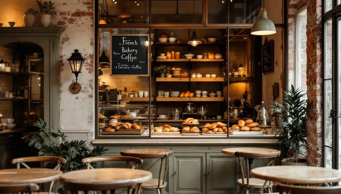
26 Aug 2025 · 5 min readThe sugary anticipation of 2025 is stirring. Forget fleeting trends; the future of bakery design will be defined by emotions baked into color. Think beyond vanilla and chocolate, and consider the palettes that can whisper promises of warmth, tradition, or even a daring departure from the expected. It's about crafting spaces and brands that not only look delicious but feel delectable, inviting customers into a sensory experience long before they take their first bite. Imagine a bakery that feels like a hug, or a brand that screams innovation with every shade. This is the power of color, wielded thoughtfully, to create unforgettable bakery experiences.
Included palettes: "Bakery Delight", "Fast Food", "Earthy Tones", "Bakery Hues", "Earthy Coffee".
Only "Bakery Delight", "Fast Food", "Earthy Tones", "Bakery Hues" and "Earthy Coffee" palettes are appropriate because they contain 'Food' or 'Bakery' in the 'industries' array in 'application_contexts' object.
Bakery Delight 🧁
The "Bakery Delight" palette whispers of artisanal bread and cozy mornings. Pure White brings a sense of pristine cleanliness, the foundation of any respectable bakery. Pale Yellow evokes the soft glow of early morning sunlight streaming through the windows, glinting off freshly baked croissants. Light Silver provides a gentle, grounding presence, suggesting the cool touch of stainless steel and brushed metal accents. Goldenrod Yellow hints at the rich, buttery flavors found within the pastries. Neutral Gray offers a muted backdrop, allowing the star ingredients to shine. Crimson Red, a daring and joyful touch, hints at the sweet rebellion of a cherry filling or a raspberry glaze. Brown Umber, as rich and decadent as a dark chocolate ganache, offers a grounding counterpoint to the brighter hues. Finally, Onyx Black provides a striking contrast, anchoring the palette and adding a touch of sophistication, perhaps in the form of elegant signage or modern packaging. Together, these colors create a bakery that feels both comforting and refined. The visual narrative is one of tradition meeting contemporary design, where every detail is carefully curated to evoke feelings of happiness and indulgence. This palette brings to mind the scent of warm bread mingling with sweet spices, a bakery you want to linger in long after you've finished your pastry.
Fast Food 🍔
“Fast Food” is an immediate siren song for the senses. Creamy Beige lays a foundation of understated elegance, suggesting that even the most hurried culinary experience holds a touch of refined pleasure. Dusty Rose adds a whisper of feminine charm, evoking images of delicate macarons and rosewater-infused pastries. However, the real story is told by the reds: Tomato Red is the pulse of pure energy, the promise of instant gratification, while Burgundy Red deepens the narrative, suggesting richness, spice, and a hint of indulgence beyond the ordinary. It's the jam in the doughnut, the secret ingredient in a signature sauce. Finally, Dark Espresso grounds the entire composition, a grounding presence that speaks of bold flavors. Imagine this palette in a modern bakery setting, where minimalist design meets maximalist flavor. It’s a place where speed and quality coexist, where you can grab a quick bite without sacrificing a moment of joy. The overall experience speaks of bold experimentation; the rush of Tomato Red tempered by the warmth of Dark Espresso. This isn't about fussy pastries. Instead, it suggests accessible, elevated experiences. It's a brand that says, "Life is too short for boring bites."
Earthy Tones 🍁
With "Earthy Tones," the bakery experience softens, inviting you to exhale and unwind. Pale Green is reminiscent of fresh herbs, the first hint of summer mint and basil notes that will elevate the experience. Tan Brown conjures images of perfectly browned crusts, the smell of toasted sugars and buttery doughs. Gray Taupe provides a quiet sophistication, evoking the smooth texture of stone-ground flour and the calming presence of antique metal serving trays. Rusty Brown, a comforting hue of cinnamon, brings a warm spice into the visual, suggesting a bakery filled with scents of autumn. Finally, Ebony provides a grounding darkness, reminiscent of bittersweet chocolate and robust coffee beans. This palette whispers of farm-to-table ingredients, small-batch creations, and a dedication to simple pleasures. Imagine exposed brick walls, wooden countertops, and the gentle murmur of conversation. It's a place where you can savor each bite, knowing that the ingredients are as wholesome as the atmosphere is inviting. The experience is one of connection – to nature, to tradition, and to community. It suggests a bakery that values quality over quantity, where every pastry is made with intention and care.
Bakery Hues 🍰
The "Bakery Hues" evokes an almost painterly vision. Light Pink has a playful air, evoking all things fanciful, like spun-sugar fantasies atop a cupcake. Khaki Brown suggests the simple pleasures of rustic pastries, the gentle chewiness of whole-grain bread. Vivid Red is a jolt of pure joy, promising a burst of flavor, like homemade jam or a tart cherry filling. Dark Slate Gray feels urban and chic, the elegant shadow that lets the sweeter, brighter colors pop. Finally, Deep Teal feels like the sophisticated friend, the slightly unexpected flavor. This palette suggests a bakery that isn’t afraid to play with expectations. I picture it in its rawest application, an industrial space softened with warm hues and surprising accents. The overall experience is one of curated whimsy. It inspires to create treats that are both delicious and visually stunning, that makes every item a work of art, a place where taste defies convention.
Earthy Coffee ☕
"Earthy Coffee" palette invites patrons into a cafe experience where every aspect exudes a sense of home. The soft Dusty Rose shade brings a soothing atmosphere invoking the quiet hours before dawn, the sound of the coffee brewing. Golden Brown is the color of the warmth emanating from a crackling fireplace making the spot truly comfortable. Tomato Red enlivens the palette with a surprising bolt of energy, a hint of the unusual fruit preserves on the table. Dark Taupe brings a layer of quiet sophistication to the space, offering a grounded sophistication. The look is finished by Dark Gray, the shade that lets the palette shine without distraction. This color mix fits small shops filled with fragrant smells and soft touches. The feel is about connectivity and comfort, making you feel appreciated. It speaks to the art and science that makes the perfect bakery-café a daily delight.
In the theatre of bakery bliss for 2025, color is much more than just decoration; it's a narrative tool, shaping moods and expectations with every glance. "Bakery Delight" promises comfort and tradition. "Fast Food" delivers energy with a burst of flavor. "Earthy Tones" whispers of simple pleasures and natural ingredients. "Bakery Hues" tempts with a playful deviation from the expected. "Earthy Coffee" provides a grounded atmosphere. Looking ahead, these palettes point to a future where bakery experiences are increasingly tailored to evoke specific emotions and connect with customers on a deeper level. The future of bakery colours isn't just about trends. It's about crafting experiences that nourish both body and soul.