'%3e%3cpath%20fill-rule='evenodd'%20clip-rule='evenodd'%20d='M51.1303%2019.2492C50.7278%2019.913%2050.1346%2020.4426%2049.3508%2020.838C48.5669%2021.2335%2047.6172%2021.4312%2046.5014%2021.4312C44.8208%2021.4312%2043.4367%2021.0216%2042.3492%2020.2025C41.2617%2019.3833%2040.6686%2018.2394%2040.5697%2016.7706H44.4253C44.4818%2017.3355%2044.6831%2017.7804%2045.0291%2018.1052C45.3751%2018.43%2045.8164%2018.5924%2046.3531%2018.5924C46.8192%2018.5924%2047.1864%2018.4653%2047.4547%2018.2111C47.7231%2017.9569%2047.8572%2017.618%2047.8572%2017.1943C47.8572%2016.8129%2047.7337%2016.4952%2047.4865%2016.241C47.2393%2015.9867%2046.9322%2015.7784%2046.565%2015.616C46.1978%2015.4536%2045.6893%2015.2594%2045.0397%2015.0334C44.0934%2014.7086%2043.3202%2014.3944%2042.72%2014.0907C42.1197%2013.7871%2041.6042%2013.3351%2041.1735%2012.7349C40.7427%2012.1347%2040.5273%2011.3544%2040.5273%2010.394C40.5273%209.50418%2040.7533%208.73448%2041.2053%208.08481C41.6572%207.43515%2042.2821%206.93731%2043.0801%206.5913C43.8781%206.24528%2044.7925%206.07227%2045.8235%206.07227C47.49%206.07227%2048.8141%206.46771%2049.7956%207.25861C50.7772%208.04951%2051.3315%209.13698%2051.4586%2010.5211H47.5395C47.4689%2010.0268%2047.2888%209.63483%2046.9993%209.3453C46.7097%209.05578%2046.3178%208.91102%2045.8235%208.91102C45.3998%208.91102%2045.0573%209.024%2044.7961%209.24997C44.5348%209.47594%2044.4041%209.80783%2044.4041%2010.2457C44.4041%2010.5988%2044.5207%2010.8989%2044.7537%2011.146C44.9867%2011.3932%2045.2798%2011.5944%2045.6328%2011.7498C45.9859%2011.9052%2046.4944%2012.1029%2047.1581%2012.343C48.1185%2012.6678%2048.9023%2012.9891%2049.5096%2013.3069C50.1169%2013.6246%2050.6395%2014.0872%2051.0773%2014.6945C51.5151%2015.3018%2051.734%2016.0927%2051.734%2017.0672C51.734%2017.8581%2051.5328%2018.5854%2051.1303%2019.2492ZM59.0242%206.3053V21.2829H55.4016V6.3053H59.0242ZM73.9409%206.3053V9.18642H69.8734V21.2829H66.2296V9.18642H62.2046V6.3053H73.9409ZM80.7438%209.18642V12.3218H85.8069V15.0546H80.7438V18.3806H86.4425V21.2829H77.1212V6.3053H86.4425V9.18642H80.7438ZM99.667%2016.0291V21.2829H96.0444V6.3053H101.913C103.692%206.3053%20105.048%206.74665%20105.98%207.62934C106.912%208.51204%20107.378%209.7019%20107.378%2011.199C107.378%2012.1311%20107.17%2012.9609%20106.753%2013.6882C106.337%2014.4155%20105.719%2014.9875%20104.9%2015.4042C104.08%2015.8208%20103.085%2016.0291%20101.913%2016.0291H99.667ZM103.692%2011.199C103.692%209.8855%20102.965%209.22879%20101.51%209.22879H99.667V13.1268H101.51C102.965%2013.1268%20103.692%2012.4842%20103.692%2011.199ZM120.092%2018.5501H114.478L113.546%2021.2829H109.732L115.219%206.41123H119.393L124.879%2021.2829H121.024L120.092%2018.5501ZM119.16%2015.7961L117.295%2010.2881L115.41%2015.7961H119.16ZM131.555%2018.5077H136.385V21.2829H127.933V6.3053H131.555V18.5077ZM143.337%209.18642V12.3218H148.4V15.0546H143.337V18.3806H149.035V21.2829H139.714V6.3053H149.035V9.18642H143.337ZM163.507%206.3053V9.18642H159.44V21.2829H155.796V9.18642H151.771V6.3053H163.507ZM177.449%206.3053V9.18642H173.382V21.2829H169.738V9.18642H165.713V6.3053H177.449ZM184.252%209.18642V12.3218H189.315V15.0546H184.252V18.3806H189.951V21.2829H180.629V6.3053H189.951V9.18642H184.252Z'%20fill='%23EEF0ED'/%3e%3cmask%20id='mask0_3101_7327'%20style='mask-type:alpha'%20maskUnits='userSpaceOnUse'%20x='0'%20y='0'%20width='27'%20height='28'%3e%3cpath%20d='M23.8328%200.759766H2.64808C1.18559%200.759766%200%201.94535%200%203.40785V24.5925C0%2026.055%201.18559%2027.2406%202.64808%2027.2406H23.8328C25.2952%2027.2406%2026.4808%2026.055%2026.4808%2024.5925V3.40785C26.4808%201.94535%2025.2952%200.759766%2023.8328%200.759766Z'%20fill='white'/%3e%3c/mask%3e%3cg%20mask='url(%23mask0_3101_7327)'%3e%3cpath%20d='M23.8328%200.759766H2.64808C1.18559%200.759766%200%201.94535%200%203.40785V24.5925C0%2026.055%201.18559%2027.2406%202.64808%2027.2406H23.8328C25.2952%2027.2406%2026.4808%2026.055%2026.4808%2024.5925V3.40785C26.4808%201.94535%2025.2952%200.759766%2023.8328%200.759766Z'%20fill='%23D8D8D8'/%3e%3cpath%20d='M13.2404%200.759766H0V14.0001H13.2404V0.759766Z'%20fill='%238C61FF'/%3e%3cpath%20d='M13.2404%2014H0V27.2404H13.2404V14Z'%20fill='%2336C3FE'/%3e%3cpath%20d='M26.4806%2014H13.2402V27.2404H26.4806V14Z'%20fill='%236592FE'/%3e%3cpath%20d='M26.4806%200.759766H13.2402V14.0002H26.4806V0.759766Z'%20fill='%236059F7'/%3e%3c/g%3e%3c/g%3e%3cdefs%3e%3cclipPath%20id='clip0_3101_7327'%3e%3crect%20width='190'%20height='28'%20fill='white'/%3e%3c/clipPath%3e%3c/defs%3e%3c/svg%3e)
'%3e%3cpath%20d='M23.8328%200.759521H2.64808C1.18559%200.759521%200%201.94511%200%203.40761V24.5923C0%2026.0548%201.18559%2027.2404%202.64808%2027.2404H23.8328C25.2952%2027.2404%2026.4808%2026.0548%2026.4808%2024.5923V3.40761C26.4808%201.94511%2025.2952%200.759521%2023.8328%200.759521Z'%20fill='%23D8D8D8'/%3e%3cpath%20d='M13.2404%200.759521H0V13.9999H13.2404V0.759521Z'%20fill='%238C61FF'/%3e%3cpath%20d='M13.2404%2013.9998H0V27.2402H13.2404V13.9998Z'%20fill='%2336C3FE'/%3e%3cpath%20d='M26.4809%2013.9998H13.2405V27.2402H26.4809V13.9998Z'%20fill='%236592FE'/%3e%3cpath%20d='M26.4809%200.759277H13.2405V13.9997H26.4809V0.759277Z'%20fill='%236059F7'/%3e%3c/g%3e%3c/svg%3e)
Green is Gold: Top 10 Industries Embracing Emerald Hues
25 Aug 2025 · 3 min readEmerald, a jewel-toned green, speaks of prosperity and renewal. Beyond mere aesthetics, a well-chosen color scheme creates and shapes perception. A considered palette can define the experience, whether it’s communicating trustworthiness in finance or conveying vitality in the food industry. The right shade holds the power to unlock doors, influence emotions, and ultimately, signal value. Green, particularly emerald, whispers of growth, sustainability, and a forward-thinking mindset—qualities increasingly prized across diverse sectors. The subtle shift in tone, from the deepest forest to the lightest mint, can reimagine a brand's identity, and even transform how customers interact with a space or product. Colors are about more than just appearance; they are stories waiting to be told and fortunes waiting to be made.
Imagine a wellness retreat, bathed in the soft glow of Light Mint walls. The air is still, and the only sound is the gentle rustling of leaves. This isn't just a space; it's an experience. The Serene Balance palette immediately cultivates a sense of calm, with Vibrant Green accents suggesting growth and vitality without jarring the senses. Deep Green anchors the space, offering a sense of grounding. Think of websites for environmental organizations, or mobile applications designed to promote mindful meditation. The Dark Gray and Medium Charcoal add a contemporary edge, acknowledging the world outside while simultaneously creating a refuge from its demands. It's the visual equivalent of a deep breath, subtly encouraging users to slow down and connect with the present. This palette understands that luxury isn’t about excess; it’s about quiet confidence and simple elegance. The Serene Balance speaks to those seeking sanctuary, both in their physical environment and their digital interactions. It's a declaration that true wealth lies not in possessions, but in well-being and a mindful connection to nature. The combination of these hues is very effective as the user builds trust while navigating the space.
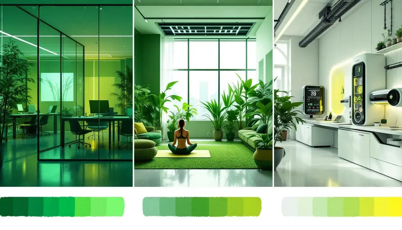
Picture a modern office space, designed to inspire creativity and collaboration. Light floods through expansive windows, illuminating walls rendered in Seafoam Green. A touch of Pale Lavender softens the atmosphere, while Teal Green accents add depth and intrigue. The Modern Balance palette isn’t afraid to mix boldness with tranquility. Bright Green provides an energetic lift, suggesting innovation and forward momentum. It's a space where ideas flow freely, and where employees feel both inspired and supported. Raspberry Pink adds a touch of playful sophistication. Envision a design agency’s branding, or an app interface that’s both intuitive and visually striking. This palette knows that success isn’t just about hard work; it’s about creating an environment that fosters imagination and encourages new approaches. A balance between gentle and bold builds confidence and security. It’s a visual invitation to think differently, to challenge long-held assumptions, to arrive with a new perspective. The balance between tranquility and energy makes it appropriate for today’s fast paced, technologically saturated world.
Imagine a cozy living room, perfect for a relaxed evening. Sunlight streams through sheer curtains, casting a warm glow upon the walls, painted in a muted Chartreuse. Earthy Contrast palette invites relaxation as the color scheme feels grounded in reality. Seafoam Green accents evoke a sense of calm and well being. Brick Red adds a touch of rustic warmth. The Charcoal Gray lends an air of sophistication. This palette is perfect for spaces that prioritize comfort and authenticity. Envision a wellness center's branding, or a website for organic products. It's an invitation to slow down, breathe deep, and connect with the simple pleasures of life. Deep Teal provides a grounding, natural element to the experience. This palette understands that true luxury lies in simplicity and comfort. It speaks to those who value authenticity and connection. The mix of warm and cool tones makes it incredibly versatile, suitable for spaces designed with both modern and traditional aesthetics. It's a visual reminder that life's greatest treasures are often found in the quiet, unassuming corners.
Visualize a dynamic workspace, designed to foster innovation and collaboration. Walls are painted in Aqua Blue, creating a sense of openness and possibility. Cornflower Blue accents add a touch of sophistication. The Fiverr Essence palette exudes confidence and professionalism. Bright Green infuses the space with energy and creativity. Picture a website for a tech startup, or a marketing campaign for a forward-thinking brand. This palette understands that success requires both skill and imagination. Deep Olive provides an grounding element as Navy Blue anchors the scheme. It's a visual declaration that you’re ready to tackle any challenge with confidence. It speaks to those who value collaboration, innovation, and a commitment to excellence. The sleek design and energizing colors make it great for brands that embrace digital creation. The Fiverr Essence declares value and competence.
Step into a state-of-the-art laboratory, where innovation and exploration come alive. Walls are bathed in Light Silver, enhancing the feeling of innovation and technology. Olive Green accents add a natural touch, bridging the gap between science and nature. The Cellular Tech palette exudes modernity and precision. Seafoam Green soothes as Dark Plum infuses intrigue into the atmosphere. Envision a website for a biotechnology company, or a presentation on cutting-edge research. This palette communicates credibility and innovation. It appeals to those who value accuracy, expertise, and a forward-thinking approach. Deep Sea provides a steady and familiar element. It speaks to those who appreciate a modern setting and a commitment to progress. It serves as a reminder that even in the most high-tech environments, it offers a vital link to the natural world.
The convergence of tones reveals a spectrum of possibilities: a sense of quiet confidence in spaces designed for wellness; a dynamic energy appropriate for those who value digital creation; precision for technological environments; a thoughtful balance between boldness and tranquility in the modern office; and an invitation to slow down, breathe deeply, and connect to simple pleasures in relaxed environments. The journey with each color palette reveals how colors have the power to define not just aesthetics, but also stories, experiences, value, progress, and well-being, shaping our perceptions and influencing the world around us. Based on the provided palettes, here are the top 10 industries that are related to palettes including at least one green hex value.
Here's the count:
- Technology: 4
- Healthcare: 3
- Wellness: 1
- Creative: 1
- Science: 1
Since there are less than 10 industries in the dataset, here's the list of all industries in descending order of frequency:
- Technology
- Healthcare
- Wellness
- Creative
- Science