'%3e%3cpath%20fill-rule='evenodd'%20clip-rule='evenodd'%20d='M51.1303%2019.2492C50.7278%2019.913%2050.1346%2020.4426%2049.3508%2020.838C48.5669%2021.2335%2047.6172%2021.4312%2046.5014%2021.4312C44.8208%2021.4312%2043.4367%2021.0216%2042.3492%2020.2025C41.2617%2019.3833%2040.6686%2018.2394%2040.5697%2016.7706H44.4253C44.4818%2017.3355%2044.6831%2017.7804%2045.0291%2018.1052C45.3751%2018.43%2045.8164%2018.5924%2046.3531%2018.5924C46.8192%2018.5924%2047.1864%2018.4653%2047.4547%2018.2111C47.7231%2017.9569%2047.8572%2017.618%2047.8572%2017.1943C47.8572%2016.8129%2047.7337%2016.4952%2047.4865%2016.241C47.2393%2015.9867%2046.9322%2015.7784%2046.565%2015.616C46.1978%2015.4536%2045.6893%2015.2594%2045.0397%2015.0334C44.0934%2014.7086%2043.3202%2014.3944%2042.72%2014.0907C42.1197%2013.7871%2041.6042%2013.3351%2041.1735%2012.7349C40.7427%2012.1347%2040.5273%2011.3544%2040.5273%2010.394C40.5273%209.50418%2040.7533%208.73448%2041.2053%208.08481C41.6572%207.43515%2042.2821%206.93731%2043.0801%206.5913C43.8781%206.24528%2044.7925%206.07227%2045.8235%206.07227C47.49%206.07227%2048.8141%206.46771%2049.7956%207.25861C50.7772%208.04951%2051.3315%209.13698%2051.4586%2010.5211H47.5395C47.4689%2010.0268%2047.2888%209.63483%2046.9993%209.3453C46.7097%209.05578%2046.3178%208.91102%2045.8235%208.91102C45.3998%208.91102%2045.0573%209.024%2044.7961%209.24997C44.5348%209.47594%2044.4041%209.80783%2044.4041%2010.2457C44.4041%2010.5988%2044.5207%2010.8989%2044.7537%2011.146C44.9867%2011.3932%2045.2798%2011.5944%2045.6328%2011.7498C45.9859%2011.9052%2046.4944%2012.1029%2047.1581%2012.343C48.1185%2012.6678%2048.9023%2012.9891%2049.5096%2013.3069C50.1169%2013.6246%2050.6395%2014.0872%2051.0773%2014.6945C51.5151%2015.3018%2051.734%2016.0927%2051.734%2017.0672C51.734%2017.8581%2051.5328%2018.5854%2051.1303%2019.2492ZM59.0242%206.3053V21.2829H55.4016V6.3053H59.0242ZM73.9409%206.3053V9.18642H69.8734V21.2829H66.2296V9.18642H62.2046V6.3053H73.9409ZM80.7438%209.18642V12.3218H85.8069V15.0546H80.7438V18.3806H86.4425V21.2829H77.1212V6.3053H86.4425V9.18642H80.7438ZM99.667%2016.0291V21.2829H96.0444V6.3053H101.913C103.692%206.3053%20105.048%206.74665%20105.98%207.62934C106.912%208.51204%20107.378%209.7019%20107.378%2011.199C107.378%2012.1311%20107.17%2012.9609%20106.753%2013.6882C106.337%2014.4155%20105.719%2014.9875%20104.9%2015.4042C104.08%2015.8208%20103.085%2016.0291%20101.913%2016.0291H99.667ZM103.692%2011.199C103.692%209.8855%20102.965%209.22879%20101.51%209.22879H99.667V13.1268H101.51C102.965%2013.1268%20103.692%2012.4842%20103.692%2011.199ZM120.092%2018.5501H114.478L113.546%2021.2829H109.732L115.219%206.41123H119.393L124.879%2021.2829H121.024L120.092%2018.5501ZM119.16%2015.7961L117.295%2010.2881L115.41%2015.7961H119.16ZM131.555%2018.5077H136.385V21.2829H127.933V6.3053H131.555V18.5077ZM143.337%209.18642V12.3218H148.4V15.0546H143.337V18.3806H149.035V21.2829H139.714V6.3053H149.035V9.18642H143.337ZM163.507%206.3053V9.18642H159.44V21.2829H155.796V9.18642H151.771V6.3053H163.507ZM177.449%206.3053V9.18642H173.382V21.2829H169.738V9.18642H165.713V6.3053H177.449ZM184.252%209.18642V12.3218H189.315V15.0546H184.252V18.3806H189.951V21.2829H180.629V6.3053H189.951V9.18642H184.252Z'%20fill='%23EEF0ED'/%3e%3cmask%20id='mask0_3101_7327'%20style='mask-type:alpha'%20maskUnits='userSpaceOnUse'%20x='0'%20y='0'%20width='27'%20height='28'%3e%3cpath%20d='M23.8328%200.759766H2.64808C1.18559%200.759766%200%201.94535%200%203.40785V24.5925C0%2026.055%201.18559%2027.2406%202.64808%2027.2406H23.8328C25.2952%2027.2406%2026.4808%2026.055%2026.4808%2024.5925V3.40785C26.4808%201.94535%2025.2952%200.759766%2023.8328%200.759766Z'%20fill='white'/%3e%3c/mask%3e%3cg%20mask='url(%23mask0_3101_7327)'%3e%3cpath%20d='M23.8328%200.759766H2.64808C1.18559%200.759766%200%201.94535%200%203.40785V24.5925C0%2026.055%201.18559%2027.2406%202.64808%2027.2406H23.8328C25.2952%2027.2406%2026.4808%2026.055%2026.4808%2024.5925V3.40785C26.4808%201.94535%2025.2952%200.759766%2023.8328%200.759766Z'%20fill='%23D8D8D8'/%3e%3cpath%20d='M13.2404%200.759766H0V14.0001H13.2404V0.759766Z'%20fill='%238C61FF'/%3e%3cpath%20d='M13.2404%2014H0V27.2404H13.2404V14Z'%20fill='%2336C3FE'/%3e%3cpath%20d='M26.4806%2014H13.2402V27.2404H26.4806V14Z'%20fill='%236592FE'/%3e%3cpath%20d='M26.4806%200.759766H13.2402V14.0002H26.4806V0.759766Z'%20fill='%236059F7'/%3e%3c/g%3e%3c/g%3e%3cdefs%3e%3cclipPath%20id='clip0_3101_7327'%3e%3crect%20width='190'%20height='28'%20fill='white'/%3e%3c/clipPath%3e%3c/defs%3e%3c/svg%3e)
'%3e%3cpath%20d='M23.8328%200.759521H2.64808C1.18559%200.759521%200%201.94511%200%203.40761V24.5923C0%2026.0548%201.18559%2027.2404%202.64808%2027.2404H23.8328C25.2952%2027.2404%2026.4808%2026.0548%2026.4808%2024.5923V3.40761C26.4808%201.94511%2025.2952%200.759521%2023.8328%200.759521Z'%20fill='%23D8D8D8'/%3e%3cpath%20d='M13.2404%200.759521H0V13.9999H13.2404V0.759521Z'%20fill='%238C61FF'/%3e%3cpath%20d='M13.2404%2013.9998H0V27.2402H13.2404V13.9998Z'%20fill='%2336C3FE'/%3e%3cpath%20d='M26.4809%2013.9998H13.2405V27.2402H26.4809V13.9998Z'%20fill='%236592FE'/%3e%3cpath%20d='M26.4809%200.759277H13.2405V13.9997H26.4809V0.759277Z'%20fill='%236059F7'/%3e%3c/g%3e%3c/svg%3e)
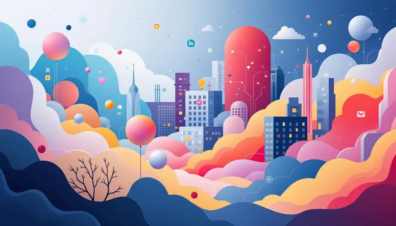
Unlocking User Engagement: Top Colors in Social Media Palettes
18 Aug 2025 · 3 min readWith a swipe and a tap, we plunge into social spheres, realms defined not merely by content, but by feeling. Color, the silent language of our screens, dictates the mood of these ephemeral interactions. It whispers of trust, shouts of urgency, or lulls with familiarity. The right palette can transform a fleeting glance into a lingering connection, turning a simple scroll into an active embrace. Forget algorithms and engagement rates for a moment, and consider the simple power of attraction. Does this space feel inviting? Does it feel authentic? Every choice of color becomes a deliberate act of world-building, each hue a conscious decision about how others perceive, feel, and ultimately, interact within our shared digital spaces. Our challenge lies in translating the language of color into engagement, painting vibrant worlds that capture and hold attention.
The "Reddit Palette" channels a distinctive blend of approachability and technological sophistication. Pure White offers a blank canvas, a starting point as clean and neutral as the promise of a fresh thread. The Pale Mint brings a touch of freshness, a suggestion of forward-thinking that contrasts beautifully with the nostalgic Light Peach. Bright Sky Blue speaks of clarity and aspiration, a fitting hue for a community built on shared knowledge and open discussion. The presence of Light Steel Gray hints at sturdy construction, a grounding in logic and reason. However, the Burnt Sienna and Vibrant Orange introduce a much-needed spark of humanity. These warmer tones prevent the palette from feeling sterile or clinical, reminding users of the lively debates and passionate opinions that characterize the platform. The inclusion of Deep Navy introduces a sense of authority, while Cool Gray provides a bridge to the Deep Charcoal backdrop often favored in contemporary interfaces, lending an air of modern mystery. Taken together, these colors create a welcoming and trustworthy digital environment, inviting users to both consume and contribute, fostering a sense of belonging within the complex landscape of online forums. It suggests order crafted from chaos.
"Urban Blend" offers a far more grounded sensibility, weaving together the grit and beauty often found within cityscapes. Immediately, Off White presents itself as a soft, diffused light, reflecting off weathered brick and concrete. The Lilac Gray adds a touch of delicate sophistication, a suggestion of blooming spring amid a stark environment. Light Cyan provides a refreshing burst of color, evocative of street art and unexpected pockets of nature. Steel Gray grounds the palette in reality, hinting at the structural underpinnings of industry and transport. A courageous Rose Pink bursts forth with an energy that's hard to ignore, suggesting vibrant displays of creativity. The Forest Green embodies renewal, a testament to the persistent power of nature. Rustic Brown offers a sense of warmth and heritage, creating a comforting feeling of reliability. The Magenta Red is disruptive and confident, embodying individuality. As with the "Reddit Palette", Deep Charcoal holds the composition together, as the inky sky over the skyline does, where most of the digital activity is happening. Navy Blue pulls this even further, suggesting a night of urban adventures. This palette would suit those interested in brand building and web design.
"Vibrant Harmony" lives up to its name, presenting a diverse array of colors which still hold together. Pure White is the starting point, similar to the "Reddit Palette" and "Urban Blend". Pale Yellow shines through, introducing a feeling of joy. Golden Yellow introduces a summery edge. Sky Blue offers a clean cut transition to the muted Dusty Lavender, which softens the palette and provides a dreamlike air. Mustard Brown is quite unusual, yet familiar, lending a worldly touch. The Teal Green is refreshing -- perhaps hinting at technology's embrace of nature. Deep Indigo adds a sense of structure, while Charcoal Gray anchors these brighter tones. Finally, Bright Red suggests courage and confidence. The effect evokes an energetic, hopeful atmosphere. It suits modern sensibilities and can be implemented in celebratory campaigns, or tech-forward and marketing initiatives.
"Warm Palette" leans into an atmosphere of welcome and invitation. The presence of Pure White echoes the earlier palettes, presenting an opportunity to establish a clean, modern feel. Light Grey functions as a gentle cushion to the more dominant hues. The Light Coral radiates a playful energy. Steel Grey offers a contrasting point. Bright Orange ignites a spark, drawing eyes and encouraging engagement. Vivid Red suggests confidence and action, while Burgundy Red introduces a touch of elevated sophistication. Finally, Dark Coffee grounds these brighter shades, adding depth and warmth. The overall effect is one of accessibility and approachability, best suited during celebratory campaigns for companies in the marketing and food industries.
The palettes explored offer distinct approaches to capturing attention and fostering engagement online. From the intellectual curiosity inspired by the "Reddit Palette" to the grounded beauty of "Urban Blend," the lively optimism of "Vibrant Harmony," and the immediate invitation of the "Warm Palette", each collection presents a unique opportunity to connect with users on an emotional level. These aren't merely colors; they're carefully constructed atmospheres, thoughtfully curated to shape experiences and inspire connection, one pixel at a time. When implemented thoughtfully, color selections can be a path to brand building and creating experiences that users will treasure.