'%3e%3cpath%20fill-rule='evenodd'%20clip-rule='evenodd'%20d='M51.1303%2019.2492C50.7278%2019.913%2050.1346%2020.4426%2049.3508%2020.838C48.5669%2021.2335%2047.6172%2021.4312%2046.5014%2021.4312C44.8208%2021.4312%2043.4367%2021.0216%2042.3492%2020.2025C41.2617%2019.3833%2040.6686%2018.2394%2040.5697%2016.7706H44.4253C44.4818%2017.3355%2044.6831%2017.7804%2045.0291%2018.1052C45.3751%2018.43%2045.8164%2018.5924%2046.3531%2018.5924C46.8192%2018.5924%2047.1864%2018.4653%2047.4547%2018.2111C47.7231%2017.9569%2047.8572%2017.618%2047.8572%2017.1943C47.8572%2016.8129%2047.7337%2016.4952%2047.4865%2016.241C47.2393%2015.9867%2046.9322%2015.7784%2046.565%2015.616C46.1978%2015.4536%2045.6893%2015.2594%2045.0397%2015.0334C44.0934%2014.7086%2043.3202%2014.3944%2042.72%2014.0907C42.1197%2013.7871%2041.6042%2013.3351%2041.1735%2012.7349C40.7427%2012.1347%2040.5273%2011.3544%2040.5273%2010.394C40.5273%209.50418%2040.7533%208.73448%2041.2053%208.08481C41.6572%207.43515%2042.2821%206.93731%2043.0801%206.5913C43.8781%206.24528%2044.7925%206.07227%2045.8235%206.07227C47.49%206.07227%2048.8141%206.46771%2049.7956%207.25861C50.7772%208.04951%2051.3315%209.13698%2051.4586%2010.5211H47.5395C47.4689%2010.0268%2047.2888%209.63483%2046.9993%209.3453C46.7097%209.05578%2046.3178%208.91102%2045.8235%208.91102C45.3998%208.91102%2045.0573%209.024%2044.7961%209.24997C44.5348%209.47594%2044.4041%209.80783%2044.4041%2010.2457C44.4041%2010.5988%2044.5207%2010.8989%2044.7537%2011.146C44.9867%2011.3932%2045.2798%2011.5944%2045.6328%2011.7498C45.9859%2011.9052%2046.4944%2012.1029%2047.1581%2012.343C48.1185%2012.6678%2048.9023%2012.9891%2049.5096%2013.3069C50.1169%2013.6246%2050.6395%2014.0872%2051.0773%2014.6945C51.5151%2015.3018%2051.734%2016.0927%2051.734%2017.0672C51.734%2017.8581%2051.5328%2018.5854%2051.1303%2019.2492ZM59.0242%206.3053V21.2829H55.4016V6.3053H59.0242ZM73.9409%206.3053V9.18642H69.8734V21.2829H66.2296V9.18642H62.2046V6.3053H73.9409ZM80.7438%209.18642V12.3218H85.8069V15.0546H80.7438V18.3806H86.4425V21.2829H77.1212V6.3053H86.4425V9.18642H80.7438ZM99.667%2016.0291V21.2829H96.0444V6.3053H101.913C103.692%206.3053%20105.048%206.74665%20105.98%207.62934C106.912%208.51204%20107.378%209.7019%20107.378%2011.199C107.378%2012.1311%20107.17%2012.9609%20106.753%2013.6882C106.337%2014.4155%20105.719%2014.9875%20104.9%2015.4042C104.08%2015.8208%20103.085%2016.0291%20101.913%2016.0291H99.667ZM103.692%2011.199C103.692%209.8855%20102.965%209.22879%20101.51%209.22879H99.667V13.1268H101.51C102.965%2013.1268%20103.692%2012.4842%20103.692%2011.199ZM120.092%2018.5501H114.478L113.546%2021.2829H109.732L115.219%206.41123H119.393L124.879%2021.2829H121.024L120.092%2018.5501ZM119.16%2015.7961L117.295%2010.2881L115.41%2015.7961H119.16ZM131.555%2018.5077H136.385V21.2829H127.933V6.3053H131.555V18.5077ZM143.337%209.18642V12.3218H148.4V15.0546H143.337V18.3806H149.035V21.2829H139.714V6.3053H149.035V9.18642H143.337ZM163.507%206.3053V9.18642H159.44V21.2829H155.796V9.18642H151.771V6.3053H163.507ZM177.449%206.3053V9.18642H173.382V21.2829H169.738V9.18642H165.713V6.3053H177.449ZM184.252%209.18642V12.3218H189.315V15.0546H184.252V18.3806H189.951V21.2829H180.629V6.3053H189.951V9.18642H184.252Z'%20fill='%23EEF0ED'/%3e%3cmask%20id='mask0_3101_7327'%20style='mask-type:alpha'%20maskUnits='userSpaceOnUse'%20x='0'%20y='0'%20width='27'%20height='28'%3e%3cpath%20d='M23.8328%200.759766H2.64808C1.18559%200.759766%200%201.94535%200%203.40785V24.5925C0%2026.055%201.18559%2027.2406%202.64808%2027.2406H23.8328C25.2952%2027.2406%2026.4808%2026.055%2026.4808%2024.5925V3.40785C26.4808%201.94535%2025.2952%200.759766%2023.8328%200.759766Z'%20fill='white'/%3e%3c/mask%3e%3cg%20mask='url(%23mask0_3101_7327)'%3e%3cpath%20d='M23.8328%200.759766H2.64808C1.18559%200.759766%200%201.94535%200%203.40785V24.5925C0%2026.055%201.18559%2027.2406%202.64808%2027.2406H23.8328C25.2952%2027.2406%2026.4808%2026.055%2026.4808%2024.5925V3.40785C26.4808%201.94535%2025.2952%200.759766%2023.8328%200.759766Z'%20fill='%23D8D8D8'/%3e%3cpath%20d='M13.2404%200.759766H0V14.0001H13.2404V0.759766Z'%20fill='%238C61FF'/%3e%3cpath%20d='M13.2404%2014H0V27.2404H13.2404V14Z'%20fill='%2336C3FE'/%3e%3cpath%20d='M26.4806%2014H13.2402V27.2404H26.4806V14Z'%20fill='%236592FE'/%3e%3cpath%20d='M26.4806%200.759766H13.2402V14.0002H26.4806V0.759766Z'%20fill='%236059F7'/%3e%3c/g%3e%3c/g%3e%3cdefs%3e%3cclipPath%20id='clip0_3101_7327'%3e%3crect%20width='190'%20height='28'%20fill='white'/%3e%3c/clipPath%3e%3c/defs%3e%3c/svg%3e)
'%3e%3cpath%20d='M23.8328%200.759521H2.64808C1.18559%200.759521%200%201.94511%200%203.40761V24.5923C0%2026.0548%201.18559%2027.2404%202.64808%2027.2404H23.8328C25.2952%2027.2404%2026.4808%2026.0548%2026.4808%2024.5923V3.40761C26.4808%201.94511%2025.2952%200.759521%2023.8328%200.759521Z'%20fill='%23D8D8D8'/%3e%3cpath%20d='M13.2404%200.759521H0V13.9999H13.2404V0.759521Z'%20fill='%238C61FF'/%3e%3cpath%20d='M13.2404%2013.9998H0V27.2402H13.2404V13.9998Z'%20fill='%2336C3FE'/%3e%3cpath%20d='M26.4809%2013.9998H13.2405V27.2402H26.4809V13.9998Z'%20fill='%236592FE'/%3e%3cpath%20d='M26.4809%200.759277H13.2405V13.9997H26.4809V0.759277Z'%20fill='%236059F7'/%3e%3c/g%3e%3c/svg%3e)
The Architect's Choice: Trending Colors in Architectural Design Projects
18 Aug 2025 · 3 min readColor, in architecture, is more than just surface decoration; it's the very air a building breathes. It shapes our perceptions, alters our moods, and dictates how we experience a space. Think of the sun-baked terracotta hues of a Tuscan villa, whispering of warmth and history, or the crisp, cool white of a Scandinavian home, evoking a sense of serenity and minimalist grace. Color choices articulate intent, transforming mere structures into evocative environments. It speaks volumes about the building's purpose, its relationship with its surroundings, and the feeling it wishes to inspire within its inhabitants. The selection of a color palette for an architectural project is, therefore, a crucial act of storytelling, carefully weaving together form and feeling.
The "Earthy Elegance" 🌲 palette whispers of understated luxury, evoking a sense of calm sophistication within a space. It suggests a seamless marriage between the natural world and the built environment, like sunlight filtering through the leaves of an ancient forest into a minimalist living room. Imagine a residence where the walls are painted in Pure White, acting as a canvas for accents of Teal Green in the furniture or perhaps Golden Bronze in the light fixtures, creating a subtle interplay of light and shadow, and depth. This scheme lends itself particularly well to spaces aiming for a refuge from the outside world, a sanctuary of peace and relaxation. Light Gray surfaces can create a neutral counterpoint to the bolder hues, while touches of Royal Blue could appear in artwork or textiles adding unexpected elegance. The Deep Charcoal and Dark Gray anchors the palette, giving gravitas to spaces in need of formal definition. Pale Beige brings warmth to walls and textiles. This palette offers a tranquil yet refined aesthetic, capable of transforming the mundane into the sublime. The feeling isn’t one of ostentation but of quiet confidence and effortless style. Picture a loft apartment with exposed brick painted Pure White, softened by touches of Seafoam Green fabrics and natural wood furniture. The color story unfolds as the visitor moves through the building, culminating in spaces of deep contemplation and a sense of serenity, showcasing just how powerfully this scheme can elevate the architectural intent from mere construction to a curated and deeply satisfying living experience. "Earthy Elegance" moves away from harsh modernism, embracing the beauty of imperfection and creating an atmosphere of effortless living: the very essence of "Architect’s Choice".
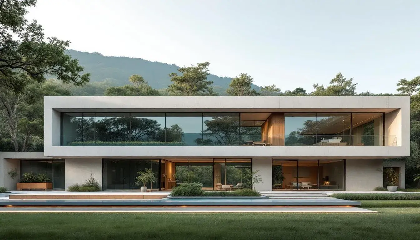
The "Earthy Construction" 🏗️ palette speaks to the raw authenticity of the built environment. Picture a sun-drenched loft, where exposed brick and unfinished concrete meet polished plaster and refined furnishings. The palette celebrates the materials themselves, allowing their natural colors to shine through. The Light Grayish Beige of aged plaster contrasts beautifully with the Neutral Gray of the concrete, creating a dynamic interplay of textures and tones. Consider an office space in a converted warehouse, where Muted Olive Green accents soften the industrial aesthetic and connect with the nature outside. Taupe Brown can bring warmth to otherwise cold or stark areas, perhaps as wood paneling or leather upholstery. Dark Olive hints at earthiness, and gives the occupant a sense of safety in an area of activity and concentration. This approach creates spaces that feel both intentional and effortless, spaces that tell a story of the building's history and its evolution. The resulting atmosphere is one of rugged elegance, where imperfections are celebrated as marks of character and the beauty of the building lies in its honesty. Think of a community center or a library that promotes a gathering place, and also a visual statement of its values and vision. "Earthy Construction" is not just about aesthetics; it's a philosophy of design that prioritizes sustainability, longevity, and a deep connection to place. It is a tribute to the power and potential of well-considered design.
The "Earthy Blues" 🎨 palette is akin to a serene seascape on a cloudy day, where light shifts through the sky and reflects off the surface of the water. It is a palette that whispers of calm, reflection, and a deep connection to the natural world. Imagine a seaside villa where walls are painted in Light Sky Blue, creating a sense of airy spaciousness, while Muted Teal accents appear in furniture and art objects. These blues evoke the feeling of wide-open spaces, and natural light streaming through great windows, making it ideal for creating environments that promote relaxation and a sense of peace. The Russet Brown provides a grounding element, like driftwood on the beach, while the soft variations of blues, from the subtle blue of the sky on a hazy morning to the deep Teal Blue reminds of a tranquil horizon. Dark Slate Gray introduces a sophisticated architectural anchor to the palette. "Earthy Blues" embraces simplicity and finds beauty in the subtle shifts of light and color. This is a palette for those who seek solace in the built environment, a sanctuary from the stresses of modern life. It connects the interior space with the exterior world, creating a relationship between architecture and nature that provides a sense of continuity, elegance and timeless appeal.
With "Modern Palette" 🎨 the architecture evokes a mood that is both refined and restful, inviting contemplation. Imagine light filtering through sheer curtains, casting shadows across surfaces of varying degrees of reflection. A Silver Gray establishes the framework, akin to the steel structure of a building. This neutral background allows the Olive Gold to glimmer as accents in light fixtures or trims. Rose Red evokes a sense of warmth in textile furnishing. The Plum Wine brings darkness and a strong modern mood in the setting, and Dark Forest brings the feeling of biophilia. Imagine entering a building bathed soft, diffused natural light, where the interior is not demanding, but instead invites you to pause and contemplate the design elements. Every decision contributes to an immersive experience that marries simplicity of form with the depth of sensory stimulation. The color scheme emphasizes quality over quantity, choosing materials that wear well and improve in time. The Modern Palette brings timeless style, an element to look for when choosing "Architect's choices".
The "Earthy Contrast" 🍁 palette is a story of visual tension and harmonious balance, capturing the essence of sophistication. The Pure White shines, creating a pristine backdrop that allows other shades to stand out. Soft Gray provides a sophisticated background in the scheme. Imagine this palette in a minimalist art gallery; the strong contrast between the surfaces of burnt umber hues, like Burnt Sienna, and the Deep Black is dramatic. The Charcoal Gray is like a shadow with a strong personality. Crimson Red is a call for attention, and provides a focal point. This palette doesn't whisper; it speaks with confidence and style and expresses intent and elegance through strong shapes and curated elements. This is a palette that transforms spaces into personal statements, reflections of a discerning eye and appreciation for the art of architecture, an example of "Architect’s Choice".
In summation, these color palettes represent a sophisticated range of choices for the architect aiming to communicate clear narratives through design. From the understated grace of "Earthy Elegance" 🌲 to the raw honesty of "Earthy Construction" 🏗️, each offers a unique possibility for shaping experiences and emotions within the built environment. "Earthy Blues" 🎨 offers its contemplative serenity, "Modern Palette" 🎨 marries simplicity and sophistication, and the "Earthy Contrast" 🍁 palette conveys both balance and visual drama. These palettes collectively exemplify the potential of color to transcend mere decoration, evolving instead into fundamental elements of architectural storytelling.