Dominant vs Thief: Which Colors REALLY Define a Palette?
18 Aug 2025 · 5 min readColor whispers and shouts. It builds worlds without words, evokes feelings deeper than prose. It’s the silent language of design, where shades and tones create the atmosphere we breathe. The interplay of light and dark, the subtle dance of hues, is more than just aesthetics — it's a story waiting to be told. But which shades reign supreme? Are they the declared leaders, the colors strategically positioned at the forefront, or the quiet influencers, subtly shaping the very fabric of the chromatic experience? This exploration moves past surface-level observations, diving into the spirit each palette invokes. We will ask: What stories do these colors tell? Who are they for? And what are their true intentions?
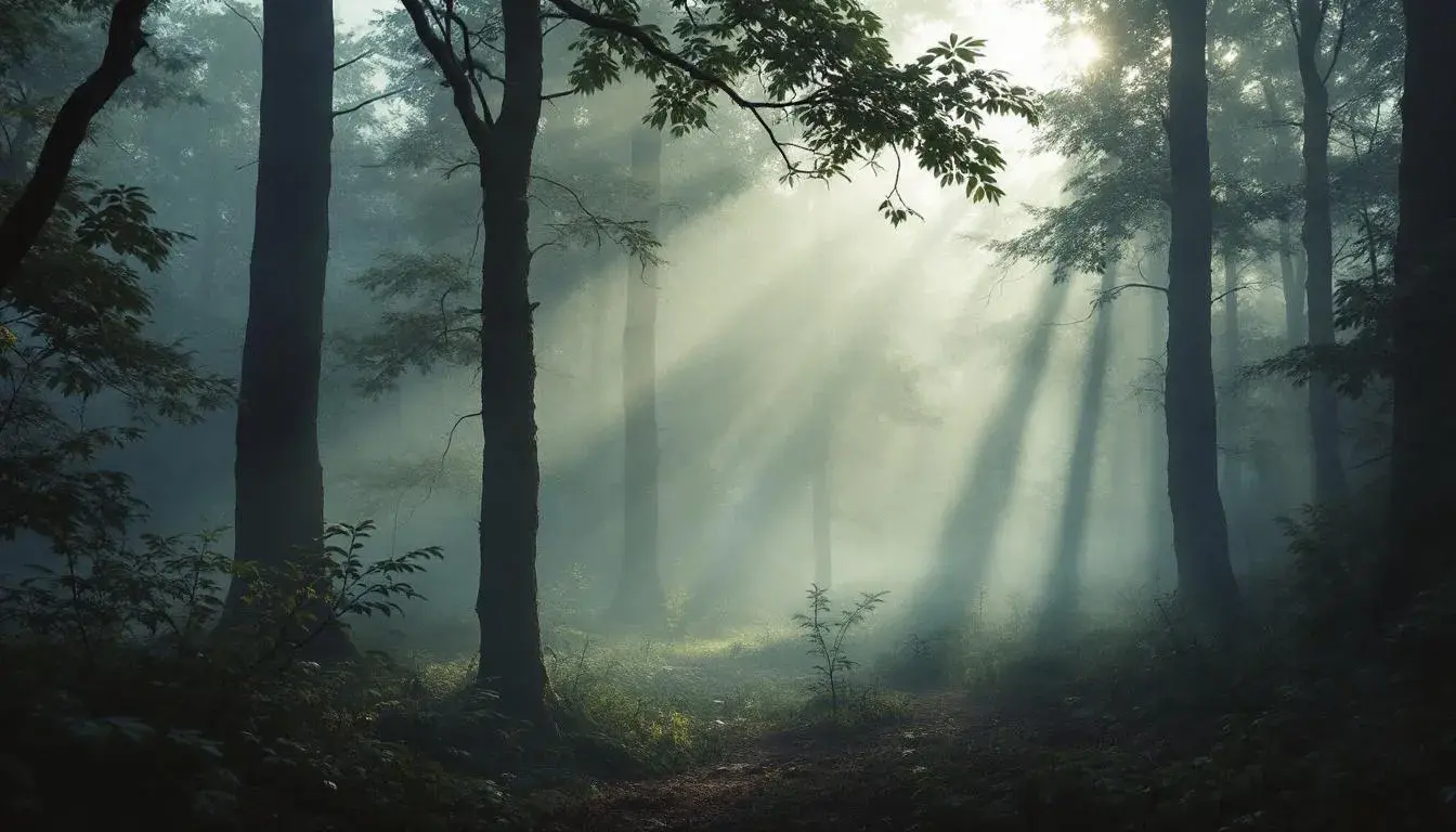
The "Cool Grays" palette invites introspection. A sense of measured calm washes over you, like a soft rain on a city street. Pale Gray leads, whispering of quiet mornings and the gentle hum of focused thought, while a slate blue hints at hidden depths, a touch of melancholy and the allure of shadowed places. There is a Smoky Mauve, its name suggesting the quiet moments before dusk. Dusty Blue adds a touch of the intellectual, a place where ideas are formed. Deep Black anchors the palette, giving gravitas to the thoughtful atmosphere, a reminder of the strength found within stillness. This isn’t a space for vibrancy or excitement, it’s a retreat for contemplation and mindful creation, where the world outside fades into a muted backdrop. If colors were sounds, this would be the quiet turning of pages, the soft scratch of a pencil on paper. It's a palette for those who seek refuge in simplicity, crafting a world bathed in quiet assurance. Those drawn to the peace of a misty morning might find solace here.
"Neutral Grays" evokes a world of quiet sophistication. Imagine the hushed seriousness of a gallery space, where the art speaks for itself. Light Silver hints at reflection, a glimmer of potential. Slate Gray and Ash Gray settle into the background, dependable and steady. Dark Taupe offers a grounding presence, a step away from the lightest hues, but not quite as dramatic. A sense of controlled intensity builds towards Deep Charcoal, which offers that final, reliable contrast. This subdued arrangement creates an environment where focus is paramount, where distractions melt away into a seamless blend. The colors never interrupt; instead, they allow what’s held within to breathe. This palette creates a sense of reliability, a stable foundation where creativity can flow. Those seeking to craft a space of quiet professionalism would find this incredibly useful.
"Bold Contrast" announces its presence with a palpable energy. The warmth radiating outwards creates excitement. Dusty Rose whispers of sunsets and fading light, while Burnt Sienna grounds the palette with the feel of sun-baked earth. Salmon Pink adds a vibrant touch, a burst of unexpected joy, and Slate Gray brings a necessary balance, a grounding force in a world of intense color. Finally, Crimson Red creates a feeling of passion and life. This color scheme feels electric, a reminder of the boldness that can emerge when warm tones and stark contrast come together. It feels like the cusp of autumn; a season where the days grow shorter and nights bring cooler air, while colors become increasingly brilliant before shedding. The palette feels alive, ready for anything.
"Neutral Elegance" offers a refuge of gentle and considered luxury. Light Beige provides a starting point of clean simplicity, suggesting a world free of fuss. Olive Drab sits comfortably between the other shades, like a moss covered stone in a secluded garden. Dark Taupe adds a subtle, sturdy character that does not demand attention. This quiet confidence slowly builds towards Deep Gray. The palette resolves finally to a Very Dark Olive, that gives the combination reliability. Imagine slipping into a room designed in these shades, a place where every detail is chosen with intention. The palette offers a sense of heritage. It hints at a timeless taste, where quality and mindfulness stand central.
"Elegant Noir" unfolds a world of sophisticated drama. Creamy Beige provides a vintage foundation, offering comfort and delicacy. Neutral Grey creates a sense of stability, preparing the viewer to explore the more imposing colors within the palette. Dusty Rose interrupts with a romantic tone; an evocation of nostalgia. The palette builds to Dark Crimson, a show of bold character with a confident, yet subtle approach. Finally, Onyx Black stands strong, anchoring the palette. The noir of the name comes through from the contrast. Consider an evening spent in a jazz club bathed in shadows, the lingering scent of rich perfume. This combination would suit individuals who prefer the dramatic in a careful, poised approach.
"Earthy Contrast" evokes a powerful connection to the natural world. Pale Apricot presents a gentle invitation, setting the stage for the palette to unfold. Steel Gray grounds the combination, like the bark of a tree weathered by time. Dark Denim Blue offers a cooling touch, whispering of twilight skies. Crimson Red rises up suggesting late summer fruits, and finally, Deep Burgundy seals the palette in a mysterious tone. Imagine a room filled with found objects and soft lighting. The colors transport you, away from the manufactured and into the raw beauty of the wilderness. This offers a comforting, grounding, and inspirational feel.
These palettes, unveiled piece by piece, reveal that color is far more than what meets the eye. It shapes our experiences, influences our emotions, and whispers to our subconscious. From the poised composure of "Neutral Elegance" to the energetic statement of "Bold Contrast", each combination forges a unique narrative. It is less about which colors are objectively dominant, as much as about a carefully considered balance capable of speaking directly to the hearts and minds of those who experience them.