'%3e%3cpath%20fill-rule='evenodd'%20clip-rule='evenodd'%20d='M51.1303%2019.2492C50.7278%2019.913%2050.1346%2020.4426%2049.3508%2020.838C48.5669%2021.2335%2047.6172%2021.4312%2046.5014%2021.4312C44.8208%2021.4312%2043.4367%2021.0216%2042.3492%2020.2025C41.2617%2019.3833%2040.6686%2018.2394%2040.5697%2016.7706H44.4253C44.4818%2017.3355%2044.6831%2017.7804%2045.0291%2018.1052C45.3751%2018.43%2045.8164%2018.5924%2046.3531%2018.5924C46.8192%2018.5924%2047.1864%2018.4653%2047.4547%2018.2111C47.7231%2017.9569%2047.8572%2017.618%2047.8572%2017.1943C47.8572%2016.8129%2047.7337%2016.4952%2047.4865%2016.241C47.2393%2015.9867%2046.9322%2015.7784%2046.565%2015.616C46.1978%2015.4536%2045.6893%2015.2594%2045.0397%2015.0334C44.0934%2014.7086%2043.3202%2014.3944%2042.72%2014.0907C42.1197%2013.7871%2041.6042%2013.3351%2041.1735%2012.7349C40.7427%2012.1347%2040.5273%2011.3544%2040.5273%2010.394C40.5273%209.50418%2040.7533%208.73448%2041.2053%208.08481C41.6572%207.43515%2042.2821%206.93731%2043.0801%206.5913C43.8781%206.24528%2044.7925%206.07227%2045.8235%206.07227C47.49%206.07227%2048.8141%206.46771%2049.7956%207.25861C50.7772%208.04951%2051.3315%209.13698%2051.4586%2010.5211H47.5395C47.4689%2010.0268%2047.2888%209.63483%2046.9993%209.3453C46.7097%209.05578%2046.3178%208.91102%2045.8235%208.91102C45.3998%208.91102%2045.0573%209.024%2044.7961%209.24997C44.5348%209.47594%2044.4041%209.80783%2044.4041%2010.2457C44.4041%2010.5988%2044.5207%2010.8989%2044.7537%2011.146C44.9867%2011.3932%2045.2798%2011.5944%2045.6328%2011.7498C45.9859%2011.9052%2046.4944%2012.1029%2047.1581%2012.343C48.1185%2012.6678%2048.9023%2012.9891%2049.5096%2013.3069C50.1169%2013.6246%2050.6395%2014.0872%2051.0773%2014.6945C51.5151%2015.3018%2051.734%2016.0927%2051.734%2017.0672C51.734%2017.8581%2051.5328%2018.5854%2051.1303%2019.2492ZM59.0242%206.3053V21.2829H55.4016V6.3053H59.0242ZM73.9409%206.3053V9.18642H69.8734V21.2829H66.2296V9.18642H62.2046V6.3053H73.9409ZM80.7438%209.18642V12.3218H85.8069V15.0546H80.7438V18.3806H86.4425V21.2829H77.1212V6.3053H86.4425V9.18642H80.7438ZM99.667%2016.0291V21.2829H96.0444V6.3053H101.913C103.692%206.3053%20105.048%206.74665%20105.98%207.62934C106.912%208.51204%20107.378%209.7019%20107.378%2011.199C107.378%2012.1311%20107.17%2012.9609%20106.753%2013.6882C106.337%2014.4155%20105.719%2014.9875%20104.9%2015.4042C104.08%2015.8208%20103.085%2016.0291%20101.913%2016.0291H99.667ZM103.692%2011.199C103.692%209.8855%20102.965%209.22879%20101.51%209.22879H99.667V13.1268H101.51C102.965%2013.1268%20103.692%2012.4842%20103.692%2011.199ZM120.092%2018.5501H114.478L113.546%2021.2829H109.732L115.219%206.41123H119.393L124.879%2021.2829H121.024L120.092%2018.5501ZM119.16%2015.7961L117.295%2010.2881L115.41%2015.7961H119.16ZM131.555%2018.5077H136.385V21.2829H127.933V6.3053H131.555V18.5077ZM143.337%209.18642V12.3218H148.4V15.0546H143.337V18.3806H149.035V21.2829H139.714V6.3053H149.035V9.18642H143.337ZM163.507%206.3053V9.18642H159.44V21.2829H155.796V9.18642H151.771V6.3053H163.507ZM177.449%206.3053V9.18642H173.382V21.2829H169.738V9.18642H165.713V6.3053H177.449ZM184.252%209.18642V12.3218H189.315V15.0546H184.252V18.3806H189.951V21.2829H180.629V6.3053H189.951V9.18642H184.252Z'%20fill='%23EEF0ED'/%3e%3cmask%20id='mask0_3101_7327'%20style='mask-type:alpha'%20maskUnits='userSpaceOnUse'%20x='0'%20y='0'%20width='27'%20height='28'%3e%3cpath%20d='M23.8328%200.759766H2.64808C1.18559%200.759766%200%201.94535%200%203.40785V24.5925C0%2026.055%201.18559%2027.2406%202.64808%2027.2406H23.8328C25.2952%2027.2406%2026.4808%2026.055%2026.4808%2024.5925V3.40785C26.4808%201.94535%2025.2952%200.759766%2023.8328%200.759766Z'%20fill='white'/%3e%3c/mask%3e%3cg%20mask='url(%23mask0_3101_7327)'%3e%3cpath%20d='M23.8328%200.759766H2.64808C1.18559%200.759766%200%201.94535%200%203.40785V24.5925C0%2026.055%201.18559%2027.2406%202.64808%2027.2406H23.8328C25.2952%2027.2406%2026.4808%2026.055%2026.4808%2024.5925V3.40785C26.4808%201.94535%2025.2952%200.759766%2023.8328%200.759766Z'%20fill='%23D8D8D8'/%3e%3cpath%20d='M13.2404%200.759766H0V14.0001H13.2404V0.759766Z'%20fill='%238C61FF'/%3e%3cpath%20d='M13.2404%2014H0V27.2404H13.2404V14Z'%20fill='%2336C3FE'/%3e%3cpath%20d='M26.4806%2014H13.2402V27.2404H26.4806V14Z'%20fill='%236592FE'/%3e%3cpath%20d='M26.4806%200.759766H13.2402V14.0002H26.4806V0.759766Z'%20fill='%236059F7'/%3e%3c/g%3e%3c/g%3e%3cdefs%3e%3cclipPath%20id='clip0_3101_7327'%3e%3crect%20width='190'%20height='28'%20fill='white'/%3e%3c/clipPath%3e%3c/defs%3e%3c/svg%3e)
'%3e%3cpath%20d='M23.8328%200.759521H2.64808C1.18559%200.759521%200%201.94511%200%203.40761V24.5923C0%2026.0548%201.18559%2027.2404%202.64808%2027.2404H23.8328C25.2952%2027.2404%2026.4808%2026.0548%2026.4808%2024.5923V3.40761C26.4808%201.94511%2025.2952%200.759521%2023.8328%200.759521Z'%20fill='%23D8D8D8'/%3e%3cpath%20d='M13.2404%200.759521H0V13.9999H13.2404V0.759521Z'%20fill='%238C61FF'/%3e%3cpath%20d='M13.2404%2013.9998H0V27.2402H13.2404V13.9998Z'%20fill='%2336C3FE'/%3e%3cpath%20d='M26.4809%2013.9998H13.2405V27.2402H26.4809V13.9998Z'%20fill='%236592FE'/%3e%3cpath%20d='M26.4809%200.759277H13.2405V13.9997H26.4809V0.759277Z'%20fill='%236059F7'/%3e%3c/g%3e%3c/svg%3e)
The Psychology of Home: Trending Color Schemes for Relaxation in 2025
15 Aug 2025 · 3 min readThe home, a sanctuary from the ceaseless currents of modern life, is poised for a chromatic shift in 2025. We're moving away from stark minimalism toward spaces that breathe, reassure, and gently cradle the senses. Color, the silent architect of emotion, becomes paramount. Forget jarring pronouncements, expect whispers of tranquility. Imagine walls that recede like mist, textiles that feel like a soft breath against the skin, and light that filters through spaces rather than blazes. The palettes surfacing are not merely decorative, they are curative. They are about creating environments that actively soothe, encouraging a state of presence and peaceful introspection. The psychology of color isn't a trend; it's a recalibration, a conscious effort to weave calm into the very fabric of our living spaces. It's about coming home, not just to a place, but to oneself.
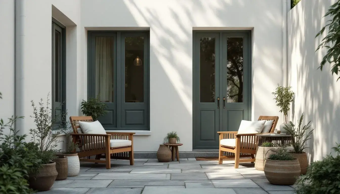
The Soft Neutrals 🤍 palette embodies the essence of calm. Picture a bedroom where morning light filters through sheer curtains, or a living room where conversation flows as easily as the gentle gradations of tone. Whisper White sets the foundation, a color so subtle it seems to breathe with the space itself. Pearl Gray adds depth without weight, like the soft shadow cast by clouds. Silver Mist introduces a hint of coolness, a gentle reminder of morning fog. Dove Gray deepens the narrative, grounding the palette with quiet strength. Charcoal Smoke provides the final anchor, a sophisticated darkness that defines without overwhelming. This palette works best with natural textures: linen, wool, unfinished wood. The goal is to create a space that feels effortlessly serene, where the eye can rest and the mind can wander. It's about subtlety over statement, about creating a backdrop for life rather than competing with it.
Nature's Embrace 🌿 brings the outdoors in with gentle authority. Imagine a sunroom filled with plants, or a kitchen where herbs grow on the windowsill. Mint Cream provides a fresh foundation, like the first breath of spring air. Sage Whisper adds herbal complexity, a reminder of garden walks and quiet contemplation. Eucalyptus Mist introduces a cooling element, like the shade of a favorite tree. Forest Whisper deepens the connection to nature, grounding the palette in earth's wisdom. Moss Shadow provides the final note, a rich darkness that speaks of forest floors and hidden groves. This palette pairs beautifully with natural materials: bamboo, rattan, stone. The intention is to create spaces that feel alive, that connect us to the rhythms of the natural world. It's about bringing peace through connection, about finding calm in the colors that surround us in nature.
The Warm Embrace ☀️ palette wraps spaces in gentle comfort. Think of a reading nook bathed in afternoon light, or a dining room where every meal feels like a celebration. Cream Silk sets the tone with luxurious softness, like cashmere against skin. Vanilla Mist adds sweetness without cloying, a gentle warmth that welcomes. Honey Glow introduces golden richness, like sunlight captured in amber. Caramel Whisper deepens the warmth, adding complexity and depth. Toffee Shadow provides grounding, a rich darkness that anchors without overwhelming. This palette works beautifully with warm woods, soft textiles, and gentle lighting. The goal is to create spaces that feel like a warm hug, where stress melts away and comfort reigns. It's about creating sanctuary through warmth, about making every corner feel like home.
Tranquil Waters 💙 evokes the peace of still lakes and endless skies. Picture a bathroom that feels like a spa, or a bedroom where sleep comes easily. Cloud White provides an airy foundation, like morning mist over water. Sky Whisper adds gentle movement, like clouds drifting across an endless horizon. Ocean Mist introduces depth and calm, like the view from a peaceful shore. Lake Blue deepens the serenity, grounding the palette in water's wisdom. Navy Depth provides the final anchor, a rich darkness that speaks of deep waters and starlit nights. This palette pairs beautifully with natural textures and soft lighting. The intention is to create spaces that feel like a deep breath, where calm flows as naturally as water. It's about finding peace through color, about creating environments that naturally soothe the soul.
The Gentle Earth 🌾 palette grounds us in nature's quiet wisdom. Imagine a meditation room where thoughts settle like dust, or a study where focus comes naturally. Linen White provides a clean foundation, like fresh sheets on a summer morning. Parchment Whisper adds gentle warmth, like aged paper holding precious words. Sand Mist introduces earthy comfort, like walking barefoot on warm ground. Clay Whisper deepens the connection to earth, grounding the palette in natural wisdom. Stone Shadow provides the final note, a rich darkness that speaks of ancient rocks and timeless strength. This palette works beautifully with natural materials and soft textures. The goal is to create spaces that feel rooted and calm, where the mind can settle and the spirit can rest. It's about finding peace through simplicity, about creating environments that honor both comfort and contemplation.
As we move through 2025, the psychology of home becomes increasingly important. These palettes offer more than aesthetic appeal; they provide pathways to peace, routes to relaxation, and blueprints for better living. By choosing colors that soothe rather than stimulate, that whisper rather than shout, we create homes that truly serve our well-being. The future of interior design isn't just about how spaces look, but how they make us feel. In a world that often feels chaotic, our homes become our sanctuaries, and color becomes our guide to calm.