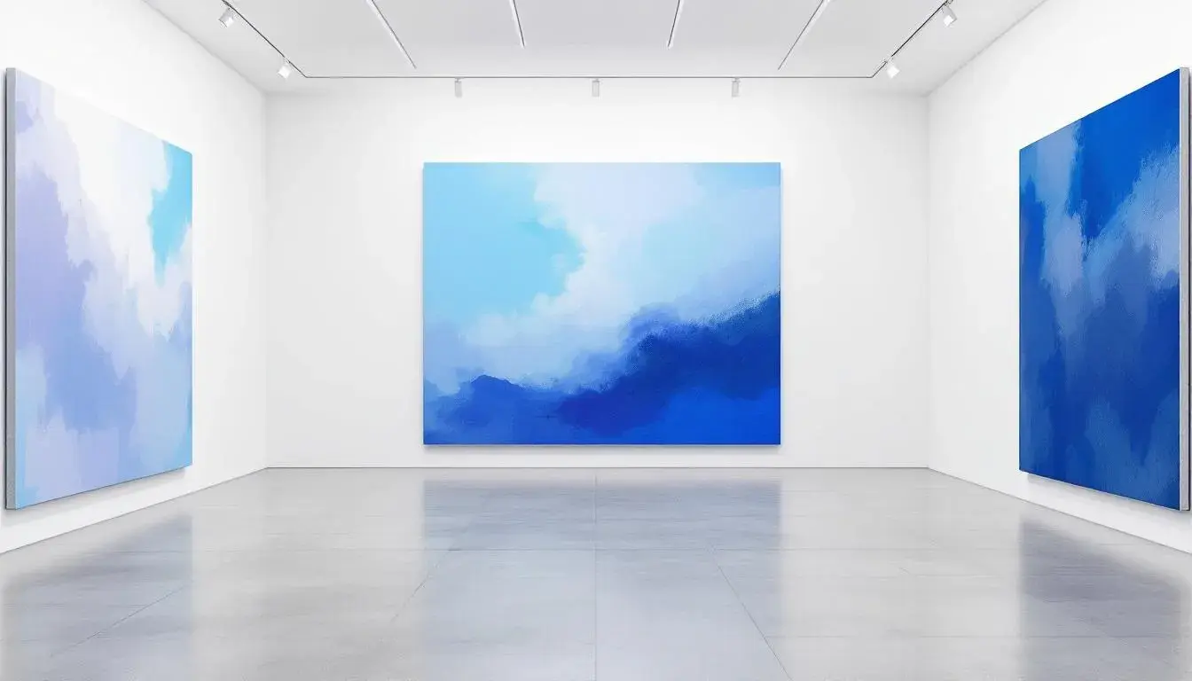
The Brightness Boost: Palettes with a Vivid Kick
15 Aug 2025 · 4 min readColor speaks. It whispers of dawn, shouts in midday sun, and murmurs in twilight's gentle embrace. The power of a vibrant color palette lies not just in its aesthetic appeal, but in its ability to transport, to invigorate, to awaken the senses. It's about crafting experiences, sparking emotions, and setting the stage for moments that feel vividly alive. Think bold contrasts against expanses of calm – a sudden burst of laughter in a quiet room, the unexpected warmth of sunshine on a cold day, the satisfying jolt of discovery in familiar surroundings. When color sings, it invites participation, curiosity, and a fresh perspective. Here, we explore palettes designed to do just that – to deliver a vivid kick.
The Electric Harmony ⚡ palette pulses with contemporary energy. Picture a modern workspace where creativity flows freely, or a living room where conversations spark with enthusiasm. Coral Pink establishes vibrant warmth, like the first blush of sunrise on ocean waves. Turquoise Bright adds cooling balance, a color that speaks of tropical waters and endless possibilities. Sky Blue introduces depth and calm, grounding the energy in peaceful authority. Mint Green provides natural freshness, like morning dew on spring leaves. Butter Yellow completes the spectrum with cheerful optimism, like sunshine breaking through morning clouds. This palette works best when used strategically – perhaps one wall in coral, accents in turquoise, and touches of the other colors throughout. The goal is to create spaces that feel alive without overwhelming, energetic without exhausting.
Sunset Festival 🎨 celebrates bold expression and joyful living. Imagine an artist's studio where inspiration strikes like lightning, or a dining room where every meal becomes an event. Terracotta Orange anchors the palette with earthy warmth, like clay pots baking in Mediterranean sun. Golden Peach adds luxurious glow, a color that speaks of abundance and celebration. Royal Purple introduces dramatic depth, like velvet curtains in a grand theater. Lavender Bright provides ethereal balance, softening the intensity with dreamy undertones. Rose Pink completes the journey with romantic warmth, like sunset clouds reflected in still water. This palette demands confidence but rewards with spaces that feel truly unique. The key is balancing these bold colors with plenty of white or neutral space, allowing each hue to shine without competing.
The Ocean Depths 🌊 palette combines serenity with striking presence. Picture a spa-like bathroom where relaxation meets luxury, or a bedroom where dreams feel more vivid. Emerald Green establishes natural authority, like deep forest pools reflecting ancient wisdom. Aqua Bright adds refreshing energy, a color that speaks of crystal-clear waters and new beginnings. Sky Blue introduces peaceful depth, grounding the palette in calming authority. Ocean Blue provides dramatic foundation, like the deepest parts of the sea holding mysteries. Violet Deep completes the spectrum with mystical richness, like twilight settling over endless waters. This palette works beautifully in spaces where you want both energy and calm – the colors are bold enough to energize but cool enough to soothe.
Fire Dance 🔥 ignites passion and warmth in any space. Imagine a kitchen where cooking becomes performance art, or a living room where energy radiates from every corner. Coral Red establishes vibrant foundation, like flames dancing in a perfect fireplace. Rose Pink adds romantic softness, tempering the intensity with gentle warmth. Golden Yellow brings sunny optimism, like morning light streaming through windows. Burnt Orange provides earthy grounding, connecting the palette to natural elements. Crimson Deep completes the journey with dramatic authority, like the heart of a perfect flame. This palette creates spaces that feel inherently energizing, where warmth and vitality flow naturally. The secret is using these colors in varying intensities – perhaps crimson as an accent wall, coral in textiles, and touches of the others throughout.
The Digital Dreams 💫 palette speaks to our tech-forward future. Picture a home office where innovation feels natural, or a gaming room where virtual worlds come alive. Electric Blue establishes digital authority, like screens glowing with possibility. Neon Green adds cyber energy, a color that speaks of code and creativity. Bright Yellow introduces optimistic clarity, like data flowing through fiber optic cables. Magenta Pink provides unexpected warmth, humanizing the technological edge. Azure Bright completes the spectrum with infinite depth, like digital skies in virtual worlds. This palette works exceptionally well in modern spaces with clean lines and high-tech elements. The goal is to create environments that feel both futuristic and welcoming, where technology and humanity exist in perfect harmony.
Cosmic Celebration 🌟 embodies joy and wonder in equal measure. Imagine a child's playroom where imagination soars, or a creative space where every project feels like an adventure. Lavender Bright establishes dreamy foundation, like clouds touched by starlight. Rose Pink adds playful warmth, a color that speaks of laughter and light hearts. Golden Peach brings sunny optimism, like morning light on flower petals. Emerald Fresh provides natural balance, grounding the palette in earth's wisdom. Sky Bright completes the journey with infinite possibility, like endless skies full of dreams. This palette creates spaces that feel inherently joyful, where creativity and happiness flow as naturally as light. The key is using these colors thoughtfully – perhaps as accent walls, in artwork, or through carefully chosen accessories that bring the palette to life.
The brightness boost isn't just about adding color; it's about adding life. These palettes remind us that our spaces can be more than functional – they can be transformative. When we embrace vivid hues with intention and balance, we create environments that don't just shelter us, but inspire us. The key lies in understanding that bold doesn't mean overwhelming, and bright doesn't mean chaotic. With careful consideration and thoughtful application, these vibrant palettes become tools for crafting spaces that truly energize and uplift the human spirit.