'%3e%3cpath%20fill-rule='evenodd'%20clip-rule='evenodd'%20d='M51.1303%2019.2492C50.7278%2019.913%2050.1346%2020.4426%2049.3508%2020.838C48.5669%2021.2335%2047.6172%2021.4312%2046.5014%2021.4312C44.8208%2021.4312%2043.4367%2021.0216%2042.3492%2020.2025C41.2617%2019.3833%2040.6686%2018.2394%2040.5697%2016.7706H44.4253C44.4818%2017.3355%2044.6831%2017.7804%2045.0291%2018.1052C45.3751%2018.43%2045.8164%2018.5924%2046.3531%2018.5924C46.8192%2018.5924%2047.1864%2018.4653%2047.4547%2018.2111C47.7231%2017.9569%2047.8572%2017.618%2047.8572%2017.1943C47.8572%2016.8129%2047.7337%2016.4952%2047.4865%2016.241C47.2393%2015.9867%2046.9322%2015.7784%2046.565%2015.616C46.1978%2015.4536%2045.6893%2015.2594%2045.0397%2015.0334C44.0934%2014.7086%2043.3202%2014.3944%2042.72%2014.0907C42.1197%2013.7871%2041.6042%2013.3351%2041.1735%2012.7349C40.7427%2012.1347%2040.5273%2011.3544%2040.5273%2010.394C40.5273%209.50418%2040.7533%208.73448%2041.2053%208.08481C41.6572%207.43515%2042.2821%206.93731%2043.0801%206.5913C43.8781%206.24528%2044.7925%206.07227%2045.8235%206.07227C47.49%206.07227%2048.8141%206.46771%2049.7956%207.25861C50.7772%208.04951%2051.3315%209.13698%2051.4586%2010.5211H47.5395C47.4689%2010.0268%2047.2888%209.63483%2046.9993%209.3453C46.7097%209.05578%2046.3178%208.91102%2045.8235%208.91102C45.3998%208.91102%2045.0573%209.024%2044.7961%209.24997C44.5348%209.47594%2044.4041%209.80783%2044.4041%2010.2457C44.4041%2010.5988%2044.5207%2010.8989%2044.7537%2011.146C44.9867%2011.3932%2045.2798%2011.5944%2045.6328%2011.7498C45.9859%2011.9052%2046.4944%2012.1029%2047.1581%2012.343C48.1185%2012.6678%2048.9023%2012.9891%2049.5096%2013.3069C50.1169%2013.6246%2050.6395%2014.0872%2051.0773%2014.6945C51.5151%2015.3018%2051.734%2016.0927%2051.734%2017.0672C51.734%2017.8581%2051.5328%2018.5854%2051.1303%2019.2492ZM59.0242%206.3053V21.2829H55.4016V6.3053H59.0242ZM73.9409%206.3053V9.18642H69.8734V21.2829H66.2296V9.18642H62.2046V6.3053H73.9409ZM80.7438%209.18642V12.3218H85.8069V15.0546H80.7438V18.3806H86.4425V21.2829H77.1212V6.3053H86.4425V9.18642H80.7438ZM99.667%2016.0291V21.2829H96.0444V6.3053H101.913C103.692%206.3053%20105.048%206.74665%20105.98%207.62934C106.912%208.51204%20107.378%209.7019%20107.378%2011.199C107.378%2012.1311%20107.17%2012.9609%20106.753%2013.6882C106.337%2014.4155%20105.719%2014.9875%20104.9%2015.4042C104.08%2015.8208%20103.085%2016.0291%20101.913%2016.0291H99.667ZM103.692%2011.199C103.692%209.8855%20102.965%209.22879%20101.51%209.22879H99.667V13.1268H101.51C102.965%2013.1268%20103.692%2012.4842%20103.692%2011.199ZM120.092%2018.5501H114.478L113.546%2021.2829H109.732L115.219%206.41123H119.393L124.879%2021.2829H121.024L120.092%2018.5501ZM119.16%2015.7961L117.295%2010.2881L115.41%2015.7961H119.16ZM131.555%2018.5077H136.385V21.2829H127.933V6.3053H131.555V18.5077ZM143.337%209.18642V12.3218H148.4V15.0546H143.337V18.3806H149.035V21.2829H139.714V6.3053H149.035V9.18642H143.337ZM163.507%206.3053V9.18642H159.44V21.2829H155.796V9.18642H151.771V6.3053H163.507ZM177.449%206.3053V9.18642H173.382V21.2829H169.738V9.18642H165.713V6.3053H177.449ZM184.252%209.18642V12.3218H189.315V15.0546H184.252V18.3806H189.951V21.2829H180.629V6.3053H189.951V9.18642H184.252Z'%20fill='%23EEF0ED'/%3e%3cmask%20id='mask0_3101_7327'%20style='mask-type:alpha'%20maskUnits='userSpaceOnUse'%20x='0'%20y='0'%20width='27'%20height='28'%3e%3cpath%20d='M23.8328%200.759766H2.64808C1.18559%200.759766%200%201.94535%200%203.40785V24.5925C0%2026.055%201.18559%2027.2406%202.64808%2027.2406H23.8328C25.2952%2027.2406%2026.4808%2026.055%2026.4808%2024.5925V3.40785C26.4808%201.94535%2025.2952%200.759766%2023.8328%200.759766Z'%20fill='white'/%3e%3c/mask%3e%3cg%20mask='url(%23mask0_3101_7327)'%3e%3cpath%20d='M23.8328%200.759766H2.64808C1.18559%200.759766%200%201.94535%200%203.40785V24.5925C0%2026.055%201.18559%2027.2406%202.64808%2027.2406H23.8328C25.2952%2027.2406%2026.4808%2026.055%2026.4808%2024.5925V3.40785C26.4808%201.94535%2025.2952%200.759766%2023.8328%200.759766Z'%20fill='%23D8D8D8'/%3e%3cpath%20d='M13.2404%200.759766H0V14.0001H13.2404V0.759766Z'%20fill='%238C61FF'/%3e%3cpath%20d='M13.2404%2014H0V27.2404H13.2404V14Z'%20fill='%2336C3FE'/%3e%3cpath%20d='M26.4806%2014H13.2402V27.2404H26.4806V14Z'%20fill='%236592FE'/%3e%3cpath%20d='M26.4806%200.759766H13.2402V14.0002H26.4806V0.759766Z'%20fill='%236059F7'/%3e%3c/g%3e%3c/g%3e%3cdefs%3e%3cclipPath%20id='clip0_3101_7327'%3e%3crect%20width='190'%20height='28'%20fill='white'/%3e%3c/clipPath%3e%3c/defs%3e%3c/svg%3e)
'%3e%3cpath%20d='M23.8328%200.759521H2.64808C1.18559%200.759521%200%201.94511%200%203.40761V24.5923C0%2026.0548%201.18559%2027.2404%202.64808%2027.2404H23.8328C25.2952%2027.2404%2026.4808%2026.0548%2026.4808%2024.5923V3.40761C26.4808%201.94511%2025.2952%200.759521%2023.8328%200.759521Z'%20fill='%23D8D8D8'/%3e%3cpath%20d='M13.2404%200.759521H0V13.9999H13.2404V0.759521Z'%20fill='%238C61FF'/%3e%3cpath%20d='M13.2404%2013.9998H0V27.2402H13.2404V13.9998Z'%20fill='%2336C3FE'/%3e%3cpath%20d='M26.4809%2013.9998H13.2405V27.2402H26.4809V13.9998Z'%20fill='%236592FE'/%3e%3cpath%20d='M26.4809%200.759277H13.2405V13.9997H26.4809V0.759277Z'%20fill='%236059F7'/%3e%3c/g%3e%3c/svg%3e)
From Farmhouse to Industrial: Decoding Interior Design Style Palettes
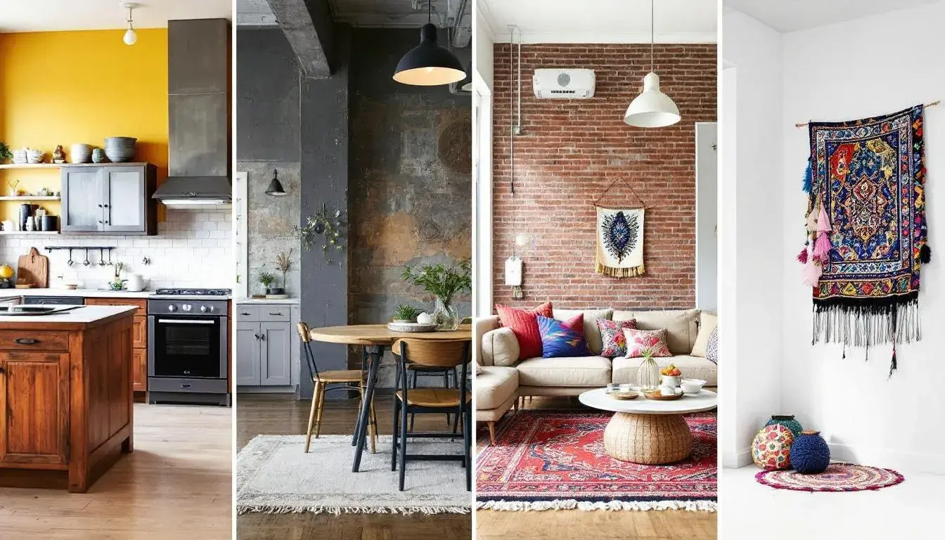
15 Aug 2025 · 5 min readFrom the weathered wood of a farmhouse table to the cool steel girders of an industrial loft, the environments we inhabit whisper stories. The colors that adorn these spaces aren't simply decorative; they are storytellers, shaping our moods and framing our experiences. Imagine the sun-drenched kitchen, painted in warm creams and gentle yellows, a place of comfort and shared meals. Contrast it with the exposed brick warehouse, where shades of gray and deep blues echo the grit and ingenuity of its past. These palettes are not merely aesthetic choices, but deeply felt connections to history, emotion, and aspiration. The journey from rustic charm to urban edge is paved with color, each shade carefully chosen to evoke a specific feeling, a particular place.
The Earthy Elegance 🪵 palette suggests a gentle retreat, a space where burdens are lifted and serenity gently takes root. Think of a farmhouse dusted with sunlight filtering through linen curtains, or the quiet corner of a bohemian hideaway. Ivory White, like aged plaster, softens the light, creating a diffused and gentle ambiance. Light Taupe grounds the palette, lending a sense of natural stability, while Mustard Yellow, a whisper of sunshine, injects a note of cautious optimism. This isn't brash, bold statement; it's a subtler narrative. The Slate Gray adds a touch of sophisticated sobriety, balancing the warmth, while Sienna Brown anchors the palette, reminding one of rich, fertile earth. This combination allows for rooms to breathe. Imagine raw linen upholstery paired with antique wooden furniture, the colors melding together to create a symphony of rustic charm. This palette extends beyond the merely visual; it speaks to a desire for authenticity, a craving for closeness with the natural world. The hues intertwine to tell a story of slow living and mindful consumption. A space adorned with these colors invites conversation, contemplation, and a slower pace of life. They work together to cultivate a feeling of sanctuary.
The Discord Palette 💬 reveals a modern sensibility, comfortable with contrasts. Imagine a tech office where innovative thinking meets pragmatic design, or a living room with minimalist decor and intentional pops of color. Dusty Silver serves as a neutral foundation, reminiscent of polished concrete floors or brushed metal fixtures. This provides a calm canvas. But the introduction of Spring Green disrupts the expected order, adding a breath of fresh air, a whisper of the natural world reclaiming space within the industrial landscape. This hints at sustainability and conscious design. Soft Indigo brings a sense of depth and introspection, a reminder of the complexities beneath the surface. Combined with Neutral Gray, the general experience is one of subdued energy, of focus and efficiency. Near Black, a grounding presence, anchors the palette, giving it structure and definition. This palette thrives when paired with clean lines, geometric shapes, and functional furniture. The materials might feature glass, steel, and concrete, softened perhaps with a few carefully chosen textiles. The story here is one of evolution and adaptation, of finding beauty and balance in a world of constant change. The colors create an environment that encourages creativity and focus, suited for a life lived deliberately. A space dressed in these tones can feel both calming and energizing, a sanctuary for the modern mind.
With Autumn Embers 🍂 comes an immediate feeling of hearth and home, of cozy evenings spent by the fire. Pale Sand, like aged parchment, is the soothing backdrop, a starting point for the story. Dusty Taupe adds depth, as the color of well-worn wood, or timeworn stone. The Burnt Sienna truly ignites it, bringing to mind the glow of embers or the colors of fallen leaves. This burst of warmth is tempered by the more somber presence of Slate Grey and Deep Charcoal. These darker hues provide some much-needed grounding, suggesting the solid structure underlying such an idyllic setting. Imagine a Scandinavian-inspired cottage: light wood floors, sheepskin rugs, and a roaring fireplace all come to mind. Or think of a farmhouse kitchen, with exposed beams and rustic pottery adorning the shelves. This palette has the ability to transport you elsewhere. It has a sense of grounded authenticity. These colors tell a story of simplicity and contentment, of finding joy in the everyday moments. Furniture would be crafted from natural materials, textiles would be soft and inviting, and lighting would be warm and diffused.
Warm Palette 🎨 resonates with grounded comfort. A dining room bathed in soft light, perfect for gatherings, or a living room with bookshelves and cozy armchairs. Pale Gold provides a subtle shimmer, calling to mind the glow of candlelight or the warmth of honey. Amber Yellow brings a bolder warmth, a celebration of sunshine and cheer. Dusty Green introduces a note of gentle nature, a whisper of the outdoors coming inside. Olive Green deepens this connection to the earth, reminding one of fertile fields and rolling hills. Dark Espresso anchors the palette, grounding the brighter shades and adding a sense of refined elegance. The result can be a restaurant where guests feel immediately at ease, or a farmhouse where family memories are made. The textures should be organic and tactile: woven rugs, linen curtains, and earthenware pottery. Together, these colors tell a story of abundance and hospitality, of sharing good food and good company. The room embraces you. The ambiance sets the scene for memories being made.
The Laravel Forge palette 🛠️ evokes purpose and serenity. Visualize an office space designed for optimum productivity, or a study filled with focused energy. Off White acts as calming neutrality, much like a blank canvas. Seafoam Green provides a subtle invigorating freshness, a whisper of renewal and creativity. Stone Gray lends gravitas and intellect. Steel Blue introduces an element of professionalism, and Deep Slate anchors the palette. It is authoritative yet not overwhelming. It is very calm and organized. The palette works with the mindset that simplicity can be beautiful. A minimalist interior comes to mind where the functionality is a top priority. Together, these colors tell a story of competence and clarity, where innovation and structure exist in harmony. Furniture would be streamlined and efficient, lighting would be bright and focused, and accessories would be carefully chosen and intentional. The palette evokes a sense of quiet confidence, an assurance that everything is in its right place. This palette seeks to create a functional and beautiful space, where one can work productively, and relax peacefully. A space that inspires innovation, creates a sense of achievement, and cultivates an atmosphere of harmony.
The Earthy Contrast 🍂 palette blends grounding rusticity with an undercurrent of tension and vitality. Think of a bohemian living room, overflowing with vibrant textiles and eclectic artifacts, or a farmhouse kitchen, punctuated by bold accents and hand-painted details. Pale Apricot sets the scene with tender, diffused light, like the glow of a sunset. Steel Gray provides a solid foundation, hinting at enduring strength and quiet resolve. But the atmosphere is disrupted with Dark Denim Blue, adding tension and complexity. Crimson Red elevates the intensity, evoking passion and drama. Deep Burgundy offers grounding and elegance. It hints at something hidden. Together, they tell a tale of courage and authenticity. Think of textiles rich with texture and pattern, from velvet cushions to woven rugs. This palette is not for the faint of heart; it demands careful coordination and thoughtful curation. It invites personal expression, celebrating the beauty of imperfection. It embraces color and contrast, creating a space that feels both inviting and intriguing. The interior exudes a balance of strength, warmth, and artistic flair where curiosity is sparked in the soul.
From the sun-faded charm of farmhouse aesthetics to the sleek, functional lines of industrial design, color acts as a compass, guiding us through diverse landscapes of style and emotion. The palettes explored reveal how color can shape our experiences, creating environments that nurture, inspire, and invigorate. They guide us towards the spaces that feel most authentically our own. Each palette has its own unique narrative to share, a story woven with hues that reflect our desire for comfort, beauty, and connection. By understanding the subtle language of color, we can create spaces that feel not just aesthetically pleasing, but fundamentally human. They transform from being a simple collection of colors into a profound reflection of our lives and aspirations.