From 'Dynamic' Mood to 'Deep Charcoal': Decoding Color Associations
15 Aug 2025 · 3 min readColor isn't just seen; it's felt. A carefully chosen palette can be the silent architect of an atmosphere, shifting a space from still to stirring, from ordinary to unforgettable. It is the intangible current that connects us to the world, a visual language spoken fluently by our emotions. The colors we choose to surround ourselves with become the lens through which we experience life, especially when seeking a feeling of movement and purpose. Consider the pull of a shadowed corner against a brightly lit window; the contrast itself is a form of energy. How can we translate this into a deliberate composition, one that offers both grounding and lift? The answer lies in understanding the unspoken stories that colors whisper to one another. Like notes in a musical composition, they can resolve to a quiet chord, or build to a crescendo of activity and excitement.
The Deep Charcoal 🖤 palette embodies sophisticated restraint. Picture a modern office where decisions are made with clarity, or a living room where conversations flow with purpose. Midnight Blue sets the foundation with authoritative depth, like the sky just before dawn. Slate Gray adds professional gravitas, a color that speaks of competence and reliability. Steel Silver introduces a technological edge, like the gleam of precision instruments. Cloud Gray softens the intensity, providing breathing room within the structure. Pearl White completes the spectrum, offering light without brightness, clarity without glare. This palette works exceptionally well with clean lines, metal accents, and strategic lighting. The goal is to create spaces that feel both powerful and peaceful, where focus comes naturally and productivity flows. It's about harnessing the energy of contrast while maintaining an atmosphere of calm control.
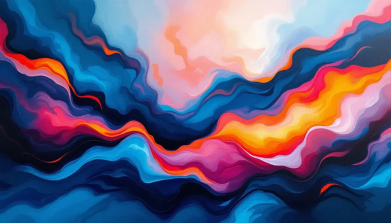
Dynamic Energy ⚡ pulses with life and movement. Imagine a creative studio where ideas spark and flow, or a fitness space where motivation comes naturally. Crimson Red ignites the palette with passion and drive, like the first burst of sunrise. Amber Orange adds warmth and enthusiasm, a color that speaks of creativity and bold thinking. Golden Yellow brings optimism and clarity, like sunlight breaking through clouds. Emerald Green introduces balance and growth, grounding the energy in natural wisdom. Azure Blue completes the spectrum with depth and possibility, like an endless sky full of potential. This palette demands careful balance but rewards with spaces that feel truly alive. The key is using these colors as accents against neutral backgrounds, allowing their energy to punctuate rather than overwhelm. It's about creating environments that inspire action while maintaining visual harmony.
The Mystic Purple 🔮 palette speaks to creativity and introspection. Picture a design studio where innovation flows freely, or a meditation space where thoughts deepen and clarify. Royal Purple establishes regal authority, a color that commands respect while inspiring creativity. Amethyst adds mystical depth, like twilight settling over ancient landscapes. Lavender Mist introduces gentle calm, softening the intensity with peaceful undertones. Lilac Whisper provides breathing space, a gentle transition that soothes the eye. Pale Orchid completes the journey with ethereal lightness, like morning mist touched by first light. This palette works beautifully in spaces dedicated to creativity, contemplation, or luxury. The goal is to create environments that feel both inspiring and peaceful, where the mind can wander freely while remaining grounded in beauty.
Fresh Growth 🌱 embodies renewal and vitality. Imagine a workspace where productivity blooms naturally, or a kitchen where healthy choices feel effortless. Forest Green anchors the palette with natural authority, like ancient trees standing guard over new growth. Emerald Bright adds vibrant energy, a color that speaks of spring mornings and fresh possibilities. Mint Fresh introduces cooling clarity, like the first breath of mountain air. Sage Soft provides gentle balance, grounding the energy in wisdom and calm. Pale Mint completes the spectrum with gentle lightness, like new leaves catching morning dew. This palette works exceptionally well in spaces focused on health, growth, or renewal. The intention is to create environments that feel naturally energizing, where positive energy flows as freely as fresh air.
The Sunset Warmth 🌅 palette radiates comfort and joy. Picture a dining room where every meal feels like a celebration, or a living room where laughter comes easily. Burnt Orange establishes warm authority, like the glow of a perfect sunset. Golden Amber adds rich depth, a color that speaks of abundance and satisfaction. Honey Yellow brings cheerful optimism, like sunshine captured in crystal. Cream Gold provides gentle transition, softening the intensity with luxurious undertones. Warm Ivory completes the journey with peaceful lightness, like morning light on fresh snow. This palette creates spaces that feel inherently welcoming, where warmth radiates from every surface. The goal is to craft environments that nurture both body and spirit, where comfort and beauty exist in perfect harmony.
Understanding color associations isn't just about aesthetics; it's about creating intentional experiences. Each palette tells a story, evokes a mood, and shapes the way we feel in our spaces. From the grounded authority of deep charcoal to the vibrant energy of dynamic hues, color becomes our tool for crafting environments that truly serve our lives. The key lies not in following trends, but in understanding how different combinations speak to our deepest needs for comfort, inspiration, and connection. When we decode these associations, we unlock the power to create spaces that don't just look beautiful, but feel exactly right.