'%3e%3cpath%20fill-rule='evenodd'%20clip-rule='evenodd'%20d='M51.1303%2019.2492C50.7278%2019.913%2050.1346%2020.4426%2049.3508%2020.838C48.5669%2021.2335%2047.6172%2021.4312%2046.5014%2021.4312C44.8208%2021.4312%2043.4367%2021.0216%2042.3492%2020.2025C41.2617%2019.3833%2040.6686%2018.2394%2040.5697%2016.7706H44.4253C44.4818%2017.3355%2044.6831%2017.7804%2045.0291%2018.1052C45.3751%2018.43%2045.8164%2018.5924%2046.3531%2018.5924C46.8192%2018.5924%2047.1864%2018.4653%2047.4547%2018.2111C47.7231%2017.9569%2047.8572%2017.618%2047.8572%2017.1943C47.8572%2016.8129%2047.7337%2016.4952%2047.4865%2016.241C47.2393%2015.9867%2046.9322%2015.7784%2046.565%2015.616C46.1978%2015.4536%2045.6893%2015.2594%2045.0397%2015.0334C44.0934%2014.7086%2043.3202%2014.3944%2042.72%2014.0907C42.1197%2013.7871%2041.6042%2013.3351%2041.1735%2012.7349C40.7427%2012.1347%2040.5273%2011.3544%2040.5273%2010.394C40.5273%209.50418%2040.7533%208.73448%2041.2053%208.08481C41.6572%207.43515%2042.2821%206.93731%2043.0801%206.5913C43.8781%206.24528%2044.7925%206.07227%2045.8235%206.07227C47.49%206.07227%2048.8141%206.46771%2049.7956%207.25861C50.7772%208.04951%2051.3315%209.13698%2051.4586%2010.5211H47.5395C47.4689%2010.0268%2047.2888%209.63483%2046.9993%209.3453C46.7097%209.05578%2046.3178%208.91102%2045.8235%208.91102C45.3998%208.91102%2045.0573%209.024%2044.7961%209.24997C44.5348%209.47594%2044.4041%209.80783%2044.4041%2010.2457C44.4041%2010.5988%2044.5207%2010.8989%2044.7537%2011.146C44.9867%2011.3932%2045.2798%2011.5944%2045.6328%2011.7498C45.9859%2011.9052%2046.4944%2012.1029%2047.1581%2012.343C48.1185%2012.6678%2048.9023%2012.9891%2049.5096%2013.3069C50.1169%2013.6246%2050.6395%2014.0872%2051.0773%2014.6945C51.5151%2015.3018%2051.734%2016.0927%2051.734%2017.0672C51.734%2017.8581%2051.5328%2018.5854%2051.1303%2019.2492ZM59.0242%206.3053V21.2829H55.4016V6.3053H59.0242ZM73.9409%206.3053V9.18642H69.8734V21.2829H66.2296V9.18642H62.2046V6.3053H73.9409ZM80.7438%209.18642V12.3218H85.8069V15.0546H80.7438V18.3806H86.4425V21.2829H77.1212V6.3053H86.4425V9.18642H80.7438ZM99.667%2016.0291V21.2829H96.0444V6.3053H101.913C103.692%206.3053%20105.048%206.74665%20105.98%207.62934C106.912%208.51204%20107.378%209.7019%20107.378%2011.199C107.378%2012.1311%20107.17%2012.9609%20106.753%2013.6882C106.337%2014.4155%20105.719%2014.9875%20104.9%2015.4042C104.08%2015.8208%20103.085%2016.0291%20101.913%2016.0291H99.667ZM103.692%2011.199C103.692%209.8855%20102.965%209.22879%20101.51%209.22879H99.667V13.1268H101.51C102.965%2013.1268%20103.692%2012.4842%20103.692%2011.199ZM120.092%2018.5501H114.478L113.546%2021.2829H109.732L115.219%206.41123H119.393L124.879%2021.2829H121.024L120.092%2018.5501ZM119.16%2015.7961L117.295%2010.2881L115.41%2015.7961H119.16ZM131.555%2018.5077H136.385V21.2829H127.933V6.3053H131.555V18.5077ZM143.337%209.18642V12.3218H148.4V15.0546H143.337V18.3806H149.035V21.2829H139.714V6.3053H149.035V9.18642H143.337ZM163.507%206.3053V9.18642H159.44V21.2829H155.796V9.18642H151.771V6.3053H163.507ZM177.449%206.3053V9.18642H173.382V21.2829H169.738V9.18642H165.713V6.3053H177.449ZM184.252%209.18642V12.3218H189.315V15.0546H184.252V18.3806H189.951V21.2829H180.629V6.3053H189.951V9.18642H184.252Z'%20fill='%23EEF0ED'/%3e%3cmask%20id='mask0_3101_7327'%20style='mask-type:alpha'%20maskUnits='userSpaceOnUse'%20x='0'%20y='0'%20width='27'%20height='28'%3e%3cpath%20d='M23.8328%200.759766H2.64808C1.18559%200.759766%200%201.94535%200%203.40785V24.5925C0%2026.055%201.18559%2027.2406%202.64808%2027.2406H23.8328C25.2952%2027.2406%2026.4808%2026.055%2026.4808%2024.5925V3.40785C26.4808%201.94535%2025.2952%200.759766%2023.8328%200.759766Z'%20fill='white'/%3e%3c/mask%3e%3cg%20mask='url(%23mask0_3101_7327)'%3e%3cpath%20d='M23.8328%200.759766H2.64808C1.18559%200.759766%200%201.94535%200%203.40785V24.5925C0%2026.055%201.18559%2027.2406%202.64808%2027.2406H23.8328C25.2952%2027.2406%2026.4808%2026.055%2026.4808%2024.5925V3.40785C26.4808%201.94535%2025.2952%200.759766%2023.8328%200.759766Z'%20fill='%23D8D8D8'/%3e%3cpath%20d='M13.2404%200.759766H0V14.0001H13.2404V0.759766Z'%20fill='%238C61FF'/%3e%3cpath%20d='M13.2404%2014H0V27.2404H13.2404V14Z'%20fill='%2336C3FE'/%3e%3cpath%20d='M26.4806%2014H13.2402V27.2404H26.4806V14Z'%20fill='%236592FE'/%3e%3cpath%20d='M26.4806%200.759766H13.2402V14.0002H26.4806V0.759766Z'%20fill='%236059F7'/%3e%3c/g%3e%3c/g%3e%3cdefs%3e%3cclipPath%20id='clip0_3101_7327'%3e%3crect%20width='190'%20height='28'%20fill='white'/%3e%3c/clipPath%3e%3c/defs%3e%3c/svg%3e)
'%3e%3cpath%20d='M23.8328%200.759521H2.64808C1.18559%200.759521%200%201.94511%200%203.40761V24.5923C0%2026.0548%201.18559%2027.2404%202.64808%2027.2404H23.8328C25.2952%2027.2404%2026.4808%2026.0548%2026.4808%2024.5923V3.40761C26.4808%201.94511%2025.2952%200.759521%2023.8328%200.759521Z'%20fill='%23D8D8D8'/%3e%3cpath%20d='M13.2404%200.759521H0V13.9999H13.2404V0.759521Z'%20fill='%238C61FF'/%3e%3cpath%20d='M13.2404%2013.9998H0V27.2402H13.2404V13.9998Z'%20fill='%2336C3FE'/%3e%3cpath%20d='M26.4809%2013.9998H13.2405V27.2402H26.4809V13.9998Z'%20fill='%236592FE'/%3e%3cpath%20d='M26.4809%200.759277H13.2405V13.9997H26.4809V0.759277Z'%20fill='%236059F7'/%3e%3c/g%3e%3c/svg%3e)
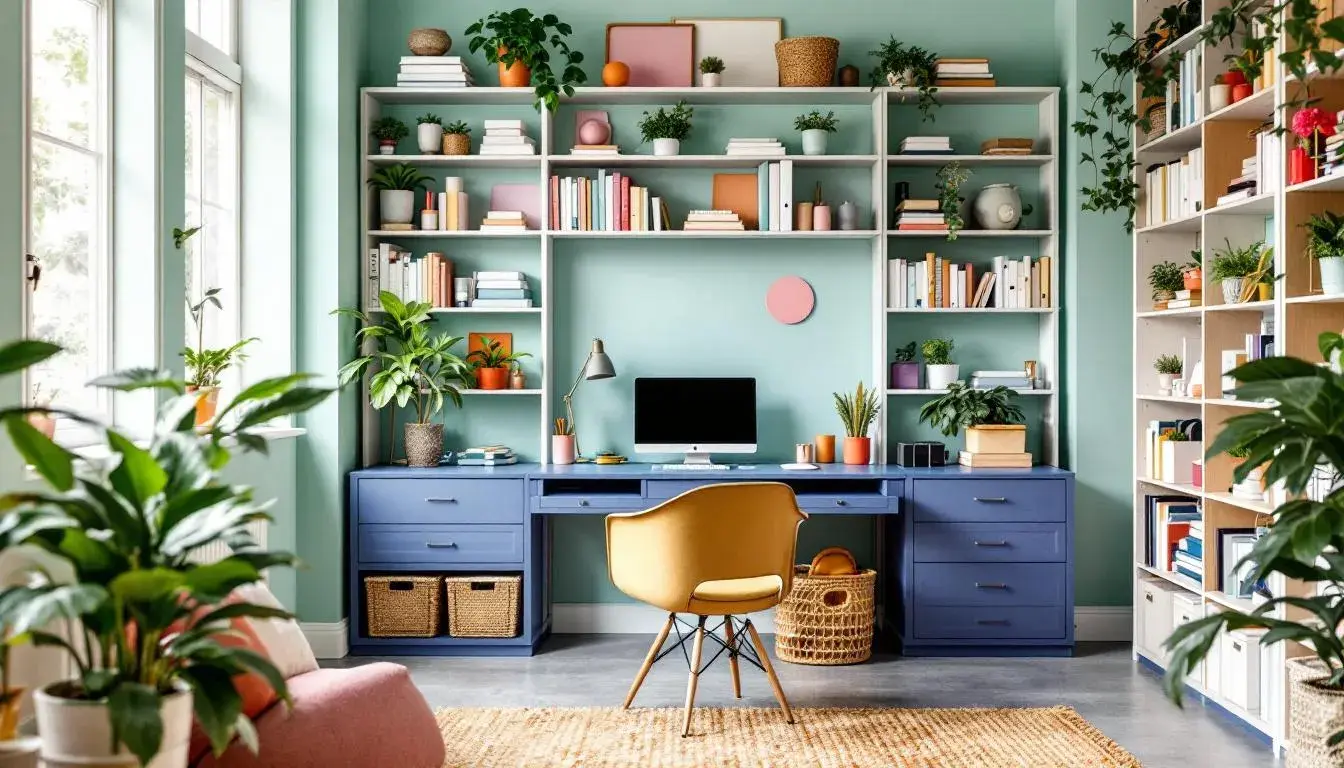
From Desk to Design: The Most Popular Colors for Home Offices
14 Aug 2025 · 5 min readColor is the silent architect of our experience. In home offices, where focus contends with comfort, and ambition shares space with the everyday, color palettes are not just aesthetic choices; they are the subtle conductors of productivity and peace. Consider the weight of a deadline under the oppressive glare of sterile white, or the gentle lift of an idea blooming amidst soft, natural hues. Our workspaces deserve considered palettes, environments built not just for utility, but for inspiration. The right shades can transform a spare room into a sanctuary of strategy, an energetic hub, or a quietly confident corner of calm. Color is the emotional current in our home office's circuit, and selecting carefully can switch on creativity, focus, and even a sense of well-being. The palettes examined here offer unique keys to unlock these potentials, painting the path to a more productive and beautiful work life.
The Amaka Palette presents a promise of focused energy with a gentle touch. Pale Mint offers a whisper of revitalization, suggesting early mornings and fresh ideas. Emerald Green brings a grounding element, connecting to concepts of growth and stability, mirroring the steady progress of projects coming to fruition. Dusty Lavender enters with quiet sophistication, providing a space for reflection and creative thought. Woven throughout this scene is Neutral Grey, acting as a soft anchor to reality and deadlines. Finally, Intense Blue delivers the spark of focused determination, like a clear, crisp sky driving one forward. Imagine a writer's room, with a single green plant against a grey wall, bathed in the morning light: these colors conjure a space that's quietly ambitious, where the digital world finds balance with natural and human elements. It's a background where ideas collect and flourish. This palette is a gentle call to action, painting a scene of progress over perfection. The subtle harmonies would serve an office dedicated to creative pursuits, or a business space designed to encourage innovative thinking. You are crafting more than a workspace; you're creating an environment where ideas grow naturally, and even intense projects feel approachable. This palette offers a refreshing alternative to the stark minimalism often associated with productivity, creating a space that supports both focus and well-being.
With the Tech Spectrum palette, a regal atmosphere emerges, hinting at focused intelligence and controlled exploration. Pale Mauve offers a foundation of quiet sophistication, evoking a sense of understated elegance. From this base, Light Lavender ascends, inviting gentle curiosity, and perhaps a touch of daydreaming before the focus sharpens. A bolt of Vivid Orange electrifies the scene, pushing back against muted tones, reminding that even in a study there is space for dynamic change. Smokey Gray provides a counterpoint, adding depth and grounding the energy. Then, the presence of Royal Purple conveys a sense of purpose, and perhaps a need to make something truly beautiful. Picture an entrepreneur designing the branding for her company at a streamlined desk. The walls are a calming mauve, while artwork featuring splashes of orange and purple inspires bold decisions. This palette suggests an office that stimulates creativity while maintaining a sense of order. This is not a space for frantic chaos, but one where inspiration meets methodical execution. It is a color scheme that invites bold thinking balanced with a grounding force. These colors bring not just a background but an environment that suggests innovation, where ideas begin as a dream and become reality.
Crumpler Colors presents a palette that vibrates with a modern, almost rebellious spirit, fit for a creative hub where energy constantly flows. Vibrant Pink, a daring splash of color, immediately commands attention, injecting the space with playful innovation and modern charm. Balanced against this are the more grounded tones. Vivid Vermilion comes forward as a jolt of active energy, while Olive Drab balances it out, creating stability through its subtle anchoring force. Next to these, Dark Taupe suggests the importance of a comfortable foundation, while Raspberry Red offers a note of depth. This is the office of a visual artist, perhaps a graphic designer, where daring combinations take center stage. Consider how the space speaks a language of individuality, where color encourages experimentation and embraces the unexpected. The walls are neutral, allowing art and inspiration to take over. This palette is built around strong individual elements that are held together to produce a vibrant design. It shows how spaces can become personalized and inspiring, promoting productivity and innovation for the modern worker. It’s not just an office, but a space that tells a personal story.
The Gusto Palette evokes a sense of grounded elegance, a space where productivity finds harmony with serenity. Goldenrod introduces a muted gleam, hinting at focus. Seafoam Green joins in, bringing a breath of fresh air, infusing the area with the feeling of nature. Granite Gray presents a grounding effect which communicates strength. Deep Forest Green brings a calming influence, ideal for promoting a relaxed atmosphere. A dash of Near Black adds dimension and anchors the color array. This palette works well for professionals. The quiet backdrop helps them navigate complex tasks with mindfulness. Picture this palette gracing the walls of a consultant’s office, instilling a calm state of mind. Productivity isn't about loud statements; it is about understated excellence. It demonstrates the palette’s capacity to instill a feeling of balance to boost creativity and reduce tension. The colors create an office with a refined, and quietly professional feel.
Bold Tech is a call to innovation, an open invitation to action. Off White suggests quiet confidence, while a vibrant Salmon Orange invigorates the ambience with subtle energy. Next, Steel Blue enters as a voice of thoughtful reflection to promote focus. Meanwhile, Burnt Sienna injects a splash of dynamism, suggesting daring possibilities, and Dark Indigo finishes the setting by contributing an air of sophistication in pursuit of wisdom. Consider this Tech palette gracing the screens of an app developer’s office, it highlights ingenuity and inspires revolutionary ideas. Workplaces need not be dull, as they can become dynamic environments that promote innovation and creativity. It brings life, encouraging the employees to push the limits. This is more than a set of colors; it's a creative spark.
These palettes are more than simply visual suggestions; each one is a carefully curated mood board intended to shape and reflect a distinct work experience. Whether you're drawn to the calm control of dusty lavenders, the energetic spark of vibrant pink, or the grounded focus of olive green, there's a combination for every ambition. These aren't simply colors, but carefully selected strategies to optimize your environment. They offer more than just aesthetics; they give a language to productivity, and a subtle nudge toward building a workspace with purpose. The transformative power of color is within reach.