'%3e%3cpath%20fill-rule='evenodd'%20clip-rule='evenodd'%20d='M51.1303%2019.2492C50.7278%2019.913%2050.1346%2020.4426%2049.3508%2020.838C48.5669%2021.2335%2047.6172%2021.4312%2046.5014%2021.4312C44.8208%2021.4312%2043.4367%2021.0216%2042.3492%2020.2025C41.2617%2019.3833%2040.6686%2018.2394%2040.5697%2016.7706H44.4253C44.4818%2017.3355%2044.6831%2017.7804%2045.0291%2018.1052C45.3751%2018.43%2045.8164%2018.5924%2046.3531%2018.5924C46.8192%2018.5924%2047.1864%2018.4653%2047.4547%2018.2111C47.7231%2017.9569%2047.8572%2017.618%2047.8572%2017.1943C47.8572%2016.8129%2047.7337%2016.4952%2047.4865%2016.241C47.2393%2015.9867%2046.9322%2015.7784%2046.565%2015.616C46.1978%2015.4536%2045.6893%2015.2594%2045.0397%2015.0334C44.0934%2014.7086%2043.3202%2014.3944%2042.72%2014.0907C42.1197%2013.7871%2041.6042%2013.3351%2041.1735%2012.7349C40.7427%2012.1347%2040.5273%2011.3544%2040.5273%2010.394C40.5273%209.50418%2040.7533%208.73448%2041.2053%208.08481C41.6572%207.43515%2042.2821%206.93731%2043.0801%206.5913C43.8781%206.24528%2044.7925%206.07227%2045.8235%206.07227C47.49%206.07227%2048.8141%206.46771%2049.7956%207.25861C50.7772%208.04951%2051.3315%209.13698%2051.4586%2010.5211H47.5395C47.4689%2010.0268%2047.2888%209.63483%2046.9993%209.3453C46.7097%209.05578%2046.3178%208.91102%2045.8235%208.91102C45.3998%208.91102%2045.0573%209.024%2044.7961%209.24997C44.5348%209.47594%2044.4041%209.80783%2044.4041%2010.2457C44.4041%2010.5988%2044.5207%2010.8989%2044.7537%2011.146C44.9867%2011.3932%2045.2798%2011.5944%2045.6328%2011.7498C45.9859%2011.9052%2046.4944%2012.1029%2047.1581%2012.343C48.1185%2012.6678%2048.9023%2012.9891%2049.5096%2013.3069C50.1169%2013.6246%2050.6395%2014.0872%2051.0773%2014.6945C51.5151%2015.3018%2051.734%2016.0927%2051.734%2017.0672C51.734%2017.8581%2051.5328%2018.5854%2051.1303%2019.2492ZM59.0242%206.3053V21.2829H55.4016V6.3053H59.0242ZM73.9409%206.3053V9.18642H69.8734V21.2829H66.2296V9.18642H62.2046V6.3053H73.9409ZM80.7438%209.18642V12.3218H85.8069V15.0546H80.7438V18.3806H86.4425V21.2829H77.1212V6.3053H86.4425V9.18642H80.7438ZM99.667%2016.0291V21.2829H96.0444V6.3053H101.913C103.692%206.3053%20105.048%206.74665%20105.98%207.62934C106.912%208.51204%20107.378%209.7019%20107.378%2011.199C107.378%2012.1311%20107.17%2012.9609%20106.753%2013.6882C106.337%2014.4155%20105.719%2014.9875%20104.9%2015.4042C104.08%2015.8208%20103.085%2016.0291%20101.913%2016.0291H99.667ZM103.692%2011.199C103.692%209.8855%20102.965%209.22879%20101.51%209.22879H99.667V13.1268H101.51C102.965%2013.1268%20103.692%2012.4842%20103.692%2011.199ZM120.092%2018.5501H114.478L113.546%2021.2829H109.732L115.219%206.41123H119.393L124.879%2021.2829H121.024L120.092%2018.5501ZM119.16%2015.7961L117.295%2010.2881L115.41%2015.7961H119.16ZM131.555%2018.5077H136.385V21.2829H127.933V6.3053H131.555V18.5077ZM143.337%209.18642V12.3218H148.4V15.0546H143.337V18.3806H149.035V21.2829H139.714V6.3053H149.035V9.18642H143.337ZM163.507%206.3053V9.18642H159.44V21.2829H155.796V9.18642H151.771V6.3053H163.507ZM177.449%206.3053V9.18642H173.382V21.2829H169.738V9.18642H165.713V6.3053H177.449ZM184.252%209.18642V12.3218H189.315V15.0546H184.252V18.3806H189.951V21.2829H180.629V6.3053H189.951V9.18642H184.252Z'%20fill='%23EEF0ED'/%3e%3cmask%20id='mask0_3101_7327'%20style='mask-type:alpha'%20maskUnits='userSpaceOnUse'%20x='0'%20y='0'%20width='27'%20height='28'%3e%3cpath%20d='M23.8328%200.759766H2.64808C1.18559%200.759766%200%201.94535%200%203.40785V24.5925C0%2026.055%201.18559%2027.2406%202.64808%2027.2406H23.8328C25.2952%2027.2406%2026.4808%2026.055%2026.4808%2024.5925V3.40785C26.4808%201.94535%2025.2952%200.759766%2023.8328%200.759766Z'%20fill='white'/%3e%3c/mask%3e%3cg%20mask='url(%23mask0_3101_7327)'%3e%3cpath%20d='M23.8328%200.759766H2.64808C1.18559%200.759766%200%201.94535%200%203.40785V24.5925C0%2026.055%201.18559%2027.2406%202.64808%2027.2406H23.8328C25.2952%2027.2406%2026.4808%2026.055%2026.4808%2024.5925V3.40785C26.4808%201.94535%2025.2952%200.759766%2023.8328%200.759766Z'%20fill='%23D8D8D8'/%3e%3cpath%20d='M13.2404%200.759766H0V14.0001H13.2404V0.759766Z'%20fill='%238C61FF'/%3e%3cpath%20d='M13.2404%2014H0V27.2404H13.2404V14Z'%20fill='%2336C3FE'/%3e%3cpath%20d='M26.4806%2014H13.2402V27.2404H26.4806V14Z'%20fill='%236592FE'/%3e%3cpath%20d='M26.4806%200.759766H13.2402V14.0002H26.4806V0.759766Z'%20fill='%236059F7'/%3e%3c/g%3e%3c/g%3e%3cdefs%3e%3cclipPath%20id='clip0_3101_7327'%3e%3crect%20width='190'%20height='28'%20fill='white'/%3e%3c/clipPath%3e%3c/defs%3e%3c/svg%3e)
'%3e%3cpath%20d='M23.8328%200.759521H2.64808C1.18559%200.759521%200%201.94511%200%203.40761V24.5923C0%2026.0548%201.18559%2027.2404%202.64808%2027.2404H23.8328C25.2952%2027.2404%2026.4808%2026.0548%2026.4808%2024.5923V3.40761C26.4808%201.94511%2025.2952%200.759521%2023.8328%200.759521Z'%20fill='%23D8D8D8'/%3e%3cpath%20d='M13.2404%200.759521H0V13.9999H13.2404V0.759521Z'%20fill='%238C61FF'/%3e%3cpath%20d='M13.2404%2013.9998H0V27.2402H13.2404V13.9998Z'%20fill='%2336C3FE'/%3e%3cpath%20d='M26.4809%2013.9998H13.2405V27.2402H26.4809V13.9998Z'%20fill='%236592FE'/%3e%3cpath%20d='M26.4809%200.759277H13.2405V13.9997H26.4809V0.759277Z'%20fill='%236059F7'/%3e%3c/g%3e%3c/svg%3e)
Palette Mood Forecast: How 'Professional' is Trending for 2025
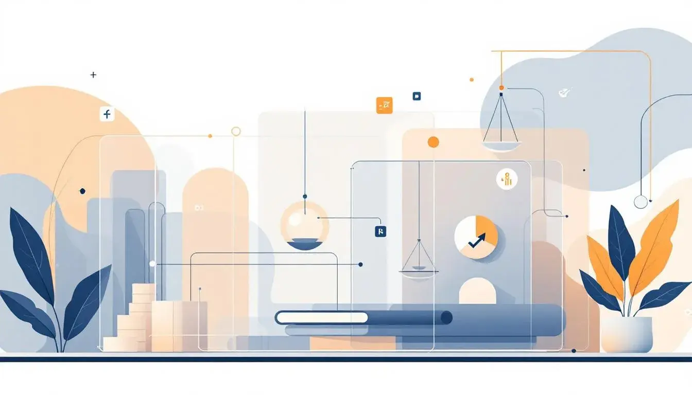
13 Aug 2025 · 3 min readThe anticipation around a new year often brings with it predictions, a glimpse into the aesthetic trends that will shape our surroundings. Color, in particular, serves as a silent narrator, influencing our perceptions and dictating the mood of spaces, brands, and experiences. More than mere hues, palettes whisper stories, set intentions, and reflect the collective aspirations of a given moment. As we look towards 2025, the prevailing sentiment appears to be a recalibration towards the Professional. But what does that even mean? Is it the crisp austerity of a corner office, or something altogether more subtle, a quiet assurance woven into the very fabric of our visual world? We’re not discussing buttoned-up stuffiness, but rather a sophisticated and confident poise, translated through color. A professional atmosphere can be bold with intention, soft with assurance, or somewhere gracefully in between. Let us consider some possible formulations, some hints of what Professional could come to suggest.
The Modern Tech palette steps forward as a study in controlled vibrancy. Calm Green offers a refreshing counterpoint, like a planted wall in a glass office. Close by, however, Raspberry Red pulses with a subtle energy — perhaps the alert on a key performance indicator. The grounding presence of Neutral Grey suggests steadfast infrastructure and unwavering processes. Stormy Blue, a color both thoughtful and commanding, evokes the digital frontier. Deep Teal settles in as the final note, a color suggestive of vast databases humming quietly in the background. This is not the exuberance of a startup playing ping-pong in the break room. This palette speaks to serious innovation, an understanding that technology is far beyond playful gadgets, but the skeleton of almost everything.
Legal Firm introduces a tone both stately and unyielding. Pale Blue Gray whispers of meticulous paperwork and marble hallways, an echo of tradition and precedent. Soft Steel Blue strengthens the proposition — stability and trust. A sudden jolt of Vivid Sky Blue momentarily breaks the composure, providing a quick lift, a brief moment of clarity as if finding a compelling piece of evidence. Deep Prussian Blue anchors the entire scene, suggesting the weighty responsibility of the law, the intense knowledge it requires. Finally, Almost Black stands as a resolute barrier, the firm line that must never be crossed. This palette feels like walking into a wood-paneled office, the scent of leather and paper filling the air. It represents the stoic face of an institution built on centuries of practice.
Email Palette is a digital mirage. Pale Lavender appears wispy and intangible, the ephemeral nature of digital communication. Vivid Blue provides the thrust — the notification that demands attention, the link that invites a click. Dusty Purple veils the message with a touch of something mysterious, a hint of personalized intrigue. Charcoal Gray lends the scene structure and sophistication, reinforcing its necessity rather than the ease of dismissal. Deep Violet, a color of regal contemplation, subtly reminds you of the power contained within information, whether in the inbox or out. This is the hum of the server room, the glow of the screen late at night, a visual representation of communication itself.
With Tech Palette, we are presented with a softer rendition of innovation, one that feels like a conversation over coffee, not a boardroom battle. Pale Blue evokes the airy openness of collaborative spaces, while Golden Beige offers a warm, approachable counterpoint. Muted Green whispers of sustainable practices, of a company mindful of its footprint. Dusty Rose lends a touch of humanism to technology, reminding us of the people behind the processes, and the services they enable. Deep Indigo anchors the palette with a sense of purpose and determination. This combination suggests a mindful approach to technological advancement, one that values both progress and humanity.
The Corporate Trust palette exudes a sense of measured restraint, a quiet confidence earned through years of diligent service. Light Grayish-Blue is crisp and clean, reflecting transparency and open communication. Cool Gray provides a solid, reliable base upon which progress can be established. Khaki Green adds a touch of earthy practicality, suggesting a grounded approach to business. Slate Gray hints at quiet authority, the wisdom gained through experience under pressure. Dark Indigo completes the picture, evoking a sense of institutional knowledge, the deep understanding that inspires genuine confidence.
The projection of Professional in 2025 is not a singular vision, but a spectrum of possibilities. From the controlled vibrancy of Modern Tech to the stoic authority of Legal Firm and the mindful innovation of Tech Palette, color forecasts a return to clarity, precision, reliability, and humanism. It suggests that audiences are moving away from frenetic or disruptive colors, or empty corporate buzzwords, toward palettes that quietly suggest competence, consideration, and character. It's not about shouting achievements, but projecting purpose.