'%3e%3cpath%20fill-rule='evenodd'%20clip-rule='evenodd'%20d='M51.1303%2019.2492C50.7278%2019.913%2050.1346%2020.4426%2049.3508%2020.838C48.5669%2021.2335%2047.6172%2021.4312%2046.5014%2021.4312C44.8208%2021.4312%2043.4367%2021.0216%2042.3492%2020.2025C41.2617%2019.3833%2040.6686%2018.2394%2040.5697%2016.7706H44.4253C44.4818%2017.3355%2044.6831%2017.7804%2045.0291%2018.1052C45.3751%2018.43%2045.8164%2018.5924%2046.3531%2018.5924C46.8192%2018.5924%2047.1864%2018.4653%2047.4547%2018.2111C47.7231%2017.9569%2047.8572%2017.618%2047.8572%2017.1943C47.8572%2016.8129%2047.7337%2016.4952%2047.4865%2016.241C47.2393%2015.9867%2046.9322%2015.7784%2046.565%2015.616C46.1978%2015.4536%2045.6893%2015.2594%2045.0397%2015.0334C44.0934%2014.7086%2043.3202%2014.3944%2042.72%2014.0907C42.1197%2013.7871%2041.6042%2013.3351%2041.1735%2012.7349C40.7427%2012.1347%2040.5273%2011.3544%2040.5273%2010.394C40.5273%209.50418%2040.7533%208.73448%2041.2053%208.08481C41.6572%207.43515%2042.2821%206.93731%2043.0801%206.5913C43.8781%206.24528%2044.7925%206.07227%2045.8235%206.07227C47.49%206.07227%2048.8141%206.46771%2049.7956%207.25861C50.7772%208.04951%2051.3315%209.13698%2051.4586%2010.5211H47.5395C47.4689%2010.0268%2047.2888%209.63483%2046.9993%209.3453C46.7097%209.05578%2046.3178%208.91102%2045.8235%208.91102C45.3998%208.91102%2045.0573%209.024%2044.7961%209.24997C44.5348%209.47594%2044.4041%209.80783%2044.4041%2010.2457C44.4041%2010.5988%2044.5207%2010.8989%2044.7537%2011.146C44.9867%2011.3932%2045.2798%2011.5944%2045.6328%2011.7498C45.9859%2011.9052%2046.4944%2012.1029%2047.1581%2012.343C48.1185%2012.6678%2048.9023%2012.9891%2049.5096%2013.3069C50.1169%2013.6246%2050.6395%2014.0872%2051.0773%2014.6945C51.5151%2015.3018%2051.734%2016.0927%2051.734%2017.0672C51.734%2017.8581%2051.5328%2018.5854%2051.1303%2019.2492ZM59.0242%206.3053V21.2829H55.4016V6.3053H59.0242ZM73.9409%206.3053V9.18642H69.8734V21.2829H66.2296V9.18642H62.2046V6.3053H73.9409ZM80.7438%209.18642V12.3218H85.8069V15.0546H80.7438V18.3806H86.4425V21.2829H77.1212V6.3053H86.4425V9.18642H80.7438ZM99.667%2016.0291V21.2829H96.0444V6.3053H101.913C103.692%206.3053%20105.048%206.74665%20105.98%207.62934C106.912%208.51204%20107.378%209.7019%20107.378%2011.199C107.378%2012.1311%20107.17%2012.9609%20106.753%2013.6882C106.337%2014.4155%20105.719%2014.9875%20104.9%2015.4042C104.08%2015.8208%20103.085%2016.0291%20101.913%2016.0291H99.667ZM103.692%2011.199C103.692%209.8855%20102.965%209.22879%20101.51%209.22879H99.667V13.1268H101.51C102.965%2013.1268%20103.692%2012.4842%20103.692%2011.199ZM120.092%2018.5501H114.478L113.546%2021.2829H109.732L115.219%206.41123H119.393L124.879%2021.2829H121.024L120.092%2018.5501ZM119.16%2015.7961L117.295%2010.2881L115.41%2015.7961H119.16ZM131.555%2018.5077H136.385V21.2829H127.933V6.3053H131.555V18.5077ZM143.337%209.18642V12.3218H148.4V15.0546H143.337V18.3806H149.035V21.2829H139.714V6.3053H149.035V9.18642H143.337ZM163.507%206.3053V9.18642H159.44V21.2829H155.796V9.18642H151.771V6.3053H163.507ZM177.449%206.3053V9.18642H173.382V21.2829H169.738V9.18642H165.713V6.3053H177.449ZM184.252%209.18642V12.3218H189.315V15.0546H184.252V18.3806H189.951V21.2829H180.629V6.3053H189.951V9.18642H184.252Z'%20fill='%23EEF0ED'/%3e%3cmask%20id='mask0_3101_7327'%20style='mask-type:alpha'%20maskUnits='userSpaceOnUse'%20x='0'%20y='0'%20width='27'%20height='28'%3e%3cpath%20d='M23.8328%200.759766H2.64808C1.18559%200.759766%200%201.94535%200%203.40785V24.5925C0%2026.055%201.18559%2027.2406%202.64808%2027.2406H23.8328C25.2952%2027.2406%2026.4808%2026.055%2026.4808%2024.5925V3.40785C26.4808%201.94535%2025.2952%200.759766%2023.8328%200.759766Z'%20fill='white'/%3e%3c/mask%3e%3cg%20mask='url(%23mask0_3101_7327)'%3e%3cpath%20d='M23.8328%200.759766H2.64808C1.18559%200.759766%200%201.94535%200%203.40785V24.5925C0%2026.055%201.18559%2027.2406%202.64808%2027.2406H23.8328C25.2952%2027.2406%2026.4808%2026.055%2026.4808%2024.5925V3.40785C26.4808%201.94535%2025.2952%200.759766%2023.8328%200.759766Z'%20fill='%23D8D8D8'/%3e%3cpath%20d='M13.2404%200.759766H0V14.0001H13.2404V0.759766Z'%20fill='%238C61FF'/%3e%3cpath%20d='M13.2404%2014H0V27.2404H13.2404V14Z'%20fill='%2336C3FE'/%3e%3cpath%20d='M26.4806%2014H13.2402V27.2404H26.4806V14Z'%20fill='%236592FE'/%3e%3cpath%20d='M26.4806%200.759766H13.2402V14.0002H26.4806V0.759766Z'%20fill='%236059F7'/%3e%3c/g%3e%3c/g%3e%3cdefs%3e%3cclipPath%20id='clip0_3101_7327'%3e%3crect%20width='190'%20height='28'%20fill='white'/%3e%3c/clipPath%3e%3c/defs%3e%3c/svg%3e)
'%3e%3cpath%20d='M23.8328%200.759521H2.64808C1.18559%200.759521%200%201.94511%200%203.40761V24.5923C0%2026.0548%201.18559%2027.2404%202.64808%2027.2404H23.8328C25.2952%2027.2404%2026.4808%2026.0548%2026.4808%2024.5923V3.40761C26.4808%201.94511%2025.2952%200.759521%2023.8328%200.759521Z'%20fill='%23D8D8D8'/%3e%3cpath%20d='M13.2404%200.759521H0V13.9999H13.2404V0.759521Z'%20fill='%238C61FF'/%3e%3cpath%20d='M13.2404%2013.9998H0V27.2402H13.2404V13.9998Z'%20fill='%2336C3FE'/%3e%3cpath%20d='M26.4809%2013.9998H13.2405V27.2402H26.4809V13.9998Z'%20fill='%236592FE'/%3e%3cpath%20d='M26.4809%200.759277H13.2405V13.9997H26.4809V0.759277Z'%20fill='%236059F7'/%3e%3c/g%3e%3c/svg%3e)
Home Sweet Palette: Matching Colors to Interior Design Styles
13 Aug 2025 · 3 min readColor breathes life into a home. It whispers of personality, of serenity, of vibrant energy. Choosing the right palette isn't merely about aesthetics; it's about crafting an environment that nurtures, inspires, and welcomes. It’s about tuning into the silent language of color, letting intention shape our physical spaces. With thoughtful consideration, walls become canvases, furniture transforms into sculptures, and an overarching design emerges that is as pleasing to the eye as it is to the soul. Color is the silent architect of atmosphere, and each carefully chosen hue contributes to the story our homes tell.
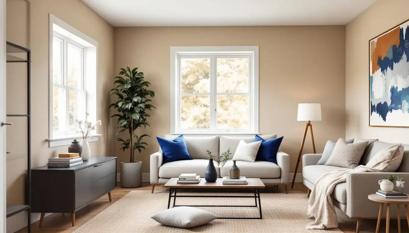
The Windows Palette allows a home to feel open, even expansive, regardless of its square footage. Pale Beige acts as a foundation of tranquility, an alternative, perhaps, to stark white. Tan Clay introduces a grounding element, suggestive of earth and stability, preventing the beige from feeling too sterile. The presence of Royal Blue brings in the coolness of water, the expanse of open sky, a refreshing counterpoint to the warmer tones. Dark Slate Gray offers structure and depth, a subtle strength that prevents the palette from becoming overly airy. Finally, the Deep Indigo deepens the experience; it's a quiet, contemplative note that adds a sense of mystery and sophistication. Imagine this palette gracing a sun-drenched living room, where natural light interacts with these curated hues, creating a space that is both calming and uplifting. The Royal Blue, perhaps in the form of accent pillows or artwork, draws the eye and invites conversation, while touches of Deep Indigo in textiles or decorative objects add a layer of intrigue. Consider how this palette might soften the hard lines of modern architecture, bringing warmth and approachability to otherwise minimalist spaces. The Windows Palette is not just about color; it’s a story that embraces light, texture, and the feeling of boundless possibility.
French Sling is the kind of palette that inspires a party, both sophisticated and slightly mischievous. Off White acts as a blank slate, allowing the other hues to burst forward with vivacity. Consider the Light Blue Gray, like a hint of sea air through open windows; it adds a breezy calm, acting as a gentle counterpoint to the more assertive colors. Pale Gold whispers of luxury, of champagne bubbles and festive celebrations, adding a refined touch. Bright Cyan leaps forward with youthful energy, akin to the excitement of trying something new. Vibrant Orange echoes that energy but adds a layer of warmth, like the glow of candlelight reflecting off glass. Medium Gray provides a necessary dose of groundedness, preventing the palette from becoming too frenetic. Bright Red is a spark, a jolt of pure excitement; it demands attention and suggests passion. Electric Blue hums with technological innovation, reminding us that playfulness can also be cutting-edge. But the real magic lies in balancing these bright shades: Dark Charcoal lends weight and sophistication, akin to a perfectly tailored suit. Dark Burgundy introduces a richness and depth, like a prized bottle of aged wine. Envision the palette in a loft space with exposed brick, where white linens and soft lighting temper the vibrant colors, creating an atmosphere that is both stimulating and effortlessly stylish.
Modern Mix is subtle and thoughtful, a way to imbue a home with depth. Mustard Yellow provides a soft glow, suggestive of quiet mornings and sunlit afternoons, offering comfort. Dusty Rose adds a touch of romance, a whisper of days gone by, a gentle reminder of enduring beauty. Rusty Red is the heart of this palette; it warms the space with comfort. Neutral Gray contributes, adding sophistication without overwhelming the palette. Deep Indigo brings in an element of mystery, the serenity of a night sky; it is a cooling presence that grounds the other hues. Imagine this palette used in a home library, where the Mustard Yellow of a velvet armchair catches the light, and the Dusty Rose appears in the antique rug beneath your feet. The Rusty Red in the walls creates an atmosphere of intimacy and warmth, while the Neutral Gray shelves provide a calm backdrop for your collection of books. The Deep Indigo might appear in the upholstery and artwork, creating a sense of quiet sophistication, a retreat from the outside world. These colors become a silent language, telling a story of refined taste and an appreciation for the beauty of imperfection.
These palettes whisper of diverse possibilities, echoing human emotion. They are not simply arrangements of colors; they are keys to transforming a space into a sanctuary, a place where design blends seamlessly with daily life. Whether seeking the serenity of open skies, the spark of vibrant celebration, or the embrace of grounded earth tones, the careful application of color can elevate the experience of home.