'%3e%3cpath%20fill-rule='evenodd'%20clip-rule='evenodd'%20d='M51.1303%2019.2492C50.7278%2019.913%2050.1346%2020.4426%2049.3508%2020.838C48.5669%2021.2335%2047.6172%2021.4312%2046.5014%2021.4312C44.8208%2021.4312%2043.4367%2021.0216%2042.3492%2020.2025C41.2617%2019.3833%2040.6686%2018.2394%2040.5697%2016.7706H44.4253C44.4818%2017.3355%2044.6831%2017.7804%2045.0291%2018.1052C45.3751%2018.43%2045.8164%2018.5924%2046.3531%2018.5924C46.8192%2018.5924%2047.1864%2018.4653%2047.4547%2018.2111C47.7231%2017.9569%2047.8572%2017.618%2047.8572%2017.1943C47.8572%2016.8129%2047.7337%2016.4952%2047.4865%2016.241C47.2393%2015.9867%2046.9322%2015.7784%2046.565%2015.616C46.1978%2015.4536%2045.6893%2015.2594%2045.0397%2015.0334C44.0934%2014.7086%2043.3202%2014.3944%2042.72%2014.0907C42.1197%2013.7871%2041.6042%2013.3351%2041.1735%2012.7349C40.7427%2012.1347%2040.5273%2011.3544%2040.5273%2010.394C40.5273%209.50418%2040.7533%208.73448%2041.2053%208.08481C41.6572%207.43515%2042.2821%206.93731%2043.0801%206.5913C43.8781%206.24528%2044.7925%206.07227%2045.8235%206.07227C47.49%206.07227%2048.8141%206.46771%2049.7956%207.25861C50.7772%208.04951%2051.3315%209.13698%2051.4586%2010.5211H47.5395C47.4689%2010.0268%2047.2888%209.63483%2046.9993%209.3453C46.7097%209.05578%2046.3178%208.91102%2045.8235%208.91102C45.3998%208.91102%2045.0573%209.024%2044.7961%209.24997C44.5348%209.47594%2044.4041%209.80783%2044.4041%2010.2457C44.4041%2010.5988%2044.5207%2010.8989%2044.7537%2011.146C44.9867%2011.3932%2045.2798%2011.5944%2045.6328%2011.7498C45.9859%2011.9052%2046.4944%2012.1029%2047.1581%2012.343C48.1185%2012.6678%2048.9023%2012.9891%2049.5096%2013.3069C50.1169%2013.6246%2050.6395%2014.0872%2051.0773%2014.6945C51.5151%2015.3018%2051.734%2016.0927%2051.734%2017.0672C51.734%2017.8581%2051.5328%2018.5854%2051.1303%2019.2492ZM59.0242%206.3053V21.2829H55.4016V6.3053H59.0242ZM73.9409%206.3053V9.18642H69.8734V21.2829H66.2296V9.18642H62.2046V6.3053H73.9409ZM80.7438%209.18642V12.3218H85.8069V15.0546H80.7438V18.3806H86.4425V21.2829H77.1212V6.3053H86.4425V9.18642H80.7438ZM99.667%2016.0291V21.2829H96.0444V6.3053H101.913C103.692%206.3053%20105.048%206.74665%20105.98%207.62934C106.912%208.51204%20107.378%209.7019%20107.378%2011.199C107.378%2012.1311%20107.17%2012.9609%20106.753%2013.6882C106.337%2014.4155%20105.719%2014.9875%20104.9%2015.4042C104.08%2015.8208%20103.085%2016.0291%20101.913%2016.0291H99.667ZM103.692%2011.199C103.692%209.8855%20102.965%209.22879%20101.51%209.22879H99.667V13.1268H101.51C102.965%2013.1268%20103.692%2012.4842%20103.692%2011.199ZM120.092%2018.5501H114.478L113.546%2021.2829H109.732L115.219%206.41123H119.393L124.879%2021.2829H121.024L120.092%2018.5501ZM119.16%2015.7961L117.295%2010.2881L115.41%2015.7961H119.16ZM131.555%2018.5077H136.385V21.2829H127.933V6.3053H131.555V18.5077ZM143.337%209.18642V12.3218H148.4V15.0546H143.337V18.3806H149.035V21.2829H139.714V6.3053H149.035V9.18642H143.337ZM163.507%206.3053V9.18642H159.44V21.2829H155.796V9.18642H151.771V6.3053H163.507ZM177.449%206.3053V9.18642H173.382V21.2829H169.738V9.18642H165.713V6.3053H177.449ZM184.252%209.18642V12.3218H189.315V15.0546H184.252V18.3806H189.951V21.2829H180.629V6.3053H189.951V9.18642H184.252Z'%20fill='%23EEF0ED'/%3e%3cmask%20id='mask0_3101_7327'%20style='mask-type:alpha'%20maskUnits='userSpaceOnUse'%20x='0'%20y='0'%20width='27'%20height='28'%3e%3cpath%20d='M23.8328%200.759766H2.64808C1.18559%200.759766%200%201.94535%200%203.40785V24.5925C0%2026.055%201.18559%2027.2406%202.64808%2027.2406H23.8328C25.2952%2027.2406%2026.4808%2026.055%2026.4808%2024.5925V3.40785C26.4808%201.94535%2025.2952%200.759766%2023.8328%200.759766Z'%20fill='white'/%3e%3c/mask%3e%3cg%20mask='url(%23mask0_3101_7327)'%3e%3cpath%20d='M23.8328%200.759766H2.64808C1.18559%200.759766%200%201.94535%200%203.40785V24.5925C0%2026.055%201.18559%2027.2406%202.64808%2027.2406H23.8328C25.2952%2027.2406%2026.4808%2026.055%2026.4808%2024.5925V3.40785C26.4808%201.94535%2025.2952%200.759766%2023.8328%200.759766Z'%20fill='%23D8D8D8'/%3e%3cpath%20d='M13.2404%200.759766H0V14.0001H13.2404V0.759766Z'%20fill='%238C61FF'/%3e%3cpath%20d='M13.2404%2014H0V27.2404H13.2404V14Z'%20fill='%2336C3FE'/%3e%3cpath%20d='M26.4806%2014H13.2402V27.2404H26.4806V14Z'%20fill='%236592FE'/%3e%3cpath%20d='M26.4806%200.759766H13.2402V14.0002H26.4806V0.759766Z'%20fill='%236059F7'/%3e%3c/g%3e%3c/g%3e%3cdefs%3e%3cclipPath%20id='clip0_3101_7327'%3e%3crect%20width='190'%20height='28'%20fill='white'/%3e%3c/clipPath%3e%3c/defs%3e%3c/svg%3e)
'%3e%3cpath%20d='M23.8328%200.759521H2.64808C1.18559%200.759521%200%201.94511%200%203.40761V24.5923C0%2026.0548%201.18559%2027.2404%202.64808%2027.2404H23.8328C25.2952%2027.2404%2026.4808%2026.0548%2026.4808%2024.5923V3.40761C26.4808%201.94511%2025.2952%200.759521%2023.8328%200.759521Z'%20fill='%23D8D8D8'/%3e%3cpath%20d='M13.2404%200.759521H0V13.9999H13.2404V0.759521Z'%20fill='%238C61FF'/%3e%3cpath%20d='M13.2404%2013.9998H0V27.2402H13.2404V13.9998Z'%20fill='%2336C3FE'/%3e%3cpath%20d='M26.4809%2013.9998H13.2405V27.2402H26.4809V13.9998Z'%20fill='%236592FE'/%3e%3cpath%20d='M26.4809%200.759277H13.2405V13.9997H26.4809V0.759277Z'%20fill='%236059F7'/%3e%3c/g%3e%3c/svg%3e)
Decoding Design Styles: Color Trends in Minimalism
13 Aug 2025 · 5 min readMinimalism, often seen as pure restraint, is, in fact, a discipline of careful selection. It's not about what you eliminate, but what you choose to keep, and how those choices speak volumes. Color, in this context, becomes a storyteller, whispering tales of space, light, and the quiet luxury of considered living. These palettes, pared down to their most suggestive elements, evoke distinct atmospheres - from the grounding serenity of nature to the sleek resolve of urban landscapes. They steer away from superfluous embellishment, and towards conveying the feeling of openness and well-being through measured chromatic choices. These are not stark, vacant expressions; they represent curated statements, shaping our perception of volume, texture, and the emotional terrain of a simplified existence. Imagine walking into rooms draped in these colors – the air feels different, clarity descends, and the mind finds stillness. Color becomes a breath, a pause, a conscious act of inhabiting the present moment, free from distraction and rich in subtle sensation. From where the light meets surfaces, to how shadows fall, a dance is choreographed with shades to construct spaces which become havens of tranquility and intention. In the realm of minimalist design, where less is more, the impact of each carefully selected hue becomes magnified, lending a profound significance to even the most understated chromatic scheme.
The "Earthy Elegance" palette 🫘 offers a serene entry point into minimalist spaces. It calls to mind a wabi-sabi aesthetic, where imperfection and naturalness are celebrated. "Off White" emerges as a canvas, a gentle whisper rather than a declaration, evoking a sense of calm and openness. This isn't a sterile, clinical white, but one imbued with subtle warmth, like sunlight filtering through linen curtains. The range of hues then travels subtly through "Neutral Gray" – think of river stones, smoothed by water over long periods – and into the more grounding depth of "Olive Drab," reminiscent of dry grasses or the muted tones of a late autumn forest. "Muted Brown," like aged wood or sun-baked earth, anchors the palette, lending a feeling of stability and connection to the natural world. Finally, "Dark Charcoal" introduces drama – a touch of shadow that defines the edges, like the silhouette of trees against a twilight sky. This quiet drama is key; it's not about sharp contrasts, but rather the layering of depths and textures. Picture a bedroom where walls are painted in an "Off White," with bedding in "Neutral Gray" and a single, handcrafted wooden stool in "Muted Brown." The effect would be one of utter serenity, a sanctuary from the modern world. The brilliance of this palette lies in its ability to create a feeling of richness and complexity despite its limited range. The colors are not merely decorative; they are imbued with sensory memories, tactile associations and emotional resonance. It translates into spaces that feel both grounded and elevated, simple but never stark, quiet but never empty. The user experience is one of tranquility, a sense of being held and soothed.
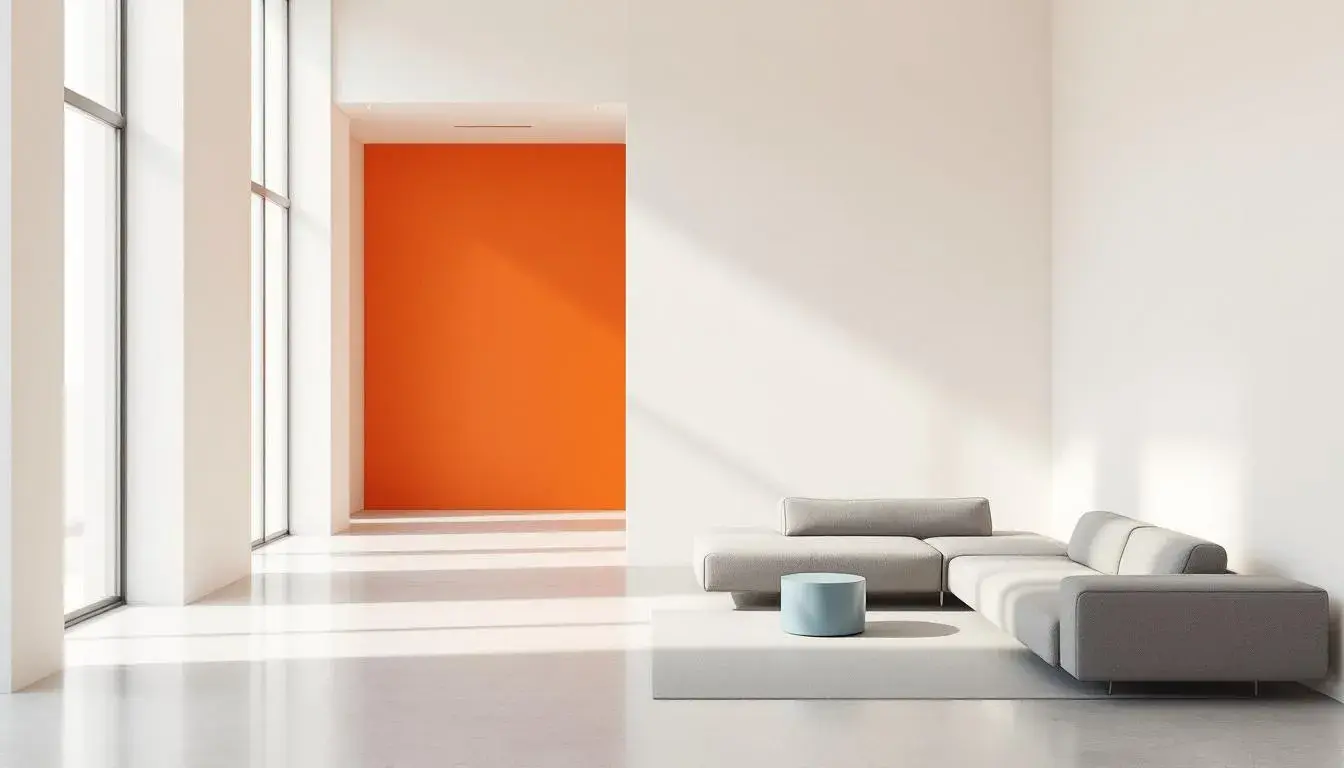
"Modern Business" 🏢 presents a minimalist statement with a measured dose of confidence. "Vibrant Orange," though the boldest of the bunch, is not overwhelming; it's a spark, an accent, like a single piece of statement art in a gallery of white walls. It hints at energy and innovation, the flicker of a screen or the warmth of a setting sun viewed from an office window. In counterpoint, "Dusty Gray" offers a grounding presence. This isn't a cold, industrial gray, but one with a subtle warmth, conjuring concrete softly weathered by time, a feeling of understated permanence and reliability. "Steel Blue" introduces a note of sophisticated calm, like gazing at a distant mountain range through clear air. It's a color of intellect and clarity, suggesting focused thought and strategic decision-making. The "Rusty Orange" works as an earthier counterpart, reminiscent of leather-bound books or antique maps, hinting at experience and solidity. And finally, "Deep Olive," offers something organic, an echo of the natural world pushing its way inside polished modern spaces. Its grounding quality provides a subtle, unexpected richness. Imagine an office space designed with this palette: walls in "Dusty Gray," punctuated by a single "Vibrant Orange" chair, with "Steel Blue" accents in the artwork. The overall effect is one of professional elegance, balanced with a touch of forward-thinking creativity. It’s a palette that fosters focus and inspires confidence, promoting both productivity and a sense of well-being. These hues, thoughtfully arranged, speak of careful attention to detail while not being ostentatious.
"Modern Contrast" 🎨 offers a daring exploration of minimalist principles, pushing the boundaries of what we expect from pared-down aesthetics. “Light Gray” delivers a neutral base, the foundation for a gallery, allowing the more vibrant personalities to shine. "Chartreuse Yellow" is the unexpected jolt, a burst of botanical energy like the first shoots pushing through the soil in spring. It's a color that sparks creativity and adds a touch of playful irreverence to otherwise serious spaces. “Aqua Teal” acts as a refreshing pool, offering respite from all the boldness in the layout, whispering of open skies and clear waters. The "Dark Taupe", similar to well-worn velvet, provides something familiar and comforting, while its darkness keeps things grounded. Finally, "Deep Charcoal," like the shadows shifting at twilight, offers a sense of depth, and allows the lighter colors to pop with visual vibrancy. Envision a minimalist living room where the walls are painted in "Light Gray," with "Chartreuse Yellow" cushions scattered across a "Dark Taupe" sofa, and a piece of "Aqua Teal" artwork adorning the wall. This palette creates a space that is both stimulating and calming, offering a balance between energy and serenity. It challenges the notion that minimalism has to be devoid of personality, demonstrating that even within a limited framework, there is room for self-expression and bold visual statements.
With "Financial Freedom" 🪙, a sense of controlled ambition takes center stage. The "Pale Gold" acts as a soothing backdrop, suggesting material comfort, without falling into lavishness. "Vibrant Cyan", like a mountain spring, brings a feeling of invigoration, sparking enthusiasm for the day ahead. The "Sapphire Blue", reminiscent of the night sky, inspires a sense of contemplation, reminding of vast opportunities and far-reaching horizons. "Bright Maroon", reminiscent of powerful, jewel-toned fabrics, exudes sophistication, and serves as an anchor for the lighter shades. The deep "Dark Coffee" shade provides comfort, similar to a warm drink on a chilly morning. Visualize an office space crafted around this palette; walls adorned in "Pale Gold," complemented by the ergonomic chairs in "Dark Coffee," enlivened by "Vibrant Cyan"-colored desk accessories. The palette cultivates an ambiance of forward-thinking mindset, that is both grounded and full of potential. These tones, harmoniously blended, evoke an attention to detail while steering clear of flamboyance.
"Urban Dusk" 🌃 introduces a moody, understated elegance to the minimalist conversation. "Pale Gold," softened by a twilight filter, suggests subdued glamour. It evokes lights reflecting on wet sidewalks, the hushed promise of a city night. "Mustard Yellow," carries hints of the sun setting, offering a subtle warmth, like streetlights beginning to glow. Introducing "Forest Green", allows for a touch of revitalization, bringing the feeling of an urban garden. The "Deep Olive" has that touch of nature, similar to a forest, bringing a sense of comfort. And the "Ebony Black", delivers elegance, akin to high rise apartments overlooking a cityscape. Imagine a loft apartment in this palette, where "Pale Gold" walls meet polished concrete floors, accented by "Forest Green" foliage. It creates a space for restoration, a reprieve, and a place to slow down. The thoughtful distribution of each hue gives an attention to detail without being pretentious.
These palettes, each a carefully curated experience, reveal the breadth of expression possible within the confines of minimalist design. They underscore the capacity of color to evoke emotion, define space, and shape our perceptions of simplicity. They demonstrate that minimalism is not merely about the absence of things, but about the presence of intention: the conscious selection of elements that speak to us on a deeper level. In thoughtfully selected areas, color can guide minimalism out of cold austerity and into sophisticated warmth.