'%3e%3cpath%20fill-rule='evenodd'%20clip-rule='evenodd'%20d='M51.1303%2019.2492C50.7278%2019.913%2050.1346%2020.4426%2049.3508%2020.838C48.5669%2021.2335%2047.6172%2021.4312%2046.5014%2021.4312C44.8208%2021.4312%2043.4367%2021.0216%2042.3492%2020.2025C41.2617%2019.3833%2040.6686%2018.2394%2040.5697%2016.7706H44.4253C44.4818%2017.3355%2044.6831%2017.7804%2045.0291%2018.1052C45.3751%2018.43%2045.8164%2018.5924%2046.3531%2018.5924C46.8192%2018.5924%2047.1864%2018.4653%2047.4547%2018.2111C47.7231%2017.9569%2047.8572%2017.618%2047.8572%2017.1943C47.8572%2016.8129%2047.7337%2016.4952%2047.4865%2016.241C47.2393%2015.9867%2046.9322%2015.7784%2046.565%2015.616C46.1978%2015.4536%2045.6893%2015.2594%2045.0397%2015.0334C44.0934%2014.7086%2043.3202%2014.3944%2042.72%2014.0907C42.1197%2013.7871%2041.6042%2013.3351%2041.1735%2012.7349C40.7427%2012.1347%2040.5273%2011.3544%2040.5273%2010.394C40.5273%209.50418%2040.7533%208.73448%2041.2053%208.08481C41.6572%207.43515%2042.2821%206.93731%2043.0801%206.5913C43.8781%206.24528%2044.7925%206.07227%2045.8235%206.07227C47.49%206.07227%2048.8141%206.46771%2049.7956%207.25861C50.7772%208.04951%2051.3315%209.13698%2051.4586%2010.5211H47.5395C47.4689%2010.0268%2047.2888%209.63483%2046.9993%209.3453C46.7097%209.05578%2046.3178%208.91102%2045.8235%208.91102C45.3998%208.91102%2045.0573%209.024%2044.7961%209.24997C44.5348%209.47594%2044.4041%209.80783%2044.4041%2010.2457C44.4041%2010.5988%2044.5207%2010.8989%2044.7537%2011.146C44.9867%2011.3932%2045.2798%2011.5944%2045.6328%2011.7498C45.9859%2011.9052%2046.4944%2012.1029%2047.1581%2012.343C48.1185%2012.6678%2048.9023%2012.9891%2049.5096%2013.3069C50.1169%2013.6246%2050.6395%2014.0872%2051.0773%2014.6945C51.5151%2015.3018%2051.734%2016.0927%2051.734%2017.0672C51.734%2017.8581%2051.5328%2018.5854%2051.1303%2019.2492ZM59.0242%206.3053V21.2829H55.4016V6.3053H59.0242ZM73.9409%206.3053V9.18642H69.8734V21.2829H66.2296V9.18642H62.2046V6.3053H73.9409ZM80.7438%209.18642V12.3218H85.8069V15.0546H80.7438V18.3806H86.4425V21.2829H77.1212V6.3053H86.4425V9.18642H80.7438ZM99.667%2016.0291V21.2829H96.0444V6.3053H101.913C103.692%206.3053%20105.048%206.74665%20105.98%207.62934C106.912%208.51204%20107.378%209.7019%20107.378%2011.199C107.378%2012.1311%20107.17%2012.9609%20106.753%2013.6882C106.337%2014.4155%20105.719%2014.9875%20104.9%2015.4042C104.08%2015.8208%20103.085%2016.0291%20101.913%2016.0291H99.667ZM103.692%2011.199C103.692%209.8855%20102.965%209.22879%20101.51%209.22879H99.667V13.1268H101.51C102.965%2013.1268%20103.692%2012.4842%20103.692%2011.199ZM120.092%2018.5501H114.478L113.546%2021.2829H109.732L115.219%206.41123H119.393L124.879%2021.2829H121.024L120.092%2018.5501ZM119.16%2015.7961L117.295%2010.2881L115.41%2015.7961H119.16ZM131.555%2018.5077H136.385V21.2829H127.933V6.3053H131.555V18.5077ZM143.337%209.18642V12.3218H148.4V15.0546H143.337V18.3806H149.035V21.2829H139.714V6.3053H149.035V9.18642H143.337ZM163.507%206.3053V9.18642H159.44V21.2829H155.796V9.18642H151.771V6.3053H163.507ZM177.449%206.3053V9.18642H173.382V21.2829H169.738V9.18642H165.713V6.3053H177.449ZM184.252%209.18642V12.3218H189.315V15.0546H184.252V18.3806H189.951V21.2829H180.629V6.3053H189.951V9.18642H184.252Z'%20fill='%23EEF0ED'/%3e%3cmask%20id='mask0_3101_7327'%20style='mask-type:alpha'%20maskUnits='userSpaceOnUse'%20x='0'%20y='0'%20width='27'%20height='28'%3e%3cpath%20d='M23.8328%200.759766H2.64808C1.18559%200.759766%200%201.94535%200%203.40785V24.5925C0%2026.055%201.18559%2027.2406%202.64808%2027.2406H23.8328C25.2952%2027.2406%2026.4808%2026.055%2026.4808%2024.5925V3.40785C26.4808%201.94535%2025.2952%200.759766%2023.8328%200.759766Z'%20fill='white'/%3e%3c/mask%3e%3cg%20mask='url(%23mask0_3101_7327)'%3e%3cpath%20d='M23.8328%200.759766H2.64808C1.18559%200.759766%200%201.94535%200%203.40785V24.5925C0%2026.055%201.18559%2027.2406%202.64808%2027.2406H23.8328C25.2952%2027.2406%2026.4808%2026.055%2026.4808%2024.5925V3.40785C26.4808%201.94535%2025.2952%200.759766%2023.8328%200.759766Z'%20fill='%23D8D8D8'/%3e%3cpath%20d='M13.2404%200.759766H0V14.0001H13.2404V0.759766Z'%20fill='%238C61FF'/%3e%3cpath%20d='M13.2404%2014H0V27.2404H13.2404V14Z'%20fill='%2336C3FE'/%3e%3cpath%20d='M26.4806%2014H13.2402V27.2404H26.4806V14Z'%20fill='%236592FE'/%3e%3cpath%20d='M26.4806%200.759766H13.2402V14.0002H26.4806V0.759766Z'%20fill='%236059F7'/%3e%3c/g%3e%3c/g%3e%3cdefs%3e%3cclipPath%20id='clip0_3101_7327'%3e%3crect%20width='190'%20height='28'%20fill='white'/%3e%3c/clipPath%3e%3c/defs%3e%3c/svg%3e)
'%3e%3cpath%20d='M23.8328%200.759521H2.64808C1.18559%200.759521%200%201.94511%200%203.40761V24.5923C0%2026.0548%201.18559%2027.2404%202.64808%2027.2404H23.8328C25.2952%2027.2404%2026.4808%2026.0548%2026.4808%2024.5923V3.40761C26.4808%201.94511%2025.2952%200.759521%2023.8328%200.759521Z'%20fill='%23D8D8D8'/%3e%3cpath%20d='M13.2404%200.759521H0V13.9999H13.2404V0.759521Z'%20fill='%238C61FF'/%3e%3cpath%20d='M13.2404%2013.9998H0V27.2402H13.2404V13.9998Z'%20fill='%2336C3FE'/%3e%3cpath%20d='M26.4809%2013.9998H13.2405V27.2402H26.4809V13.9998Z'%20fill='%236592FE'/%3e%3cpath%20d='M26.4809%200.759277H13.2405V13.9997H26.4809V0.759277Z'%20fill='%236059F7'/%3e%3c/g%3e%3c/svg%3e)
The Hospitality Hue: Colors Dominating Hotel and Hospitality Industries
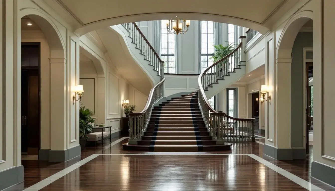
12 Aug 2025 · 3 min readConsider how designers might navigate the sensory experiences of travelers. Color dictates mood; it whispers stories of welcome as one crosses the threshold into a new, temporary domain. Think of stepping inside a haven painted in colors that soothe anxieties borne from long journeys, or imagine a boutique hotel bathed in shades that ignite curiosity. The right colors anticipate needs, relax the weary, and maybe even nudge the guest to extend their stay just one more night. These are not just paint choices, these are calculated orchestrations designed to create lasting positive impressions, transforming mere lodging into memorable moments woven into the fabric of one's travels. Color impacts how one will perceive a brand, its offerings, and perhaps most importantly, the overall value proposition. The palettes selected are not merely aesthetic, but rather immersive environments designed to resonate in the discerning minds of the modern traveler.
The palette Earthy Elegance suggests a retreat into understated sophistication. From the "Off White" to the "Steel Blue", the colors communicate gentle reassurances. Imagine these shades adorning the walls of a high-end spa, where whispered promises of self-care echo through the air. A guest room designed with these colors might feature textured linens in "Slate Green" and calming artwork incorporating "Powder Blue" to create a space of serene escapism. The strategic placement of dark wood furniture, reminiscent of the "Ash Gray," would anchor the lightness, creating a grounded yet luxurious ambience. It’s a place removed from haste, promising respite and quiet reflection in every meticulously designed corner. The combination of hues suggests a journey into calmness; it's the visual equivalent of a deep breath, an intentional exhalation of stress. Guests find themselves surrounded by a quiet grace, one that elevates their understanding of what 'hotel' can truly mean. These colors don’t scream luxury, they whisper it, creating a sensory experience where every detail contributes to an overarching aura of serene attentiveness. Consider the reception area: a textured wall in the "Off White" shade reflecting soft, indirect light, highlighting the natural variations in the material. This subtle depth welcomes arrival and speaks to the location's commitment to a refined, personal guest experience; it's a first greeting that lingers.
With Earthy Serenity, the palette channels the feeling of a secluded, natural sanctuary. The "Light Sky Blue" brings an air of openness, perhaps suggesting views onto expansive landscapes that erase the boundaries between indoors and outdoors. "Light Olive" and "Golden Khaki" hints at an immersion into natural fabrics and textures: think hand-woven throws, reclaimed wooden furniture, and pottery with organic forms that populate these colors. These tones establish a space where guests feel at peace, invited to reconnect with a simplified pace of living. Juxtaposed with the grounding effect of "Dark Chocolate" and "Ebony," this palette creates an environment that is both comforting and elegant. This isn't a place for loud parties, but one designed for morning meditations and the soft murmur of conversations over afternoon tea. Consider the lobby: filled with plush cushions in a mix of these colors, creating a tactile invitation to unwind, an unexpected discovery of comfort. This palette isn't trendy, it's timeless; it doesn't adhere to fleeting fashions, it celebrates the eternal allure of simplicity and calm. The subtle narrative this color collection unveils is a retreat into nature, a moment captured between the guest and their essential need for rest. It’s about providing not just a room, but a holistic experience, a pause button in the hectic hum of modern existence.
The Dust Rose Dusk palette draws inward, to private and intimate moments. The inclusion of "Pure White" is an open invitation for clean, refreshing simplicity. A "Pale Gold" can offer glimmers of muted glamour, as the light plays across textured walls or gilded mirror frames. "Dusty Rose" evokes a sensual softness, wrapping guests in warmth and quiet indulgence, suggesting a sanctuary dedicated to both relaxation and refinement. The "Dark Charcoal" adds a foundation of strength, grounding the ethereal shades and giving structure to the overall composition. Picture this in a boutique hotel: small, carefully curated rooms with soft lighting and plush furnishings where every detail feels tailored to the individual. It’s a color scheme of unpretentious taste, reminiscent of romantic hideaways where personalized service and attention to detail are paramount. Imagine a room bathed in the soft glow of evening, with a plush velvet chaise lounge in "Dusty Rose", inviting guests to unwind with a glass of wine, lost in quiet contemplation. This space nurtures introspection; it creates an ambiance that encourages a slowing of pace and an appreciation for simple joys. The careful balancing of light and dark creates a dance of shadows and illumination, a story told through pigment and texture, transforming a hotel room into a personal haven.
The Earthy Harmony palette suggests a journey into nature's embrace, evoking feelings of tranquil connection and grounded stability. The "Subtle Beige" offers a comforting backdrop, allowing other colors to unfold gradually, similar to discovering a serene valley on a hike. With shades of "Cool Gray" which lends an element of understated sophistication, while "Mustard Yellow" adds an elegant touch, reminiscent of sun-drenched meadows. "Brick Red" provides a warm, rustic accent, hinting at artisanal craftsmanship and heartfelt hospitality. "Dark Slate Gray" anchors the composition, grounding it in a sense of lasting reliability. Picture this in a boutique lodge: the scent of woodsmoke in the air, rooms adorned with locally sourced textiles, and common areas that invite quiet contemplation. One can imagine a stay rooted in the landscape, where hospitality acts as the passageway to nature’s restorative powers. Such a color collection doesn't just decorate, it cultivates an immersion in nature. Picture a lounge bathed in "Subtle Beige", with cushions and throws showcasing the other colors and bringing an organic, comfortable feeling. This is about creating an atmosphere that speaks to authenticity, resonating with simplicity, and the value of being present.
The Coastal Elegance palette captures the essence of seaside serenity, recalling the feeling of effortless repose. The "Bright Sky Blue" brings a breath of fresh air, evoking visions of wide-open horizons and endless possibilities. "Dusty Rose" introduces a touch of subtle blush, hinting at sunset reflections dancing on the waves, while the "Light Steel Blue" brings refinement to the design. "Medium Gray" offers a neutral balance, providing a sense of stability, reminiscent of weathered rocks along the shoreline. "Deep Teal" anchors the composition, evoking the depth and mystery of the ocean. These hues speak of sun-kissed skin and calm waters, of days spent wandering barefoot along the sand. Picture this within a beachfront resort; guests are greeted by a palette of oceanic calm. The space feels at one with its surroundings, as if the colors had been lifted directly from the landscape. Imagine a lobby lounge adorned with plush seating in muted blues and grays, creating an oasis where one can relax to the soft sounds of the waves. This is coastal luxury without pretense, an invitation to unwind and embrace the simple pleasures of life by the sea. Such thoughtful arrangements promise refuge without extravagance.
Ultimately, these palettes highlight the power of strategic color selection. The common thread running through each is the aim to establish not just visually pleasing environments, but rather carefully considered spaces that resonate with the needs and desires of the traveler. Whether it's the calm reassurance of neutral tones or the invitation to quiet introspection, these palettes reflect an understanding of the crucial role color plays in redefining hospitality experiences. The thoughtful selection of hues ensures that a hotel, resort, or inn transcends its functional purpose, becoming a transformative encounter, a place where color truly shapes memory.