'%3e%3cpath%20fill-rule='evenodd'%20clip-rule='evenodd'%20d='M51.1303%2019.2492C50.7278%2019.913%2050.1346%2020.4426%2049.3508%2020.838C48.5669%2021.2335%2047.6172%2021.4312%2046.5014%2021.4312C44.8208%2021.4312%2043.4367%2021.0216%2042.3492%2020.2025C41.2617%2019.3833%2040.6686%2018.2394%2040.5697%2016.7706H44.4253C44.4818%2017.3355%2044.6831%2017.7804%2045.0291%2018.1052C45.3751%2018.43%2045.8164%2018.5924%2046.3531%2018.5924C46.8192%2018.5924%2047.1864%2018.4653%2047.4547%2018.2111C47.7231%2017.9569%2047.8572%2017.618%2047.8572%2017.1943C47.8572%2016.8129%2047.7337%2016.4952%2047.4865%2016.241C47.2393%2015.9867%2046.9322%2015.7784%2046.565%2015.616C46.1978%2015.4536%2045.6893%2015.2594%2045.0397%2015.0334C44.0934%2014.7086%2043.3202%2014.3944%2042.72%2014.0907C42.1197%2013.7871%2041.6042%2013.3351%2041.1735%2012.7349C40.7427%2012.1347%2040.5273%2011.3544%2040.5273%2010.394C40.5273%209.50418%2040.7533%208.73448%2041.2053%208.08481C41.6572%207.43515%2042.2821%206.93731%2043.0801%206.5913C43.8781%206.24528%2044.7925%206.07227%2045.8235%206.07227C47.49%206.07227%2048.8141%206.46771%2049.7956%207.25861C50.7772%208.04951%2051.3315%209.13698%2051.4586%2010.5211H47.5395C47.4689%2010.0268%2047.2888%209.63483%2046.9993%209.3453C46.7097%209.05578%2046.3178%208.91102%2045.8235%208.91102C45.3998%208.91102%2045.0573%209.024%2044.7961%209.24997C44.5348%209.47594%2044.4041%209.80783%2044.4041%2010.2457C44.4041%2010.5988%2044.5207%2010.8989%2044.7537%2011.146C44.9867%2011.3932%2045.2798%2011.5944%2045.6328%2011.7498C45.9859%2011.9052%2046.4944%2012.1029%2047.1581%2012.343C48.1185%2012.6678%2048.9023%2012.9891%2049.5096%2013.3069C50.1169%2013.6246%2050.6395%2014.0872%2051.0773%2014.6945C51.5151%2015.3018%2051.734%2016.0927%2051.734%2017.0672C51.734%2017.8581%2051.5328%2018.5854%2051.1303%2019.2492ZM59.0242%206.3053V21.2829H55.4016V6.3053H59.0242ZM73.9409%206.3053V9.18642H69.8734V21.2829H66.2296V9.18642H62.2046V6.3053H73.9409ZM80.7438%209.18642V12.3218H85.8069V15.0546H80.7438V18.3806H86.4425V21.2829H77.1212V6.3053H86.4425V9.18642H80.7438ZM99.667%2016.0291V21.2829H96.0444V6.3053H101.913C103.692%206.3053%20105.048%206.74665%20105.98%207.62934C106.912%208.51204%20107.378%209.7019%20107.378%2011.199C107.378%2012.1311%20107.17%2012.9609%20106.753%2013.6882C106.337%2014.4155%20105.719%2014.9875%20104.9%2015.4042C104.08%2015.8208%20103.085%2016.0291%20101.913%2016.0291H99.667ZM103.692%2011.199C103.692%209.8855%20102.965%209.22879%20101.51%209.22879H99.667V13.1268H101.51C102.965%2013.1268%20103.692%2012.4842%20103.692%2011.199ZM120.092%2018.5501H114.478L113.546%2021.2829H109.732L115.219%206.41123H119.393L124.879%2021.2829H121.024L120.092%2018.5501ZM119.16%2015.7961L117.295%2010.2881L115.41%2015.7961H119.16ZM131.555%2018.5077H136.385V21.2829H127.933V6.3053H131.555V18.5077ZM143.337%209.18642V12.3218H148.4V15.0546H143.337V18.3806H149.035V21.2829H139.714V6.3053H149.035V9.18642H143.337ZM163.507%206.3053V9.18642H159.44V21.2829H155.796V9.18642H151.771V6.3053H163.507ZM177.449%206.3053V9.18642H173.382V21.2829H169.738V9.18642H165.713V6.3053H177.449ZM184.252%209.18642V12.3218H189.315V15.0546H184.252V18.3806H189.951V21.2829H180.629V6.3053H189.951V9.18642H184.252Z'%20fill='%23EEF0ED'/%3e%3cmask%20id='mask0_3101_7327'%20style='mask-type:alpha'%20maskUnits='userSpaceOnUse'%20x='0'%20y='0'%20width='27'%20height='28'%3e%3cpath%20d='M23.8328%200.759766H2.64808C1.18559%200.759766%200%201.94535%200%203.40785V24.5925C0%2026.055%201.18559%2027.2406%202.64808%2027.2406H23.8328C25.2952%2027.2406%2026.4808%2026.055%2026.4808%2024.5925V3.40785C26.4808%201.94535%2025.2952%200.759766%2023.8328%200.759766Z'%20fill='white'/%3e%3c/mask%3e%3cg%20mask='url(%23mask0_3101_7327)'%3e%3cpath%20d='M23.8328%200.759766H2.64808C1.18559%200.759766%200%201.94535%200%203.40785V24.5925C0%2026.055%201.18559%2027.2406%202.64808%2027.2406H23.8328C25.2952%2027.2406%2026.4808%2026.055%2026.4808%2024.5925V3.40785C26.4808%201.94535%2025.2952%200.759766%2023.8328%200.759766Z'%20fill='%23D8D8D8'/%3e%3cpath%20d='M13.2404%200.759766H0V14.0001H13.2404V0.759766Z'%20fill='%238C61FF'/%3e%3cpath%20d='M13.2404%2014H0V27.2404H13.2404V14Z'%20fill='%2336C3FE'/%3e%3cpath%20d='M26.4806%2014H13.2402V27.2404H26.4806V14Z'%20fill='%236592FE'/%3e%3cpath%20d='M26.4806%200.759766H13.2402V14.0002H26.4806V0.759766Z'%20fill='%236059F7'/%3e%3c/g%3e%3c/g%3e%3cdefs%3e%3cclipPath%20id='clip0_3101_7327'%3e%3crect%20width='190'%20height='28'%20fill='white'/%3e%3c/clipPath%3e%3c/defs%3e%3c/svg%3e)
'%3e%3cpath%20d='M23.8328%200.759521H2.64808C1.18559%200.759521%200%201.94511%200%203.40761V24.5923C0%2026.0548%201.18559%2027.2404%202.64808%2027.2404H23.8328C25.2952%2027.2404%2026.4808%2026.0548%2026.4808%2024.5923V3.40761C26.4808%201.94511%2025.2952%200.759521%2023.8328%200.759521Z'%20fill='%23D8D8D8'/%3e%3cpath%20d='M13.2404%200.759521H0V13.9999H13.2404V0.759521Z'%20fill='%238C61FF'/%3e%3cpath%20d='M13.2404%2013.9998H0V27.2402H13.2404V13.9998Z'%20fill='%2336C3FE'/%3e%3cpath%20d='M26.4809%2013.9998H13.2405V27.2402H26.4809V13.9998Z'%20fill='%236592FE'/%3e%3cpath%20d='M26.4809%200.759277H13.2405V13.9997H26.4809V0.759277Z'%20fill='%236059F7'/%3e%3c/g%3e%3c/svg%3e)
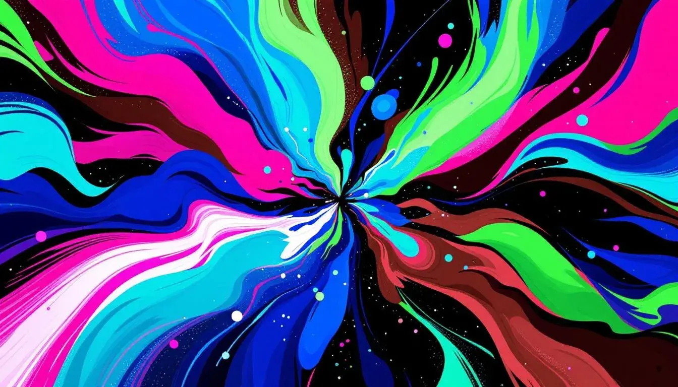
Beyond Blue: Exploring Top 5 Most Used Colors in Entertainment Industry Projects
12 Aug 2025 · 3 min readColor, a silent storyteller, shapes our perceptions and directs our gaze in the vast theater of entertainment. Think of the opening scene of a film, the splash page of a website, the very logo that brands a streaming service: each hue chosen is a calculated step in drawing us into a world of spectacle, intrigue, or joy. The art of color lies not merely in decoration, but in crafting immersive scenarios, suggesting moods, and subtly manipulating our expectations. It's the secret ingredient that transforms information into experience, turning passive viewers into active participants within the narrative. Finding the colors that are reoccuring reveals something about the common threads in entertainment experiences today.
Electric Dreams hums with the energy of a late-night arcade, the promise of digital adventures flickering on the screen. A touch of Pale Olive Green introduces a sense of grounded reality, like the worn carpet underfoot, subtly anchoring us before we launch into the virtual realm. Seafoam Green evokes oceanic depths, a sense of limitless possibility for exploration. Dark Slate Gray, like the shadows cast by towering game cabinets, adds depth and mystery. Then, Bright Lavender explodes with the synthetic thrill of victory, a jolt of pure, unadulterated fun. It all is underpinned by the Midnight Purple, a color as deep as space and as close as the screen in your hand. Imagine a fantasy film where ancient magic meets technological prowess, visualized in shades of twilight and starlight. Or an animated series about interdimensional exploration, where each portal shimmers with unearthly light. This palette wouldn't just clothe the characters and paint the scenery; it would define the very essence of their world.
Energetic Broadcast crackles with the hyperrealism of modern media, the urgent demand for attention in the attention economy. It’s the palette of a news channel breaking a major story, of a streaming platform launching its next big hit. Sky Blue communicates the promise of open skies, of connection and possibility. Cool Gray is the slick sheen of the studio, the unblinking eye of the camera. Fuchsia Pink is the audacious streak of influencer branding, the splash of a headline designed to grab the eye. Bright Red is pure alarm, the visual equivalent of a breaking news siren. Finally, Dark Brown keeps things grounded by the familiar reliability of a wooden desk or leather chair, suggesting tradition and experience. Envision a live concert film, where swirling lights of Sky Blue wash over a crowd lost in music, while Fuchsia Pink highlights a performer's silhouette against a backdrop of Bright Red and the steadiness of Dark Brown.
Vibrant Contrast suggests a world seen through the lens of social media, where curated aesthetics collide with raw experience. Lime Chartreuse bursts with an acidic energy, the visual equivalent of a notification ping. Muted Green provides a necessary counterpoint, a reminder of organic growth and connection to the earth. Royal Blue offers a sense of regal authority, while Dark Navy hints at seriousness and professionalism. Rustic Brown adds depth and richness, like seeing your favorite dish being cooked. Think of a cooking show, where Lime Chartreuse highlights the freshness of ingredients, while Rustic Brown represents the warmth of hearth and home. The Royal Blue is the modern, stainless steel equipment while Dark Navy represents a comforting trustworthiness. This is the palette of accessibility, connection and the everyday made spectacular.
Event Palette conjures the atmosphere of a sophisticated gathering, where culture and technology intertwine. Aqua Marine shimmers with the cool confidence of a contemporary gallery opening, a place where art and conversation flow freely. Periwinkle Blue adds a touch of intellectual curiosity, like the feeling of discovering a hidden gem in a curated collection. Crimson Brown brings a grounding warmth, the comfort of a well-worn leather chair in a dimly lit corner. Deep Sapphire adds a dark richness, the aura of a late-night speakeasy, where secrets and stories are exchanged in hushed tones. Finally, Dark Olive speaks to experience, memories of travels abroad, exotic flavors savored, the patina of age on a treasured object. It suggests a modern dance performance, where Aqua Marine costumes move under Periwinkle Blue lighting, punctuated by the Crimson Brown accents of aged wood flooring and accented with the darkness of Deep Sapphire. It’s a story of human connection, creative energy, and shared experience.
Neo Bloom feels like stepping into the vibrant world of high fashion, where unexpected combinations create a daring and unforgettable statement. Light Gray acts as a canvas, highlighting the boldness of the chosen hues. Then Fuchsia Pink pops with undeniable energy, the confidence of a model striding down the runway. Medium Purple adds a touch of dreamlike fantasy, the feeling of being transported to another world. Dark Burgundy brings a sense of understated elegance, the quiet sophistication of a timeless design. Finally, Royal Blue adds depth and intrigue, like the mystery behind a designer's creative vision. Imagine a musical performance where Fuchsia Pink illuminates the lead singer while Royal Blue lights accent the bass. It’s about daring choices, arresting compositions, and leaving a lasting impression.
The narratives woven through these palettes reveal interesting directions in entertainment. The prominence of Royal Blue and Fuchsia Pink suggests a gravitation toward bold, confident statements and a celebration of the digital frontier. Shades of aqua and green are finding their place amid the flash, hinting at a desire for authenticity and connection to the natural world. Dark Brown signals a return to roots, a craving for stories grounded in tradition and experience. These colors will be used to craft worlds that are not only visually stunning and emotionally engaging, but rich with meaning and resonance.