'%3e%3cpath%20fill-rule='evenodd'%20clip-rule='evenodd'%20d='M51.1303%2019.2492C50.7278%2019.913%2050.1346%2020.4426%2049.3508%2020.838C48.5669%2021.2335%2047.6172%2021.4312%2046.5014%2021.4312C44.8208%2021.4312%2043.4367%2021.0216%2042.3492%2020.2025C41.2617%2019.3833%2040.6686%2018.2394%2040.5697%2016.7706H44.4253C44.4818%2017.3355%2044.6831%2017.7804%2045.0291%2018.1052C45.3751%2018.43%2045.8164%2018.5924%2046.3531%2018.5924C46.8192%2018.5924%2047.1864%2018.4653%2047.4547%2018.2111C47.7231%2017.9569%2047.8572%2017.618%2047.8572%2017.1943C47.8572%2016.8129%2047.7337%2016.4952%2047.4865%2016.241C47.2393%2015.9867%2046.9322%2015.7784%2046.565%2015.616C46.1978%2015.4536%2045.6893%2015.2594%2045.0397%2015.0334C44.0934%2014.7086%2043.3202%2014.3944%2042.72%2014.0907C42.1197%2013.7871%2041.6042%2013.3351%2041.1735%2012.7349C40.7427%2012.1347%2040.5273%2011.3544%2040.5273%2010.394C40.5273%209.50418%2040.7533%208.73448%2041.2053%208.08481C41.6572%207.43515%2042.2821%206.93731%2043.0801%206.5913C43.8781%206.24528%2044.7925%206.07227%2045.8235%206.07227C47.49%206.07227%2048.8141%206.46771%2049.7956%207.25861C50.7772%208.04951%2051.3315%209.13698%2051.4586%2010.5211H47.5395C47.4689%2010.0268%2047.2888%209.63483%2046.9993%209.3453C46.7097%209.05578%2046.3178%208.91102%2045.8235%208.91102C45.3998%208.91102%2045.0573%209.024%2044.7961%209.24997C44.5348%209.47594%2044.4041%209.80783%2044.4041%2010.2457C44.4041%2010.5988%2044.5207%2010.8989%2044.7537%2011.146C44.9867%2011.3932%2045.2798%2011.5944%2045.6328%2011.7498C45.9859%2011.9052%2046.4944%2012.1029%2047.1581%2012.343C48.1185%2012.6678%2048.9023%2012.9891%2049.5096%2013.3069C50.1169%2013.6246%2050.6395%2014.0872%2051.0773%2014.6945C51.5151%2015.3018%2051.734%2016.0927%2051.734%2017.0672C51.734%2017.8581%2051.5328%2018.5854%2051.1303%2019.2492ZM59.0242%206.3053V21.2829H55.4016V6.3053H59.0242ZM73.9409%206.3053V9.18642H69.8734V21.2829H66.2296V9.18642H62.2046V6.3053H73.9409ZM80.7438%209.18642V12.3218H85.8069V15.0546H80.7438V18.3806H86.4425V21.2829H77.1212V6.3053H86.4425V9.18642H80.7438ZM99.667%2016.0291V21.2829H96.0444V6.3053H101.913C103.692%206.3053%20105.048%206.74665%20105.98%207.62934C106.912%208.51204%20107.378%209.7019%20107.378%2011.199C107.378%2012.1311%20107.17%2012.9609%20106.753%2013.6882C106.337%2014.4155%20105.719%2014.9875%20104.9%2015.4042C104.08%2015.8208%20103.085%2016.0291%20101.913%2016.0291H99.667ZM103.692%2011.199C103.692%209.8855%20102.965%209.22879%20101.51%209.22879H99.667V13.1268H101.51C102.965%2013.1268%20103.692%2012.4842%20103.692%2011.199ZM120.092%2018.5501H114.478L113.546%2021.2829H109.732L115.219%206.41123H119.393L124.879%2021.2829H121.024L120.092%2018.5501ZM119.16%2015.7961L117.295%2010.2881L115.41%2015.7961H119.16ZM131.555%2018.5077H136.385V21.2829H127.933V6.3053H131.555V18.5077ZM143.337%209.18642V12.3218H148.4V15.0546H143.337V18.3806H149.035V21.2829H139.714V6.3053H149.035V9.18642H143.337ZM163.507%206.3053V9.18642H159.44V21.2829H155.796V9.18642H151.771V6.3053H163.507ZM177.449%206.3053V9.18642H173.382V21.2829H169.738V9.18642H165.713V6.3053H177.449ZM184.252%209.18642V12.3218H189.315V15.0546H184.252V18.3806H189.951V21.2829H180.629V6.3053H189.951V9.18642H184.252Z'%20fill='%23EEF0ED'/%3e%3cmask%20id='mask0_3101_7327'%20style='mask-type:alpha'%20maskUnits='userSpaceOnUse'%20x='0'%20y='0'%20width='27'%20height='28'%3e%3cpath%20d='M23.8328%200.759766H2.64808C1.18559%200.759766%200%201.94535%200%203.40785V24.5925C0%2026.055%201.18559%2027.2406%202.64808%2027.2406H23.8328C25.2952%2027.2406%2026.4808%2026.055%2026.4808%2024.5925V3.40785C26.4808%201.94535%2025.2952%200.759766%2023.8328%200.759766Z'%20fill='white'/%3e%3c/mask%3e%3cg%20mask='url(%23mask0_3101_7327)'%3e%3cpath%20d='M23.8328%200.759766H2.64808C1.18559%200.759766%200%201.94535%200%203.40785V24.5925C0%2026.055%201.18559%2027.2406%202.64808%2027.2406H23.8328C25.2952%2027.2406%2026.4808%2026.055%2026.4808%2024.5925V3.40785C26.4808%201.94535%2025.2952%200.759766%2023.8328%200.759766Z'%20fill='%23D8D8D8'/%3e%3cpath%20d='M13.2404%200.759766H0V14.0001H13.2404V0.759766Z'%20fill='%238C61FF'/%3e%3cpath%20d='M13.2404%2014H0V27.2404H13.2404V14Z'%20fill='%2336C3FE'/%3e%3cpath%20d='M26.4806%2014H13.2402V27.2404H26.4806V14Z'%20fill='%236592FE'/%3e%3cpath%20d='M26.4806%200.759766H13.2402V14.0002H26.4806V0.759766Z'%20fill='%236059F7'/%3e%3c/g%3e%3c/g%3e%3cdefs%3e%3cclipPath%20id='clip0_3101_7327'%3e%3crect%20width='190'%20height='28'%20fill='white'/%3e%3c/clipPath%3e%3c/defs%3e%3c/svg%3e)
'%3e%3cpath%20d='M23.8328%200.759521H2.64808C1.18559%200.759521%200%201.94511%200%203.40761V24.5923C0%2026.0548%201.18559%2027.2404%202.64808%2027.2404H23.8328C25.2952%2027.2404%2026.4808%2026.0548%2026.4808%2024.5923V3.40761C26.4808%201.94511%2025.2952%200.759521%2023.8328%200.759521Z'%20fill='%23D8D8D8'/%3e%3cpath%20d='M13.2404%200.759521H0V13.9999H13.2404V0.759521Z'%20fill='%238C61FF'/%3e%3cpath%20d='M13.2404%2013.9998H0V27.2402H13.2404V13.9998Z'%20fill='%2336C3FE'/%3e%3cpath%20d='M26.4809%2013.9998H13.2405V27.2402H26.4809V13.9998Z'%20fill='%236592FE'/%3e%3cpath%20d='M26.4809%200.759277H13.2405V13.9997H26.4809V0.759277Z'%20fill='%236059F7'/%3e%3c/g%3e%3c/svg%3e)
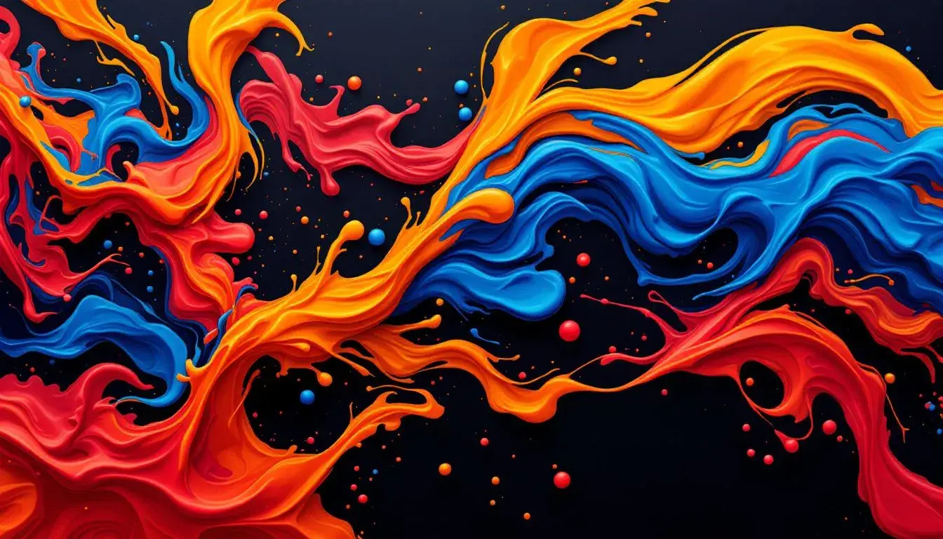
Triadic Triumph: How Color Schemes Impact Visual Energy in Marketing
11 Aug 2025 · 2 min readThe visual language of marketing whispers and shouts through color. It’s the initial embrace, the lingering afterimage. A carefully considered palette does more than catch the eye; it crafts an atmosphere, plants a feeling, and ultimately, shapes a decision. Imagine a symphony of hues working in careful accord; not a predictable harmony, but a vibrant dance of contrasts, where unexpected partners find a rhythmic balance. Color can invigorate a campaign, turn a static space into a dynamic stage, and transform mundane messages into urgent invitations. The right triad, chosen with sensitivity, becomes a powerful instrument, turning heads and sparking action. It's about moving beyond simple aesthetics and embracing the potential of calculated color decisions. This exploration navigates the possibilities and visual electricity created by the artful selection of color.
The Bold Contrast 🎨 palette arrives with the force of a city sunrise, a jolt of energy that cuts through the predictable. It is a declaration, not a suggestion; a spectrum of confidence tailor-made for those unafraid to command attention. Imagine this playing out in an advertising campaign: the warm embrace of Golden Yellow splashed against the muted serenity of Light Gray, a careful provocation setting the stage for immediate engagement. The grounding weight of Dark Espresso plays against the audacious Steel Blue and the passionate Brick Red, elements combining to convey a feeling of depth and intensity. This is not a gentle nudge; it is an invigorating push, a call to action broadcast in tones of decisiveness. It lends itself to experiences of discovery and surprise. Think of a brand launching a new product, seeking to capture the spirit of innovation. This palette positions products, brands, and campaigns for those who are ready to disrupt the status quo. The boldness is in the pairings – the unexpected dance of warm and cool, the drama of light and shadow. Its presence in the marketing world is the visual equivalent of a persuasive pitch; it plants a seed of immediate intrigue in the viewer's mind. This color scheme is assertive yet grounded; it communicates the power of forward motion.
The RestroPilot Palette 🎨 weaves a more complex narrative, one of balanced ambition. Here, the visual story is written in tones that speak of focused creativity and steady, forward progress. The grounding nature of Olive Brown intertwines with the crisp neutrality of Off White, a canvas upon which the other elements can dance. The unexpected intrigue comes with the marriage of Teal Green and Burnt Sienna, a gentle reminder of nature’s innate harmony that speaks to authenticity. A sense of measured confidence emerges, fueled by the quiet depth of Dark Indigo, almost beckoning reflection. As such, campaigns using this palette might create an environment of trust and inspiration. It suggests a world where innovation is not a frantic sprint, but a deliberate journey marked by intention. Visually, this creates a feeling of reliability and ingenuity, a visual identity representing brands that are both established and creatively curious. A project that takes flight with this sequence carries an air of mindful leadership, inviting the audience to participate in the measured ascent toward something brilliant. The palette suggests reliability with a hint of artistic flair.
The Earthy Accent 🌳 palette emerges from a place of grounded optimism, echoing days spent in amber sunlight. This combination invites comfort and reliability, a promise of authenticity delivered through familiar hues. Light Tan weaves its way through the visual story, bringing a sense of warmth that is both serene and inviting. It’s a grounding element, reflecting a commitment to genuineness. The surprising twist comes with the injection of Rose Red and Bright Red, a gentle reminder of passion that invigorates a calming space. Imagine a space where rest and stimulation dance in equal measure. Balanced by the grounding force of Dusty Sienna and the underlying strength of Charcoal Gray, viewers are drawn to a feeling of timelessness. This palette invites a sense of belonging. It's a feeling that might resonate with brands seeking to cultivate deep connections. Products marked by this visual language promise enduring quality, appealing to consumers searching for a return to simplicity. It's about slowing down and cherishing the moment, an invitation to breathe that is communicated through gentle color.
The Vibrant Fusion 🎨 palette dives headfirst into the domain of bold experimentation, echoing the thrill of discovery. This arrangement radiates confidence and imagination, ideal for capturing the world’s attention. With a bold combination of Chartreuse and Light Lime, the audience is immediately captured by an atmosphere of optimism. It's as if the colors were plucked straight from a dream. A counterpoint of Deep Emerald and Dark Moss gives a grounding force to the overall experience; like the earth rising up to meet the sky. A final addition of Plum Wine brings a welcome tension to the visual; as if beckoning to explore. Brands ready to make a statement, to disrupt the common narrative, will discover a powerful tool. These may be campaigns aimed at capturing a youth audience, seeking to embody the spirit of boldness and individuality. With the palette, campaigns become less about selling and more about inspiring. It’s an invitation to join a movement, to embrace the unconventional. This palette brings a quality of memorability and intrigue to any visual endeavor.
The Earthy Pop 🎨 name itself describes the tension within. The colors combine with a natural yet quirky charisma. A touch of Lavender Mist sets a scene of subtle sophistication, as Chartreuse Green breaks convention with youthful charm. Campaigns may be designed to deliver a sense of playful elegance. Mustard Brown offers an anchor, creating a sense of trustworthiness. Campaigns may use this approach for those that are looking to deliver sophisticated artistry with an authentic feel. Brick Red hints at adventure, suggesting a brand that is both established and spirited. With a touch of understated drama in Deep Charcoal, those with a particular, yet grounded sensibility will find themselves drawn to it. This palette gives a feeling of accessibility and charm, creating an experience that feels welcoming and also engaging.
Each of these palettes offers a distinct route to capturing attention and sparking action. From the commanding presence of Bold Contrast 🎨 to the balanced ambition of RestroPilot Palette 🎨, from the grounded optimism of Earthy Accent 🌳 to the bold experimentation of Vibrant Fusion 🎨, and even the quirky charisma of Earthy Pop 🎨, there exists a visual language capable of transforming the mundane into the memorable. Visual communication through color elevates marketing from a transaction to an experience. It's not just about what you see, but how it makes you feel; not just about catching the eye, but capturing the imagination.