'%3e%3cpath%20fill-rule='evenodd'%20clip-rule='evenodd'%20d='M51.1303%2019.2492C50.7278%2019.913%2050.1346%2020.4426%2049.3508%2020.838C48.5669%2021.2335%2047.6172%2021.4312%2046.5014%2021.4312C44.8208%2021.4312%2043.4367%2021.0216%2042.3492%2020.2025C41.2617%2019.3833%2040.6686%2018.2394%2040.5697%2016.7706H44.4253C44.4818%2017.3355%2044.6831%2017.7804%2045.0291%2018.1052C45.3751%2018.43%2045.8164%2018.5924%2046.3531%2018.5924C46.8192%2018.5924%2047.1864%2018.4653%2047.4547%2018.2111C47.7231%2017.9569%2047.8572%2017.618%2047.8572%2017.1943C47.8572%2016.8129%2047.7337%2016.4952%2047.4865%2016.241C47.2393%2015.9867%2046.9322%2015.7784%2046.565%2015.616C46.1978%2015.4536%2045.6893%2015.2594%2045.0397%2015.0334C44.0934%2014.7086%2043.3202%2014.3944%2042.72%2014.0907C42.1197%2013.7871%2041.6042%2013.3351%2041.1735%2012.7349C40.7427%2012.1347%2040.5273%2011.3544%2040.5273%2010.394C40.5273%209.50418%2040.7533%208.73448%2041.2053%208.08481C41.6572%207.43515%2042.2821%206.93731%2043.0801%206.5913C43.8781%206.24528%2044.7925%206.07227%2045.8235%206.07227C47.49%206.07227%2048.8141%206.46771%2049.7956%207.25861C50.7772%208.04951%2051.3315%209.13698%2051.4586%2010.5211H47.5395C47.4689%2010.0268%2047.2888%209.63483%2046.9993%209.3453C46.7097%209.05578%2046.3178%208.91102%2045.8235%208.91102C45.3998%208.91102%2045.0573%209.024%2044.7961%209.24997C44.5348%209.47594%2044.4041%209.80783%2044.4041%2010.2457C44.4041%2010.5988%2044.5207%2010.8989%2044.7537%2011.146C44.9867%2011.3932%2045.2798%2011.5944%2045.6328%2011.7498C45.9859%2011.9052%2046.4944%2012.1029%2047.1581%2012.343C48.1185%2012.6678%2048.9023%2012.9891%2049.5096%2013.3069C50.1169%2013.6246%2050.6395%2014.0872%2051.0773%2014.6945C51.5151%2015.3018%2051.734%2016.0927%2051.734%2017.0672C51.734%2017.8581%2051.5328%2018.5854%2051.1303%2019.2492ZM59.0242%206.3053V21.2829H55.4016V6.3053H59.0242ZM73.9409%206.3053V9.18642H69.8734V21.2829H66.2296V9.18642H62.2046V6.3053H73.9409ZM80.7438%209.18642V12.3218H85.8069V15.0546H80.7438V18.3806H86.4425V21.2829H77.1212V6.3053H86.4425V9.18642H80.7438ZM99.667%2016.0291V21.2829H96.0444V6.3053H101.913C103.692%206.3053%20105.048%206.74665%20105.98%207.62934C106.912%208.51204%20107.378%209.7019%20107.378%2011.199C107.378%2012.1311%20107.17%2012.9609%20106.753%2013.6882C106.337%2014.4155%20105.719%2014.9875%20104.9%2015.4042C104.08%2015.8208%20103.085%2016.0291%20101.913%2016.0291H99.667ZM103.692%2011.199C103.692%209.8855%20102.965%209.22879%20101.51%209.22879H99.667V13.1268H101.51C102.965%2013.1268%20103.692%2012.4842%20103.692%2011.199ZM120.092%2018.5501H114.478L113.546%2021.2829H109.732L115.219%206.41123H119.393L124.879%2021.2829H121.024L120.092%2018.5501ZM119.16%2015.7961L117.295%2010.2881L115.41%2015.7961H119.16ZM131.555%2018.5077H136.385V21.2829H127.933V6.3053H131.555V18.5077ZM143.337%209.18642V12.3218H148.4V15.0546H143.337V18.3806H149.035V21.2829H139.714V6.3053H149.035V9.18642H143.337ZM163.507%206.3053V9.18642H159.44V21.2829H155.796V9.18642H151.771V6.3053H163.507ZM177.449%206.3053V9.18642H173.382V21.2829H169.738V9.18642H165.713V6.3053H177.449ZM184.252%209.18642V12.3218H189.315V15.0546H184.252V18.3806H189.951V21.2829H180.629V6.3053H189.951V9.18642H184.252Z'%20fill='%23EEF0ED'/%3e%3cmask%20id='mask0_3101_7327'%20style='mask-type:alpha'%20maskUnits='userSpaceOnUse'%20x='0'%20y='0'%20width='27'%20height='28'%3e%3cpath%20d='M23.8328%200.759766H2.64808C1.18559%200.759766%200%201.94535%200%203.40785V24.5925C0%2026.055%201.18559%2027.2406%202.64808%2027.2406H23.8328C25.2952%2027.2406%2026.4808%2026.055%2026.4808%2024.5925V3.40785C26.4808%201.94535%2025.2952%200.759766%2023.8328%200.759766Z'%20fill='white'/%3e%3c/mask%3e%3cg%20mask='url(%23mask0_3101_7327)'%3e%3cpath%20d='M23.8328%200.759766H2.64808C1.18559%200.759766%200%201.94535%200%203.40785V24.5925C0%2026.055%201.18559%2027.2406%202.64808%2027.2406H23.8328C25.2952%2027.2406%2026.4808%2026.055%2026.4808%2024.5925V3.40785C26.4808%201.94535%2025.2952%200.759766%2023.8328%200.759766Z'%20fill='%23D8D8D8'/%3e%3cpath%20d='M13.2404%200.759766H0V14.0001H13.2404V0.759766Z'%20fill='%238C61FF'/%3e%3cpath%20d='M13.2404%2014H0V27.2404H13.2404V14Z'%20fill='%2336C3FE'/%3e%3cpath%20d='M26.4806%2014H13.2402V27.2404H26.4806V14Z'%20fill='%236592FE'/%3e%3cpath%20d='M26.4806%200.759766H13.2402V14.0002H26.4806V0.759766Z'%20fill='%236059F7'/%3e%3c/g%3e%3c/g%3e%3cdefs%3e%3cclipPath%20id='clip0_3101_7327'%3e%3crect%20width='190'%20height='28'%20fill='white'/%3e%3c/clipPath%3e%3c/defs%3e%3c/svg%3e)
'%3e%3cpath%20d='M23.8328%200.759521H2.64808C1.18559%200.759521%200%201.94511%200%203.40761V24.5923C0%2026.0548%201.18559%2027.2404%202.64808%2027.2404H23.8328C25.2952%2027.2404%2026.4808%2026.0548%2026.4808%2024.5923V3.40761C26.4808%201.94511%2025.2952%200.759521%2023.8328%200.759521Z'%20fill='%23D8D8D8'/%3e%3cpath%20d='M13.2404%200.759521H0V13.9999H13.2404V0.759521Z'%20fill='%238C61FF'/%3e%3cpath%20d='M13.2404%2013.9998H0V27.2402H13.2404V13.9998Z'%20fill='%2336C3FE'/%3e%3cpath%20d='M26.4809%2013.9998H13.2405V27.2402H26.4809V13.9998Z'%20fill='%236592FE'/%3e%3cpath%20d='M26.4809%200.759277H13.2405V13.9997H26.4809V0.759277Z'%20fill='%236059F7'/%3e%3c/g%3e%3c/svg%3e)
Celebrating with Color: Occasion-Based Palette Selection for Celebrations
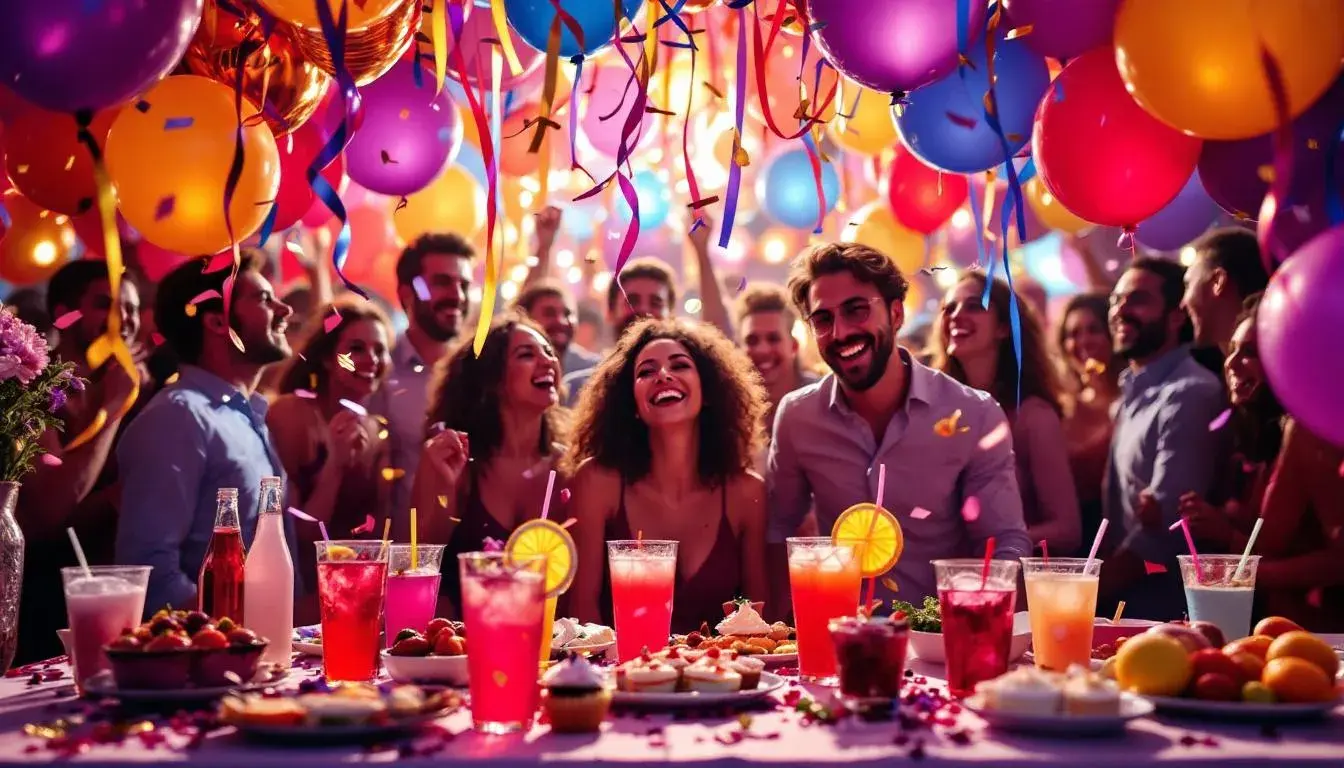
11 Aug 2025 · 3 min readColor stirs anticipation in quiet ways. It's the flash of matching hues, the unexpected highlight, the echo of place, tradition and the essence of joy. Color choices for celebrations frame experiences, from the subdued elegance of a small gathering, to the vibrant spectacle of a grand festival. We use particular shades to trigger the right feelings, connect with deeper cultural meanings, and mark moments as separate, precious, distinct. Selecting color as a participant, we become designers of atmosphere and memory. How do select color palettes contribute to feelings of celebration? Each collection offers insights for crafting your own vibrant experiences.
The "Bold Contrast" palette suggests a unique energy, a curated mix of tradition and something unanticipated. Light Gray whispers of heritage and handmade paper, while Golden Yellow bursts forth like confetti caught in sunlight. Steel Blue adds a considered dignity, a depth that prevents the merriment from becoming saccharine. Brick Red provides a grounding element that stops the composition from floating. Dark Espresso, like dark wood, offers a rich, deep baseline that balances the brightness above. Imagine this palette in a modernized barn setting for a wedding celebration – crisp linen tablecloths, golden candlelight reflecting off aged wood and touches of blue in the flower arrangements. The surprise would be the food itself: rather than expectations, you might be presented with avant-garde cocktails that echo these colors in their presentation and ingredients, or courses made with unusual flavor profiles. It’s a palette that’s confident enough to defy expectations and construct a striking, memorable picture. It hints at curated moments, bespoke experiences, a warmth and intimacy born from surprise. Celebrating skillfully through unexpected contrast.
The "Vibrant Contrast" palette proposes a different kind of energy, a subtle dance of warm and cool tones that avoids the predictable. Pinkish Cream lends a vintage touch, reminiscent of faded photographs and whispered stories. Cool Gray adds a sophisticated layer of restraint, a calming presence amidst the potential frenzy of celebration. Rusty Brown adds an earthy, grounded note, like vintage leather, anchoring the palette to a sense of history. Dark Navy provides a grounding influence, a counterpoint to the lighter shades. Charcoal Black adds elegance. This palette would feel truly stunning at an outdoor gathering, at dusk on a late summer evening. Think linen dresses catching the breeze, glasses of sparkling wine, and garlands of flowers strung beneath trees strung with lights. The food wouldn't be fussy, but instead celebrate simple, elegant flavors: fresh ingredients, carefully chosen and beautifully presented. It feels both modern and timeless, offering a sense of easy elegance. It encourages conversation and quiet joy, a celebration marked by gentle presence and shared experiences.
The "Playful Harmony" palette whispers of lighthearted elegance. Off White forms the canvas, providing a neutral base on which other colors sing. Olive Green proposes a natural world. Golden Yellow adds sunshine and laughter. Teal Blue provides a cooling note, evoking summer skies and water reflections. Burnt Orange provides strength. Picture this palette in a sun-drenched garden party, with attendees drifting across manicured lawns, sipping lemonade, and trailing ribbons behind them. Bouquets of wildflowers adorn tables, and laughter drifts on the breeze. Rather than formal and stuffy dishes, serve finger foods or small bites that complement the surroundings: colorful fruits and vegetables, sweet and small desserts. The palette is open and inviting, and perfect for outdoor enjoyment and interaction. It evokes a sense of youthful curiosity, and could foster a sense of community in the group.
The "Feminine Vibe" palette blends shades of tenderness and power. Light Gray conveys a delicacy, a quiet thoughtfulness. Teal Green lends energy. Taupe Brown adds grounding. Rose Red brings a layer of romanticism. Dark Charcoal adds weight and definition. It could be a particularly suitable palette for a sophisticated bridal shower, set in a modern interior with soft lighting and elegant décor. Imagine small bouquets of roses on each table, accented by lush greenery, and personalized place settings with calligraphy names. The food would be delicate and refined, with dainty desserts and sparkling cocktails. The palette makes an event feel deeply personal, with guests feeling especially cared for. It evokes both strength and beauty.
The "Puerto Rico" palette bursts forth with unrestrained emotion and vibrant energy. Light Sky Blue reminds us of ocean and sky. Scarlet adds fervor. Royal Blue brings a sense of depth. Deep Violet lends royalty. Charcoal offers weight and definition. This palette perfectly encapsulates the spirit of a festival, where streets overflow with dancers, music pulses through the air, and colorful flags adorn every building. The food would be bold and flavorful, with spicy dishes and exotic fruits. Consider a lively setting in a public space filled with music, dance. This palette evokes the spirit of celebration, marking this moment in bright memory.
The "Plum Passion" palette suggests a feeling of warmth and understated celebration. Pale Lavender whispers of history. Muted Rose adds something romantic. Tan Brown offers something down to earth. Rose Red contributes boldness, Dark Plum conveys depth. Imagine using this palette for a dinner party between close friends at a rural restaurant , set in a beautifully decorated room with soft lighting and luxurious fabrics. The cuisine would be rich and flavorful, featuring decadent desserts and rare wines. This palette encourages comfortable conversation and intimate connection, fostering a sense of closeness and comfort.
Each collection offers a distinctive vision of celebration. From the bold contrasts that demand attention, to the playful harmonies that inspire joy, and the feminine vibes that whisper of love, color provides a common framework for moments of intimacy. Each palette creates an experience – an atmosphere crafted with intent and feeling. In observing the selections, it becomes clear the color palettes and memories are deeply intertwined, transforming ordinary moments into celebrations of life.