'%3e%3cpath%20fill-rule='evenodd'%20clip-rule='evenodd'%20d='M51.1303%2019.2492C50.7278%2019.913%2050.1346%2020.4426%2049.3508%2020.838C48.5669%2021.2335%2047.6172%2021.4312%2046.5014%2021.4312C44.8208%2021.4312%2043.4367%2021.0216%2042.3492%2020.2025C41.2617%2019.3833%2040.6686%2018.2394%2040.5697%2016.7706H44.4253C44.4818%2017.3355%2044.6831%2017.7804%2045.0291%2018.1052C45.3751%2018.43%2045.8164%2018.5924%2046.3531%2018.5924C46.8192%2018.5924%2047.1864%2018.4653%2047.4547%2018.2111C47.7231%2017.9569%2047.8572%2017.618%2047.8572%2017.1943C47.8572%2016.8129%2047.7337%2016.4952%2047.4865%2016.241C47.2393%2015.9867%2046.9322%2015.7784%2046.565%2015.616C46.1978%2015.4536%2045.6893%2015.2594%2045.0397%2015.0334C44.0934%2014.7086%2043.3202%2014.3944%2042.72%2014.0907C42.1197%2013.7871%2041.6042%2013.3351%2041.1735%2012.7349C40.7427%2012.1347%2040.5273%2011.3544%2040.5273%2010.394C40.5273%209.50418%2040.7533%208.73448%2041.2053%208.08481C41.6572%207.43515%2042.2821%206.93731%2043.0801%206.5913C43.8781%206.24528%2044.7925%206.07227%2045.8235%206.07227C47.49%206.07227%2048.8141%206.46771%2049.7956%207.25861C50.7772%208.04951%2051.3315%209.13698%2051.4586%2010.5211H47.5395C47.4689%2010.0268%2047.2888%209.63483%2046.9993%209.3453C46.7097%209.05578%2046.3178%208.91102%2045.8235%208.91102C45.3998%208.91102%2045.0573%209.024%2044.7961%209.24997C44.5348%209.47594%2044.4041%209.80783%2044.4041%2010.2457C44.4041%2010.5988%2044.5207%2010.8989%2044.7537%2011.146C44.9867%2011.3932%2045.2798%2011.5944%2045.6328%2011.7498C45.9859%2011.9052%2046.4944%2012.1029%2047.1581%2012.343C48.1185%2012.6678%2048.9023%2012.9891%2049.5096%2013.3069C50.1169%2013.6246%2050.6395%2014.0872%2051.0773%2014.6945C51.5151%2015.3018%2051.734%2016.0927%2051.734%2017.0672C51.734%2017.8581%2051.5328%2018.5854%2051.1303%2019.2492ZM59.0242%206.3053V21.2829H55.4016V6.3053H59.0242ZM73.9409%206.3053V9.18642H69.8734V21.2829H66.2296V9.18642H62.2046V6.3053H73.9409ZM80.7438%209.18642V12.3218H85.8069V15.0546H80.7438V18.3806H86.4425V21.2829H77.1212V6.3053H86.4425V9.18642H80.7438ZM99.667%2016.0291V21.2829H96.0444V6.3053H101.913C103.692%206.3053%20105.048%206.74665%20105.98%207.62934C106.912%208.51204%20107.378%209.7019%20107.378%2011.199C107.378%2012.1311%20107.17%2012.9609%20106.753%2013.6882C106.337%2014.4155%20105.719%2014.9875%20104.9%2015.4042C104.08%2015.8208%20103.085%2016.0291%20101.913%2016.0291H99.667ZM103.692%2011.199C103.692%209.8855%20102.965%209.22879%20101.51%209.22879H99.667V13.1268H101.51C102.965%2013.1268%20103.692%2012.4842%20103.692%2011.199ZM120.092%2018.5501H114.478L113.546%2021.2829H109.732L115.219%206.41123H119.393L124.879%2021.2829H121.024L120.092%2018.5501ZM119.16%2015.7961L117.295%2010.2881L115.41%2015.7961H119.16ZM131.555%2018.5077H136.385V21.2829H127.933V6.3053H131.555V18.5077ZM143.337%209.18642V12.3218H148.4V15.0546H143.337V18.3806H149.035V21.2829H139.714V6.3053H149.035V9.18642H143.337ZM163.507%206.3053V9.18642H159.44V21.2829H155.796V9.18642H151.771V6.3053H163.507ZM177.449%206.3053V9.18642H173.382V21.2829H169.738V9.18642H165.713V6.3053H177.449ZM184.252%209.18642V12.3218H189.315V15.0546H184.252V18.3806H189.951V21.2829H180.629V6.3053H189.951V9.18642H184.252Z'%20fill='%23EEF0ED'/%3e%3cmask%20id='mask0_3101_7327'%20style='mask-type:alpha'%20maskUnits='userSpaceOnUse'%20x='0'%20y='0'%20width='27'%20height='28'%3e%3cpath%20d='M23.8328%200.759766H2.64808C1.18559%200.759766%200%201.94535%200%203.40785V24.5925C0%2026.055%201.18559%2027.2406%202.64808%2027.2406H23.8328C25.2952%2027.2406%2026.4808%2026.055%2026.4808%2024.5925V3.40785C26.4808%201.94535%2025.2952%200.759766%2023.8328%200.759766Z'%20fill='white'/%3e%3c/mask%3e%3cg%20mask='url(%23mask0_3101_7327)'%3e%3cpath%20d='M23.8328%200.759766H2.64808C1.18559%200.759766%200%201.94535%200%203.40785V24.5925C0%2026.055%201.18559%2027.2406%202.64808%2027.2406H23.8328C25.2952%2027.2406%2026.4808%2026.055%2026.4808%2024.5925V3.40785C26.4808%201.94535%2025.2952%200.759766%2023.8328%200.759766Z'%20fill='%23D8D8D8'/%3e%3cpath%20d='M13.2404%200.759766H0V14.0001H13.2404V0.759766Z'%20fill='%238C61FF'/%3e%3cpath%20d='M13.2404%2014H0V27.2404H13.2404V14Z'%20fill='%2336C3FE'/%3e%3cpath%20d='M26.4806%2014H13.2402V27.2404H26.4806V14Z'%20fill='%236592FE'/%3e%3cpath%20d='M26.4806%200.759766H13.2402V14.0002H26.4806V0.759766Z'%20fill='%236059F7'/%3e%3c/g%3e%3c/g%3e%3cdefs%3e%3cclipPath%20id='clip0_3101_7327'%3e%3crect%20width='190'%20height='28'%20fill='white'/%3e%3c/clipPath%3e%3c/defs%3e%3c/svg%3e)
'%3e%3cpath%20d='M23.8328%200.759521H2.64808C1.18559%200.759521%200%201.94511%200%203.40761V24.5923C0%2026.0548%201.18559%2027.2404%202.64808%2027.2404H23.8328C25.2952%2027.2404%2026.4808%2026.0548%2026.4808%2024.5923V3.40761C26.4808%201.94511%2025.2952%200.759521%2023.8328%200.759521Z'%20fill='%23D8D8D8'/%3e%3cpath%20d='M13.2404%200.759521H0V13.9999H13.2404V0.759521Z'%20fill='%238C61FF'/%3e%3cpath%20d='M13.2404%2013.9998H0V27.2402H13.2404V13.9998Z'%20fill='%2336C3FE'/%3e%3cpath%20d='M26.4809%2013.9998H13.2405V27.2402H26.4809V13.9998Z'%20fill='%236592FE'/%3e%3cpath%20d='M26.4809%200.759277H13.2405V13.9997H26.4809V0.759277Z'%20fill='%236059F7'/%3e%3c/g%3e%3c/svg%3e)
The Rise of 'Tranquil Transformation': Mood Trend Analysis for Interior Design
08 Aug 2025 · 5 min readThe home, once merely shelter, now whispers of sanctuary. The relentless pace of modern existence drives a deep yearning for spaces that soothe, that offer respite from the cacophony. Forget stark minimalism and jarring chromatics; the trend sweeping design is one of quietude, a 'Tranquil Transformation' that seeks to imbue our interiors with a sense of peace. It’s a movement fueled by a collective desire to reconnect with ourselves, to curate environments that nurture well-being. Walls breathe easier, demanding colors that comfort and calm. Textiles soften, begging to be touched. Light filters gently, banishing harsh glare. This isn't simply about aesthetics; it's about crafting havens of quietude, where the spirit can truly rest. The influence of color in this movement is paramount.
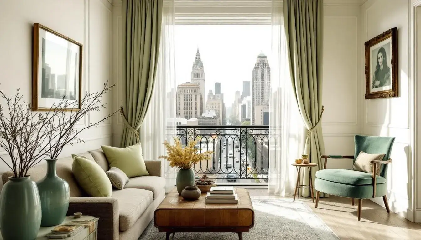
The Ayurveda Calm ☘️ palette introduces a grounded serenity, reminiscent of a sun-drenched meadow after a gentle rain. Imagine stepping into a room painted with Off-White walls, creating a canvas for tranquility. Dabs of Pale Lime on cushions or throws hint at the vitality of new growth, a subtle reminder of nature’s enduring power. Teal Green, present in a ceramic vase or woven rug, adds depth, like the cool shade of a forest canopy. Sage Green, possibly adorning a piece of upholstered furniture, brings a sense of quiet wisdom, a connection to ancient healing practices. The touch of Deep Forest Green, perhaps in picture frames or detailing, adds a grounding note, like the rich soil that nourishes life. This is a palette that speaks of well-being not as a luxury, but as a return to essential elements. The space it creates is less about visual drama and more about sensory restoration. It invites deep breaths, encourages slow movements, and provides a comforting sense of being rooted. Think of it as the antidote to the constant hum of digital devices, an invitation to disconnect and rediscover the restorative power of simplicity. This palette whispers of slow living and a mindful approach to interior design, promoting a profound awareness of place and presence, a subtle call to reconnect the self with the rhythms of the natural world. These colors, softly muted, create a sanctuary where time seems to slow down, allowing for introspection and a deep sense of inner peace.
The Coastal Calm 🌊 palette seeks inspiration from the meeting point of land and sea, evoking the serenity of a breezy horizon. Pure White, as the dominant wall color, reflects light, amplifying the sense of spaciousness and airiness. Pale Lime, perhaps in the form of sheer curtains, filters sunlight, casting a subtle, refreshing glow. Light Blue, used in accent pillows or artwork, hints at the boundless expanse of the sky above. Vibrant Amber, carefully placed in decorative objects, provides small bursts of sunshine, mirroring the warmth of a summer day. Lively Green, finds its place in potted plants, bringing the outdoors in, connecting the space to the enduring rhythm of nature. Bright Turquoise, appearing possibly in small tiles or accessories, adds a touch of playful energy, like the shimmer of waves under sunlight. Neutral Gray, used in flooring or furniture, offers a subtle grounding element, like weathered stones on the shore. Deep Blue, accents in nautical inspired artwork evoke the powerful depths of the ocean. Rustic Brown, perhaps in the form of driftwood decor or woven baskets, imparts a sense of natural history, echoing the timeless processes of erosion and transformation. Deep Teal, as an accent color in upholstery, provides a contrasting element, representing the mysterious depths of the sea. This palette is tailored for those who seek a light, airy, and sophisticated living space. It subtly encourages a slower pace, a moment to pause and appreciate the calming presence of naturally inspired shades. It is an invitation to transform the home into a haven, a space that restores and revitalizes, echoing the ever-soft murmur.
The Dental Calm 🪸 palette offers a surprising approach to tranquility, finding peace in the precision of modern design. Light Gray establishes the palette, conjuring images of clean lines and geometric shapes. The inclusion of Steel Blue, a softer, more approachable hue, introduces a sense of depth without sacrificing the overall impression of calm. It's a shift away from stark, sterile environments towards spaces that feel subtly considered. Spots of Tan Brown weave its way through, offering a gentle note, like aged leather accents and adding sophistication. The hint of Mauve Rose – consider it a subtle splash in artwork or a delicate fabric – introduces a whisper of warmth, preventing the space from feeling overly clinical. Finally, the presence of Deep Teal acts as a visual anchor, recalling the richness of dark stone. This arrangement creates an atmosphere that’s both professional and soothing. A refuge for the mind, the palette offers a space to engage in work, creativity, or contemplation. These shades together provide a subtle sense of comfort, turning a room into a space that is both functional and subtly inviting, demonstrating that “Tranquil Transformation” can exist even within the crisp forms of modern design.
The Corporate Calm 👔 palette transcends the expected severity of the workplace, imbuing it with an atmosphere of composed productivity. Pale Lavender sets a tone of understated elegance, suggesting a departure from stark white walls and a movement toward more subtly comforting spaces. The employment of Cool Grey in textiles offers a gentle balance, an echo of sophistication. Nuances of Taupe Brown, perhaps in wooden furniture, add a grounding touch. A glimpse of Periwinkle Blue, maybe in subtle artwork, gently draws the eye. Dark Indigo creates a rich counterpoint, inviting focus and thoughtfulness. These combined tones construct a professional haven, where the pressures of work are softened by a sense of refined calmness. Imagine a space where creativity flows organically, and decisions are made with clarity. It proposes an atmosphere of thoughtful productivity, encouraging a work environment where well-being is as valued as output. This palette, far from mere decoration, stands as a statement. It presents the possibility of “Tranquil Transformation” even within the confines of the corporate world, shaping workspaces that nurture the human spirit while inspiring focused collaboration.
Executive Serenity 🏢 presents a sanctuary for the discerning professional, where achievement meets inner peace. Colors melt into one another in this interior design vision. Light Blue Green reflects the vastness of open skies, inviting expansive thinking and imaginative solutions. The inclusion of Neutral Gray provides an anchoring presence to the palette, promoting mindfulness and tranquility amidst the dynamism of leadership. A sweep of Vibrant Blue gives depth and vitality to the palette, sparking innovation and progressive thought. Further layers of Dark Teal Green, adds a comforting tone, creating a haven of restorative energy. The palette is completed with shades of Deep Slate, which builds a space for clarity and balance. The collection of shades reflects a modern appreciation for inner calm and beauty. It provides the perfect space for individuals to recenter themselves and take on the challenges of the business world with vigor and peace.
The concept of ‘Tranquil Transformation’ is not merely a fleeting trend; it signifies a profound shift in how we perceive and interact with our environments. From the grounding embrace of Ayurveda Calm to the crisp composure of Corporate Calm, each palette offers a unique pathway to creating spaces that nurture our well-being. These palettes are invitations to curate environments that reflect our deepest needs for peace, connection, and rejuvenation. They offer not just aesthetic upgrades, but profound shifts in how we live and experience our daily lives. It’s a move away from sterile perfection and towards spaces imbued with personality, comfort, and a deep sense of belonging. This is the essence of thoughtful design: to create spaces that not only look beautiful, but also feel deeply good, fostering a sense of tranquility that resonates within.