'%3e%3cpath%20fill-rule='evenodd'%20clip-rule='evenodd'%20d='M51.1303%2019.2492C50.7278%2019.913%2050.1346%2020.4426%2049.3508%2020.838C48.5669%2021.2335%2047.6172%2021.4312%2046.5014%2021.4312C44.8208%2021.4312%2043.4367%2021.0216%2042.3492%2020.2025C41.2617%2019.3833%2040.6686%2018.2394%2040.5697%2016.7706H44.4253C44.4818%2017.3355%2044.6831%2017.7804%2045.0291%2018.1052C45.3751%2018.43%2045.8164%2018.5924%2046.3531%2018.5924C46.8192%2018.5924%2047.1864%2018.4653%2047.4547%2018.2111C47.7231%2017.9569%2047.8572%2017.618%2047.8572%2017.1943C47.8572%2016.8129%2047.7337%2016.4952%2047.4865%2016.241C47.2393%2015.9867%2046.9322%2015.7784%2046.565%2015.616C46.1978%2015.4536%2045.6893%2015.2594%2045.0397%2015.0334C44.0934%2014.7086%2043.3202%2014.3944%2042.72%2014.0907C42.1197%2013.7871%2041.6042%2013.3351%2041.1735%2012.7349C40.7427%2012.1347%2040.5273%2011.3544%2040.5273%2010.394C40.5273%209.50418%2040.7533%208.73448%2041.2053%208.08481C41.6572%207.43515%2042.2821%206.93731%2043.0801%206.5913C43.8781%206.24528%2044.7925%206.07227%2045.8235%206.07227C47.49%206.07227%2048.8141%206.46771%2049.7956%207.25861C50.7772%208.04951%2051.3315%209.13698%2051.4586%2010.5211H47.5395C47.4689%2010.0268%2047.2888%209.63483%2046.9993%209.3453C46.7097%209.05578%2046.3178%208.91102%2045.8235%208.91102C45.3998%208.91102%2045.0573%209.024%2044.7961%209.24997C44.5348%209.47594%2044.4041%209.80783%2044.4041%2010.2457C44.4041%2010.5988%2044.5207%2010.8989%2044.7537%2011.146C44.9867%2011.3932%2045.2798%2011.5944%2045.6328%2011.7498C45.9859%2011.9052%2046.4944%2012.1029%2047.1581%2012.343C48.1185%2012.6678%2048.9023%2012.9891%2049.5096%2013.3069C50.1169%2013.6246%2050.6395%2014.0872%2051.0773%2014.6945C51.5151%2015.3018%2051.734%2016.0927%2051.734%2017.0672C51.734%2017.8581%2051.5328%2018.5854%2051.1303%2019.2492ZM59.0242%206.3053V21.2829H55.4016V6.3053H59.0242ZM73.9409%206.3053V9.18642H69.8734V21.2829H66.2296V9.18642H62.2046V6.3053H73.9409ZM80.7438%209.18642V12.3218H85.8069V15.0546H80.7438V18.3806H86.4425V21.2829H77.1212V6.3053H86.4425V9.18642H80.7438ZM99.667%2016.0291V21.2829H96.0444V6.3053H101.913C103.692%206.3053%20105.048%206.74665%20105.98%207.62934C106.912%208.51204%20107.378%209.7019%20107.378%2011.199C107.378%2012.1311%20107.17%2012.9609%20106.753%2013.6882C106.337%2014.4155%20105.719%2014.9875%20104.9%2015.4042C104.08%2015.8208%20103.085%2016.0291%20101.913%2016.0291H99.667ZM103.692%2011.199C103.692%209.8855%20102.965%209.22879%20101.51%209.22879H99.667V13.1268H101.51C102.965%2013.1268%20103.692%2012.4842%20103.692%2011.199ZM120.092%2018.5501H114.478L113.546%2021.2829H109.732L115.219%206.41123H119.393L124.879%2021.2829H121.024L120.092%2018.5501ZM119.16%2015.7961L117.295%2010.2881L115.41%2015.7961H119.16ZM131.555%2018.5077H136.385V21.2829H127.933V6.3053H131.555V18.5077ZM143.337%209.18642V12.3218H148.4V15.0546H143.337V18.3806H149.035V21.2829H139.714V6.3053H149.035V9.18642H143.337ZM163.507%206.3053V9.18642H159.44V21.2829H155.796V9.18642H151.771V6.3053H163.507ZM177.449%206.3053V9.18642H173.382V21.2829H169.738V9.18642H165.713V6.3053H177.449ZM184.252%209.18642V12.3218H189.315V15.0546H184.252V18.3806H189.951V21.2829H180.629V6.3053H189.951V9.18642H184.252Z'%20fill='%23EEF0ED'/%3e%3cmask%20id='mask0_3101_7327'%20style='mask-type:alpha'%20maskUnits='userSpaceOnUse'%20x='0'%20y='0'%20width='27'%20height='28'%3e%3cpath%20d='M23.8328%200.759766H2.64808C1.18559%200.759766%200%201.94535%200%203.40785V24.5925C0%2026.055%201.18559%2027.2406%202.64808%2027.2406H23.8328C25.2952%2027.2406%2026.4808%2026.055%2026.4808%2024.5925V3.40785C26.4808%201.94535%2025.2952%200.759766%2023.8328%200.759766Z'%20fill='white'/%3e%3c/mask%3e%3cg%20mask='url(%23mask0_3101_7327)'%3e%3cpath%20d='M23.8328%200.759766H2.64808C1.18559%200.759766%200%201.94535%200%203.40785V24.5925C0%2026.055%201.18559%2027.2406%202.64808%2027.2406H23.8328C25.2952%2027.2406%2026.4808%2026.055%2026.4808%2024.5925V3.40785C26.4808%201.94535%2025.2952%200.759766%2023.8328%200.759766Z'%20fill='%23D8D8D8'/%3e%3cpath%20d='M13.2404%200.759766H0V14.0001H13.2404V0.759766Z'%20fill='%238C61FF'/%3e%3cpath%20d='M13.2404%2014H0V27.2404H13.2404V14Z'%20fill='%2336C3FE'/%3e%3cpath%20d='M26.4806%2014H13.2402V27.2404H26.4806V14Z'%20fill='%236592FE'/%3e%3cpath%20d='M26.4806%200.759766H13.2402V14.0002H26.4806V0.759766Z'%20fill='%236059F7'/%3e%3c/g%3e%3c/g%3e%3cdefs%3e%3cclipPath%20id='clip0_3101_7327'%3e%3crect%20width='190'%20height='28'%20fill='white'/%3e%3c/clipPath%3e%3c/defs%3e%3c/svg%3e)
'%3e%3cpath%20d='M23.8328%200.759521H2.64808C1.18559%200.759521%200%201.94511%200%203.40761V24.5923C0%2026.0548%201.18559%2027.2404%202.64808%2027.2404H23.8328C25.2952%2027.2404%2026.4808%2026.0548%2026.4808%2024.5923V3.40761C26.4808%201.94511%2025.2952%200.759521%2023.8328%200.759521Z'%20fill='%23D8D8D8'/%3e%3cpath%20d='M13.2404%200.759521H0V13.9999H13.2404V0.759521Z'%20fill='%238C61FF'/%3e%3cpath%20d='M13.2404%2013.9998H0V27.2402H13.2404V13.9998Z'%20fill='%2336C3FE'/%3e%3cpath%20d='M26.4809%2013.9998H13.2405V27.2402H26.4809V13.9998Z'%20fill='%236592FE'/%3e%3cpath%20d='M26.4809%200.759277H13.2405V13.9997H26.4809V0.759277Z'%20fill='%236059F7'/%3e%3c/g%3e%3c/svg%3e)
Color Psychology: Exploring the Moodiest Palettes for Calm
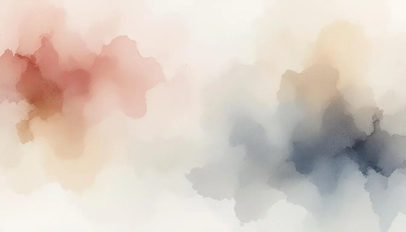
08 Aug 2025 · 5 min readColor moves through us. The soft wash of a watercolor sunset. The deep, enveloping hug of a twilight sky. Color holds a power, a direct line to our emotions, sculpting spaces of tranquility, even in the midst of bustle. It’s far beyond simple decoration: instead, it's a careful orchestration of shades and tones, a visual balm for the soul. The palettes we select can either fray the edges or soothe the spirit. In the quest for calm, the colors we surround ourselves with are paramount. They create the environments where we breathe deeply, reflect quietly, and find solace from the everyday. But where does one begin to paint serenity? Let us explore some selections and discover sanctuaries within the spectrum.
Earthy Harmony 🍂 speaks of whispers in nature. The light brushstrokes of Rose Quartz offer a gentle, floral touch, reminiscent of spring buds peeking through thawing earth. Neutral Silver provides a quiet counterpoint to the warmth, similar to the soft grey of river stones polished smooth by patient currents. Salmon Red presents a comforting earthiness, like clay warmed by the sun; it is a touch bolder, representing passion held in quiet reserve. Charcoal Gray brings a grounding presence, the strong silhouette of trees against a twilight sky. Completing the vision, Dark Burgundy infuses depth and richness. Think of aged wood, the heart of the forest floor, the essence of a long sunset that lingers in memory. This is a palette that invites gentle contemplation, spaces where thoughts can unwind, and the external world fades into a quiet murmur. Imagine a living room defined by rustic textures – linen throws in soft creams and greys, hand-thrown pottery in burgundy and rose, and the deep comfort of a well-worn leather armchair. It’s an atmosphere of slow mornings and quiet evenings, a refuge created with care, where the air holds the soft promise of renewal. Ultimately, Earthy Harmony asks us to slow down, to witness the beauty in subtlety, and to let the colors guide us to a place of inner peace.
Versatile Palette 🎨 creates a space of understated elegance, a sanctuary built upon the foundations of neutral tones. Off-White serves as a gentle beginning, like soft morning light filtering through sheer linen curtains. Golden Tan introduces a hint of warmth to balance the cool aspects, reminiscent of sun-baked earth beneath a clear sky. Cool Gray allows for sophistication and clarity. Think of polished concrete floors in a modern apartment, or perhaps the sleek lines of minimalist furniture. Deep Brown suggests stability and grounding, much like a sturdy tree rooted deep in the earth, its branches reaching outwards with assurance. Dark Charcoal provides an anchor, the quiet strength of mountains in the distance. This composition cultivates rooms for mindfulness: a yoga studio with muted walls and natural light, or perhaps a reading nook bathed in the soft glow of a lamp. One can envision spaces where creativity flows freely, where the mind is uncluttered, ready to embrace new ideas. The Versatile Palette whispers of quiet confidence, a design ethos based on timeless appeal, and a space where one feels safely held and free to exist. It's a gentle reminder that true sophistication lies in simplicity, in the art of quiet expression.
Earthy Elegance 🧵 balances between the raw and the refined, bringing stillness into everyday life. Pale Silver offers a subtle gleam, like moonlight filtering through a silent forest. Apricot Tan adds a sun-kissed touch to the scene. Slate Gray forms a bedrock of quiet reliability, the strength of stone whispering quiet confidence. Deep Brown is the grounding tone of forest soil, enriching the senses with a welcoming heart. Onyx Black offers the mystery of the night sky, an invitation to rest in deep shadows. Here, the palette offers both rustic textures and thoughtful details. Imagine a bedroom with exposed wooden beams, soft linens in muted tones, and accents of brass. Woven baskets hold blankets, while earthenware vases display sprigs of seasonal foliage. Think of a steaming cup of tea, savored next to a crackling fire. It’s about feeling connected with the world around us, but safely cocooned, in a space that feels nourishing and protective. Earthy Elegance speaks of sanctuary, of creating a calm retreat from the chaos, where the simple pleasures are elevated, and the spirit finds a place to rest and renew. This palette offers solace by inviting the outside world in while building a secure fortress.
Subtle Sophistication 🎨 is a collection of hushed tones that favor gentle spaces for focused activity. Light Khaki leads with warmth yet avoids being too assertive, reminiscent of sun-dried grass after harvest season. Then Pale Silver adds a quiet reflective element, similar to a cloudy sky filled with the gentle promise of rain. Mustard Yellow provides a single bolder stroke, like the flicker of a candle flame, a small accent of curiosity. Deep Grayish Brown speaks of inner sanctums filled with secrets, like the worn pages of a favorite book. Dark Olive Brown is nature's gentle hand, reminding us to stay grounded and humble. This palette creates workspaces where the mind can settle into productive stillness. Imagine a home office with walls painted in the softest khaki, diffused natural light streaming through linen blinds, and furniture crafted from dark, muted wood. A simple desk, a comfortable chair, and a few carefully chosen objects create a space free from distraction, conducive to deep thought and creativity. Subtle Sophistication is an exploration of measured design, one focused on cultivating quietude, promoting attentiveness, and providing a serene backdrop for the workday. It is built not on flash but instead whispers.
Earthy Contrast 🎨 offers a meeting of different sensations, building an atmosphere for calm reflection. Off White opens the heart like the gentle, almost forgotten caress of an old friend. Neutral Gray provides a muted sophistication to build around, similar to the silent strength of stone foundations. Steel Blue adds depth without overwhelming, like the first glimpse of a winter sky. Dark Slate Gray serves as a grounding element, like the protective feeling of a long, forest path beneath your feet. Finally, Dark Brown offers comforting thoughts filled with chocolate and warmth. Imagine a room with soft, diffused light, tactile fabrics, and thoughtfully placed objects. A comfortable sofa in off-white invites relaxation, while throws and cushions in muted greys and blues add layers of texture. Artwork featuring natural scenes hangs on the walls, drawing the eye and soothing the soul. Perhaps a vintage wooden table holds a collection of books and candles, creating a cozy focal point. Earthy Contrast calls to those who yearn for a quiet, restorative atmosphere, a celebration that invites the mind to settle. This is a space to recharge and find peace.
Ultimately, the search for calm through color is a personal one, that transforms with each new context. While each collection above utilizes grounding tones and softer shades, they each resonate in distinct ways. Earthy Harmony uses a mix of gentle flowers and wood tones, Versatile Palette speaks to the ease of modern times, Earthy Elegance balances rustic comfort and sanctuary, Subtle Sophistication emphasizes quiet elegance, and Earthy Contrast creates peace for reflection. When artfully brought together, the careful and consistent use of color can become more than mere decoration; it becomes a powerful tool for emotional and mental ease, a steady path towards greater clarity, balance, and enduring calm. Consider these offerings, experiment with their whispers, and let them lead your path on the search for soothing simplicity.