'%3e%3cpath%20fill-rule='evenodd'%20clip-rule='evenodd'%20d='M51.1303%2019.2492C50.7278%2019.913%2050.1346%2020.4426%2049.3508%2020.838C48.5669%2021.2335%2047.6172%2021.4312%2046.5014%2021.4312C44.8208%2021.4312%2043.4367%2021.0216%2042.3492%2020.2025C41.2617%2019.3833%2040.6686%2018.2394%2040.5697%2016.7706H44.4253C44.4818%2017.3355%2044.6831%2017.7804%2045.0291%2018.1052C45.3751%2018.43%2045.8164%2018.5924%2046.3531%2018.5924C46.8192%2018.5924%2047.1864%2018.4653%2047.4547%2018.2111C47.7231%2017.9569%2047.8572%2017.618%2047.8572%2017.1943C47.8572%2016.8129%2047.7337%2016.4952%2047.4865%2016.241C47.2393%2015.9867%2046.9322%2015.7784%2046.565%2015.616C46.1978%2015.4536%2045.6893%2015.2594%2045.0397%2015.0334C44.0934%2014.7086%2043.3202%2014.3944%2042.72%2014.0907C42.1197%2013.7871%2041.6042%2013.3351%2041.1735%2012.7349C40.7427%2012.1347%2040.5273%2011.3544%2040.5273%2010.394C40.5273%209.50418%2040.7533%208.73448%2041.2053%208.08481C41.6572%207.43515%2042.2821%206.93731%2043.0801%206.5913C43.8781%206.24528%2044.7925%206.07227%2045.8235%206.07227C47.49%206.07227%2048.8141%206.46771%2049.7956%207.25861C50.7772%208.04951%2051.3315%209.13698%2051.4586%2010.5211H47.5395C47.4689%2010.0268%2047.2888%209.63483%2046.9993%209.3453C46.7097%209.05578%2046.3178%208.91102%2045.8235%208.91102C45.3998%208.91102%2045.0573%209.024%2044.7961%209.24997C44.5348%209.47594%2044.4041%209.80783%2044.4041%2010.2457C44.4041%2010.5988%2044.5207%2010.8989%2044.7537%2011.146C44.9867%2011.3932%2045.2798%2011.5944%2045.6328%2011.7498C45.9859%2011.9052%2046.4944%2012.1029%2047.1581%2012.343C48.1185%2012.6678%2048.9023%2012.9891%2049.5096%2013.3069C50.1169%2013.6246%2050.6395%2014.0872%2051.0773%2014.6945C51.5151%2015.3018%2051.734%2016.0927%2051.734%2017.0672C51.734%2017.8581%2051.5328%2018.5854%2051.1303%2019.2492ZM59.0242%206.3053V21.2829H55.4016V6.3053H59.0242ZM73.9409%206.3053V9.18642H69.8734V21.2829H66.2296V9.18642H62.2046V6.3053H73.9409ZM80.7438%209.18642V12.3218H85.8069V15.0546H80.7438V18.3806H86.4425V21.2829H77.1212V6.3053H86.4425V9.18642H80.7438ZM99.667%2016.0291V21.2829H96.0444V6.3053H101.913C103.692%206.3053%20105.048%206.74665%20105.98%207.62934C106.912%208.51204%20107.378%209.7019%20107.378%2011.199C107.378%2012.1311%20107.17%2012.9609%20106.753%2013.6882C106.337%2014.4155%20105.719%2014.9875%20104.9%2015.4042C104.08%2015.8208%20103.085%2016.0291%20101.913%2016.0291H99.667ZM103.692%2011.199C103.692%209.8855%20102.965%209.22879%20101.51%209.22879H99.667V13.1268H101.51C102.965%2013.1268%20103.692%2012.4842%20103.692%2011.199ZM120.092%2018.5501H114.478L113.546%2021.2829H109.732L115.219%206.41123H119.393L124.879%2021.2829H121.024L120.092%2018.5501ZM119.16%2015.7961L117.295%2010.2881L115.41%2015.7961H119.16ZM131.555%2018.5077H136.385V21.2829H127.933V6.3053H131.555V18.5077ZM143.337%209.18642V12.3218H148.4V15.0546H143.337V18.3806H149.035V21.2829H139.714V6.3053H149.035V9.18642H143.337ZM163.507%206.3053V9.18642H159.44V21.2829H155.796V9.18642H151.771V6.3053H163.507ZM177.449%206.3053V9.18642H173.382V21.2829H169.738V9.18642H165.713V6.3053H177.449ZM184.252%209.18642V12.3218H189.315V15.0546H184.252V18.3806H189.951V21.2829H180.629V6.3053H189.951V9.18642H184.252Z'%20fill='%23EEF0ED'/%3e%3cmask%20id='mask0_3101_7327'%20style='mask-type:alpha'%20maskUnits='userSpaceOnUse'%20x='0'%20y='0'%20width='27'%20height='28'%3e%3cpath%20d='M23.8328%200.759766H2.64808C1.18559%200.759766%200%201.94535%200%203.40785V24.5925C0%2026.055%201.18559%2027.2406%202.64808%2027.2406H23.8328C25.2952%2027.2406%2026.4808%2026.055%2026.4808%2024.5925V3.40785C26.4808%201.94535%2025.2952%200.759766%2023.8328%200.759766Z'%20fill='white'/%3e%3c/mask%3e%3cg%20mask='url(%23mask0_3101_7327)'%3e%3cpath%20d='M23.8328%200.759766H2.64808C1.18559%200.759766%200%201.94535%200%203.40785V24.5925C0%2026.055%201.18559%2027.2406%202.64808%2027.2406H23.8328C25.2952%2027.2406%2026.4808%2026.055%2026.4808%2024.5925V3.40785C26.4808%201.94535%2025.2952%200.759766%2023.8328%200.759766Z'%20fill='%23D8D8D8'/%3e%3cpath%20d='M13.2404%200.759766H0V14.0001H13.2404V0.759766Z'%20fill='%238C61FF'/%3e%3cpath%20d='M13.2404%2014H0V27.2404H13.2404V14Z'%20fill='%2336C3FE'/%3e%3cpath%20d='M26.4806%2014H13.2402V27.2404H26.4806V14Z'%20fill='%236592FE'/%3e%3cpath%20d='M26.4806%200.759766H13.2402V14.0002H26.4806V0.759766Z'%20fill='%236059F7'/%3e%3c/g%3e%3c/g%3e%3cdefs%3e%3cclipPath%20id='clip0_3101_7327'%3e%3crect%20width='190'%20height='28'%20fill='white'/%3e%3c/clipPath%3e%3c/defs%3e%3c/svg%3e)
'%3e%3cpath%20d='M23.8328%200.759521H2.64808C1.18559%200.759521%200%201.94511%200%203.40761V24.5923C0%2026.0548%201.18559%2027.2404%202.64808%2027.2404H23.8328C25.2952%2027.2404%2026.4808%2026.0548%2026.4808%2024.5923V3.40761C26.4808%201.94511%2025.2952%200.759521%2023.8328%200.759521Z'%20fill='%23D8D8D8'/%3e%3cpath%20d='M13.2404%200.759521H0V13.9999H13.2404V0.759521Z'%20fill='%238C61FF'/%3e%3cpath%20d='M13.2404%2013.9998H0V27.2402H13.2404V13.9998Z'%20fill='%2336C3FE'/%3e%3cpath%20d='M26.4809%2013.9998H13.2405V27.2402H26.4809V13.9998Z'%20fill='%236592FE'/%3e%3cpath%20d='M26.4809%200.759277H13.2405V13.9997H26.4809V0.759277Z'%20fill='%236059F7'/%3e%3c/g%3e%3c/svg%3e)
Bright Blue's Application: A Study of Application Contexts
08 Aug 2025 · 4 min readColor surrounds us, a language preceding words, shaping perception and feeling. It's the silent architect of mood, capable of whispering calm or shouting urgency. Nowhere is this more vital than in the world of applications, of interfaces designed to guide and engage. Within this realm, bright blue holds a curious power. It suggests reliability, modernity, and an approachable technological prowess, but deployed carelessly, it can feel cold and impersonal. The challenge lies in finding the right companions for this assertive hue, creating palettes that balance its energy with warmth, depth, and a touch of the unexpected. It's about crafting visual narratives that resonate with users, creating comfortable and compelling spaces where technology feels less like a tool and more like a trusted partner. To explore the impact of Bright Blue is to understand the art of balancing visual command with subtle persuasion, creating interactions that are both effective and inviting.
The Invoice Interface palette suggests the crisp focus of a well-designed workspace. Aqua Mint hints at clarity and forward motion, like the initial gleam of morning light filtering through a glass tower. Beside it, Neutral Gray provides a grounding sense of seriousness, of quiet competence. The true jolt comes, of course, from Bright Blue itself: decisive, forthright, demanding attention but not overpowering the quieter shades. It's a hue that understands the gravity of the situation – finances, transactions, critical information – without succumbing to dourness. It wants to be helpful, like a trusted guide. Tucked away at the end, Dark Warm Gray offers a touch of shadow, a place for the eye to rest, while Deep Indigo evokes intelligence, the considered wisdom of experience. Conjure the feeling of a well-ordered desk, a streamlined process, a sense of control in the face of complexity. This isn't about childish playfulness. It’s about inviting trust, conveying efficiency, and projecting expertise. This palette performs, and performs professionally, offering a secure route through the often-turbulent waters of commerce, while it promises reliability, all in a single glance.
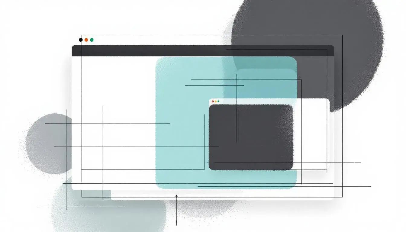
The Tech Blue selection is precise and calculated, born from cool calculations. It evokes the measured pace of innovation or an organized, modern command center. Off White offers a soothing background, the equivalent of polished concrete floors. Then appears Sky Blue, a color of upward movement, almost weightless suggesting possibilities of flight. Nearby, Steel Gray projects strength and reliability, a solid foundation for creative activity. The true focal point here is Vibrant Blue, the color of ambition, the spark that ignites ideas and drives progress forward. Not flamboyant, but confident. It has more in common with moonlight reflecting off metal than with a wildflower in bloom. All of this is anchored by Dark Charcoal, substantial and shadowy, lending depth and authority. When envisioning this palette, imagine a space devoid of clutter, furnished with minimalist forms, a space where decisions are made with foresight and resolve. It’s about clarity without ruthlessness, power without aggression, and technology geared towards results.
Corporate Calm whispers of quiet concentration, projecting the composure sought in serious occupations. Light Gray creates a neutral backdrop, something like the pale linen of a well-tailored suit. Then comes Light Teal, soft and serene, encouraging focus without causing overwhelm. Bright Azure brings a hint of sky, a subtle suggestion of innovation, but its strength is managed, carefully calibrated. Forest Green brings a hint of nature, a reminder of balance. Finally, there's Deep Teal, a rich, anchoring shade that grounds the experience, speaking of steady reliability. Conjure an airy office, furnished with natural materials, bathed in natural light; where mindful thought leads to grounded action, and a calculated approach drives innovation. It’s about creating an atmosphere where creativity can thrive within a structured framework. A space where precision walks hand-in-hand with imagination.
The palettes for modern applications offer far more than simple visual aesthetics. They are carefully considered languages, each color a strategic element in a broader message. They speak of trust, of precision, and of an understanding of the user's emotional state. Whether it's the forthright reliability of Invoice Interface, the calm confidence of Corporate Calm, or the streamlined ambition of Tech Blue, these collections prove that mindful color decisions can be a powerful tool for communication. Bright Blue, in particular, emerges as a multifaceted player: capable of exuding authority, inviting confidence, and sparking creativity, yet always demanding thoughtful consideration in its application. It’s a lesson in the power of tone, the impact of subtle variation, and the lasting impression created by a well-composed palette. In a world increasingly driven by seamless experiences, the colors we choose are more consequential than ever. They are the silent storytellers, the architects of our perceptions, and the key to unlocking meaningful connections.