'%3e%3cpath%20fill-rule='evenodd'%20clip-rule='evenodd'%20d='M51.1303%2019.2492C50.7278%2019.913%2050.1346%2020.4426%2049.3508%2020.838C48.5669%2021.2335%2047.6172%2021.4312%2046.5014%2021.4312C44.8208%2021.4312%2043.4367%2021.0216%2042.3492%2020.2025C41.2617%2019.3833%2040.6686%2018.2394%2040.5697%2016.7706H44.4253C44.4818%2017.3355%2044.6831%2017.7804%2045.0291%2018.1052C45.3751%2018.43%2045.8164%2018.5924%2046.3531%2018.5924C46.8192%2018.5924%2047.1864%2018.4653%2047.4547%2018.2111C47.7231%2017.9569%2047.8572%2017.618%2047.8572%2017.1943C47.8572%2016.8129%2047.7337%2016.4952%2047.4865%2016.241C47.2393%2015.9867%2046.9322%2015.7784%2046.565%2015.616C46.1978%2015.4536%2045.6893%2015.2594%2045.0397%2015.0334C44.0934%2014.7086%2043.3202%2014.3944%2042.72%2014.0907C42.1197%2013.7871%2041.6042%2013.3351%2041.1735%2012.7349C40.7427%2012.1347%2040.5273%2011.3544%2040.5273%2010.394C40.5273%209.50418%2040.7533%208.73448%2041.2053%208.08481C41.6572%207.43515%2042.2821%206.93731%2043.0801%206.5913C43.8781%206.24528%2044.7925%206.07227%2045.8235%206.07227C47.49%206.07227%2048.8141%206.46771%2049.7956%207.25861C50.7772%208.04951%2051.3315%209.13698%2051.4586%2010.5211H47.5395C47.4689%2010.0268%2047.2888%209.63483%2046.9993%209.3453C46.7097%209.05578%2046.3178%208.91102%2045.8235%208.91102C45.3998%208.91102%2045.0573%209.024%2044.7961%209.24997C44.5348%209.47594%2044.4041%209.80783%2044.4041%2010.2457C44.4041%2010.5988%2044.5207%2010.8989%2044.7537%2011.146C44.9867%2011.3932%2045.2798%2011.5944%2045.6328%2011.7498C45.9859%2011.9052%2046.4944%2012.1029%2047.1581%2012.343C48.1185%2012.6678%2048.9023%2012.9891%2049.5096%2013.3069C50.1169%2013.6246%2050.6395%2014.0872%2051.0773%2014.6945C51.5151%2015.3018%2051.734%2016.0927%2051.734%2017.0672C51.734%2017.8581%2051.5328%2018.5854%2051.1303%2019.2492ZM59.0242%206.3053V21.2829H55.4016V6.3053H59.0242ZM73.9409%206.3053V9.18642H69.8734V21.2829H66.2296V9.18642H62.2046V6.3053H73.9409ZM80.7438%209.18642V12.3218H85.8069V15.0546H80.7438V18.3806H86.4425V21.2829H77.1212V6.3053H86.4425V9.18642H80.7438ZM99.667%2016.0291V21.2829H96.0444V6.3053H101.913C103.692%206.3053%20105.048%206.74665%20105.98%207.62934C106.912%208.51204%20107.378%209.7019%20107.378%2011.199C107.378%2012.1311%20107.17%2012.9609%20106.753%2013.6882C106.337%2014.4155%20105.719%2014.9875%20104.9%2015.4042C104.08%2015.8208%20103.085%2016.0291%20101.913%2016.0291H99.667ZM103.692%2011.199C103.692%209.8855%20102.965%209.22879%20101.51%209.22879H99.667V13.1268H101.51C102.965%2013.1268%20103.692%2012.4842%20103.692%2011.199ZM120.092%2018.5501H114.478L113.546%2021.2829H109.732L115.219%206.41123H119.393L124.879%2021.2829H121.024L120.092%2018.5501ZM119.16%2015.7961L117.295%2010.2881L115.41%2015.7961H119.16ZM131.555%2018.5077H136.385V21.2829H127.933V6.3053H131.555V18.5077ZM143.337%209.18642V12.3218H148.4V15.0546H143.337V18.3806H149.035V21.2829H139.714V6.3053H149.035V9.18642H143.337ZM163.507%206.3053V9.18642H159.44V21.2829H155.796V9.18642H151.771V6.3053H163.507ZM177.449%206.3053V9.18642H173.382V21.2829H169.738V9.18642H165.713V6.3053H177.449ZM184.252%209.18642V12.3218H189.315V15.0546H184.252V18.3806H189.951V21.2829H180.629V6.3053H189.951V9.18642H184.252Z'%20fill='%23EEF0ED'/%3e%3cmask%20id='mask0_3101_7327'%20style='mask-type:alpha'%20maskUnits='userSpaceOnUse'%20x='0'%20y='0'%20width='27'%20height='28'%3e%3cpath%20d='M23.8328%200.759766H2.64808C1.18559%200.759766%200%201.94535%200%203.40785V24.5925C0%2026.055%201.18559%2027.2406%202.64808%2027.2406H23.8328C25.2952%2027.2406%2026.4808%2026.055%2026.4808%2024.5925V3.40785C26.4808%201.94535%2025.2952%200.759766%2023.8328%200.759766Z'%20fill='white'/%3e%3c/mask%3e%3cg%20mask='url(%23mask0_3101_7327)'%3e%3cpath%20d='M23.8328%200.759766H2.64808C1.18559%200.759766%200%201.94535%200%203.40785V24.5925C0%2026.055%201.18559%2027.2406%202.64808%2027.2406H23.8328C25.2952%2027.2406%2026.4808%2026.055%2026.4808%2024.5925V3.40785C26.4808%201.94535%2025.2952%200.759766%2023.8328%200.759766Z'%20fill='%23D8D8D8'/%3e%3cpath%20d='M13.2404%200.759766H0V14.0001H13.2404V0.759766Z'%20fill='%238C61FF'/%3e%3cpath%20d='M13.2404%2014H0V27.2404H13.2404V14Z'%20fill='%2336C3FE'/%3e%3cpath%20d='M26.4806%2014H13.2402V27.2404H26.4806V14Z'%20fill='%236592FE'/%3e%3cpath%20d='M26.4806%200.759766H13.2402V14.0002H26.4806V0.759766Z'%20fill='%236059F7'/%3e%3c/g%3e%3c/g%3e%3cdefs%3e%3cclipPath%20id='clip0_3101_7327'%3e%3crect%20width='190'%20height='28'%20fill='white'/%3e%3c/clipPath%3e%3c/defs%3e%3c/svg%3e)
'%3e%3cpath%20d='M23.8328%200.759521H2.64808C1.18559%200.759521%200%201.94511%200%203.40761V24.5923C0%2026.0548%201.18559%2027.2404%202.64808%2027.2404H23.8328C25.2952%2027.2404%2026.4808%2026.0548%2026.4808%2024.5923V3.40761C26.4808%201.94511%2025.2952%200.759521%2023.8328%200.759521Z'%20fill='%23D8D8D8'/%3e%3cpath%20d='M13.2404%200.759521H0V13.9999H13.2404V0.759521Z'%20fill='%238C61FF'/%3e%3cpath%20d='M13.2404%2013.9998H0V27.2402H13.2404V13.9998Z'%20fill='%2336C3FE'/%3e%3cpath%20d='M26.4809%2013.9998H13.2405V27.2402H26.4809V13.9998Z'%20fill='%236592FE'/%3e%3cpath%20d='M26.4809%200.759277H13.2405V13.9997H26.4809V0.759277Z'%20fill='%236059F7'/%3e%3c/g%3e%3c/svg%3e)
Summer's Palette Shift: Colors Losing and Gaining Popularity
04 Aug 2025 · 3 min readSummer, a season synonymous with vibrancy, isn't immune to the subtle shifts in style and perception. The colors we associate with its endless days and balmy nights are in a constant, perhaps imperceptible, state of flux. Predicting the ebb and flow of these chromatic currents reveals as much about the changing times as it tells us about the inherent qualities of the colors themselves. What was once fresh now feels familiar; tones once relegated to the background now command center stage. The story of summer’s colors is not merely about shades but about our collective moods and aspirations. Consider how a subdued, almost sun-bleached pastel elicits a sense of elegant preservation, or how an explosion of hyper-saturated hues speaks of a craving for unbridled excitement. These palettes aren't just decorative; they are a reflection of a cultural longing.
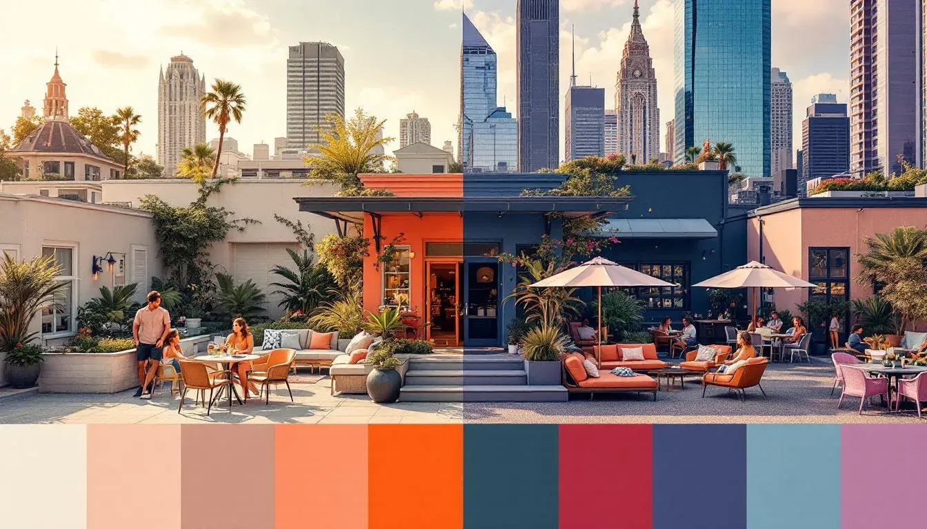
Modern Vibrance, with its suggestion of urban landscapes softened by fleeting blossoms, paints a picture of summer that’s less about escape and more about infusing everyday life with sparks of delight. It acknowledges that summer isn't confined to a beach holiday or a countryside retreat; instead, it thrives in the unexpected moments. Rose Beige whispers of sunsets viewed from rooftop bars, while Silver Gray mirrors the shimmering reflections on glass skyscrapers. The deeper currents of Slate Blue draw inspiration from the cool interiors of art galleries and tech start-ups, providing an anchor to the palette’s lighter tones. Even Rustic Brown, often relegated to autumn, finds a place, perhaps as a nod to craft coffee shops and artisanal markets that pulse with summer’s energy. Charcoal Black, the unsung hero, grounds it all, hinting at the late-night concerts and impromptu gatherings that turn city streets into vibrant social spaces. The lack of aggressively bright colors speaks towards a sophisticated summer, a move away from the neon-drenched aesthetic, allowing for a more nuanced, contemporary feel. This palette champions the idea that summer can be a state of mind achieved even in the midst of urban life, using color not as a shout, but as a softly spoken invitation to embrace the season’s spirit. This palette expresses summer through a lifestyle lens, rather than just referencing traditional sunny motifs.
Aqua Pop immediately transports us to a world of iced lollies and carefree abandon, an echo from childhood summers. Yet, beneath the surface of what seems like pure playfulness, a slight shift can be identified. The palette doesn't embrace the overly saccharine pastels traditionally linked to summer fun, but rather introduces shades with an intriguing edge. Dusty Gray provides a grounding element, reflecting a desire for balance and a move away from the hyper-stimulation that can often define the season. Fiery Red and Tangerine Orange, while undeniably vibrant, don't possess the synthetic quality favored by previous trends, leaning instead towards natural pigments, hinting at organic garden parties and locally-sourced produce at outdoor markets. Even Vivid Violet, a color that might have once felt out of place, takes on a contemporary coolness, suggesting late-night swims under the stars or twilight picnics in open fields. Deep Charcoal acts as a counterbalance, lending a touch of sophistication and depth. Instead of representing a simple longing for childhood nostalgia, Aqua Pop speaks to the integration of playful elements into a more mature, discerning life. It says summer can be both fun and fashionable, vibrant and considered, a reflection of a society seeking joy without sacrificing depth. It's precisely this balancing act that will see this palette find itself in the spotlight this summer.
Coastal Harmony offers a different perspective on the season, less about overt excitement and more about serene escape. It’s not merely echoing traditional seaside palettes, yet speaks instead to the tranquil moments that can recharge the soul. Off White evokes windswept beaches and softly filtered light, while Pale Blue mirrors the vast expanse of the ocean on a calm day. But this isn't picture-postcard prettiness; rather the intensity increases in Electric Blue and Indigo Blue, portraying the deeper, mysterious depths of the sea and a sense of the unknown. Dark Taupe offers a grounding counterpoint, recalling weathered driftwood and sun-baked earth. This touch of natural, rustic sensibility separates this palette from overly-contrived nautical motifs. It conveys relaxation, but with an underlying call to adventure, suggesting sailing expeditions, secluded coves, and sunset bonfires. Coastal Harmony seems to anticipate a longing for meaningful connection with nature and a rejection of fleeting trends and cheap thrills. The shift is about finding solace and stimulation in the real world.
Vibrant Contrast is a declaration of playful defiance. The colour combinations are unexpected, pulling the eye to the colours like Lime Chartreuse, which pops out against the deeper colours. It is a move away from softer, more muted summer palettes. Muted Green tempers the brightness, reminding us of the forests in summer, the times when the green seems to soften as the season progresses. Royal Blue is a confident colour that suggests water, while Dark Navy feels like twilight approaches. Both shades invite the night to come. Rustic Brown continues the natural feel that is emerging and grounds the palette, making this bold combination very wearable. Vibrant Contrast acknowledges that summer can be more than simply sun-drenched days; it can be an invitation to experiment, to be mischievous, and to embrace a sense of youthful exuberance. The lack of pastel tones makes this a statement option, not for the faint of heart.
Electropink Bloom presents us with a world where artificial and organic intertwine, a futuristic digital garden where technological advancement and natural beauty coexist. Light Gray provides a subtle foundation, setting a contrast for the exciting colours. The Fuchsia Pink is the hero of the palette, but does not exist alone. Medium Purple adds depth and complexity, alluding to a sky at dusk, and a feeling of freedom on a summer’s night. Dark Burgundy offers a hint of sophistication and maturity where Royal Blue hints at a seriousness to the palette. The combination is intense and speaks to a season of experimentation with an unashamed, electrifying sense of fun.
Playful Brights seeks to bottle the optimism associated with the warmest months. Lightest Grey creates a subtle background that allows the main colours to take centre stage. Mustard Yellow is a summer shade that feels warm and positive, while Aqua Blue is a modern take on that sea-side feel. Vivid Red-Orange stands out from the crowd and creates an inviting feel, and Charcoal Grey brings that modern sophistication. Playful Brights is very accessible, a people-pleasing pick that is both current and charming.
As we reflect on these diverse palettes, what becomes clear is there isn't a single "Summer" aesthetic, but rather a spectrum of experiences, moods, and desires. We've moved beyond the predictable, predictable beach hues and sun-drenched clichés and into a place where summer can be found not just in a destination, but in a state of mind. From the urban sophistication of Modern Vibrance to the playful boldness of Aqua Pop, with shades of Coastal Harmony, Vibrant Contrast, Electropink Bloom and Playful Brights in between, these color stories paint a portrait of a season that is as complex and multifaceted as the people who inhabit it. The subtle shifts in color trends that are not simply aesthetic choices, but reflections of our ever-changing relationship with ourselves, with nature, and with the world around us. Each color carries a story, each palette conveys a message, and understanding their subtle dance is about reading the signs of the times.