'%3e%3cpath%20fill-rule='evenodd'%20clip-rule='evenodd'%20d='M51.1303%2019.2492C50.7278%2019.913%2050.1346%2020.4426%2049.3508%2020.838C48.5669%2021.2335%2047.6172%2021.4312%2046.5014%2021.4312C44.8208%2021.4312%2043.4367%2021.0216%2042.3492%2020.2025C41.2617%2019.3833%2040.6686%2018.2394%2040.5697%2016.7706H44.4253C44.4818%2017.3355%2044.6831%2017.7804%2045.0291%2018.1052C45.3751%2018.43%2045.8164%2018.5924%2046.3531%2018.5924C46.8192%2018.5924%2047.1864%2018.4653%2047.4547%2018.2111C47.7231%2017.9569%2047.8572%2017.618%2047.8572%2017.1943C47.8572%2016.8129%2047.7337%2016.4952%2047.4865%2016.241C47.2393%2015.9867%2046.9322%2015.7784%2046.565%2015.616C46.1978%2015.4536%2045.6893%2015.2594%2045.0397%2015.0334C44.0934%2014.7086%2043.3202%2014.3944%2042.72%2014.0907C42.1197%2013.7871%2041.6042%2013.3351%2041.1735%2012.7349C40.7427%2012.1347%2040.5273%2011.3544%2040.5273%2010.394C40.5273%209.50418%2040.7533%208.73448%2041.2053%208.08481C41.6572%207.43515%2042.2821%206.93731%2043.0801%206.5913C43.8781%206.24528%2044.7925%206.07227%2045.8235%206.07227C47.49%206.07227%2048.8141%206.46771%2049.7956%207.25861C50.7772%208.04951%2051.3315%209.13698%2051.4586%2010.5211H47.5395C47.4689%2010.0268%2047.2888%209.63483%2046.9993%209.3453C46.7097%209.05578%2046.3178%208.91102%2045.8235%208.91102C45.3998%208.91102%2045.0573%209.024%2044.7961%209.24997C44.5348%209.47594%2044.4041%209.80783%2044.4041%2010.2457C44.4041%2010.5988%2044.5207%2010.8989%2044.7537%2011.146C44.9867%2011.3932%2045.2798%2011.5944%2045.6328%2011.7498C45.9859%2011.9052%2046.4944%2012.1029%2047.1581%2012.343C48.1185%2012.6678%2048.9023%2012.9891%2049.5096%2013.3069C50.1169%2013.6246%2050.6395%2014.0872%2051.0773%2014.6945C51.5151%2015.3018%2051.734%2016.0927%2051.734%2017.0672C51.734%2017.8581%2051.5328%2018.5854%2051.1303%2019.2492ZM59.0242%206.3053V21.2829H55.4016V6.3053H59.0242ZM73.9409%206.3053V9.18642H69.8734V21.2829H66.2296V9.18642H62.2046V6.3053H73.9409ZM80.7438%209.18642V12.3218H85.8069V15.0546H80.7438V18.3806H86.4425V21.2829H77.1212V6.3053H86.4425V9.18642H80.7438ZM99.667%2016.0291V21.2829H96.0444V6.3053H101.913C103.692%206.3053%20105.048%206.74665%20105.98%207.62934C106.912%208.51204%20107.378%209.7019%20107.378%2011.199C107.378%2012.1311%20107.17%2012.9609%20106.753%2013.6882C106.337%2014.4155%20105.719%2014.9875%20104.9%2015.4042C104.08%2015.8208%20103.085%2016.0291%20101.913%2016.0291H99.667ZM103.692%2011.199C103.692%209.8855%20102.965%209.22879%20101.51%209.22879H99.667V13.1268H101.51C102.965%2013.1268%20103.692%2012.4842%20103.692%2011.199ZM120.092%2018.5501H114.478L113.546%2021.2829H109.732L115.219%206.41123H119.393L124.879%2021.2829H121.024L120.092%2018.5501ZM119.16%2015.7961L117.295%2010.2881L115.41%2015.7961H119.16ZM131.555%2018.5077H136.385V21.2829H127.933V6.3053H131.555V18.5077ZM143.337%209.18642V12.3218H148.4V15.0546H143.337V18.3806H149.035V21.2829H139.714V6.3053H149.035V9.18642H143.337ZM163.507%206.3053V9.18642H159.44V21.2829H155.796V9.18642H151.771V6.3053H163.507ZM177.449%206.3053V9.18642H173.382V21.2829H169.738V9.18642H165.713V6.3053H177.449ZM184.252%209.18642V12.3218H189.315V15.0546H184.252V18.3806H189.951V21.2829H180.629V6.3053H189.951V9.18642H184.252Z'%20fill='%23EEF0ED'/%3e%3cmask%20id='mask0_3101_7327'%20style='mask-type:alpha'%20maskUnits='userSpaceOnUse'%20x='0'%20y='0'%20width='27'%20height='28'%3e%3cpath%20d='M23.8328%200.759766H2.64808C1.18559%200.759766%200%201.94535%200%203.40785V24.5925C0%2026.055%201.18559%2027.2406%202.64808%2027.2406H23.8328C25.2952%2027.2406%2026.4808%2026.055%2026.4808%2024.5925V3.40785C26.4808%201.94535%2025.2952%200.759766%2023.8328%200.759766Z'%20fill='white'/%3e%3c/mask%3e%3cg%20mask='url(%23mask0_3101_7327)'%3e%3cpath%20d='M23.8328%200.759766H2.64808C1.18559%200.759766%200%201.94535%200%203.40785V24.5925C0%2026.055%201.18559%2027.2406%202.64808%2027.2406H23.8328C25.2952%2027.2406%2026.4808%2026.055%2026.4808%2024.5925V3.40785C26.4808%201.94535%2025.2952%200.759766%2023.8328%200.759766Z'%20fill='%23D8D8D8'/%3e%3cpath%20d='M13.2404%200.759766H0V14.0001H13.2404V0.759766Z'%20fill='%238C61FF'/%3e%3cpath%20d='M13.2404%2014H0V27.2404H13.2404V14Z'%20fill='%2336C3FE'/%3e%3cpath%20d='M26.4806%2014H13.2402V27.2404H26.4806V14Z'%20fill='%236592FE'/%3e%3cpath%20d='M26.4806%200.759766H13.2402V14.0002H26.4806V0.759766Z'%20fill='%236059F7'/%3e%3c/g%3e%3c/g%3e%3cdefs%3e%3cclipPath%20id='clip0_3101_7327'%3e%3crect%20width='190'%20height='28'%20fill='white'/%3e%3c/clipPath%3e%3c/defs%3e%3c/svg%3e)
'%3e%3cpath%20d='M23.8328%200.759521H2.64808C1.18559%200.759521%200%201.94511%200%203.40761V24.5923C0%2026.0548%201.18559%2027.2404%202.64808%2027.2404H23.8328C25.2952%2027.2404%2026.4808%2026.0548%2026.4808%2024.5923V3.40761C26.4808%201.94511%2025.2952%200.759521%2023.8328%200.759521Z'%20fill='%23D8D8D8'/%3e%3cpath%20d='M13.2404%200.759521H0V13.9999H13.2404V0.759521Z'%20fill='%238C61FF'/%3e%3cpath%20d='M13.2404%2013.9998H0V27.2402H13.2404V13.9998Z'%20fill='%2336C3FE'/%3e%3cpath%20d='M26.4809%2013.9998H13.2405V27.2402H26.4809V13.9998Z'%20fill='%236592FE'/%3e%3cpath%20d='M26.4809%200.759277H13.2405V13.9997H26.4809V0.759277Z'%20fill='%236059F7'/%3e%3c/g%3e%3c/svg%3e)
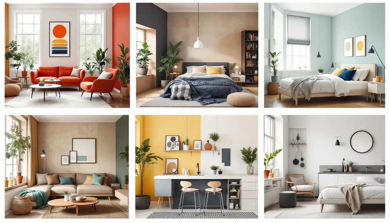
Room Raiders: Palettes Tailored for Specific Interiors
04 Aug 2025 · 5 min readColor has the power to fundamentally alter the very air we breathe within a space. It’s not merely about aesthetics; it's about crafting atmospheres, whispering stories through walls, and influencing the emotional landscape of our daily lives. A carefully chosen palette can transform a sterile office into a haven of focus, or recast a living room as an oasis of calm and connection. Think of the hushed tranquility of a room washed in gentle blues, or the bold energy of a space ignited by vibrant oranges. These aren’t just colors; they are conductors of feeling, architects of experience. The right arrangement can make a space feel larger, cozier, more sophisticated, or more playful. The wrong ones can create discord. It’s a quiet power, potent and profound, shaping our moods and memories in ways we often don’t consciously realize. Imagine walking into a room bathed in the warm glow of sunset hues, instantly feeling a sense of welcome and ease. Color has the power to evoke these feelings and so much more.
The Modern Contrast palette sings of dynamic energy, a balance of intensity and grounded neutrality. Visualize a workspace where Intense Blue invigorates creative thought against a backdrop of Cool Gray's quiet focus. Bright Orange, judiciously applied, punctuates collaboration zones, sparking conversation and innovation. Deep Violet adds hints of luxury to quiet corners, fostering reflection. It’s a palette that dances between stimulation and composure, ideally suited for spaces where ideas are born and refined. Think towering tech headquarters where the future is being written, or bright marketing studios where campaigns are built. The effect is not merely visually appealing; it creates an environment primed for problem-solving and the generation of new perspectives. Imagine this applied to a collaborative meeting room, where the cool grays temper the intensity of brainstorming, while the vibrant orange fuels the fire of creativity. The Deep Violet inspires individual contemplation, allowing team members to retreat into their own thoughts before bringing ideas back to the group. This is not just decoration; it's about crafting a space where people feel both energized and focused, where creativity flourishes within a framework of calm composure. The overall affect would be transformative, turning ordinary rooms into engines for the extraordinary.
The Solar Serenity palette washes spaces with a sense of calm and calculated elegance. Picture an executive office where Deep Teal anchors the room, lending unwavering stability, and the Muted Teal softens the focus, fostering clear thought. Off White surfaces, subtly textured, reflect light and add depth. Imagine Forest Green accents, bringing a touch of the outside in, grounding the workplace within the natural world. Deep Charcoal provides definition, ensuring that elements don't fade into the background. It's an invocation of clarity and composure, perfect for environments seeking a sense of enduring stability. Imagine a consulting firm seeking to project an image of reasoned judgement, or a finance office requiring a sense of unbreakable trust. The impact is less about making a loud statement, and more about cultivating an atmosphere of unwavering competence. Picture this palette gracing a modern living room intended as a retreat. Here, Deep Teal can serve as a calming accent wall, its depth creating a sense of expansiveness. Forest Green might manifest as plush velvet cushions or a carefully chosen piece of artwork, whispering tranquility into the space. The Off White walls act as a soft canvas, showcasing furniture and design objects without overwhelming the sense of peace. Every element comes together to create a sanctuary where the outside world fades away.
The Modern Vibrance palette bursts forth with an effervescent spirit, a vibrant invitation to innovation. Envision a creative agency's workspace, energized by Spring Green accents, mirroring new growth and forward-thinking. Periwinkle induces calm focus, essential during collaborative sessions. Steel Blue establishes dependable strength, a grounding presence amidst the flurry of activity. Dark Taupe grounds the space, acting as an anchor. Brick Red adds moments of visual electricity. Imagine this in a marketing firm designed to spark inspiration. This palette offers a unique blend of playfulness and focus, ideally suited for spaces where brainstorming and creativity are not just encouraged, but demanded. Imagine this applied to a living room designed for lively gatherings. Here, Spring Green could inject a playful vibrancy. Periwinkle walls become a serene backdrop, fostering easy conversation. Imagine plush seating in Steel Blue, anchoring the room and adding a sense of comfortable sophistication. The inclusion of Dark Taupe brings warmth, while pops of Brick Red serve as visual exclamation points. This evokes a feeling of joy without sacrificing sophistication, fostering an environment for memorable moments. It is an invitation to live fully and with exuberance.
The Vibrant Harmony palette sings a song of balanced intensity, a careful chorus of both excitement and composure. Imagine stepping into a designer's studio where Light Pink walls act as a soft canvas, promoting calm creativity, the focal point centered on the captivating notes of Fuchsia Pink. Emerald Green flourishes, infusing a sense of growth and new possibilities. Deep Indigo lends sophistication, providing a depth that prevents the palette from feeling shallow. Dark Burgundy brings richness and adds an earthy undertone. Envision a fashion house showroom designed to project a cutting-edge mood, or a marketing firm wishing to embrace an aesthetic of playful innovation, or, better here, a modern living room that becomes an artful haven, energized by Emerald Green cushions, as Dark Burgundy accents add luxurious warmth. Deep Indigo infuses a sense of mystery, completing the feeling of sophisticated comfort. The impact is a space of sophisticated calm, a peaceful haven that reflects the beauty of balance found in natural surroundings. The overall effect turns basic into beautiful.
The Bold Contrast palette commands attention with its powerful choices, crafting spaces of confident expression. Picture a tech startup office where Light Beige provides comforting neutrality, and Smoky Brown offers a modern edge. Imagine Rusty Brown adding a touch of earthy sophistication. Deep Taupe fosters stability, while Midnight Blue introduces intrigue. Imagine a fashion boutique showcasing the owner's artistry. The effect is simultaneously grounded and exhilarating, ideal where individual expression is celebrated. Imagine this gracing a living room with a touch of bohemian elegance. Here, Midnight Blue might serve as a dramatic anchor. Light Beige and Smoky Brown work together to wrap the room in warmth. Rusty Brown can be an accent in furniture or art. Deep Taupe, perhaps, finds footing with raw wood accents. The overall statement invokes depth and originality without sacrificing warmth, offering an unexpected harmony.
The Subtle Sophistication palette whispers of understated elegance, crafting spaces of refined focus. Picture a corporate headquarters where Light Khaki and Pale Silver create an atmosphere of calm competence. Mustard Yellow adds visual interest. Deep Grayish Brown anchors the space, while Dark Olive Brown brings earthy warmth. Imagine a technology firm seeking to project calm, reasoned leadership, or an executive office focused on mindful productivity. The palette exudes confidence without demanding attention, cultivating focus and careful precision. Imagine this palette inside a living room intended for contemplation. Light Khaki lends warmth. Pale Silver provides a modern touch. Mustard Yellow brings individuality with artfully curated accessories. Deep Grayish Brown, perhaps in tailored fabrics, provides comfort while Dark Olive Brown grounds the space with natural fiber rugs. The overall design encourages a quiet luxury.
Room by room, palette by palette, we see how color can be less about conformity, and more about crafting spaces that speak to our needs, our aspirations, and, ultimately, our souls. The Modern Contrast palette electrifies the office space, sparking creativity with its Bright Orange and grounding focus with its Cool Gray. Solar Serenity whispers calm into the living room, reflecting Light Teal accents and ensuring an unspoken stability with a muted palette. Modern Vibrance offers a playful boost to brainstorming sessions, infusing spaces with Spring Green notes. With Vibrant Harmony living rooms become artful havens for intimate interaction. Rooms are reborn as havens of creativity and quiet, and sanctuaries of sophisticated joy thanks to palettes like Bold Contrast and Subtle Sophistication. The impact of a well-considered palette extends far beyond aesthetics – it transforms a space into something meaningful, where people are more productive, more inspired, and more alive.