'%3e%3cpath%20fill-rule='evenodd'%20clip-rule='evenodd'%20d='M51.1303%2019.2492C50.7278%2019.913%2050.1346%2020.4426%2049.3508%2020.838C48.5669%2021.2335%2047.6172%2021.4312%2046.5014%2021.4312C44.8208%2021.4312%2043.4367%2021.0216%2042.3492%2020.2025C41.2617%2019.3833%2040.6686%2018.2394%2040.5697%2016.7706H44.4253C44.4818%2017.3355%2044.6831%2017.7804%2045.0291%2018.1052C45.3751%2018.43%2045.8164%2018.5924%2046.3531%2018.5924C46.8192%2018.5924%2047.1864%2018.4653%2047.4547%2018.2111C47.7231%2017.9569%2047.8572%2017.618%2047.8572%2017.1943C47.8572%2016.8129%2047.7337%2016.4952%2047.4865%2016.241C47.2393%2015.9867%2046.9322%2015.7784%2046.565%2015.616C46.1978%2015.4536%2045.6893%2015.2594%2045.0397%2015.0334C44.0934%2014.7086%2043.3202%2014.3944%2042.72%2014.0907C42.1197%2013.7871%2041.6042%2013.3351%2041.1735%2012.7349C40.7427%2012.1347%2040.5273%2011.3544%2040.5273%2010.394C40.5273%209.50418%2040.7533%208.73448%2041.2053%208.08481C41.6572%207.43515%2042.2821%206.93731%2043.0801%206.5913C43.8781%206.24528%2044.7925%206.07227%2045.8235%206.07227C47.49%206.07227%2048.8141%206.46771%2049.7956%207.25861C50.7772%208.04951%2051.3315%209.13698%2051.4586%2010.5211H47.5395C47.4689%2010.0268%2047.2888%209.63483%2046.9993%209.3453C46.7097%209.05578%2046.3178%208.91102%2045.8235%208.91102C45.3998%208.91102%2045.0573%209.024%2044.7961%209.24997C44.5348%209.47594%2044.4041%209.80783%2044.4041%2010.2457C44.4041%2010.5988%2044.5207%2010.8989%2044.7537%2011.146C44.9867%2011.3932%2045.2798%2011.5944%2045.6328%2011.7498C45.9859%2011.9052%2046.4944%2012.1029%2047.1581%2012.343C48.1185%2012.6678%2048.9023%2012.9891%2049.5096%2013.3069C50.1169%2013.6246%2050.6395%2014.0872%2051.0773%2014.6945C51.5151%2015.3018%2051.734%2016.0927%2051.734%2017.0672C51.734%2017.8581%2051.5328%2018.5854%2051.1303%2019.2492ZM59.0242%206.3053V21.2829H55.4016V6.3053H59.0242ZM73.9409%206.3053V9.18642H69.8734V21.2829H66.2296V9.18642H62.2046V6.3053H73.9409ZM80.7438%209.18642V12.3218H85.8069V15.0546H80.7438V18.3806H86.4425V21.2829H77.1212V6.3053H86.4425V9.18642H80.7438ZM99.667%2016.0291V21.2829H96.0444V6.3053H101.913C103.692%206.3053%20105.048%206.74665%20105.98%207.62934C106.912%208.51204%20107.378%209.7019%20107.378%2011.199C107.378%2012.1311%20107.17%2012.9609%20106.753%2013.6882C106.337%2014.4155%20105.719%2014.9875%20104.9%2015.4042C104.08%2015.8208%20103.085%2016.0291%20101.913%2016.0291H99.667ZM103.692%2011.199C103.692%209.8855%20102.965%209.22879%20101.51%209.22879H99.667V13.1268H101.51C102.965%2013.1268%20103.692%2012.4842%20103.692%2011.199ZM120.092%2018.5501H114.478L113.546%2021.2829H109.732L115.219%206.41123H119.393L124.879%2021.2829H121.024L120.092%2018.5501ZM119.16%2015.7961L117.295%2010.2881L115.41%2015.7961H119.16ZM131.555%2018.5077H136.385V21.2829H127.933V6.3053H131.555V18.5077ZM143.337%209.18642V12.3218H148.4V15.0546H143.337V18.3806H149.035V21.2829H139.714V6.3053H149.035V9.18642H143.337ZM163.507%206.3053V9.18642H159.44V21.2829H155.796V9.18642H151.771V6.3053H163.507ZM177.449%206.3053V9.18642H173.382V21.2829H169.738V9.18642H165.713V6.3053H177.449ZM184.252%209.18642V12.3218H189.315V15.0546H184.252V18.3806H189.951V21.2829H180.629V6.3053H189.951V9.18642H184.252Z'%20fill='%23EEF0ED'/%3e%3cmask%20id='mask0_3101_7327'%20style='mask-type:alpha'%20maskUnits='userSpaceOnUse'%20x='0'%20y='0'%20width='27'%20height='28'%3e%3cpath%20d='M23.8328%200.759766H2.64808C1.18559%200.759766%200%201.94535%200%203.40785V24.5925C0%2026.055%201.18559%2027.2406%202.64808%2027.2406H23.8328C25.2952%2027.2406%2026.4808%2026.055%2026.4808%2024.5925V3.40785C26.4808%201.94535%2025.2952%200.759766%2023.8328%200.759766Z'%20fill='white'/%3e%3c/mask%3e%3cg%20mask='url(%23mask0_3101_7327)'%3e%3cpath%20d='M23.8328%200.759766H2.64808C1.18559%200.759766%200%201.94535%200%203.40785V24.5925C0%2026.055%201.18559%2027.2406%202.64808%2027.2406H23.8328C25.2952%2027.2406%2026.4808%2026.055%2026.4808%2024.5925V3.40785C26.4808%201.94535%2025.2952%200.759766%2023.8328%200.759766Z'%20fill='%23D8D8D8'/%3e%3cpath%20d='M13.2404%200.759766H0V14.0001H13.2404V0.759766Z'%20fill='%238C61FF'/%3e%3cpath%20d='M13.2404%2014H0V27.2404H13.2404V14Z'%20fill='%2336C3FE'/%3e%3cpath%20d='M26.4806%2014H13.2402V27.2404H26.4806V14Z'%20fill='%236592FE'/%3e%3cpath%20d='M26.4806%200.759766H13.2402V14.0002H26.4806V0.759766Z'%20fill='%236059F7'/%3e%3c/g%3e%3c/g%3e%3cdefs%3e%3cclipPath%20id='clip0_3101_7327'%3e%3crect%20width='190'%20height='28'%20fill='white'/%3e%3c/clipPath%3e%3c/defs%3e%3c/svg%3e)
'%3e%3cpath%20d='M23.8328%200.759521H2.64808C1.18559%200.759521%200%201.94511%200%203.40761V24.5923C0%2026.0548%201.18559%2027.2404%202.64808%2027.2404H23.8328C25.2952%2027.2404%2026.4808%2026.0548%2026.4808%2024.5923V3.40761C26.4808%201.94511%2025.2952%200.759521%2023.8328%200.759521Z'%20fill='%23D8D8D8'/%3e%3cpath%20d='M13.2404%200.759521H0V13.9999H13.2404V0.759521Z'%20fill='%238C61FF'/%3e%3cpath%20d='M13.2404%2013.9998H0V27.2402H13.2404V13.9998Z'%20fill='%2336C3FE'/%3e%3cpath%20d='M26.4809%2013.9998H13.2405V27.2402H26.4809V13.9998Z'%20fill='%236592FE'/%3e%3cpath%20d='M26.4809%200.759277H13.2405V13.9997H26.4809V0.759277Z'%20fill='%236059F7'/%3e%3c/g%3e%3c/svg%3e)
Coloring the Modern Office: Top Hues for Productivity and Calm
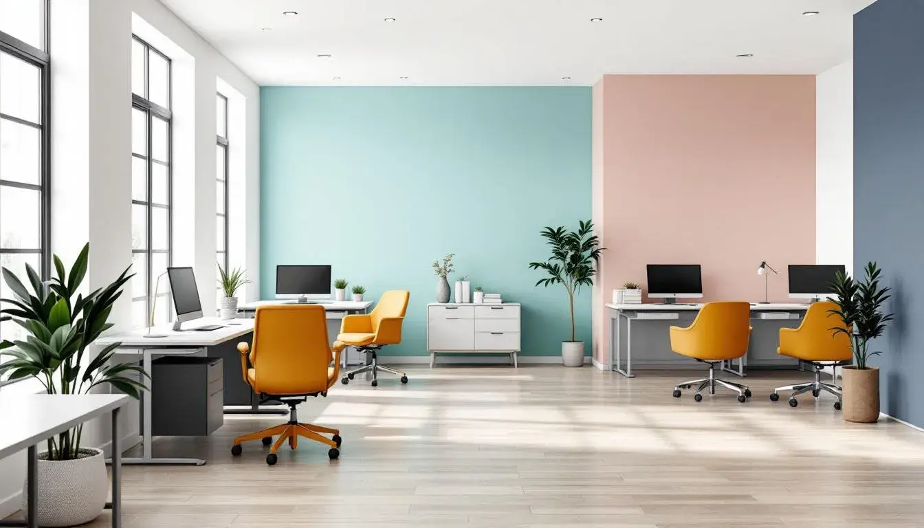
04 Aug 2025 · 3 min readThe modern office, a place formerly synonymous with sterile beige and soul-crushing fluorescent lights, is experiencing a renaissance. Color, once an afterthought, now stakes its claim as a vital tool for fostering creativity, focus, and overall well-being. Gone are the days of uniformity; instead, forward-thinking companies recognize the profound impact a thoughtfully curated color palette can have on productivity and promoting a sense of calm amidst the daily bustle. Imagine walking into a workspace that inspires rather than intimidates, where color breathes life into the environment, encouraging collaboration and sparking inspiration. It's about creating an ecosystem that supports not just the tasks at hand, but the very human beings performing them. These are not merely decorations; they are carefully considered compositions designed to subtly influence mood and motivation, transforming the office from a place of drudgery into a haven of innovation.
The "Foundation Palette" offers a sanctuary from the relentless demands of the contemporary workplace. Light Gray whispers of understated elegance, providing a refreshing openness that counters the visual clutter so often associated with the modern office environment. Light Turquoise brings a hint of the ocean's tranquility, a subtle nod to nature’s calming effects, providing a mental escape without physically leaving the workspace. Consider it the visual equivalent of a deep breath. Mustard Brown introduces a measure of grounded warmth, reminiscent of well-worn leather and quiet libraries, lending a sense of steadfast resolve and quiet competence. Dusty Rose adds a touch of unexpected warmth, a gentle and sophisticated comfort that feels both feminine and empowering, while the sophisticated nature of Deep Indigo anchors the palette with a sense of calm authority. Applied to surfaces, textures, and even the soft furnishings within a shared working space, these hues work together to evoke a feeling of clarity and focus, creating an environment where employees feel both productive and protected, able to tackle complex tasks with a sense of quiet confidence. The colors are a steadying visual support system that whispers, "You are safe. You are capable. You can focus here." This palette seems ideally partnered with spaces where collaboration thrives on thoughtful exchange, where ideas are carefully considered, and innovation emerges from deep concentration rather than fleeting frenzy. The effect is akin to a soft-focus lens, smoothing the edges without sacrificing detail, creating an ideal environment for individuals seeking a productive and restorative workday.
The "Corporate Calm" palette proposes a quietly confident take on the contemporary workspace, a space where innovation finds its ground in thoughtful collaboration. Light Sky Blue channels open skies and a sense of boundless possibility, encouraging a mindset of exploration and creative problem-solving. Imagine a presentation room bathed in this soft, airy hue, stimulating brainstorming sessions. The understated elegance of Dusty Lavender evokes a sense of sophisticated tranquility, fostering an atmosphere of mindful concentration. These calming effects play well upon the steadiness of Slate Blue. Lending a sense of dependability, its strength and depth communicates a level of trust and expertise that could permeate a professional setting. The neutrality of Charcoal Grey provides a grounding presence, subtly balancing the ethereal tones, while Russet Brown introduces an element of earthiness and authenticity, reminding us of the tangible world beyond the digital realm. Think of quiet corners accented with warm woodgrain, providing a respite from the technology-driven intensity of the modern workplace. This palette is an invitation to create a sanctuary of focus, a space where creative ideas are not only welcomed but nurtured, where calm prevails and innovation blooms organically. It subtly inspires a work ethic that values mindfulness and a focus on well-being -- a visual embodiment of a company that cares for both performance and people.
The "Calm Health" palette takes on the theme of office serenity with a subtle understanding of light and shadow. Light Beige, a near-neutral that brings gentle warmth, suggests organic textures like linen and raw silk, transforming harsh environments into relaxing environments. Grayish Lavender, an unusual yet soothing presence, brings a level of calm and understated sophistication, ideal for a waiting room or shared spaces where quiet repose is expected. Soft Purple enhances that tranquility, while remaining professional. Consider this shade applied to soft furnishings or artwork, a subtle visual reminder to breathe and restore oneself. The natural tones of Taupe Brown instill a sense of stability, of solid ground in a world of constant flux. This offers a comforting sensibility when added to interior finishes and furniture. Dark Gray provides a measured elegance to counteract the lighter colors, establishing a level of depth across the palette and ensuring that it never feels washed out or excessively saccharine. Picture this balanced array applied to the interiors of a wellness center: Light Beige walls paired with Soft Purple accents and grounding wooden tables. This creates a professional and pleasant environment that nurtures productivity without compromising serenity. What emerges is an atmosphere of focused calm—a place where wellbeing informs every aspect of work, creating a virtuous circle of productivity and peace.
"Steel Horizon" provides a soothing sense of professionalism to any modern office. Light Gray begins the vision by offering a foundational neutrality, a backdrop against which bolder hues can gently express themselves. This is the color of honed concrete, of quiet competence, inspiring steadfast commitment. Light Teal evokes a sense of optimism and renewal -- a nod to the natural world and a reminder to breathe amidst the chaos. Bright Azure brings a spark of creativity and innovation, a clear blue sky on the horizon encouraging expansive thinking and bold solutions. Forest Green grounds the palette with a touch of earthy wisdom, recalling the quiet resilience of nature and a deep connection to process. This element inspires a sense of grounded determination that permeates the work at hand, and the seriousness of Deep Teal makes this dream into a functional reality. Imagine an office conference room: Light Gray walls, Light Teal accents in the furniture, and a central piece of art featuring Bright Azure brushstrokes. This would create an environment poised between creativity and professionality, where ideas can bloom against the stable backdrop. This palette is a subtle expression of strength and serenity, designed to foster clear-headed productivity and inspire collaborative solutions.
The journey to coloring the modern office for both productivity and calm does not reside solely in selecting individual shades but in thoughtfully composing entire visual narratives. Each palette presented here whispers a distinct suggestion, a subtle yet persuasive proposal for how we can transform the workspace into a sanctuary of focus and inspiration. From the grounding warmth of the "Foundation Palette" to the innovative spirit of "Corporate Calm", passing through the soothing textures of "Calm Health" to the thoughtful strength of "Steel Horizon", each design paints a vivid picture of what's possible when we consider color as an essential component in our pursuit of a more balanced and fulfilling work life. The shift from stark, sterile environments to thoughtfully designed spaces is not merely an aesthetic upgrade but a strategic move toward fostering employee well-being and unlocking creative potential. When these visual elements meet our deepest needs, we achieve something more: a space where we can bring our best selves to work, ready to innovate, collaborate, and thrive.