'%3e%3cpath%20fill-rule='evenodd'%20clip-rule='evenodd'%20d='M51.1303%2019.2492C50.7278%2019.913%2050.1346%2020.4426%2049.3508%2020.838C48.5669%2021.2335%2047.6172%2021.4312%2046.5014%2021.4312C44.8208%2021.4312%2043.4367%2021.0216%2042.3492%2020.2025C41.2617%2019.3833%2040.6686%2018.2394%2040.5697%2016.7706H44.4253C44.4818%2017.3355%2044.6831%2017.7804%2045.0291%2018.1052C45.3751%2018.43%2045.8164%2018.5924%2046.3531%2018.5924C46.8192%2018.5924%2047.1864%2018.4653%2047.4547%2018.2111C47.7231%2017.9569%2047.8572%2017.618%2047.8572%2017.1943C47.8572%2016.8129%2047.7337%2016.4952%2047.4865%2016.241C47.2393%2015.9867%2046.9322%2015.7784%2046.565%2015.616C46.1978%2015.4536%2045.6893%2015.2594%2045.0397%2015.0334C44.0934%2014.7086%2043.3202%2014.3944%2042.72%2014.0907C42.1197%2013.7871%2041.6042%2013.3351%2041.1735%2012.7349C40.7427%2012.1347%2040.5273%2011.3544%2040.5273%2010.394C40.5273%209.50418%2040.7533%208.73448%2041.2053%208.08481C41.6572%207.43515%2042.2821%206.93731%2043.0801%206.5913C43.8781%206.24528%2044.7925%206.07227%2045.8235%206.07227C47.49%206.07227%2048.8141%206.46771%2049.7956%207.25861C50.7772%208.04951%2051.3315%209.13698%2051.4586%2010.5211H47.5395C47.4689%2010.0268%2047.2888%209.63483%2046.9993%209.3453C46.7097%209.05578%2046.3178%208.91102%2045.8235%208.91102C45.3998%208.91102%2045.0573%209.024%2044.7961%209.24997C44.5348%209.47594%2044.4041%209.80783%2044.4041%2010.2457C44.4041%2010.5988%2044.5207%2010.8989%2044.7537%2011.146C44.9867%2011.3932%2045.2798%2011.5944%2045.6328%2011.7498C45.9859%2011.9052%2046.4944%2012.1029%2047.1581%2012.343C48.1185%2012.6678%2048.9023%2012.9891%2049.5096%2013.3069C50.1169%2013.6246%2050.6395%2014.0872%2051.0773%2014.6945C51.5151%2015.3018%2051.734%2016.0927%2051.734%2017.0672C51.734%2017.8581%2051.5328%2018.5854%2051.1303%2019.2492ZM59.0242%206.3053V21.2829H55.4016V6.3053H59.0242ZM73.9409%206.3053V9.18642H69.8734V21.2829H66.2296V9.18642H62.2046V6.3053H73.9409ZM80.7438%209.18642V12.3218H85.8069V15.0546H80.7438V18.3806H86.4425V21.2829H77.1212V6.3053H86.4425V9.18642H80.7438ZM99.667%2016.0291V21.2829H96.0444V6.3053H101.913C103.692%206.3053%20105.048%206.74665%20105.98%207.62934C106.912%208.51204%20107.378%209.7019%20107.378%2011.199C107.378%2012.1311%20107.17%2012.9609%20106.753%2013.6882C106.337%2014.4155%20105.719%2014.9875%20104.9%2015.4042C104.08%2015.8208%20103.085%2016.0291%20101.913%2016.0291H99.667ZM103.692%2011.199C103.692%209.8855%20102.965%209.22879%20101.51%209.22879H99.667V13.1268H101.51C102.965%2013.1268%20103.692%2012.4842%20103.692%2011.199ZM120.092%2018.5501H114.478L113.546%2021.2829H109.732L115.219%206.41123H119.393L124.879%2021.2829H121.024L120.092%2018.5501ZM119.16%2015.7961L117.295%2010.2881L115.41%2015.7961H119.16ZM131.555%2018.5077H136.385V21.2829H127.933V6.3053H131.555V18.5077ZM143.337%209.18642V12.3218H148.4V15.0546H143.337V18.3806H149.035V21.2829H139.714V6.3053H149.035V9.18642H143.337ZM163.507%206.3053V9.18642H159.44V21.2829H155.796V9.18642H151.771V6.3053H163.507ZM177.449%206.3053V9.18642H173.382V21.2829H169.738V9.18642H165.713V6.3053H177.449ZM184.252%209.18642V12.3218H189.315V15.0546H184.252V18.3806H189.951V21.2829H180.629V6.3053H189.951V9.18642H184.252Z'%20fill='%23EEF0ED'/%3e%3cmask%20id='mask0_3101_7327'%20style='mask-type:alpha'%20maskUnits='userSpaceOnUse'%20x='0'%20y='0'%20width='27'%20height='28'%3e%3cpath%20d='M23.8328%200.759766H2.64808C1.18559%200.759766%200%201.94535%200%203.40785V24.5925C0%2026.055%201.18559%2027.2406%202.64808%2027.2406H23.8328C25.2952%2027.2406%2026.4808%2026.055%2026.4808%2024.5925V3.40785C26.4808%201.94535%2025.2952%200.759766%2023.8328%200.759766Z'%20fill='white'/%3e%3c/mask%3e%3cg%20mask='url(%23mask0_3101_7327)'%3e%3cpath%20d='M23.8328%200.759766H2.64808C1.18559%200.759766%200%201.94535%200%203.40785V24.5925C0%2026.055%201.18559%2027.2406%202.64808%2027.2406H23.8328C25.2952%2027.2406%2026.4808%2026.055%2026.4808%2024.5925V3.40785C26.4808%201.94535%2025.2952%200.759766%2023.8328%200.759766Z'%20fill='%23D8D8D8'/%3e%3cpath%20d='M13.2404%200.759766H0V14.0001H13.2404V0.759766Z'%20fill='%238C61FF'/%3e%3cpath%20d='M13.2404%2014H0V27.2404H13.2404V14Z'%20fill='%2336C3FE'/%3e%3cpath%20d='M26.4806%2014H13.2402V27.2404H26.4806V14Z'%20fill='%236592FE'/%3e%3cpath%20d='M26.4806%200.759766H13.2402V14.0002H26.4806V0.759766Z'%20fill='%236059F7'/%3e%3c/g%3e%3c/g%3e%3cdefs%3e%3cclipPath%20id='clip0_3101_7327'%3e%3crect%20width='190'%20height='28'%20fill='white'/%3e%3c/clipPath%3e%3c/defs%3e%3c/svg%3e)
'%3e%3cpath%20d='M23.8328%200.759521H2.64808C1.18559%200.759521%200%201.94511%200%203.40761V24.5923C0%2026.0548%201.18559%2027.2404%202.64808%2027.2404H23.8328C25.2952%2027.2404%2026.4808%2026.0548%2026.4808%2024.5923V3.40761C26.4808%201.94511%2025.2952%200.759521%2023.8328%200.759521Z'%20fill='%23D8D8D8'/%3e%3cpath%20d='M13.2404%200.759521H0V13.9999H13.2404V0.759521Z'%20fill='%238C61FF'/%3e%3cpath%20d='M13.2404%2013.9998H0V27.2402H13.2404V13.9998Z'%20fill='%2336C3FE'/%3e%3cpath%20d='M26.4809%2013.9998H13.2405V27.2402H26.4809V13.9998Z'%20fill='%236592FE'/%3e%3cpath%20d='M26.4809%200.759277H13.2405V13.9997H26.4809V0.759277Z'%20fill='%236059F7'/%3e%3c/g%3e%3c/svg%3e)
Bohemian Rhapsody: Tracing Hottest Colors in Bohemian Interior Design
04 Aug 2025 · 5 min readBohemian interior design, at its core, is about freedom—freedom of expression, freedom from convention, and freedom to collect and curate a space that tells a story. Color, in this context, is not merely decoration; it's a language, a feeling, an invitation to explore. It's the sun-drenched adobe walls of a Moroccan riad, the faded jewel tones of a vintage Persian rug, the unexpected pop of a hand-painted ceramic vase. The most successful Bohemian spaces are not afraid to mix and match, to layer textures and patterns, to embrace the unexpected. They whisper of faraway travels, long-forgotten treasures, and a life lived authentically, vibrantly, and without apology. It's less about following rules and more about curating a space that reflects your truest self. The palettes that capture this style must reflect that, speaking to the soul rather than the spreadsheet.
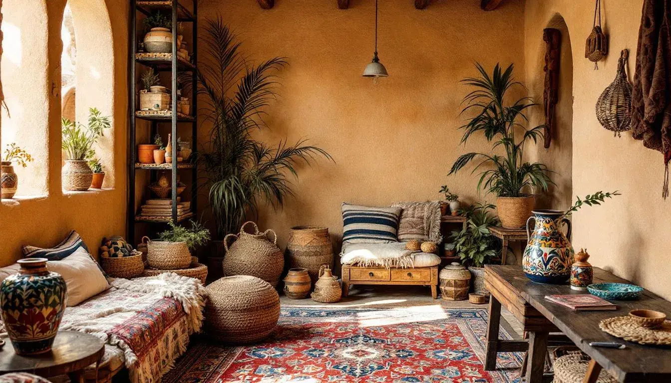
Imagine a room where shadows dance across sun-baked clay walls, the air thick with the scent of incense and old leather. The Earthy Elegance palette evokes just that—a sense of groundedness and quiet luxury. Pale Sand forms the foundation, a canvas upon which stories are painted. Gray Taupe lends a calming influence, as if time itself has softened the edges of the space. Golden Brown brings warmth and richness, reminiscent of aged wood and woven textiles. A hint of Reddish Brown adds a touch of spice, like a hidden treasure unearthed from a dusty antique shop. Finally, Ebony Shade provides a striking contrast, anchoring the palette and suggesting the deep, mysterious corners of a well-loved home. This isn't a palette for the faint of heart; it’s for those who appreciate the beauty of imperfection, the allure of the handcrafted, and the comfort of a space that feels both ancient and deeply personal. This palette is for the storyteller, the artist, the wanderer who seeks sanctuary in the familiar. It speaks of slow mornings, shared meals, and a life lived close to the earth. Picture vintage kilim pillows scattered across a low-slung sofa, a collection of antique maps adorning the walls, and the soft glow of candlelight illuminating hand-thrown pottery. It’s Bohemian, yes, but with a touch of refinement, a subtle reminder that true beauty lies in the details.
The Rustic Serenity palette paints a picture of a sun-drenched hacienda, the air thick with the scent of wildflowers and sun-dried earth. This palette evokes a feeling of quiet escape, a retreat from the chaos of the modern world. Light Beige whispers of sun-bleached linen curtains billowing in a gentle breeze, while Sage Green recalls the lush, untamed gardens that surround the house. Steel Blue, a muted and calming presence, suggests the cool depths of a hidden courtyard fountain. Dark Sienna adds a touch of warmth and richness, reminiscent of hand-carved wooden furniture and intricately woven tapestries. And finally, Onyx provides a grounding element, anchoring the palette with its deep, mysterious presence. This is for those who favor vintage finds and natural materials, creating a space that feels both lived-in and deeply peaceful. This palette invites you to slow down, breathe deeply, and reconnect with the simple pleasures of life. Imagine textured throws draped over well-worn armchairs, a collection of antique books stacked on a reclaimed wood bookshelf, and the soft glow of lanterns casting intricate shadows across the walls. It’s a Bohemian haven, a place where you can escape from the world and find solace in the beauty of the natural world. The low saturation creates a sense of depth and history, evoking the feeling of a space that has been lovingly curated over time.
Whisperwood Hues suggests a peaceful cabin nestled deep within a forest, where the air is crisp and clean, and the only sounds are the rustling of leaves and the gentle murmur of a nearby stream. Light Grey creates a sense of airy spaciousness, reminiscent of sunlight filtering through the trees. Khaki Green lends a grounding element, evoking the earthy tones of moss-covered rocks and weathered bark. Slate Green adds a touch of coolness and tranquility, like the shaded depths of a forest glade. Muted Olive brings a subtle richness and complexity, reminiscent of the intricate patterns found in nature. Finally, Deep Black provides a dramatic contrast, anchoring the palette and suggesting the deep, mysterious shadows of the woods. This is for those who seek refuge in nature, who appreciate the beauty of simplicity, and who find solace in the tranquility of the natural world. It invites you to disconnect from the digital world, reconnect with your senses, and find peace in the present moment. Picture woven rugs scattered across a hardwood floor, a collection of dried flowers adorning a mantelpiece, and the soft glow of candlelight illuminating hand-carved wooden sculptures. While inspired by nature, there is an echo of travels from far away. The palette works best with a collection of art and artifacts from another time, other cultures, that suggests you have sought your spirituality in the wider world.
Earthy Harmony is the sun setting over the desert. Imagine an open-air tent draped with flowing fabrics, a crackling fire casting shadows on the sand. Off-White suggests the bleached bones of the landscape, a brilliant base for colorful accents. Taupe Brown lends a sense of grounding, reminiscent of the weathered earth beneath your feet. Brick Red, a bold and fiery hue, adds a touch of drama and passion, echoing the intensity of the desert sun. Olive Drab brings a subtle coolness, like the shade offered by a lone acacia tree. And finally, Deep Teal, a surprising and unexpected addition, provides a refreshing contrast, suggesting the hidden oases that dot the landscape. The palette is for the nomadic spirit, those who thirst for adventure, and those who find beauty in the stark and unforgiving landscape. It’s an invitation to embrace the untamed and to find freedom in the vastness of the unknown. Think of hand-woven tapestries adorned with tribal patterns, a collection of vintage maps charting faraway lands, and the flickering light of lanterns casting dancing shadows on the walls. It's a call to embrace the unconventional, to mix and match textures and patterns, and to create a space that reflects your unique sense of style.
The Autumn Whispers palette is not about the bright, blatant blaze of color, but the subtlety of transformation. Imagine a room filled with the scent of dried leaves and cinnamon, sunlight streaming through sheer curtains. Off White is the blank canvas, a whisper of purity before color arrives. Dusty Rose hints at faded romance, memories clinging to antique lace. Taupe Brown adds depth, the reassuring solidity of hand-carved furniture, seasoned by time. Steel Blue, a surprising intrusion of coolness, suggests the first hint of winter’s chill, an unexpected breath of air. Burnt Orange bursts like a final, defiant flame before the season’s close. Dark Olive, a somber note, recalls shadows lengthening, leaves decaying back to earth. Jet Black, a grounding force, echoes the stark branches against a twilight sky. The palette is for those who find beauty in decay, who are soothed by quiet contemplation, and who embrace the inevitable cycle of change. A room with vintage velvet cushions scattered across antique chairs, a collection of antique books stacked high, the glow of a fireplace. It speaks not of youthful exuberance, but thoughtful reflection, the quiet pleasures of a life richly lived, and gratefully observed. It's the essence of Bohemian spirit.
Consider Playful Palette, and picture a room where laughter echoes, where the walls are adorned with whimsical artwork, and vintage finds mingle with modern pieces. Pale Peach brings joy, reminiscent of blooming spring blossoms and sunrises. Cornflower Blue offers a breath of fresh air, like a clear blue sky after a rain shower. Seafoam Green adds tranquility, evoking the gentle rhythm of ocean waves. Deep Teal creates a bold focal point, suggesting the depths of a hidden lagoon. Ebony grounds, providing the necessary contrast. This combination is for those who aren’t afraid to embrace eccentricity, to mix and match styles, and to create a space that reflects their joyful, unconventional spirit. It invites you to let your inner child run wild. It's a living room with colorful macramé wall hangings, an eclectic collection of vintage records, or soft light. This palette is a journey through a vintage boutique, picking up items that speak to different facets of your personality. It suggests travels to a port city, and the adoption of colors, materials, textures, and art from across cultures and aesthetics,
Each palette presented here offers a unique interpretation of the Bohemian spirit. Earthy Elegance channels grounded refinement, while Rustic Serenity promotes a sanctuary of calm. Whisperwood Hues captures the essence of a nature-filled haven, while Earthy Harmony stirs the adventurous soul. Autumn Whispers embraces the beauty of change, and Playful Palette celebrates joyful eccentricity. Together, they form a vibrant, eclectic collection that reflects the diverse and ever-evolving nature of Bohemian design. These palettes affirm the freedom to curate, the courage to collect, and the joy of creating a space that truly feels like home, a reflection of one's most authentic self. They remind us that true style is not about following trends, but about embracing individuality and surrounding ourselves with things that spark joy and tell our story.