'%3e%3cpath%20fill-rule='evenodd'%20clip-rule='evenodd'%20d='M51.1303%2019.2492C50.7278%2019.913%2050.1346%2020.4426%2049.3508%2020.838C48.5669%2021.2335%2047.6172%2021.4312%2046.5014%2021.4312C44.8208%2021.4312%2043.4367%2021.0216%2042.3492%2020.2025C41.2617%2019.3833%2040.6686%2018.2394%2040.5697%2016.7706H44.4253C44.4818%2017.3355%2044.6831%2017.7804%2045.0291%2018.1052C45.3751%2018.43%2045.8164%2018.5924%2046.3531%2018.5924C46.8192%2018.5924%2047.1864%2018.4653%2047.4547%2018.2111C47.7231%2017.9569%2047.8572%2017.618%2047.8572%2017.1943C47.8572%2016.8129%2047.7337%2016.4952%2047.4865%2016.241C47.2393%2015.9867%2046.9322%2015.7784%2046.565%2015.616C46.1978%2015.4536%2045.6893%2015.2594%2045.0397%2015.0334C44.0934%2014.7086%2043.3202%2014.3944%2042.72%2014.0907C42.1197%2013.7871%2041.6042%2013.3351%2041.1735%2012.7349C40.7427%2012.1347%2040.5273%2011.3544%2040.5273%2010.394C40.5273%209.50418%2040.7533%208.73448%2041.2053%208.08481C41.6572%207.43515%2042.2821%206.93731%2043.0801%206.5913C43.8781%206.24528%2044.7925%206.07227%2045.8235%206.07227C47.49%206.07227%2048.8141%206.46771%2049.7956%207.25861C50.7772%208.04951%2051.3315%209.13698%2051.4586%2010.5211H47.5395C47.4689%2010.0268%2047.2888%209.63483%2046.9993%209.3453C46.7097%209.05578%2046.3178%208.91102%2045.8235%208.91102C45.3998%208.91102%2045.0573%209.024%2044.7961%209.24997C44.5348%209.47594%2044.4041%209.80783%2044.4041%2010.2457C44.4041%2010.5988%2044.5207%2010.8989%2044.7537%2011.146C44.9867%2011.3932%2045.2798%2011.5944%2045.6328%2011.7498C45.9859%2011.9052%2046.4944%2012.1029%2047.1581%2012.343C48.1185%2012.6678%2048.9023%2012.9891%2049.5096%2013.3069C50.1169%2013.6246%2050.6395%2014.0872%2051.0773%2014.6945C51.5151%2015.3018%2051.734%2016.0927%2051.734%2017.0672C51.734%2017.8581%2051.5328%2018.5854%2051.1303%2019.2492ZM59.0242%206.3053V21.2829H55.4016V6.3053H59.0242ZM73.9409%206.3053V9.18642H69.8734V21.2829H66.2296V9.18642H62.2046V6.3053H73.9409ZM80.7438%209.18642V12.3218H85.8069V15.0546H80.7438V18.3806H86.4425V21.2829H77.1212V6.3053H86.4425V9.18642H80.7438ZM99.667%2016.0291V21.2829H96.0444V6.3053H101.913C103.692%206.3053%20105.048%206.74665%20105.98%207.62934C106.912%208.51204%20107.378%209.7019%20107.378%2011.199C107.378%2012.1311%20107.17%2012.9609%20106.753%2013.6882C106.337%2014.4155%20105.719%2014.9875%20104.9%2015.4042C104.08%2015.8208%20103.085%2016.0291%20101.913%2016.0291H99.667ZM103.692%2011.199C103.692%209.8855%20102.965%209.22879%20101.51%209.22879H99.667V13.1268H101.51C102.965%2013.1268%20103.692%2012.4842%20103.692%2011.199ZM120.092%2018.5501H114.478L113.546%2021.2829H109.732L115.219%206.41123H119.393L124.879%2021.2829H121.024L120.092%2018.5501ZM119.16%2015.7961L117.295%2010.2881L115.41%2015.7961H119.16ZM131.555%2018.5077H136.385V21.2829H127.933V6.3053H131.555V18.5077ZM143.337%209.18642V12.3218H148.4V15.0546H143.337V18.3806H149.035V21.2829H139.714V6.3053H149.035V9.18642H143.337ZM163.507%206.3053V9.18642H159.44V21.2829H155.796V9.18642H151.771V6.3053H163.507ZM177.449%206.3053V9.18642H173.382V21.2829H169.738V9.18642H165.713V6.3053H177.449ZM184.252%209.18642V12.3218H189.315V15.0546H184.252V18.3806H189.951V21.2829H180.629V6.3053H189.951V9.18642H184.252Z'%20fill='%23EEF0ED'/%3e%3cmask%20id='mask0_3101_7327'%20style='mask-type:alpha'%20maskUnits='userSpaceOnUse'%20x='0'%20y='0'%20width='27'%20height='28'%3e%3cpath%20d='M23.8328%200.759766H2.64808C1.18559%200.759766%200%201.94535%200%203.40785V24.5925C0%2026.055%201.18559%2027.2406%202.64808%2027.2406H23.8328C25.2952%2027.2406%2026.4808%2026.055%2026.4808%2024.5925V3.40785C26.4808%201.94535%2025.2952%200.759766%2023.8328%200.759766Z'%20fill='white'/%3e%3c/mask%3e%3cg%20mask='url(%23mask0_3101_7327)'%3e%3cpath%20d='M23.8328%200.759766H2.64808C1.18559%200.759766%200%201.94535%200%203.40785V24.5925C0%2026.055%201.18559%2027.2406%202.64808%2027.2406H23.8328C25.2952%2027.2406%2026.4808%2026.055%2026.4808%2024.5925V3.40785C26.4808%201.94535%2025.2952%200.759766%2023.8328%200.759766Z'%20fill='%23D8D8D8'/%3e%3cpath%20d='M13.2404%200.759766H0V14.0001H13.2404V0.759766Z'%20fill='%238C61FF'/%3e%3cpath%20d='M13.2404%2014H0V27.2404H13.2404V14Z'%20fill='%2336C3FE'/%3e%3cpath%20d='M26.4806%2014H13.2402V27.2404H26.4806V14Z'%20fill='%236592FE'/%3e%3cpath%20d='M26.4806%200.759766H13.2402V14.0002H26.4806V0.759766Z'%20fill='%236059F7'/%3e%3c/g%3e%3c/g%3e%3cdefs%3e%3cclipPath%20id='clip0_3101_7327'%3e%3crect%20width='190'%20height='28'%20fill='white'/%3e%3c/clipPath%3e%3c/defs%3e%3c/svg%3e)
'%3e%3cpath%20d='M23.8328%200.759521H2.64808C1.18559%200.759521%200%201.94511%200%203.40761V24.5923C0%2026.0548%201.18559%2027.2404%202.64808%2027.2404H23.8328C25.2952%2027.2404%2026.4808%2026.0548%2026.4808%2024.5923V3.40761C26.4808%201.94511%2025.2952%200.759521%2023.8328%200.759521Z'%20fill='%23D8D8D8'/%3e%3cpath%20d='M13.2404%200.759521H0V13.9999H13.2404V0.759521Z'%20fill='%238C61FF'/%3e%3cpath%20d='M13.2404%2013.9998H0V27.2402H13.2404V13.9998Z'%20fill='%2336C3FE'/%3e%3cpath%20d='M26.4809%2013.9998H13.2405V27.2402H26.4809V13.9998Z'%20fill='%236592FE'/%3e%3cpath%20d='M26.4809%200.759277H13.2405V13.9997H26.4809V0.759277Z'%20fill='%236059F7'/%3e%3c/g%3e%3c/svg%3e)
The Off-White Obsession: Deconstructing The Core of Interior Design
01 Aug 2025 · 5 min readThe slow creep of off-white has become synonymous with contemporary taste. It's the whisper where there was once a shout, a gentle suggestion where vibrancy once reigned. Think of sun-bleached linens, the patina on antique plaster, the way fog softens the sharp edges of a city skyline. Its appeal lies in its quiet confidence, its ability to create spaces that feel both lived-in and impossibly chic. It avoids the starkness of white, offering a subtle warmth and depth that acts as a blank canvas for the textures and stories each room tells. But what is it about this muted realm that captures our collective imagination? What are the subtle harmonies and tensions held within? Let’s examine how some carefully curated palettes use this phenomenon.
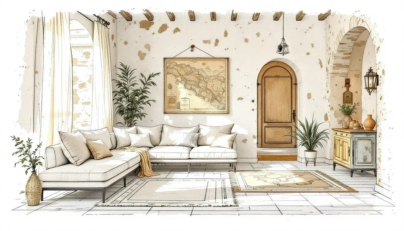
The "Earthy Elegance" 🌿 palette paints a picture of a sun-drenched Tuscan villa, where time slows down, and every detail tells a story. The Pale Ivory whispers of aged stone walls, bathed in the morning light, while the Golden Tan suggests the rich hues of leather and wood, softened by years of use. Deep Olive evokes the scent of herbs drying in the sun, a grounding element that brings a sense of nature indoors. Dark Taupe offers a counterpoint, providing depth and shadow, like the cool interior of a wine cellar. And finally, Onyx Black adds a touch of drama, a grounding force that keeps the palette from becoming overly delicate. Imagine a space where these colors intertwine: linen sofas draped with textured throws, walls adorned with vintage maps, and floors covered in hand-woven rugs. Light filters through sheer curtains, creating a soft glow that accentuates the subtle variations in tone. This is a space designed for quiet contemplation, for savoring the simple pleasures of life. The palette speaks of relaxed sophistication, a rejection of fleeting trends in favor of timeless beauty. It is an invitation to slow down, to breathe deeply, and to connect with the natural world. It evokes a sense of history and craftsmanship, reminding us of the enduring power of quality over quantity. This "Earthy Elegance" serves as a reminder that true luxury lies in the details, in the textures and tones that create a sense of depth and character. The quiet intensity of the darkened end pulls the light colours into alignment, as if they are bound by a common space.
"Earthy Contrast" 🎨 brings a grounded warmth, like a forgotten path through sun-baked earth, as if hinting at sun-drenched adobe walls in a forgotten corner of the world. Beige Cream offers a soft foundation, a muted backdrop that allows the other colors to take center stage. Coral Pink adds a touch of unexpected vibrancy, a pop of color that suggests the fiery hues of a desert sunset. Earthy Brown provides a grounding presence, like the rich soil beneath our feet. Navy Blue enters as a calming counterpoint, suggesting the vast expanse of the night sky. And again, Onyx Black delivers that necessary anchor. Envision a room where these colors play off each other: walls painted in Beige Cream, accented with pops of Coral Pink in artwork and textiles. Imagine earthy ceramics and dark iron fixtures. Sunlight streams through woven blinds, casting shadows that dance across the walls. This palette speaks of understated elegance, a celebration of natural beauty. It is an invitation to embrace imperfection, to find beauty in the raw and unrefined. The inclusion of navy is inspired, suggesting a depth beyond the earth tones, as if there is a hidden tranquility within the landscape. The subtle contrast between warm and cool creates a sense of energy, preventing the palette from feeling stagnant or predictable. It is a reminder that beauty can be found in unexpected places, in the juxtaposition of light and shadow, in the balance between boldness and restraint.
"Rustic Dawn" 🍞 unfolds like a quiet morning in a farmhouse kitchen, the air filled with the scent of freshly baked bread and the promise of a new day. Pure White represents the crispness of freshly starched linens, the blank slate upon which the day's events will unfold. Pale Peach brings a soft warmth, like the first rays of sunlight filtering through the window. Grayish Beige suggests the weathered wood of the farmhouse table, worn smooth by years of use. Burnt Sienna speaks of the rich earth, the source of all nourishment. And Dark Charcoal offers a sense of grounding, stability, much like the cast-iron stove in the corner. Picture a space where these colors come together: walls painted in Pure White, accented with Pale Peach textiles and vintage artwork. Floors covered in Grayish Beige rugs, providing a soft and inviting backdrop. This palette speaks of simplicity and authenticity, inviting the viewer into a space where they can truly relax and be themselves. It’s an ode to the beauty of imperfection, the charm of hand-crafted objects, and the enduring appeal of natural materials. The presence of white reinforces the light and airy feeling, while the darker tones add depth and character, preventing the palette from being overly saccharine. It is a reminder that true beauty lies not in perfection, but in the stories that our spaces tell, in the memories they hold, and in the sense of comfort and belonging they provide.
"Earthy Serenity" 🪵 whispers of a calm, uncluttered space, a haven from the chaos of the outside world. Pale ivory embodies the gentle glow of candlelight, casting a warm and inviting ambiance, much like raw silk. Soft beige is reminiscent of smooth river stones, worn smooth by the relentless flow of water. Taupe brown conjures images of aged leather, soft to the touch, redoldent of classic leather bound journals. Rustic red offers a touch of unexpected warmth, like a crackling fireplace on a winter's night. Grayish green brings a touch of the outdoors in, echoing the muted tones of a moss-covered forest. Imagine a room where these colors blend seamlessly: walls painted in pale ivory, accented with soft beige textiles. Accents of taupe brown providing a comforting contrast, while pops of rustic red add a touch of visual interest. This palette speaks of understated sophistication, a celebration of natural beauty and a rejection of overt embellishment. It is an invitation to slow down, to breathe deeply, and to reconnect with the simple pleasures of life. The palette is an embodiment of calm, a visual representation of serenity.
With its thoughtful reserve, "Earthy Harmony" 🌿 presents a sophisticated balance. Off-White, the star of the show, sets the tone, a foundational whisper that suggests depth and texture without demanding attention. Muted Olive brings a grounding element, evocative of aged foliage. Khaki Green offers a subtle variation, hinting at sun-drenched grasses in autumn. Berry Red provides a touch of unexpected drama, like a splash of color in an otherwise muted landscape. And Forest Green completes the picture, anchoring the palette with a sense of depth and tranquility. Imagine a space crafted with these hues: an open-plan living area where natural light streams through linen curtains, illuminating walls painted in Off-White. A velvet Muted Olive sofa invites relaxation, while Khaki Green cushions add a touch of visual interest. A carefully curated collection of art adorns the walls, punctuated by the subtle flash of Berry Red. This palette is a testament to the power of subtlety, a reminder that true elegance lies in simplicity and restraint. It is an invitation to create a space that feels both sophisticated and inviting, a sanctuary from the outside world.
The "Gray Scale" 🌧️ palette offers a study in contrasts, a exploration of tone and texture. Pale Ivory serves as a muted anchor, a soft backdrop that allows the other colors to emerge. Chartreuse Tint lends a touch of unexpected brightness, a vivid spark that hints at burgeoning life. Granite Gray brings a sense of solidity, like the rough texture of a stone wall. Olive Drab offers a connection to nature, suggesting a forest floor. And Dark Asphalt provides a grounding element, anchoring the palette with a sense of depth and permanence. Envision a modern loft space where these colors intertwine: concrete walls painted in Pale Ivory, accented with Chartreuse Tint in the form of abstract art. Granite Gray furniture adds a touch of industrial chic, while Olive Drab plants bring a touch of nature indoors. This palette speaks of urban sophistication, offering a glimpse into a world where the raw and refined collide. It is a celebration of the unexpected, a reminder that beauty can be found in the most unlikely places. It is a visual exploration of texture and tone, offering a range of possibilities for design.
Off-White appears 1 time among the 6 palettes in the 'cube', 'thief', and 'vibrant' keys. White (Pure White) appears 1 time across those sources. Therefore, Off-White appears in 50% of the instances that White appears.
These palettes illustrate the subtle power of nuanced color choices. From evoking rustic charm to celebrating understated elegance, each collection offers a unique perspective on the theme. What emerges is the understanding that color is not merely decorative, but rather a powerful tool for shaping our experiences, influencing our emotions, and telling stories through space.