'%3e%3cpath%20fill-rule='evenodd'%20clip-rule='evenodd'%20d='M51.1303%2019.2492C50.7278%2019.913%2050.1346%2020.4426%2049.3508%2020.838C48.5669%2021.2335%2047.6172%2021.4312%2046.5014%2021.4312C44.8208%2021.4312%2043.4367%2021.0216%2042.3492%2020.2025C41.2617%2019.3833%2040.6686%2018.2394%2040.5697%2016.7706H44.4253C44.4818%2017.3355%2044.6831%2017.7804%2045.0291%2018.1052C45.3751%2018.43%2045.8164%2018.5924%2046.3531%2018.5924C46.8192%2018.5924%2047.1864%2018.4653%2047.4547%2018.2111C47.7231%2017.9569%2047.8572%2017.618%2047.8572%2017.1943C47.8572%2016.8129%2047.7337%2016.4952%2047.4865%2016.241C47.2393%2015.9867%2046.9322%2015.7784%2046.565%2015.616C46.1978%2015.4536%2045.6893%2015.2594%2045.0397%2015.0334C44.0934%2014.7086%2043.3202%2014.3944%2042.72%2014.0907C42.1197%2013.7871%2041.6042%2013.3351%2041.1735%2012.7349C40.7427%2012.1347%2040.5273%2011.3544%2040.5273%2010.394C40.5273%209.50418%2040.7533%208.73448%2041.2053%208.08481C41.6572%207.43515%2042.2821%206.93731%2043.0801%206.5913C43.8781%206.24528%2044.7925%206.07227%2045.8235%206.07227C47.49%206.07227%2048.8141%206.46771%2049.7956%207.25861C50.7772%208.04951%2051.3315%209.13698%2051.4586%2010.5211H47.5395C47.4689%2010.0268%2047.2888%209.63483%2046.9993%209.3453C46.7097%209.05578%2046.3178%208.91102%2045.8235%208.91102C45.3998%208.91102%2045.0573%209.024%2044.7961%209.24997C44.5348%209.47594%2044.4041%209.80783%2044.4041%2010.2457C44.4041%2010.5988%2044.5207%2010.8989%2044.7537%2011.146C44.9867%2011.3932%2045.2798%2011.5944%2045.6328%2011.7498C45.9859%2011.9052%2046.4944%2012.1029%2047.1581%2012.343C48.1185%2012.6678%2048.9023%2012.9891%2049.5096%2013.3069C50.1169%2013.6246%2050.6395%2014.0872%2051.0773%2014.6945C51.5151%2015.3018%2051.734%2016.0927%2051.734%2017.0672C51.734%2017.8581%2051.5328%2018.5854%2051.1303%2019.2492ZM59.0242%206.3053V21.2829H55.4016V6.3053H59.0242ZM73.9409%206.3053V9.18642H69.8734V21.2829H66.2296V9.18642H62.2046V6.3053H73.9409ZM80.7438%209.18642V12.3218H85.8069V15.0546H80.7438V18.3806H86.4425V21.2829H77.1212V6.3053H86.4425V9.18642H80.7438ZM99.667%2016.0291V21.2829H96.0444V6.3053H101.913C103.692%206.3053%20105.048%206.74665%20105.98%207.62934C106.912%208.51204%20107.378%209.7019%20107.378%2011.199C107.378%2012.1311%20107.17%2012.9609%20106.753%2013.6882C106.337%2014.4155%20105.719%2014.9875%20104.9%2015.4042C104.08%2015.8208%20103.085%2016.0291%20101.913%2016.0291H99.667ZM103.692%2011.199C103.692%209.8855%20102.965%209.22879%20101.51%209.22879H99.667V13.1268H101.51C102.965%2013.1268%20103.692%2012.4842%20103.692%2011.199ZM120.092%2018.5501H114.478L113.546%2021.2829H109.732L115.219%206.41123H119.393L124.879%2021.2829H121.024L120.092%2018.5501ZM119.16%2015.7961L117.295%2010.2881L115.41%2015.7961H119.16ZM131.555%2018.5077H136.385V21.2829H127.933V6.3053H131.555V18.5077ZM143.337%209.18642V12.3218H148.4V15.0546H143.337V18.3806H149.035V21.2829H139.714V6.3053H149.035V9.18642H143.337ZM163.507%206.3053V9.18642H159.44V21.2829H155.796V9.18642H151.771V6.3053H163.507ZM177.449%206.3053V9.18642H173.382V21.2829H169.738V9.18642H165.713V6.3053H177.449ZM184.252%209.18642V12.3218H189.315V15.0546H184.252V18.3806H189.951V21.2829H180.629V6.3053H189.951V9.18642H184.252Z'%20fill='%23EEF0ED'/%3e%3cmask%20id='mask0_3101_7327'%20style='mask-type:alpha'%20maskUnits='userSpaceOnUse'%20x='0'%20y='0'%20width='27'%20height='28'%3e%3cpath%20d='M23.8328%200.759766H2.64808C1.18559%200.759766%200%201.94535%200%203.40785V24.5925C0%2026.055%201.18559%2027.2406%202.64808%2027.2406H23.8328C25.2952%2027.2406%2026.4808%2026.055%2026.4808%2024.5925V3.40785C26.4808%201.94535%2025.2952%200.759766%2023.8328%200.759766Z'%20fill='white'/%3e%3c/mask%3e%3cg%20mask='url(%23mask0_3101_7327)'%3e%3cpath%20d='M23.8328%200.759766H2.64808C1.18559%200.759766%200%201.94535%200%203.40785V24.5925C0%2026.055%201.18559%2027.2406%202.64808%2027.2406H23.8328C25.2952%2027.2406%2026.4808%2026.055%2026.4808%2024.5925V3.40785C26.4808%201.94535%2025.2952%200.759766%2023.8328%200.759766Z'%20fill='%23D8D8D8'/%3e%3cpath%20d='M13.2404%200.759766H0V14.0001H13.2404V0.759766Z'%20fill='%238C61FF'/%3e%3cpath%20d='M13.2404%2014H0V27.2404H13.2404V14Z'%20fill='%2336C3FE'/%3e%3cpath%20d='M26.4806%2014H13.2402V27.2404H26.4806V14Z'%20fill='%236592FE'/%3e%3cpath%20d='M26.4806%200.759766H13.2402V14.0002H26.4806V0.759766Z'%20fill='%236059F7'/%3e%3c/g%3e%3c/g%3e%3cdefs%3e%3cclipPath%20id='clip0_3101_7327'%3e%3crect%20width='190'%20height='28'%20fill='white'/%3e%3c/clipPath%3e%3c/defs%3e%3c/svg%3e)
'%3e%3cpath%20d='M23.8328%200.759521H2.64808C1.18559%200.759521%200%201.94511%200%203.40761V24.5923C0%2026.0548%201.18559%2027.2404%202.64808%2027.2404H23.8328C25.2952%2027.2404%2026.4808%2026.0548%2026.4808%2024.5923V3.40761C26.4808%201.94511%2025.2952%200.759521%2023.8328%200.759521Z'%20fill='%23D8D8D8'/%3e%3cpath%20d='M13.2404%200.759521H0V13.9999H13.2404V0.759521Z'%20fill='%238C61FF'/%3e%3cpath%20d='M13.2404%2013.9998H0V27.2402H13.2404V13.9998Z'%20fill='%2336C3FE'/%3e%3cpath%20d='M26.4809%2013.9998H13.2405V27.2402H26.4809V13.9998Z'%20fill='%236592FE'/%3e%3cpath%20d='M26.4809%200.759277H13.2405V13.9997H26.4809V0.759277Z'%20fill='%236059F7'/%3e%3c/g%3e%3c/svg%3e)
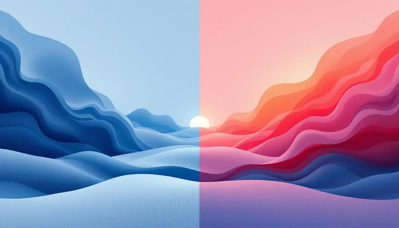
Steel Blues vs Coral Pinks, the epic battle of warmth and coolness
01 Aug 2025 · 5 min readThe world of color is a constant conversation, a push and pull between opposing forces. We find ourselves caught in the delightful tension of Steel Blues versus Coral Pinks, a visual duel between serenity and vibrancy, coolness and warmth. These aren't merely shades; they are experiences, moods, memories waiting to be awakened. One whispers of quiet mornings and frosted landscapes, the other shouts of sunsets and blooming orchards. Exploring these palettes is like stepping into different emotional landscapes, each offering a unique sensory journey and telling a distinct story. The cool blues bring forth a sense of calm, of intellectual grounding, like a deep winter sky. The coral pinks, in turn, evoke warmth and a sense of playful energy, the flush of a summer evening. This isn't simply a cosmetic preference, but a primal attraction to different forms of beauty, to the contrasting ways the world speaks to us. This exploration goes beyond mere trends and dives deep into the psychological impact of the colors we choose to surround ourselves with.
The "Fiery Earth" palette is less a head-on clash and more a smoldering dance between warmth and grounding. The Off-White whispers of sun-baked clay, a weathered surface holding stories etched by time. Slate Gray introduces a touch of stoicism, the silent strength of stone, preventing things from becoming too exuberant. The real fire starts with Burnt Sienna, a reminder of autumn leaves crackling underfoot, followed by the bold statement of Tomato Red, a burst of late summer blooms pushing against the odds. At the base, Dark Brown anchors everything, the fertile soil from which this vibrant narrative springs forth. This palette is far from the serene coolness of blues or the playful exuberance of pinks; instead, it evokes the intense beauty of an arid landscape. It suggests the rustic charm of handcrafted pottery, the comfort of a well-worn leather journal, the satisfaction of a harvest festival. Emotionally, it lands somewhere between nostalgia and anticipation; reminiscent of cherished heritage with an eye on creation. It would resonate in the soft glow of a library, perhaps filled with leather-bound books and the scent of aging paper, or maybe in a sun-drenched atelier, where tactile artworks are born. It speaks to a desire for grounding, for connecting with the earth and its raw beauty, a celebration of imperfect beauty and a gentle invitation to get your hands dirty. This isn't the battle of coral and blue, but a quiet observer, content to embody the earthiness that forms the origin of everything else.
"Vibrant Contrast" feels like a breath of fresh air, a cool breeze on a sunny day, subtly aligning closer to the Steel Blues in our consideration. The Pale Lavender starts as a soft whisper, an early morning mist gently kissing the landscape, while Soft Lavender deepens that initial serenity into something more considered and thoughtful. Emerald Green arrives with a burst of springtime renewal, reminding us of new shoots emerging from the soil and vibrant life taking hold. Cool Gray offers the composed restraint necessary for this color scheme to feel mature. Finally, Deep Taupe provides a solid foundation, akin to rich soil allowing the other colors to thrive without losing connection. This palette, while possessing a touch of warmth with its green, primarily resonates with the refreshing embrace of a cool, modern aesthetic. You imagine crisp linen shirts on a summer’s afternoon, the clean lines of modern architecture juxtaposed against natural materials, the intellectual buzz of a think-tank brainstorming session. Emotionally, it speaks to clarity and purpose. It would flourish in an open-concept office, maybe with walls of exposed brick and an abundance of natural light, or in a minimalist apartment overlooking the city skyline. It suits atmospheres where ideas germinate, projects take wing, and a sense of purpose prevails. Consider the clean lines of a museum displaying contemporary designs, or the invigorating atmosphere of a co-working space buzzing with future projects. It represents thoughtful innovation, carefully balancing creativity with grounded pragmatism.
"Modern Dusk" calls to mind the quiet hour between day and night, a time of contemplation and reflection, leaning toward the coolness of Steel Blues. Pure White provides the backdrop of a crisp, starlit sky, the vast canvas against which the drama unfolds. Light Gray adds a touch of gentle haze, like a soft cloud obscuring the moon’s light. Medium Gray builds depth and dimension, evoking the hushed tones of twilight. Vivid Blue, the color of the approaching night, lends a sense of sophisticated mystery. Finally, Dark Charcoal anchors the composition, giving it gravitas and defining the horizon. This palette doesn't shout; it whispers. It's the feeling of cool, smooth concrete under bare feet, the inky surface of a still lake reflecting the night sky, the comforting weight of a warm blanket on a chilly evening. It evokes calmness and clarity, encouraging mindful engagement with the world. It thrives in a serene bedroom where sleep is a welcome indulgence, or in a sleek, minimalist office where fresh ideas get their start. The color story suggests sophistication and a quiet confidence, a sense of being self-possessed and at peace in one's surroundings. The palette echoes the polished steel of a modern building, or the soft glow of a screen in a dimly lit space. The narrative is one of understated elegance, embracing simplicity and finding beauty in the quiet moments.
"Earthy Elegance" is a grounding force, a refined take on nature's hues. Light Beige sets the stage with its understated grace, reminiscent of raw silk or sun-bleached linen. Sage Green brings in a touch of the outdoors, mirroring the quiet serenity of a forest. Steel Blue injects a muted coolness. Dark Sienna injects depth and warmth, thinking of dark wood furniture or old, worn leather. Onyx grounds the palette in a deep richness. This color story invites a sense of calm sophistication, the feeling of bare feet on a stone floor, maybe somewhere out in the desert. This palette is a refuge, a return to organic forms. It feels distinctly intentional, from the softest materials to earth tones. It would thrive in a comfortable living room, perfect for a long conversation, or in a peaceful bedroom designed to calm the mind. It's the kind of palette that would suit a rustic home, maybe with a view of the countryside, or a cozy yoga studio, where the focus is on relaxation and self-care. It would look as good in a hospitality setting as it does in an office for a wellness brand because it speaks to comfort and balance.
"Autumn Whisper" hints at the subdued beauty of a fading season. Pure White acts as the backdrop, like the first frost coating the landscape. A Pale Gold arrives to remind us of harvest tones. Then comes Orchid Pink, a splash of fleeting color. Azure Blue carries the coolness of the mountain air. Dusty Olive provides a natural anchor. Burnt Sienna evokes the cozy warmth of a fireplace in the evening. Deep Moss, the rich undertones of soil, grounds the color scheme. Dark Charcoal adds depth and a touch of mystery. This palette is not about clear contrasts but about the quiet transition of seasons. It reminds us of the simple pleasures of home, cozying up with a book, or quiet meditations with tea. It is a color story of comfort, reminding us of woolen blankets and the lighthearted anticipation of cooler days. The palette evokes an atmosphere of welcome elegance and is perfect in a living room where conversation flows, or in a bedroom designed for peaceful slumber. The emotional message is clear – simplicity and connection.
"Earthy Harmony" represents serene balance and the understated elegance of nature. Light Beige brings to mind the smooth texture of untreated materials. Aqua Green is a refreshing contrast, evoking the feeling of cool water. Sage Green brings nature's calm into the palette. Russet Brown injects notes of comforting grounding. Deep Black, the fertile soil, provides contrast to the lighter tones. This palette is a subtle nudge toward serenity and the comfort of home. It's the feeling of walking barefoot on a rustic wood floor, finding rest in a quiet forest, the peaceful comfort of organic fabrics. It aligns with authenticity, from the simplest natural materials to curated earthy tones. It would thrive in a cozy living room filled with conversation, or in a bedroom designed for restorative meditation before sleep. The harmony promotes calmness and a focus on authentic living.
The Verdict
Considering our challenge, the scales tilt slightly toward the realm of Steel Blues. Palettes like "Vibrant Contrast" and "Modern Dusk" distinctly highlight the qualities of coolness, tranquility, and modern sensibility closely linked to the Steel Blues. While the coral pinks made an appearance in the "Autumn Whisper" palette, they were part of a balanced composition, not a dominant force. Palettes like "Fiery Earth," "Earthy Elegance," and "Earthy Harmony" chose the middle ground, opting for a balanced approach that embraces both warmth and coolness. Ultimately, the subtle dominance of cool tones reflects not necessarily a victory, but an expression of modern sensibilities gravitating toward serenity and intentionality. The world of color evolves, and so does our appreciation for harmony.