'%3e%3cpath%20fill-rule='evenodd'%20clip-rule='evenodd'%20d='M51.1303%2019.2492C50.7278%2019.913%2050.1346%2020.4426%2049.3508%2020.838C48.5669%2021.2335%2047.6172%2021.4312%2046.5014%2021.4312C44.8208%2021.4312%2043.4367%2021.0216%2042.3492%2020.2025C41.2617%2019.3833%2040.6686%2018.2394%2040.5697%2016.7706H44.4253C44.4818%2017.3355%2044.6831%2017.7804%2045.0291%2018.1052C45.3751%2018.43%2045.8164%2018.5924%2046.3531%2018.5924C46.8192%2018.5924%2047.1864%2018.4653%2047.4547%2018.2111C47.7231%2017.9569%2047.8572%2017.618%2047.8572%2017.1943C47.8572%2016.8129%2047.7337%2016.4952%2047.4865%2016.241C47.2393%2015.9867%2046.9322%2015.7784%2046.565%2015.616C46.1978%2015.4536%2045.6893%2015.2594%2045.0397%2015.0334C44.0934%2014.7086%2043.3202%2014.3944%2042.72%2014.0907C42.1197%2013.7871%2041.6042%2013.3351%2041.1735%2012.7349C40.7427%2012.1347%2040.5273%2011.3544%2040.5273%2010.394C40.5273%209.50418%2040.7533%208.73448%2041.2053%208.08481C41.6572%207.43515%2042.2821%206.93731%2043.0801%206.5913C43.8781%206.24528%2044.7925%206.07227%2045.8235%206.07227C47.49%206.07227%2048.8141%206.46771%2049.7956%207.25861C50.7772%208.04951%2051.3315%209.13698%2051.4586%2010.5211H47.5395C47.4689%2010.0268%2047.2888%209.63483%2046.9993%209.3453C46.7097%209.05578%2046.3178%208.91102%2045.8235%208.91102C45.3998%208.91102%2045.0573%209.024%2044.7961%209.24997C44.5348%209.47594%2044.4041%209.80783%2044.4041%2010.2457C44.4041%2010.5988%2044.5207%2010.8989%2044.7537%2011.146C44.9867%2011.3932%2045.2798%2011.5944%2045.6328%2011.7498C45.9859%2011.9052%2046.4944%2012.1029%2047.1581%2012.343C48.1185%2012.6678%2048.9023%2012.9891%2049.5096%2013.3069C50.1169%2013.6246%2050.6395%2014.0872%2051.0773%2014.6945C51.5151%2015.3018%2051.734%2016.0927%2051.734%2017.0672C51.734%2017.8581%2051.5328%2018.5854%2051.1303%2019.2492ZM59.0242%206.3053V21.2829H55.4016V6.3053H59.0242ZM73.9409%206.3053V9.18642H69.8734V21.2829H66.2296V9.18642H62.2046V6.3053H73.9409ZM80.7438%209.18642V12.3218H85.8069V15.0546H80.7438V18.3806H86.4425V21.2829H77.1212V6.3053H86.4425V9.18642H80.7438ZM99.667%2016.0291V21.2829H96.0444V6.3053H101.913C103.692%206.3053%20105.048%206.74665%20105.98%207.62934C106.912%208.51204%20107.378%209.7019%20107.378%2011.199C107.378%2012.1311%20107.17%2012.9609%20106.753%2013.6882C106.337%2014.4155%20105.719%2014.9875%20104.9%2015.4042C104.08%2015.8208%20103.085%2016.0291%20101.913%2016.0291H99.667ZM103.692%2011.199C103.692%209.8855%20102.965%209.22879%20101.51%209.22879H99.667V13.1268H101.51C102.965%2013.1268%20103.692%2012.4842%20103.692%2011.199ZM120.092%2018.5501H114.478L113.546%2021.2829H109.732L115.219%206.41123H119.393L124.879%2021.2829H121.024L120.092%2018.5501ZM119.16%2015.7961L117.295%2010.2881L115.41%2015.7961H119.16ZM131.555%2018.5077H136.385V21.2829H127.933V6.3053H131.555V18.5077ZM143.337%209.18642V12.3218H148.4V15.0546H143.337V18.3806H149.035V21.2829H139.714V6.3053H149.035V9.18642H143.337ZM163.507%206.3053V9.18642H159.44V21.2829H155.796V9.18642H151.771V6.3053H163.507ZM177.449%206.3053V9.18642H173.382V21.2829H169.738V9.18642H165.713V6.3053H177.449ZM184.252%209.18642V12.3218H189.315V15.0546H184.252V18.3806H189.951V21.2829H180.629V6.3053H189.951V9.18642H184.252Z'%20fill='%23EEF0ED'/%3e%3cmask%20id='mask0_3101_7327'%20style='mask-type:alpha'%20maskUnits='userSpaceOnUse'%20x='0'%20y='0'%20width='27'%20height='28'%3e%3cpath%20d='M23.8328%200.759766H2.64808C1.18559%200.759766%200%201.94535%200%203.40785V24.5925C0%2026.055%201.18559%2027.2406%202.64808%2027.2406H23.8328C25.2952%2027.2406%2026.4808%2026.055%2026.4808%2024.5925V3.40785C26.4808%201.94535%2025.2952%200.759766%2023.8328%200.759766Z'%20fill='white'/%3e%3c/mask%3e%3cg%20mask='url(%23mask0_3101_7327)'%3e%3cpath%20d='M23.8328%200.759766H2.64808C1.18559%200.759766%200%201.94535%200%203.40785V24.5925C0%2026.055%201.18559%2027.2406%202.64808%2027.2406H23.8328C25.2952%2027.2406%2026.4808%2026.055%2026.4808%2024.5925V3.40785C26.4808%201.94535%2025.2952%200.759766%2023.8328%200.759766Z'%20fill='%23D8D8D8'/%3e%3cpath%20d='M13.2404%200.759766H0V14.0001H13.2404V0.759766Z'%20fill='%238C61FF'/%3e%3cpath%20d='M13.2404%2014H0V27.2404H13.2404V14Z'%20fill='%2336C3FE'/%3e%3cpath%20d='M26.4806%2014H13.2402V27.2404H26.4806V14Z'%20fill='%236592FE'/%3e%3cpath%20d='M26.4806%200.759766H13.2402V14.0002H26.4806V0.759766Z'%20fill='%236059F7'/%3e%3c/g%3e%3c/g%3e%3cdefs%3e%3cclipPath%20id='clip0_3101_7327'%3e%3crect%20width='190'%20height='28'%20fill='white'/%3e%3c/clipPath%3e%3c/defs%3e%3c/svg%3e)
'%3e%3cpath%20d='M23.8328%200.759521H2.64808C1.18559%200.759521%200%201.94511%200%203.40761V24.5923C0%2026.0548%201.18559%2027.2404%202.64808%2027.2404H23.8328C25.2952%2027.2404%2026.4808%2026.0548%2026.4808%2024.5923V3.40761C26.4808%201.94511%2025.2952%200.759521%2023.8328%200.759521Z'%20fill='%23D8D8D8'/%3e%3cpath%20d='M13.2404%200.759521H0V13.9999H13.2404V0.759521Z'%20fill='%238C61FF'/%3e%3cpath%20d='M13.2404%2013.9998H0V27.2402H13.2404V13.9998Z'%20fill='%2336C3FE'/%3e%3cpath%20d='M26.4809%2013.9998H13.2405V27.2402H26.4809V13.9998Z'%20fill='%236592FE'/%3e%3cpath%20d='M26.4809%200.759277H13.2405V13.9997H26.4809V0.759277Z'%20fill='%236059F7'/%3e%3c/g%3e%3c/svg%3e)
Mood Board Mania: Crafting Energetic Color Palettes
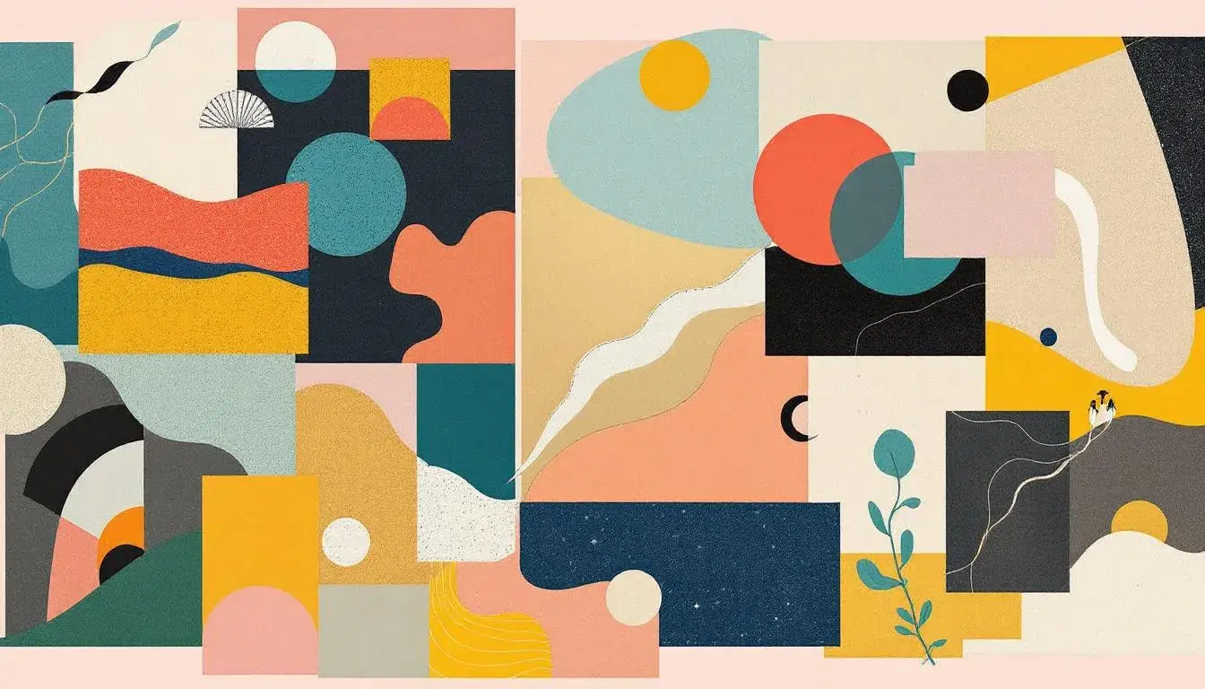
01 Aug 2025 · 3 min readColor breathes life into design, acting as an emotional conductor. It shapes perception, evokes feeling, and sets the stage for any visual story. When carefully curated, color becomes a potent tool to translate abstract concepts into tangible, relatable experiences. Finding the truly perfect combination is key. A mood board, then, becomes a canvas, an experiment in visual linguistics. It invites exploration with shades and tones until you reach the desired emotional output. This is more than aesthetics; it's about crafting energy—the very pulse of a composition—and transforming a static image into a vibrant, living thing. So let's look at some carefully configured examples, where color combinations will generate interest and visual speed.
The aptly named Vibrant Contrast palette brings to mind a busy city street at twilight. It is an array where skyscrapers pierce the sky. The interplay of Pure White against the Deep Indigo suggests a modern, almost futuristic setting, tempered by earthy tones like Olive Drab and Dusty Taupe, acting as cement holding it all together. Imagine storefronts ablaze with Golden Yellow and Vivid Coral, reflecting the hustle below. Light Teal whispers of calm oases tucked between towers. This palette feels like the soundtrack to a fast-paced film, full of possibility and action. Applying it speaks to brands pushing the boundaries of contemporary expression, from technology to visionary marketing, capturing the pulse of innovation with its inherent tension and thrilling surprises. A website using these colors would feel alive with information, and branding would speak to forward momentum. Bright Green delivers vitality and natural growth in the core of the urban feel. Pale Gold feels like sunlight glinting off glass, adding depth with moments of sudden illumination. These colors, used thoughtfully, promise a journey, not just a destination.
The Vibrant Spectrum palette evokes movement and play, like a kaleidoscope of confetti frozen in mid-air. The sharp contrast of Pure White against Charcoal Black creates a grounded foundation, which allows for the exuberance of Sky Blue, Bright Red, and Vibrant Lavender to truly sing. Imagine a music festival, with flashing lights and a sea of faces. Olive Green and Teal Green bring to mind lush fields surrounding the stage, a connection to nature amid the pulsing energy. Burnt Sienna recalls vintage instruments adding to the overall ambiance. This combination screams optimism, perfect for an event inviting participants to discover, innovate, and celebrate together. Applying the colors will create a buzz. Websites will come to life, jumping off the screen and drawing eyes. Deep Indigo offers an anchor, a serious note in playful composition, demonstrating that energy is not just about volume, but how the whole composition contributes to the sensory experience. It is a dance between boldness and balance, a promise of the new and exciting.
Bold Palette practically vibrates with anticipation. It balances on the edge of risk. The anchor of Deep Black intensifies the gleam of Pure White, establishing a stark stage for the drama to unfold. The shock of Electric Magenta, the jolt of Bright Lime—these are colors that demand attention. They are offset by the grounding presence of Neutral Gray and Burnt Sienna, much like a daring performance framed by classic architecture. It recalls underground art spaces, the raw energy of unfiltered creativity. Crimson Red brings an urgency, a need to be noticed. The unexpected inclusion of Light Lavender creates an appealing disruption to the intensity. This palette screams individuality. If used by a tech company, it shows an unapologetic spirit; in design, a willingness to break free from conformity; for branding, an unforgettable identity. Royal Purple lends a regal air, promising luxury tempered with avant-garde sensibilities.
To master the art of energetic palettes is to understand the language of vibrancy. It’s about capturing the feeling of movement, possibility, and life, and injecting it into a visual format. Each palette illustrates strategic use of color schemes, and reminds us that energy isn’t simply about brightness. It’s about thoughtfully using contrast, strategic infusions of light, and balance. Consider the impact of each color and its interplay with others. Vibrant color is far more than just throwing bright hues together. It's about curating an exhilarating visual experience. A composition can truly awaken the senses. When done correctly, each palette can leave a lingering impression, a spark of inspiration that lasts long after the last glance.