'%3e%3cpath%20fill-rule='evenodd'%20clip-rule='evenodd'%20d='M51.1303%2019.2492C50.7278%2019.913%2050.1346%2020.4426%2049.3508%2020.838C48.5669%2021.2335%2047.6172%2021.4312%2046.5014%2021.4312C44.8208%2021.4312%2043.4367%2021.0216%2042.3492%2020.2025C41.2617%2019.3833%2040.6686%2018.2394%2040.5697%2016.7706H44.4253C44.4818%2017.3355%2044.6831%2017.7804%2045.0291%2018.1052C45.3751%2018.43%2045.8164%2018.5924%2046.3531%2018.5924C46.8192%2018.5924%2047.1864%2018.4653%2047.4547%2018.2111C47.7231%2017.9569%2047.8572%2017.618%2047.8572%2017.1943C47.8572%2016.8129%2047.7337%2016.4952%2047.4865%2016.241C47.2393%2015.9867%2046.9322%2015.7784%2046.565%2015.616C46.1978%2015.4536%2045.6893%2015.2594%2045.0397%2015.0334C44.0934%2014.7086%2043.3202%2014.3944%2042.72%2014.0907C42.1197%2013.7871%2041.6042%2013.3351%2041.1735%2012.7349C40.7427%2012.1347%2040.5273%2011.3544%2040.5273%2010.394C40.5273%209.50418%2040.7533%208.73448%2041.2053%208.08481C41.6572%207.43515%2042.2821%206.93731%2043.0801%206.5913C43.8781%206.24528%2044.7925%206.07227%2045.8235%206.07227C47.49%206.07227%2048.8141%206.46771%2049.7956%207.25861C50.7772%208.04951%2051.3315%209.13698%2051.4586%2010.5211H47.5395C47.4689%2010.0268%2047.2888%209.63483%2046.9993%209.3453C46.7097%209.05578%2046.3178%208.91102%2045.8235%208.91102C45.3998%208.91102%2045.0573%209.024%2044.7961%209.24997C44.5348%209.47594%2044.4041%209.80783%2044.4041%2010.2457C44.4041%2010.5988%2044.5207%2010.8989%2044.7537%2011.146C44.9867%2011.3932%2045.2798%2011.5944%2045.6328%2011.7498C45.9859%2011.9052%2046.4944%2012.1029%2047.1581%2012.343C48.1185%2012.6678%2048.9023%2012.9891%2049.5096%2013.3069C50.1169%2013.6246%2050.6395%2014.0872%2051.0773%2014.6945C51.5151%2015.3018%2051.734%2016.0927%2051.734%2017.0672C51.734%2017.8581%2051.5328%2018.5854%2051.1303%2019.2492ZM59.0242%206.3053V21.2829H55.4016V6.3053H59.0242ZM73.9409%206.3053V9.18642H69.8734V21.2829H66.2296V9.18642H62.2046V6.3053H73.9409ZM80.7438%209.18642V12.3218H85.8069V15.0546H80.7438V18.3806H86.4425V21.2829H77.1212V6.3053H86.4425V9.18642H80.7438ZM99.667%2016.0291V21.2829H96.0444V6.3053H101.913C103.692%206.3053%20105.048%206.74665%20105.98%207.62934C106.912%208.51204%20107.378%209.7019%20107.378%2011.199C107.378%2012.1311%20107.17%2012.9609%20106.753%2013.6882C106.337%2014.4155%20105.719%2014.9875%20104.9%2015.4042C104.08%2015.8208%20103.085%2016.0291%20101.913%2016.0291H99.667ZM103.692%2011.199C103.692%209.8855%20102.965%209.22879%20101.51%209.22879H99.667V13.1268H101.51C102.965%2013.1268%20103.692%2012.4842%20103.692%2011.199ZM120.092%2018.5501H114.478L113.546%2021.2829H109.732L115.219%206.41123H119.393L124.879%2021.2829H121.024L120.092%2018.5501ZM119.16%2015.7961L117.295%2010.2881L115.41%2015.7961H119.16ZM131.555%2018.5077H136.385V21.2829H127.933V6.3053H131.555V18.5077ZM143.337%209.18642V12.3218H148.4V15.0546H143.337V18.3806H149.035V21.2829H139.714V6.3053H149.035V9.18642H143.337ZM163.507%206.3053V9.18642H159.44V21.2829H155.796V9.18642H151.771V6.3053H163.507ZM177.449%206.3053V9.18642H173.382V21.2829H169.738V9.18642H165.713V6.3053H177.449ZM184.252%209.18642V12.3218H189.315V15.0546H184.252V18.3806H189.951V21.2829H180.629V6.3053H189.951V9.18642H184.252Z'%20fill='%23EEF0ED'/%3e%3cmask%20id='mask0_3101_7327'%20style='mask-type:alpha'%20maskUnits='userSpaceOnUse'%20x='0'%20y='0'%20width='27'%20height='28'%3e%3cpath%20d='M23.8328%200.759766H2.64808C1.18559%200.759766%200%201.94535%200%203.40785V24.5925C0%2026.055%201.18559%2027.2406%202.64808%2027.2406H23.8328C25.2952%2027.2406%2026.4808%2026.055%2026.4808%2024.5925V3.40785C26.4808%201.94535%2025.2952%200.759766%2023.8328%200.759766Z'%20fill='white'/%3e%3c/mask%3e%3cg%20mask='url(%23mask0_3101_7327)'%3e%3cpath%20d='M23.8328%200.759766H2.64808C1.18559%200.759766%200%201.94535%200%203.40785V24.5925C0%2026.055%201.18559%2027.2406%202.64808%2027.2406H23.8328C25.2952%2027.2406%2026.4808%2026.055%2026.4808%2024.5925V3.40785C26.4808%201.94535%2025.2952%200.759766%2023.8328%200.759766Z'%20fill='%23D8D8D8'/%3e%3cpath%20d='M13.2404%200.759766H0V14.0001H13.2404V0.759766Z'%20fill='%238C61FF'/%3e%3cpath%20d='M13.2404%2014H0V27.2404H13.2404V14Z'%20fill='%2336C3FE'/%3e%3cpath%20d='M26.4806%2014H13.2402V27.2404H26.4806V14Z'%20fill='%236592FE'/%3e%3cpath%20d='M26.4806%200.759766H13.2402V14.0002H26.4806V0.759766Z'%20fill='%236059F7'/%3e%3c/g%3e%3c/g%3e%3cdefs%3e%3cclipPath%20id='clip0_3101_7327'%3e%3crect%20width='190'%20height='28'%20fill='white'/%3e%3c/clipPath%3e%3c/defs%3e%3c/svg%3e)
'%3e%3cpath%20d='M23.8328%200.759521H2.64808C1.18559%200.759521%200%201.94511%200%203.40761V24.5923C0%2026.0548%201.18559%2027.2404%202.64808%2027.2404H23.8328C25.2952%2027.2404%2026.4808%2026.0548%2026.4808%2024.5923V3.40761C26.4808%201.94511%2025.2952%200.759521%2023.8328%200.759521Z'%20fill='%23D8D8D8'/%3e%3cpath%20d='M13.2404%200.759521H0V13.9999H13.2404V0.759521Z'%20fill='%238C61FF'/%3e%3cpath%20d='M13.2404%2013.9998H0V27.2402H13.2404V13.9998Z'%20fill='%2336C3FE'/%3e%3cpath%20d='M26.4809%2013.9998H13.2405V27.2402H26.4809V13.9998Z'%20fill='%236592FE'/%3e%3cpath%20d='M26.4809%200.759277H13.2405V13.9997H26.4809V0.759277Z'%20fill='%236059F7'/%3e%3c/g%3e%3c/svg%3e)
The Comfort Color Craze: Bakery Hues Analog
30 Jul 2025 · 5 min readThe craving for comfort has found an unlikely muse: the humble bakery. Forget stark minimalism – the appetite now is for spaces that feel like a warm hug, smells of rising dough and simmering jam, and colors that whisper of simpler times. It’s a world where edges soften, memories stir, and the visual palette draws inspiration not from screens, but from sun-drenched flour bins and the rosy blush of perfectly ripe fruit. Imagine spaces drenched not in stark white, but in the gentle glow of early morning light filtering through linen curtains, casting long shadows across a baker's worn hands. These are the colors of nostalgia, of a handcrafted life, and a yearning for authenticity in an increasingly digitized world. This "Comfort Color Craze" isn’t merely a trend, it’s a visual exhale, a collective sigh of relief rendered in buttercream and browned butter. It’s about cultivating environments that soothe the soul, one perfectly frosted detail at a time. The focus is on how these familiar hues create havens of peace, conjuring the comforting embrace of a grandmother's kitchen, or the inviting front of a friendly neighborhood bake shop.
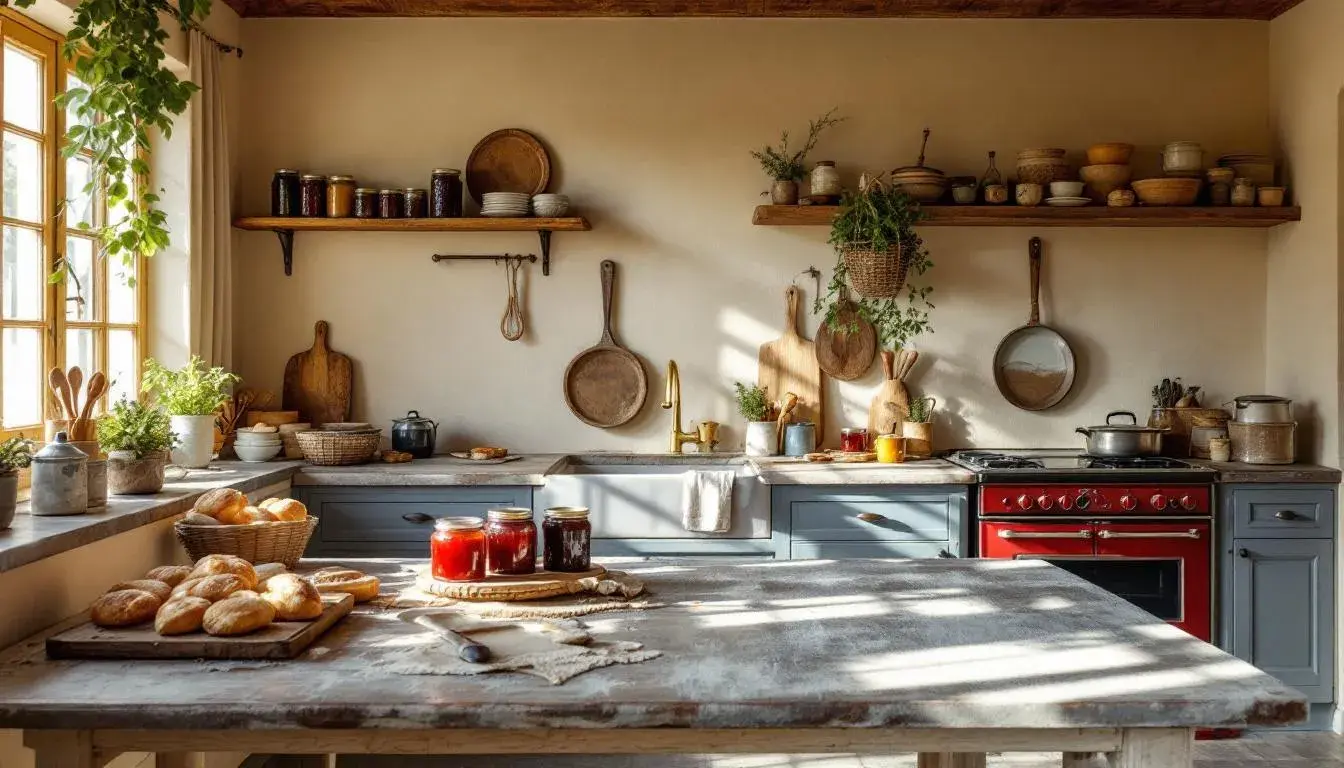
The "Bakery Hues" palette is a visual testament to the raw and rustic charm of the baker's world. The inclusion of Pure White conjures images of canvas aprons dusted with flour, or the clean, crisp lines of a freshly iced cake. Pale Pink like the delicate blush on a strawberry tart, brings a touch of sweetness without being saccharine, hinting at the gentle pleasures found in simple confections. Neutral Gray invokes the sturdy practicality of stoneware bowls and weathered wooden surfaces, the tools of a time-honored trade. Olive Green, a subtle nod to the natural ingredients that form the foundations of baking, like fresh herbs and vibrant fruits. Brick Red provides a grounding element, reminiscent of the warm tones of a wood-fired oven or the rich, caramelization of roasted nuts. Finally, the quiet contrast between Charcoal Gray and Deep Black represents the shadows and contours found in the details, like the dark crackle of a perfectly baked crust. These colors work together not as a statement of bold exuberance, but as a gentle suggestion of warmth, stability, and comforting reassurance. Imagine the palette applied to a bakery interior: the Pure White walls and Pale Pink accents create a light and airy feel, while the Neutral Gray and Brick Red elements add depth and character. It's a space that feels welcoming, honest, and deeply rooted in tradition, where the aroma of baking bread fills the air and every color contributes to an atmosphere of unhurried comfort. The subtle use of Olive Green suggests a commitment to fresh, quality ingredients, enhancing the overall feeling of artisanal craftsmanship. “Bakery Hues” encourages one to slow down and savor the simple pleasures of life.
"Earthy Contrast" evokes a feeling of natural serenity, as if wandering through a spice market on a late afternoon. Creamy Beige suggests the soft, yielding surfaces of flour sacks, creating a sense of warmth and organic simplicity. Mustard Yellow resonates with the golden hues of honey, hinting at natural sweetness and comfort. Light Gray adds a muted elegance, reminiscent of stone-ground countertops or the soft texture of aged linen. Steel Blue offers a cool contrast, as calming as shadows lengthening across a sun-baked surface. Olive Drab speaks to rich, cultivated flavors, like the earthy notes of artisan bread or the subtle perfume of a hand-mixed pie filling. Bright Crimson brings vibrancy, like the burst of freshly preserved jams and baked-plum compotes. Deep Indigo introduces a hint of mystery and depth, like the twilight sky as hearth fires start. Finally, Dark Olive completes the picture, recalling the dark, rich earth from which all ingredients originate. Taken together, these hues offer a sense of grounding and well-being, inviting one to reconnect with simple pleasures and savor the inherent beauty of the artisan lifestyle. Thinking of this palette in a home: a living room using Creamy Beige walls, accents of Mustard Yellow and Olive Drab in textiles, and touches of Steel Blue for moments of contrast. This creates a welcoming and timeless aesthetic, a calm and inviting space where one can truly unwind and connect with a sense of simple authenticity. "Earthy Contrast" is perfect for moments of relaxation, inviting a slower pace of life.
The "Coffee Impulse" palette conjures the feeling of a warm, intimate café during the quiet hours of the late morning. Rose Quartz invokes the rosy-cheeked comfort of a customer wrapped in a knitted scarf, or the gentle blush on a ceramic mug filled to the brim. Mahogany echoes the rich, comforting hue of freshly brewed coffee, its aroma permeating the air. Olive Green offers a grounding respite, reminiscent of the calming presence of succulents on a windowsill. Garnet Red suggests the deep richness of berry scones, fresh from the oven. Finally, the inclusion of Almost Black grounds the palette, offering a sophisticated contrast akin to the dark depths of an espresso shot or the sleek, stylish fixtures of an upscale café. Thinking about how this palette translates into branding: imagine the logo of a boutique coffee shop using Mahogany and Garnet Red against a soft Rose Quartz background. The colors are warm and inviting, hinting at both the comforting ritual of enjoying a cup of coffee and the sophisticated atmosphere of the space. The touch of Rose Quartz gives it a contemporary feel, appealing to those who appreciate both quality and style. "Coffee Impulse" encourages a warm approach to cafe design.
"Golden Hour" captures the warm, ethereal mood of a late afternoon spent relaxing by a sunlit window, perhaps in a cozy dining space. Light Beige sets a base tone, like the diffused glow of the setting sun filtering through sheer curtains, creating a sense of serene calmness. Vibrant Gold mirrors sunbeams dancing across the surfaces of a freshly baked pie while Muted Teal offers a visual counterpoint like the cool stillness of shadows lengthening with the sun's descent. Dark Chestnut conveys the richness of well-worn wooden furniture or the deep, aromatic spices used in comforting recipes. Soft Black grounds the palette, reflecting the quiet darkness that gathers as the day ends. Visually consider these colors applied to Web Design: The Light Beige can serve as the background, while Vibrant Gold highlights important elements of information, navigation bars and headers. The Dark Chestnut, combined with Soft Black, brings a sense of classic sophistication and balance. The touch of Muted Teal adds a hint of creativity without distraction. "Golden Hour" suggests a relaxed atmosphere, one in which visitors can feel at ease and fully absorbed.
The "Earthy Coffee" palette summons images of a rustic kitchen bathed in soft morning light, where the day begins with the simple ritual of brewing coffee and preparing breakfast. Dusty Rose evokes the delicate blush of a pastry chef’s hands, lightly dusted with flour. Golden Brown mirrors the rich, comforting hues of a perfectly brewed cup of coffee, radiating both flavor and warmth. Tomato Red provides a vibrant, energizing element, capturing the essence of sun-ripened fruit or the lively crackle of a wood-burning stove. Dark Taupe suggests stability and timeless elegance, referencing the earthiness of natural materials or a vintage countertop. Finally, Dark Gray provides a grounding contrast, as deep and mysterious as the aroma rising from a dark roast. Envision this palette influencing branding materials: the Dusty Rose can create the backdrop for a minimalist food blog, while Golden Brown highlights key ingredients and call-to-action buttons. Tomato Red can be used sparingly to draw attention to special offers or seasonal recipes, while Dark Taupe provides a sense of grounding and trust. This earthy, comforting palette would be attractive to those who appreciate simplicity, authenticity, and the art of slow living. "Earthy Coffee" helps users feel relaxed within a website.
The Comfort Color Craze, particularly when focused through the lens of "Bakery Hues Analog," offers far more than fleeting visual appeal. These palettes excavate a deeper longing for simplicity, authenticity, and human connection. They guide us to embrace imperfections, to find beauty in time-worn surfaces, and to cultivate environments that whisper of warmth. They invite a slower pace, where the ritual of baking, brewing, and savoring becomes a celebration of life's small pleasures. In essence, this trend isn’t just about color – but about creating spaces that feed not just the body, but the soul.