'%3e%3cpath%20fill-rule='evenodd'%20clip-rule='evenodd'%20d='M51.1303%2019.2492C50.7278%2019.913%2050.1346%2020.4426%2049.3508%2020.838C48.5669%2021.2335%2047.6172%2021.4312%2046.5014%2021.4312C44.8208%2021.4312%2043.4367%2021.0216%2042.3492%2020.2025C41.2617%2019.3833%2040.6686%2018.2394%2040.5697%2016.7706H44.4253C44.4818%2017.3355%2044.6831%2017.7804%2045.0291%2018.1052C45.3751%2018.43%2045.8164%2018.5924%2046.3531%2018.5924C46.8192%2018.5924%2047.1864%2018.4653%2047.4547%2018.2111C47.7231%2017.9569%2047.8572%2017.618%2047.8572%2017.1943C47.8572%2016.8129%2047.7337%2016.4952%2047.4865%2016.241C47.2393%2015.9867%2046.9322%2015.7784%2046.565%2015.616C46.1978%2015.4536%2045.6893%2015.2594%2045.0397%2015.0334C44.0934%2014.7086%2043.3202%2014.3944%2042.72%2014.0907C42.1197%2013.7871%2041.6042%2013.3351%2041.1735%2012.7349C40.7427%2012.1347%2040.5273%2011.3544%2040.5273%2010.394C40.5273%209.50418%2040.7533%208.73448%2041.2053%208.08481C41.6572%207.43515%2042.2821%206.93731%2043.0801%206.5913C43.8781%206.24528%2044.7925%206.07227%2045.8235%206.07227C47.49%206.07227%2048.8141%206.46771%2049.7956%207.25861C50.7772%208.04951%2051.3315%209.13698%2051.4586%2010.5211H47.5395C47.4689%2010.0268%2047.2888%209.63483%2046.9993%209.3453C46.7097%209.05578%2046.3178%208.91102%2045.8235%208.91102C45.3998%208.91102%2045.0573%209.024%2044.7961%209.24997C44.5348%209.47594%2044.4041%209.80783%2044.4041%2010.2457C44.4041%2010.5988%2044.5207%2010.8989%2044.7537%2011.146C44.9867%2011.3932%2045.2798%2011.5944%2045.6328%2011.7498C45.9859%2011.9052%2046.4944%2012.1029%2047.1581%2012.343C48.1185%2012.6678%2048.9023%2012.9891%2049.5096%2013.3069C50.1169%2013.6246%2050.6395%2014.0872%2051.0773%2014.6945C51.5151%2015.3018%2051.734%2016.0927%2051.734%2017.0672C51.734%2017.8581%2051.5328%2018.5854%2051.1303%2019.2492ZM59.0242%206.3053V21.2829H55.4016V6.3053H59.0242ZM73.9409%206.3053V9.18642H69.8734V21.2829H66.2296V9.18642H62.2046V6.3053H73.9409ZM80.7438%209.18642V12.3218H85.8069V15.0546H80.7438V18.3806H86.4425V21.2829H77.1212V6.3053H86.4425V9.18642H80.7438ZM99.667%2016.0291V21.2829H96.0444V6.3053H101.913C103.692%206.3053%20105.048%206.74665%20105.98%207.62934C106.912%208.51204%20107.378%209.7019%20107.378%2011.199C107.378%2012.1311%20107.17%2012.9609%20106.753%2013.6882C106.337%2014.4155%20105.719%2014.9875%20104.9%2015.4042C104.08%2015.8208%20103.085%2016.0291%20101.913%2016.0291H99.667ZM103.692%2011.199C103.692%209.8855%20102.965%209.22879%20101.51%209.22879H99.667V13.1268H101.51C102.965%2013.1268%20103.692%2012.4842%20103.692%2011.199ZM120.092%2018.5501H114.478L113.546%2021.2829H109.732L115.219%206.41123H119.393L124.879%2021.2829H121.024L120.092%2018.5501ZM119.16%2015.7961L117.295%2010.2881L115.41%2015.7961H119.16ZM131.555%2018.5077H136.385V21.2829H127.933V6.3053H131.555V18.5077ZM143.337%209.18642V12.3218H148.4V15.0546H143.337V18.3806H149.035V21.2829H139.714V6.3053H149.035V9.18642H143.337ZM163.507%206.3053V9.18642H159.44V21.2829H155.796V9.18642H151.771V6.3053H163.507ZM177.449%206.3053V9.18642H173.382V21.2829H169.738V9.18642H165.713V6.3053H177.449ZM184.252%209.18642V12.3218H189.315V15.0546H184.252V18.3806H189.951V21.2829H180.629V6.3053H189.951V9.18642H184.252Z'%20fill='%23EEF0ED'/%3e%3cmask%20id='mask0_3101_7327'%20style='mask-type:alpha'%20maskUnits='userSpaceOnUse'%20x='0'%20y='0'%20width='27'%20height='28'%3e%3cpath%20d='M23.8328%200.759766H2.64808C1.18559%200.759766%200%201.94535%200%203.40785V24.5925C0%2026.055%201.18559%2027.2406%202.64808%2027.2406H23.8328C25.2952%2027.2406%2026.4808%2026.055%2026.4808%2024.5925V3.40785C26.4808%201.94535%2025.2952%200.759766%2023.8328%200.759766Z'%20fill='white'/%3e%3c/mask%3e%3cg%20mask='url(%23mask0_3101_7327)'%3e%3cpath%20d='M23.8328%200.759766H2.64808C1.18559%200.759766%200%201.94535%200%203.40785V24.5925C0%2026.055%201.18559%2027.2406%202.64808%2027.2406H23.8328C25.2952%2027.2406%2026.4808%2026.055%2026.4808%2024.5925V3.40785C26.4808%201.94535%2025.2952%200.759766%2023.8328%200.759766Z'%20fill='%23D8D8D8'/%3e%3cpath%20d='M13.2404%200.759766H0V14.0001H13.2404V0.759766Z'%20fill='%238C61FF'/%3e%3cpath%20d='M13.2404%2014H0V27.2404H13.2404V14Z'%20fill='%2336C3FE'/%3e%3cpath%20d='M26.4806%2014H13.2402V27.2404H26.4806V14Z'%20fill='%236592FE'/%3e%3cpath%20d='M26.4806%200.759766H13.2402V14.0002H26.4806V0.759766Z'%20fill='%236059F7'/%3e%3c/g%3e%3c/g%3e%3cdefs%3e%3cclipPath%20id='clip0_3101_7327'%3e%3crect%20width='190'%20height='28'%20fill='white'/%3e%3c/clipPath%3e%3c/defs%3e%3c/svg%3e)
'%3e%3cpath%20d='M23.8328%200.759521H2.64808C1.18559%200.759521%200%201.94511%200%203.40761V24.5923C0%2026.0548%201.18559%2027.2404%202.64808%2027.2404H23.8328C25.2952%2027.2404%2026.4808%2026.0548%2026.4808%2024.5923V3.40761C26.4808%201.94511%2025.2952%200.759521%2023.8328%200.759521Z'%20fill='%23D8D8D8'/%3e%3cpath%20d='M13.2404%200.759521H0V13.9999H13.2404V0.759521Z'%20fill='%238C61FF'/%3e%3cpath%20d='M13.2404%2013.9998H0V27.2402H13.2404V13.9998Z'%20fill='%2336C3FE'/%3e%3cpath%20d='M26.4809%2013.9998H13.2405V27.2402H26.4809V13.9998Z'%20fill='%236592FE'/%3e%3cpath%20d='M26.4809%200.759277H13.2405V13.9997H26.4809V0.759277Z'%20fill='%236059F7'/%3e%3c/g%3e%3c/svg%3e)
Summer is Electric: Seasonal Palette Dominance
30 Jul 2025 · 5 min readSummer, the electric hum of cicadas at dusk, the shimmer of heat rising from sun-baked pavement, the impossible blue of a midday sky. It's a season of heightened sensation, where colors become almost palpable—tangible bursts of energy that define our experiences. Within these vibrant months, color palettes speak a language all their own, moving beyond mere aesthetics toward capturing the season’s very soul. What narratives do these collections of hues tell? Do they lean into refreshing coolness, or do they bask in the warmth of long, lingering sunsets? The answer may surprise, and this season's trends paint an interesting story.
Rustic Sunset 🌇 offers a particular take on the summer’s twilight hours. Imagine watching the sun dip below the horizon, not over the ocean, but across a field of dry grasses. Creamy Ivory and Sandy Beige evoke a sense of sun-drenched earth, while Golden Yellow echoes the last rays of the day. There's a hint of lightness as well, the blues and greens conjuring an atmosphere less about tropical waters and more about a quiet stillness. Earthy Brown and Olive Green root the palette in the organic world, suggesting parched ground and late-summer foliage turning toward umber. This isn't the ostentatious display of midday energy; it's a whispered farewell, a subdued and gentle warmth akin to the embers of a dying fire. The Bright Coral and Deep Burgundy punctuate the harmony and whisper of a change coming, an autumn breeze nipping at the edges of a summer memory. It calls to mind relaxed retreats, not high-impact energy. This palette's appeal lies in its ability to transport us to open spaces, offering solace away from the electric pulse of urban life. Its muted intensity provides a sophisticated counterpoint to more aggressively cheerful summer schemes – a welcome respite from the blinding glare, exchanging pure light for the hazy memories held in the colors of eventide. The inclusion of Dark Charcoal offers a grounding effect, while Deep Teal adds depth and dimension, preventing the palette from feeling flat or washed out. Overall it is a refined and tempered experience.
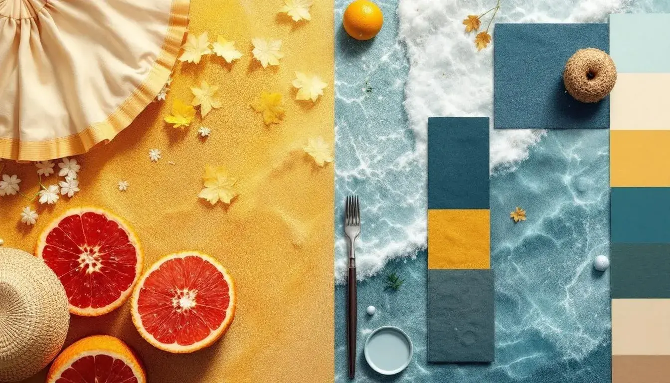
Coastal Elegance 🏖️ proposes a summer on the shore. Pure White reflects the harsh glare of the sun off of sand, but the overall effect leans toward a particular sense of cultivated refinement. Sky Blue and Deep Sapphire establish the dominance of cool tones, mimicking the ocean's vastness, tempered by the suggestion of a sun-drenched beach with the Golden Yellow and Vibrant Amber. Slate Gray adds an element of sophistication, a touch of city sophistication woven into a seaside landscape. Dark Taupe offers a grounding influence, similar to driftwood worn smooth by tides, while Crimson Red offers a punctuation, a burst of warmth evocative of late-day heat against a darkening sky. This palette balances the invigorating feeling with a subtle current of understated luxury, perhaps suggesting a curated experience of summer rather than a raw, untamed one. It's about linen dresses billowing in the breeze and the understated glamour of a beachside retreat. Onyx grounds the palette, providing a counterpoint to the airiness of the white and blue while connecting to the dark stones sometimes found on the beach. Ultimately the palette evokes tranquility, a cultivated version of summer's abandon.
Cryo Palette 🧊 presents a fascinating deviation from the expected warmth. Its approach to summer color hinges on the idea of cool relief, the shocking, pleasant sensation of stepping into air conditioning on a sweltering day or the icy refreshment of a chilled drink. Bright Sky Blue dominates, evoking glaciers carving through the sun warmed earth and the cool rush of a sudden rain shower. Pure White amplifies the overall sense of freshness, heightening the cooling effect, while Light Grey provides a subtle grounding, preventing the palette from feeling too ethereal. Fiery Red introduces unexpected energy, a reminder of the sun's power kept at bay by the overarching coolness. Deep Indigo and Navy Depths offer a sense of depth, like shadows cast by a cloud on a bright summer day. Plum Purple and Dark Crimson function as surprising accents, like the hidden coolness found in shady spots of a sprawling garden. This palette isn't about replicating the blatant heat; instead, it's about the strategic harnessing of refreshing counterpoints. Dark Charcoal offers a sophisticated edge, while Light Apricot provides a hint of warmth, a reminder that even in the coolest environments, the sun's influence is never entirely absent. It brings to mind crisp air, reflective surfaces, and strategic pops of color.
Earthy Greens 🌿 whispers of shaded meadows and sun-dappled forests, offering a quiet alternative to the typical seaside exuberance. Pale Lime Green and Bright Olive Green serve as the foundation, evoking lush vegetation and leafy canopies. Dusty Beige provides grounding, reminiscent of sun-baked soil beneath the trees, a counterpoint to the vibrancy of the greens. This creates a sense of enclosure, a departure from the expansive skies and seascapes often associated with summer. The palette leans towards a contemplative mood, ideal for moments of quiet reflection away from the season's frenetic energy. Dark Teal and Very Dark Green add depth and mystery, like the cool shadows found deep within the woods. Although the palette speaks to vitality, it forges a connection with the natural world—one of soft textures and rustling leaves. It's an invitation to slow down, breathe deep, and find tranquility within the verdant embrace of the forest. It’s a hushed alternative to more strident palettes, an affirmation of the earth’s steady presence.
Vibrant Serenity 🌿 presents a study in calculated contrasts, its approach is energetic and nuanced rather than straightforward exuberance. Electric Green electrifies the senses, while Bright Cyan mirrors a perfectly clear sky on a summer day. This juxtaposition gives the palette a unique energy, one of alertness combined with optimism. Pale Gray acts as a neutral anchor, similar to the calming effect of clouds drifting above as the summer sun blazes. Salmon Pink introduces warmth, like the soft blush of a sunset, while Lime Green contributes to the overall sense of vibrancy. Forest Green grounds the palette, connecting it to organic elements to counterpoint against the bolder shades. The Olive Drab evokes a cultivated garden, while the Onyx and Slate Gray add depth, preventing the palette from feeling overly sweet. It's a palette for the energetic soul, those who thrive on stimulation and seek to balance it with moments of calm. It suggests mindful activity, intentional vibrancy, and a world where energy finds expression through clarity, a blend of curated sophistication and natural liveliness. It is a celebration of summer in its totality.
Earthy Blues 🎨 weaves together the terrestrial and the aquatic, presenting a summer experience rooted in both grounded comfort and breezy openness. Sky Blue dominates, conjuring images of vast horizons and tranquil waters. Beige Sand and Earthy Brown establish a warmth tempered by an air of ease, like the feeling of bare feet on sun-warmed earth. Hints of bright sunlit days are found in Golden Yellow and Bright Coral, while a sense of more structured leisure is found in the Rustic Sienna and Deep Sapphire. It's a palette that suggests relaxation, natural environments, and a connection with the land. The introduction of Pure White adds a touch of radiance, reflecting the clear brilliance of the summer skies. The color harmonies don't strive for high contrasts, rather they offer balance, suggesting a balanced connection to the world, a summer spent immersed in nature’s calming embrace. Fiery Red punctuates the tonal range, while Dark Charcoal pulls you down to earth once again.
As the season unfolds, these palettes illuminate something essential: Summer isn't a monolith. It's a mutable experience, shaped by the way we choose to engage with its heightened sensory landscape. These range from vibrant, cool escapes from scorching days, to quiet afternoons spent in the cool shade of woods. By understanding the subtleties of these color stories, we unlock the power to not only capture the season's essence, but to craft unique stories all our own, as well as the stories of spaces that reflect, refract and remember them.