'%3e%3cpath%20fill-rule='evenodd'%20clip-rule='evenodd'%20d='M51.1303%2019.2492C50.7278%2019.913%2050.1346%2020.4426%2049.3508%2020.838C48.5669%2021.2335%2047.6172%2021.4312%2046.5014%2021.4312C44.8208%2021.4312%2043.4367%2021.0216%2042.3492%2020.2025C41.2617%2019.3833%2040.6686%2018.2394%2040.5697%2016.7706H44.4253C44.4818%2017.3355%2044.6831%2017.7804%2045.0291%2018.1052C45.3751%2018.43%2045.8164%2018.5924%2046.3531%2018.5924C46.8192%2018.5924%2047.1864%2018.4653%2047.4547%2018.2111C47.7231%2017.9569%2047.8572%2017.618%2047.8572%2017.1943C47.8572%2016.8129%2047.7337%2016.4952%2047.4865%2016.241C47.2393%2015.9867%2046.9322%2015.7784%2046.565%2015.616C46.1978%2015.4536%2045.6893%2015.2594%2045.0397%2015.0334C44.0934%2014.7086%2043.3202%2014.3944%2042.72%2014.0907C42.1197%2013.7871%2041.6042%2013.3351%2041.1735%2012.7349C40.7427%2012.1347%2040.5273%2011.3544%2040.5273%2010.394C40.5273%209.50418%2040.7533%208.73448%2041.2053%208.08481C41.6572%207.43515%2042.2821%206.93731%2043.0801%206.5913C43.8781%206.24528%2044.7925%206.07227%2045.8235%206.07227C47.49%206.07227%2048.8141%206.46771%2049.7956%207.25861C50.7772%208.04951%2051.3315%209.13698%2051.4586%2010.5211H47.5395C47.4689%2010.0268%2047.2888%209.63483%2046.9993%209.3453C46.7097%209.05578%2046.3178%208.91102%2045.8235%208.91102C45.3998%208.91102%2045.0573%209.024%2044.7961%209.24997C44.5348%209.47594%2044.4041%209.80783%2044.4041%2010.2457C44.4041%2010.5988%2044.5207%2010.8989%2044.7537%2011.146C44.9867%2011.3932%2045.2798%2011.5944%2045.6328%2011.7498C45.9859%2011.9052%2046.4944%2012.1029%2047.1581%2012.343C48.1185%2012.6678%2048.9023%2012.9891%2049.5096%2013.3069C50.1169%2013.6246%2050.6395%2014.0872%2051.0773%2014.6945C51.5151%2015.3018%2051.734%2016.0927%2051.734%2017.0672C51.734%2017.8581%2051.5328%2018.5854%2051.1303%2019.2492ZM59.0242%206.3053V21.2829H55.4016V6.3053H59.0242ZM73.9409%206.3053V9.18642H69.8734V21.2829H66.2296V9.18642H62.2046V6.3053H73.9409ZM80.7438%209.18642V12.3218H85.8069V15.0546H80.7438V18.3806H86.4425V21.2829H77.1212V6.3053H86.4425V9.18642H80.7438ZM99.667%2016.0291V21.2829H96.0444V6.3053H101.913C103.692%206.3053%20105.048%206.74665%20105.98%207.62934C106.912%208.51204%20107.378%209.7019%20107.378%2011.199C107.378%2012.1311%20107.17%2012.9609%20106.753%2013.6882C106.337%2014.4155%20105.719%2014.9875%20104.9%2015.4042C104.08%2015.8208%20103.085%2016.0291%20101.913%2016.0291H99.667ZM103.692%2011.199C103.692%209.8855%20102.965%209.22879%20101.51%209.22879H99.667V13.1268H101.51C102.965%2013.1268%20103.692%2012.4842%20103.692%2011.199ZM120.092%2018.5501H114.478L113.546%2021.2829H109.732L115.219%206.41123H119.393L124.879%2021.2829H121.024L120.092%2018.5501ZM119.16%2015.7961L117.295%2010.2881L115.41%2015.7961H119.16ZM131.555%2018.5077H136.385V21.2829H127.933V6.3053H131.555V18.5077ZM143.337%209.18642V12.3218H148.4V15.0546H143.337V18.3806H149.035V21.2829H139.714V6.3053H149.035V9.18642H143.337ZM163.507%206.3053V9.18642H159.44V21.2829H155.796V9.18642H151.771V6.3053H163.507ZM177.449%206.3053V9.18642H173.382V21.2829H169.738V9.18642H165.713V6.3053H177.449ZM184.252%209.18642V12.3218H189.315V15.0546H184.252V18.3806H189.951V21.2829H180.629V6.3053H189.951V9.18642H184.252Z'%20fill='%23EEF0ED'/%3e%3cmask%20id='mask0_3101_7327'%20style='mask-type:alpha'%20maskUnits='userSpaceOnUse'%20x='0'%20y='0'%20width='27'%20height='28'%3e%3cpath%20d='M23.8328%200.759766H2.64808C1.18559%200.759766%200%201.94535%200%203.40785V24.5925C0%2026.055%201.18559%2027.2406%202.64808%2027.2406H23.8328C25.2952%2027.2406%2026.4808%2026.055%2026.4808%2024.5925V3.40785C26.4808%201.94535%2025.2952%200.759766%2023.8328%200.759766Z'%20fill='white'/%3e%3c/mask%3e%3cg%20mask='url(%23mask0_3101_7327)'%3e%3cpath%20d='M23.8328%200.759766H2.64808C1.18559%200.759766%200%201.94535%200%203.40785V24.5925C0%2026.055%201.18559%2027.2406%202.64808%2027.2406H23.8328C25.2952%2027.2406%2026.4808%2026.055%2026.4808%2024.5925V3.40785C26.4808%201.94535%2025.2952%200.759766%2023.8328%200.759766Z'%20fill='%23D8D8D8'/%3e%3cpath%20d='M13.2404%200.759766H0V14.0001H13.2404V0.759766Z'%20fill='%238C61FF'/%3e%3cpath%20d='M13.2404%2014H0V27.2404H13.2404V14Z'%20fill='%2336C3FE'/%3e%3cpath%20d='M26.4806%2014H13.2402V27.2404H26.4806V14Z'%20fill='%236592FE'/%3e%3cpath%20d='M26.4806%200.759766H13.2402V14.0002H26.4806V0.759766Z'%20fill='%236059F7'/%3e%3c/g%3e%3c/g%3e%3cdefs%3e%3cclipPath%20id='clip0_3101_7327'%3e%3crect%20width='190'%20height='28'%20fill='white'/%3e%3c/clipPath%3e%3c/defs%3e%3c/svg%3e)
'%3e%3cpath%20d='M23.8328%200.759521H2.64808C1.18559%200.759521%200%201.94511%200%203.40761V24.5923C0%2026.0548%201.18559%2027.2404%202.64808%2027.2404H23.8328C25.2952%2027.2404%2026.4808%2026.0548%2026.4808%2024.5923V3.40761C26.4808%201.94511%2025.2952%200.759521%2023.8328%200.759521Z'%20fill='%23D8D8D8'/%3e%3cpath%20d='M13.2404%200.759521H0V13.9999H13.2404V0.759521Z'%20fill='%238C61FF'/%3e%3cpath%20d='M13.2404%2013.9998H0V27.2402H13.2404V13.9998Z'%20fill='%2336C3FE'/%3e%3cpath%20d='M26.4809%2013.9998H13.2405V27.2402H26.4809V13.9998Z'%20fill='%236592FE'/%3e%3cpath%20d='M26.4809%200.759277H13.2405V13.9997H26.4809V0.759277Z'%20fill='%236059F7'/%3e%3c/g%3e%3c/svg%3e)
Dominated Styles: The Design Eras Defining Color in 2025
30 Jul 2025 · 3 min readColor, the silent language of design, is poised to shape our experiences come 2025. More than just aesthetic appeal, color choices create environments, dictate moods, and offer subtle narratives about the world we inhabit and the stories we tell. From the screens we touch to the spaces we occupy, carefully considered palettes will define our sense of style, speaking volumes about the technological advancements and artistic sensibilities of this near future. The interplay of hues will not be merely decorative; instead, they will function as coded cues, guiding us through increasingly complex landscapes of information and emotion. Will we embrace bold contrasts, or seek solace in gentle gradients? How will color convey urgency, or inspire trust? The answers, it seems, are already in the making, emerging from the intersection of creativity, technology, and a deep understanding of the human spirit.
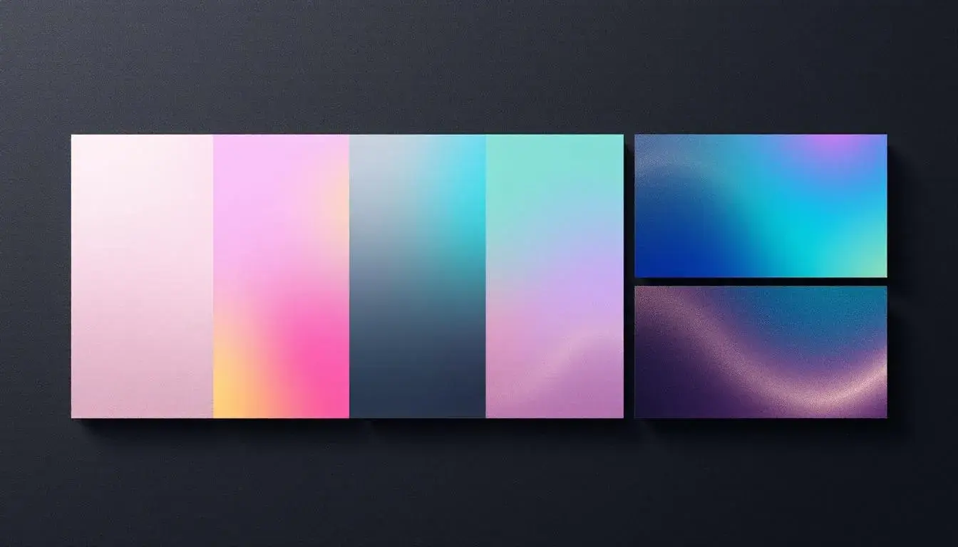
Consider "Vibrant Webinar," a spectrum seemingly plucked from the very airwaves of a future conference. There's Blush White, a whisper of calm before the storm of information. It plays against the cool confidence of Sky Blue, a digital clarity that promises seamless transmission even as connectivity buckles under unprecedented demand. Seafoam Green, an unexpected guest, brings a touch of serenity, nodding to nature even inside the machine. Imagine Coral Pink holding hands with Vibrant Orange: a power couple promising high engagement with user communities and a digital charm offensive that can hold attention spans hostage. Slate Gray acknowledges the serious work being done, while Deep Azure keeps pace in the deep end, all the while keeping one foot grounded with Rustic Brown. Teal Abyss, a hint of mystery, hints at undiscovered potential. Onyx Black is the stage, the silent setting for these digital dramas. This is the palette of progress, of learning unbound, of future meetings where ideas spark and connections are made, all within the pixel-perfect embrace of our screens. It’s optimistic, clear, and ever so slightly daring, hinting at the creative leaps that await us.
Then there's "Betting Interface," a study in controlled excitement. Off White establishes a clean foundation, a digital page ready to receive the bets of the future. Sea Green suggests growth and gains, a gentle promise of prosperity. Light Indigo proposes forward leaning analytics and insight, the mental labor that can lead to more than luck. ForestGreen reflects potential and sustainability, but in the context of the palette, this hue feels like a double or nothing opportunity. Slate Gray offers a measured tone that seeks calm, logical thinking, and restraint. Dark Charcoal provides structure, the framework within which the games unfold. This palette whispers of calculated risks, where intuition meets algorithms, and fortunes are made (and lost) with the click of a button. It’s a far cry from the gaudy casinos of the past, a sophisticated space where data dances with desire. Here, color is not about luck, but the illusion of control, and the promise of a calculated win, a subtle nod to an aspirational lifestyle where every risk is measured, and every decision is informed.
"Staking Service" presents a tableau of trust in the digital age. Pale Lavender hints at innovation and imagination, a service without equal. Sandy Brown anchors the space, bringing in stability and reliability when entrusting third parties with significant assets. Medium Gray presents balance to the palette, making Pale Lavender brighter by comparison and Sandy Brown calmer. Deep Indigo suggests security, authority, and protection. Electric Blue represents the technological advancements that are the only way all parties can be assured of safety, efficiency, and fair arbitration. This palette is not about flashy gains, but steadfast returns; a symbol of confidence, where trust is the ultimate transaction and a better tomorrow.
The "Incident Palette," however, strikes a more urgent tone. Rose Beige, a muted warning flag, suggests that calm is on the wane. Medium Gray, the color of concrete and steel, implies a necessary toughness. Fiery Red signals immediate action, a call to attention that cannot be ignored. Dark Taupe suggests a stoic response, a reminder of what must be done. Indigo Blue speaks of calm focus and critical thinking and judgement. It's a composition that evokes a sense of controlled chaos, a crisis averted, a fire contained. Within the world of design themes, "Incident Palette" paints a picture of vigilance and resilience: even minor problems must be addressed to prevent a larger conflagration.
Finally, “Bold Innovation” captures the essence of disruption. Light Beige anchors the space, reflecting a comfortable position. Charcoal Gray offsets the Light Beige with a grounded, stable foundation. Scarlet offers a jolt of energy, a dare to be different. Deep Charcoal provides the counterpoint, urging refinement and care. Dark Purple promotes creativity, imagining a digital renaissance that could forever alter the landscape of design. This palette is an invitation to break the mold, to see the world through a new lens, and to embrace the unknown with fearless curiosity. It whispers of future endeavors and daring dreams, all within the framework of a new era.
As 2025 dawns, the colors that surround us have become strategic tools, capable of shaping our perceptions, influencing our behaviors, and even altering the very fabric of our reality. From the controlled intensity of "Incident Palette" to the aspirational optimism of "Betting Interface," these palettes offer a glimpse into the design ethos of a future where every shade is chosen with intention, and every hue tells a story.