'%3e%3cpath%20fill-rule='evenodd'%20clip-rule='evenodd'%20d='M51.1303%2019.2492C50.7278%2019.913%2050.1346%2020.4426%2049.3508%2020.838C48.5669%2021.2335%2047.6172%2021.4312%2046.5014%2021.4312C44.8208%2021.4312%2043.4367%2021.0216%2042.3492%2020.2025C41.2617%2019.3833%2040.6686%2018.2394%2040.5697%2016.7706H44.4253C44.4818%2017.3355%2044.6831%2017.7804%2045.0291%2018.1052C45.3751%2018.43%2045.8164%2018.5924%2046.3531%2018.5924C46.8192%2018.5924%2047.1864%2018.4653%2047.4547%2018.2111C47.7231%2017.9569%2047.8572%2017.618%2047.8572%2017.1943C47.8572%2016.8129%2047.7337%2016.4952%2047.4865%2016.241C47.2393%2015.9867%2046.9322%2015.7784%2046.565%2015.616C46.1978%2015.4536%2045.6893%2015.2594%2045.0397%2015.0334C44.0934%2014.7086%2043.3202%2014.3944%2042.72%2014.0907C42.1197%2013.7871%2041.6042%2013.3351%2041.1735%2012.7349C40.7427%2012.1347%2040.5273%2011.3544%2040.5273%2010.394C40.5273%209.50418%2040.7533%208.73448%2041.2053%208.08481C41.6572%207.43515%2042.2821%206.93731%2043.0801%206.5913C43.8781%206.24528%2044.7925%206.07227%2045.8235%206.07227C47.49%206.07227%2048.8141%206.46771%2049.7956%207.25861C50.7772%208.04951%2051.3315%209.13698%2051.4586%2010.5211H47.5395C47.4689%2010.0268%2047.2888%209.63483%2046.9993%209.3453C46.7097%209.05578%2046.3178%208.91102%2045.8235%208.91102C45.3998%208.91102%2045.0573%209.024%2044.7961%209.24997C44.5348%209.47594%2044.4041%209.80783%2044.4041%2010.2457C44.4041%2010.5988%2044.5207%2010.8989%2044.7537%2011.146C44.9867%2011.3932%2045.2798%2011.5944%2045.6328%2011.7498C45.9859%2011.9052%2046.4944%2012.1029%2047.1581%2012.343C48.1185%2012.6678%2048.9023%2012.9891%2049.5096%2013.3069C50.1169%2013.6246%2050.6395%2014.0872%2051.0773%2014.6945C51.5151%2015.3018%2051.734%2016.0927%2051.734%2017.0672C51.734%2017.8581%2051.5328%2018.5854%2051.1303%2019.2492ZM59.0242%206.3053V21.2829H55.4016V6.3053H59.0242ZM73.9409%206.3053V9.18642H69.8734V21.2829H66.2296V9.18642H62.2046V6.3053H73.9409ZM80.7438%209.18642V12.3218H85.8069V15.0546H80.7438V18.3806H86.4425V21.2829H77.1212V6.3053H86.4425V9.18642H80.7438ZM99.667%2016.0291V21.2829H96.0444V6.3053H101.913C103.692%206.3053%20105.048%206.74665%20105.98%207.62934C106.912%208.51204%20107.378%209.7019%20107.378%2011.199C107.378%2012.1311%20107.17%2012.9609%20106.753%2013.6882C106.337%2014.4155%20105.719%2014.9875%20104.9%2015.4042C104.08%2015.8208%20103.085%2016.0291%20101.913%2016.0291H99.667ZM103.692%2011.199C103.692%209.8855%20102.965%209.22879%20101.51%209.22879H99.667V13.1268H101.51C102.965%2013.1268%20103.692%2012.4842%20103.692%2011.199ZM120.092%2018.5501H114.478L113.546%2021.2829H109.732L115.219%206.41123H119.393L124.879%2021.2829H121.024L120.092%2018.5501ZM119.16%2015.7961L117.295%2010.2881L115.41%2015.7961H119.16ZM131.555%2018.5077H136.385V21.2829H127.933V6.3053H131.555V18.5077ZM143.337%209.18642V12.3218H148.4V15.0546H143.337V18.3806H149.035V21.2829H139.714V6.3053H149.035V9.18642H143.337ZM163.507%206.3053V9.18642H159.44V21.2829H155.796V9.18642H151.771V6.3053H163.507ZM177.449%206.3053V9.18642H173.382V21.2829H169.738V9.18642H165.713V6.3053H177.449ZM184.252%209.18642V12.3218H189.315V15.0546H184.252V18.3806H189.951V21.2829H180.629V6.3053H189.951V9.18642H184.252Z'%20fill='%23EEF0ED'/%3e%3cmask%20id='mask0_3101_7327'%20style='mask-type:alpha'%20maskUnits='userSpaceOnUse'%20x='0'%20y='0'%20width='27'%20height='28'%3e%3cpath%20d='M23.8328%200.759766H2.64808C1.18559%200.759766%200%201.94535%200%203.40785V24.5925C0%2026.055%201.18559%2027.2406%202.64808%2027.2406H23.8328C25.2952%2027.2406%2026.4808%2026.055%2026.4808%2024.5925V3.40785C26.4808%201.94535%2025.2952%200.759766%2023.8328%200.759766Z'%20fill='white'/%3e%3c/mask%3e%3cg%20mask='url(%23mask0_3101_7327)'%3e%3cpath%20d='M23.8328%200.759766H2.64808C1.18559%200.759766%200%201.94535%200%203.40785V24.5925C0%2026.055%201.18559%2027.2406%202.64808%2027.2406H23.8328C25.2952%2027.2406%2026.4808%2026.055%2026.4808%2024.5925V3.40785C26.4808%201.94535%2025.2952%200.759766%2023.8328%200.759766Z'%20fill='%23D8D8D8'/%3e%3cpath%20d='M13.2404%200.759766H0V14.0001H13.2404V0.759766Z'%20fill='%238C61FF'/%3e%3cpath%20d='M13.2404%2014H0V27.2404H13.2404V14Z'%20fill='%2336C3FE'/%3e%3cpath%20d='M26.4806%2014H13.2402V27.2404H26.4806V14Z'%20fill='%236592FE'/%3e%3cpath%20d='M26.4806%200.759766H13.2402V14.0002H26.4806V0.759766Z'%20fill='%236059F7'/%3e%3c/g%3e%3c/g%3e%3cdefs%3e%3cclipPath%20id='clip0_3101_7327'%3e%3crect%20width='190'%20height='28'%20fill='white'/%3e%3c/clipPath%3e%3c/defs%3e%3c/svg%3e)
'%3e%3cpath%20d='M23.8328%200.759521H2.64808C1.18559%200.759521%200%201.94511%200%203.40761V24.5923C0%2026.0548%201.18559%2027.2404%202.64808%2027.2404H23.8328C25.2952%2027.2404%2026.4808%2026.0548%2026.4808%2024.5923V3.40761C26.4808%201.94511%2025.2952%200.759521%2023.8328%200.759521Z'%20fill='%23D8D8D8'/%3e%3cpath%20d='M13.2404%200.759521H0V13.9999H13.2404V0.759521Z'%20fill='%238C61FF'/%3e%3cpath%20d='M13.2404%2013.9998H0V27.2402H13.2404V13.9998Z'%20fill='%2336C3FE'/%3e%3cpath%20d='M26.4809%2013.9998H13.2405V27.2402H26.4809V13.9998Z'%20fill='%236592FE'/%3e%3cpath%20d='M26.4809%200.759277H13.2405V13.9997H26.4809V0.759277Z'%20fill='%236059F7'/%3e%3c/g%3e%3c/svg%3e)
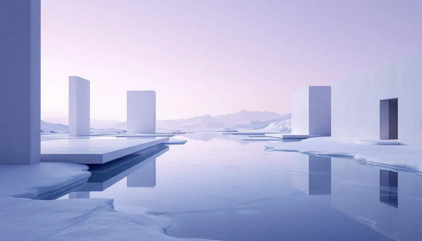
Winter's Icy Grip: Unpacking Cool Dominant Color Trends for 2025
29 Jul 2025 · 5 min readThe whispers of winter wind, the fractured light on frozen surfaces, the stark beauty of a landscape slumbering under ice—these are the sensations that define winter's palette. It's a season that challenges us to find warmth in coolness, to see vibrancy in what might appear muted. Colors become more than decoration; they are a language spoken by the season itself; they tell a story of endurance, of transformation, and of the quiet power held within dormancy. As we look toward 2025, the color trends embracing this 'Winter's Icy Grip' aren't about replicating the literal cold, but capturing the spirit, the feelings the season stirs: reflection, resilience, and a serene, almost otherworldly beauty. The choices architects, designers, and artists make will not be just about the surface, it will be about how we percieve and how we feel in the environments they create.
The Tech Palette 💻 brings an intellectual hush, akin to the silence after a fresh snowfall. Its essence is found in the calculated precision of modern technology, rendering a space both functional and atmospheric. Pale Lavender acts as a subdued foundation, mirroring the faint blush of sunrise on a frozen horizon, while Neutral Gray and Dark Stone create a sense of stability and grounding, like the sturdy architecture amidst a winter landscape. This palette draws inspiration from the metallic gleam on ice, a Bright Blue reminiscent of glacial waters cutting through rocks adding a vivid, crisp energy, a reminder of the latent power beneath a placid surface. Deep Indigo then comes in a manner that invites deep thought and concentration. It's less about overt beauty and more about creating an environment conductive to analytical thinking and exploration. The overall sense is one of considered calm, inviting the viewer to ponder the interplay between natural phenomena and the structures of our own creation. It’s the visual equivalent of a well-organized workspace, where every element contributes to clarity and focus. Imagine it in an office setting, where innovation thrives not from impulsive bursts but reasoned contemplation, or a design studio, creating an atmosphere of purposeful exploration.
With Modern Serenity 📚, the atmosphere becomes more ethereal, akin to watching snowfall from behind a frosted windowpane. Pale Cyan casts a gentle light that could represent light reflecting through a glacier cave. Light Periwinkle evokes the delicate beauty of frost patterns as they creep across glass surfaces. Slate Gray lends a grounding presence, mirroring the solid bedrock beneath a layer of snow. This palette whispers of peace and introspection, inspired by the understated glamour of winter landscapes. Imagine a room bathed in its hues, filled with soft textures that offer tactile comfort. The inclusion of Amethyst Gray adds a subtle hint of luxury, like the faint purple tinge of the evening sky as twilight descends on a snow-covered plain. The finishing touch of Dark Slate grounds the palette, but without feeling heavy. It is reminiscent of the quiet strength that enables us to weather storms and find peace within the stillness of the season. It is a visual ode to finding beauty in the spareness of winter, transforming our surroundings into tranquil havens.
The spirit of winter thaws slightly in Blue Coupons 💙, offering a refreshing take on the season's chill. Light Azure mirrors crystalline ice, reflecting the subtle, shifting patterns of light within. Vivid Blue has a sharp, exhilarating quality that evokes the exhilaration of winter air against your skin. Seafoam Green introduces a gentle counterpart, reminding of the subtle resilience of life persevering in the season's cool embrace. This palette doesn't shy away from the cold; instead, it showcases its invigorating side. It mirrors the clarity of a bright winter day. Dark Blue adds depth and complexity, grounding the other elements in a sense of stability. Ebony adds a touch of sophistication and contrast, deepening the overall impact. The result is a balance of invigorating energy and contemplative quiet, making it suited for spaces where creativity and focus are encouraged.
There is a quiet determination at play with Betting Interface 🎰. Light Gray provides a background to build up from, the overcast skies of a winter day. Jade Green cuts through the other shades as a sign of life, like hardy winter foliage pushing through the snow. Periwinkle introduces a sense of understated elegance like the last light of the day. This palette is born from the cold itself, but reflects the quiet of a forest walk in winter. Cool Gray and Onyx serve as a steady foundation, evoking the rugged beauty of the season's darker moments. Together, the shades create an atmosphere that promotes both precision and comfort, blending analytical thinking with a sense of ease. This is a palette designed to both encourage concentration and inspire confidence.
In Cool Serenity 🧊, we find a refined quietude, capturing the elegance of winter twilight, like a still life painted in shades of hushed blues and greys. Pale Silver presents a soft, muted ambiance, mirroring the gentle snowfall blanketing the ground. Misty Gray evokes the ethereal atmosphere of fog rolling across a frozen landscape. Ocean Teal provides a subtle contrast, as if a hidden spring still flows beneath the ice, adding depth and intrigue. This palette is as subdued as it is sophisticated, drawing inspiration from the quiet beauty found in the season's simplest moments. Stone Gray and Dark Abyss offer a grounding weight, creating a sense of security that is both comforting and reassuring. It's a palette that seems to say, “find peace in simplicity, find strength in stillness.” The result is an atmosphere promoting both contemplation and calm, suited for spaces where one seeks to escape and to find balance within a hectic world.
Frozen Echoes 🧊 captures the essence of a landscape hushed by snow. Light Ice evokes the crystal clarity of a cold winter day, a gentle, enveloping light that speaks of purity and stillness. Soft Lavender, a whisper of color, mirrors the subtle purples that sometimes paint the horizon at twilight. Cool Gray stretches across the design as a grounding point; Medium Gray adds depth and dimension, like shadows cast against a snow-covered field. This palette is not about bright fanfare, but quiet, introspective beauty. Dark Teal brings a touch of subtle depth, reminiscent of the dark evergreens standing resilient against the winter snow. The feeling is one of peaceful reflection, where time slows down, and the mind can wander, or find focus. This palette is evocative of quiet strength, of beauty uncovered through subtlety and it brings that air to collaborative environments.
These palettes do more than decorate—they create atmosphere. 'Winter's Icy Grip' is not just a stylistic trend; it is an expression of our relationship with the natural world and our inner selves. These colors are the echoes of winter – the whisper of wind, sight of soft snow, the touch of cool air. They are evocative of an internal world where introspection and quietude take center stage, with a focus on finding the energy in stillness, the beauty in spareness. They call for design that is both aesthetic and emotionally resonant, that offers not just spaces but experiences. Through this lens, we can transform our surroundings from mere backdrops into genuine touchstones.