'%3e%3cpath%20fill-rule='evenodd'%20clip-rule='evenodd'%20d='M51.1303%2019.2492C50.7278%2019.913%2050.1346%2020.4426%2049.3508%2020.838C48.5669%2021.2335%2047.6172%2021.4312%2046.5014%2021.4312C44.8208%2021.4312%2043.4367%2021.0216%2042.3492%2020.2025C41.2617%2019.3833%2040.6686%2018.2394%2040.5697%2016.7706H44.4253C44.4818%2017.3355%2044.6831%2017.7804%2045.0291%2018.1052C45.3751%2018.43%2045.8164%2018.5924%2046.3531%2018.5924C46.8192%2018.5924%2047.1864%2018.4653%2047.4547%2018.2111C47.7231%2017.9569%2047.8572%2017.618%2047.8572%2017.1943C47.8572%2016.8129%2047.7337%2016.4952%2047.4865%2016.241C47.2393%2015.9867%2046.9322%2015.7784%2046.565%2015.616C46.1978%2015.4536%2045.6893%2015.2594%2045.0397%2015.0334C44.0934%2014.7086%2043.3202%2014.3944%2042.72%2014.0907C42.1197%2013.7871%2041.6042%2013.3351%2041.1735%2012.7349C40.7427%2012.1347%2040.5273%2011.3544%2040.5273%2010.394C40.5273%209.50418%2040.7533%208.73448%2041.2053%208.08481C41.6572%207.43515%2042.2821%206.93731%2043.0801%206.5913C43.8781%206.24528%2044.7925%206.07227%2045.8235%206.07227C47.49%206.07227%2048.8141%206.46771%2049.7956%207.25861C50.7772%208.04951%2051.3315%209.13698%2051.4586%2010.5211H47.5395C47.4689%2010.0268%2047.2888%209.63483%2046.9993%209.3453C46.7097%209.05578%2046.3178%208.91102%2045.8235%208.91102C45.3998%208.91102%2045.0573%209.024%2044.7961%209.24997C44.5348%209.47594%2044.4041%209.80783%2044.4041%2010.2457C44.4041%2010.5988%2044.5207%2010.8989%2044.7537%2011.146C44.9867%2011.3932%2045.2798%2011.5944%2045.6328%2011.7498C45.9859%2011.9052%2046.4944%2012.1029%2047.1581%2012.343C48.1185%2012.6678%2048.9023%2012.9891%2049.5096%2013.3069C50.1169%2013.6246%2050.6395%2014.0872%2051.0773%2014.6945C51.5151%2015.3018%2051.734%2016.0927%2051.734%2017.0672C51.734%2017.8581%2051.5328%2018.5854%2051.1303%2019.2492ZM59.0242%206.3053V21.2829H55.4016V6.3053H59.0242ZM73.9409%206.3053V9.18642H69.8734V21.2829H66.2296V9.18642H62.2046V6.3053H73.9409ZM80.7438%209.18642V12.3218H85.8069V15.0546H80.7438V18.3806H86.4425V21.2829H77.1212V6.3053H86.4425V9.18642H80.7438ZM99.667%2016.0291V21.2829H96.0444V6.3053H101.913C103.692%206.3053%20105.048%206.74665%20105.98%207.62934C106.912%208.51204%20107.378%209.7019%20107.378%2011.199C107.378%2012.1311%20107.17%2012.9609%20106.753%2013.6882C106.337%2014.4155%20105.719%2014.9875%20104.9%2015.4042C104.08%2015.8208%20103.085%2016.0291%20101.913%2016.0291H99.667ZM103.692%2011.199C103.692%209.8855%20102.965%209.22879%20101.51%209.22879H99.667V13.1268H101.51C102.965%2013.1268%20103.692%2012.4842%20103.692%2011.199ZM120.092%2018.5501H114.478L113.546%2021.2829H109.732L115.219%206.41123H119.393L124.879%2021.2829H121.024L120.092%2018.5501ZM119.16%2015.7961L117.295%2010.2881L115.41%2015.7961H119.16ZM131.555%2018.5077H136.385V21.2829H127.933V6.3053H131.555V18.5077ZM143.337%209.18642V12.3218H148.4V15.0546H143.337V18.3806H149.035V21.2829H139.714V6.3053H149.035V9.18642H143.337ZM163.507%206.3053V9.18642H159.44V21.2829H155.796V9.18642H151.771V6.3053H163.507ZM177.449%206.3053V9.18642H173.382V21.2829H169.738V9.18642H165.713V6.3053H177.449ZM184.252%209.18642V12.3218H189.315V15.0546H184.252V18.3806H189.951V21.2829H180.629V6.3053H189.951V9.18642H184.252Z'%20fill='%23EEF0ED'/%3e%3cmask%20id='mask0_3101_7327'%20style='mask-type:alpha'%20maskUnits='userSpaceOnUse'%20x='0'%20y='0'%20width='27'%20height='28'%3e%3cpath%20d='M23.8328%200.759766H2.64808C1.18559%200.759766%200%201.94535%200%203.40785V24.5925C0%2026.055%201.18559%2027.2406%202.64808%2027.2406H23.8328C25.2952%2027.2406%2026.4808%2026.055%2026.4808%2024.5925V3.40785C26.4808%201.94535%2025.2952%200.759766%2023.8328%200.759766Z'%20fill='white'/%3e%3c/mask%3e%3cg%20mask='url(%23mask0_3101_7327)'%3e%3cpath%20d='M23.8328%200.759766H2.64808C1.18559%200.759766%200%201.94535%200%203.40785V24.5925C0%2026.055%201.18559%2027.2406%202.64808%2027.2406H23.8328C25.2952%2027.2406%2026.4808%2026.055%2026.4808%2024.5925V3.40785C26.4808%201.94535%2025.2952%200.759766%2023.8328%200.759766Z'%20fill='%23D8D8D8'/%3e%3cpath%20d='M13.2404%200.759766H0V14.0001H13.2404V0.759766Z'%20fill='%238C61FF'/%3e%3cpath%20d='M13.2404%2014H0V27.2404H13.2404V14Z'%20fill='%2336C3FE'/%3e%3cpath%20d='M26.4806%2014H13.2402V27.2404H26.4806V14Z'%20fill='%236592FE'/%3e%3cpath%20d='M26.4806%200.759766H13.2402V14.0002H26.4806V0.759766Z'%20fill='%236059F7'/%3e%3c/g%3e%3c/g%3e%3cdefs%3e%3cclipPath%20id='clip0_3101_7327'%3e%3crect%20width='190'%20height='28'%20fill='white'/%3e%3c/clipPath%3e%3c/defs%3e%3c/svg%3e)
'%3e%3cpath%20d='M23.8328%200.759521H2.64808C1.18559%200.759521%200%201.94511%200%203.40761V24.5923C0%2026.0548%201.18559%2027.2404%202.64808%2027.2404H23.8328C25.2952%2027.2404%2026.4808%2026.0548%2026.4808%2024.5923V3.40761C26.4808%201.94511%2025.2952%200.759521%2023.8328%200.759521Z'%20fill='%23D8D8D8'/%3e%3cpath%20d='M13.2404%200.759521H0V13.9999H13.2404V0.759521Z'%20fill='%238C61FF'/%3e%3cpath%20d='M13.2404%2013.9998H0V27.2402H13.2404V13.9998Z'%20fill='%2336C3FE'/%3e%3cpath%20d='M26.4809%2013.9998H13.2405V27.2402H26.4809V13.9998Z'%20fill='%236592FE'/%3e%3cpath%20d='M26.4809%200.759277H13.2405V13.9997H26.4809V0.759277Z'%20fill='%236059F7'/%3e%3c/g%3e%3c/svg%3e)
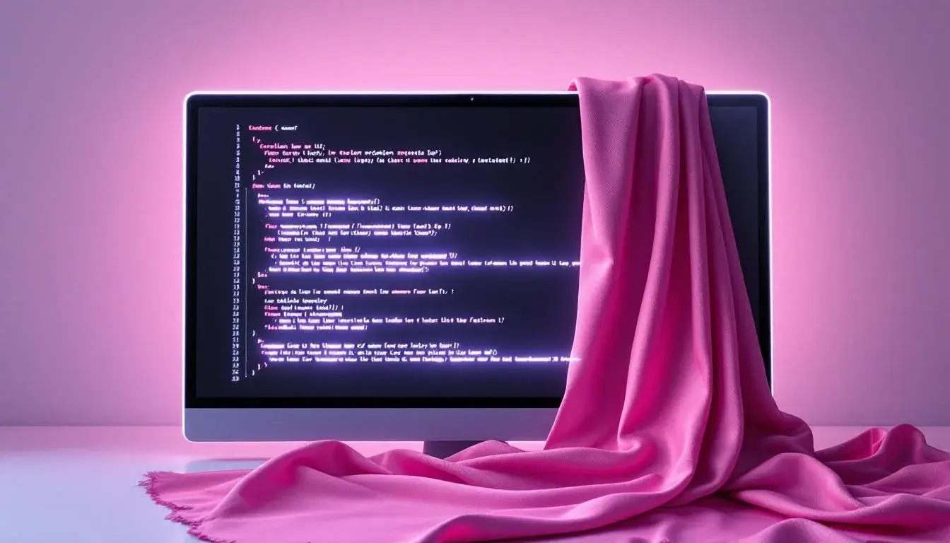
The Rise of Muted Fuchsia: From Code to Couture
29 Jul 2025 · 3 min readThe unexpected alchemy of color continues to redefine our world, blurring the lines between virtual realms and tactile experiences. Fuchsia, once a declaration of unapologetic boldness, now whispers in muted tones, permeating screens and seams with equal measure. It's a recalibration, a quiet revolution where vividity gives way to versatility, allowing a singular hue to travel from the glow of a monitor to the drape of a dress. This subtle shift reflects a desire for both digital fluency and tangible beauty, a recognition that the language of color must adapt to our increasingly hybrid existence. From the stark lines of code to the flowing forms of fashion, Muted Fuchsia signals a bridge between two worlds, proving that even the most assertive shades can find grace in restraint. It suggests new confidence. And points to a richer visual vocabulary for our collective future.
The palette called Vibrant Customization presents a complex dance, a vibrant and subdued meeting of sensibilities. Magenta Pink, while present, is thoughtfully positioned. The tension between the stark purity of Pure White and the grounding depth of Dark Charcoal encourages the eye to explore the spectrum. Vibrant Yellow introduces a spark of playful energy, contrasting nicely with Olive Drab, offering a feeling of elegant constraint. Pale Blue provides a moment of coolness. Crimson Red interjects a note of drama. Its presence alongside Magenta Pink offers an interesting tension – one suggesting a careful deliberation in the assembly. It's not simply about being bright; it's about where light is placed, and where darkness falls to sharpen the focus. In fashion, this translates to a bold statement piece balanced with neutral, grounding counterparts, a fuschia silk scarf draped over a charcoal knit dress. Imagine similarly, for web design, a clean, white interface punctuated by interactive elements in Magenta Pink, drawing the user's eye towards engagement. The interplay suggests control and power. Overall it is a palette that whispers of bespoke experiences and tailor-made realities. The presence of Forest Green and Deep Teal further emphasizes an interesting conversation of chromatic play.
The name Modern Palette suggests a streamlined approach, and the colors deliver exactly that. Here, Magenta Pink is softened, less a shout and more of a considered note. Pure White and Deep Black act as anchors, a classic foundation upon which more lively elements can reside. Pale Yellow adds a touch of sunshine, while Sky Blue brings a sense of openness, encouraging reflection. Bright Orange provides a burst of creative energy, but one that remains grounded by the presence of Neutral Gray. Teal Blue offers a counterpoint, but it doesn't challenge the other shades. It seems content to bring depth. In the realm of fashion, this restraint translates to a minimalist aesthetic, perhaps a Magenta Pink sweater paired with wide-leg black trousers and Sky Blue sneakers. In web design, imagine a website with bold typography and ample white space, where a splash of Bright Orange highlights calls to action against a Deep Black backdrop. It’s a palette of intention, carefully composed to create an effect of effortless sophistication. Lime Green adds a touch of the uncanny. The gray tones are a perfect foil.
Modern Blend, presents an intriguing medley of tones. Ghost White sits alongside Dark Charcoal, creating a stage for a spectrum of characters. Magenta Pink steps forward, this time tempered to a degree that feels gentle, nearly whispered. Vibrant Aqua offers a clean contrast. Electric Violet and Deep Indigo introduce layers of sophistication. Lemon Yellow delivers an optimistic beam. This palette suggests a carefully curated collection. Taupe Gray contributes an earthy feeling, adding to its approachability. Deep Burgundy interjects a note of the nocturnal. Imagine a fashion collection built around these colors: the juxtaposition of a Magenta Pink silk blouse with a tailored jacket in Deep Indigo, worn with wide-leg trousers in Taupe Gray. For web design, consider a minimalist layout where Electric Violet accents highlight key information atop a Ghost White background. The site benefits from moments of bright color that complement each other. This palette does not shout. The colors sing in concert.
Earthy Vintage presents a story of time and texture. Here, Magenta Rose feels like an echo from the past, subdued and sophisticated. Pure White and Dark Charcoal are again the poles. Pale Yellow and Olive Yellow introduce a warm glow. Teal Green offers a grounding counterpoint, reflecting the richness of nature. Burnt Sienna contributes a patina, suggesting stories whispered through the ages. Bright Red adds a burst of energy. Imagine a web design incorporating vintage typography on a textured background in Neutral Gray, punctuated by the surprise of Magenta Rose accents. It suggests old letters. For fashion, consider a dress with geometric Teal Green patterns combined with a long coat in Pure White and Magenta Rose piping. It points to forgotten stories. The palette speaks of rediscovered treasures.
Vibrant Harmony is aptly named, inviting divergent shades into a considered partnership. Magenta Pink makes an entrance, but does not take over. Its presence is balanced by Soft Teal and Emerald Green. Golden Yellow offers a hint of richness, and Royal Blue introduces a touch of majesty. Pure White acts as a canvas. Bubblegum Pink offers a touch of youthfulness. In a fashion context, it means a dress with a floral print of Magenta Pink, Royal Blue and Bubblegum Pink set against a Emerald Green background. It suggests a carefree garden party. For web design, picture a gallery platform. Images pop against a carefully chosen background of Pure White with interactive elements in Soft Teal. Teal Green and Dark Brown give depth and earthiness alongside the brightness. The palette is alive.
In navigating this spectrum of muted fuchsias, a clear narrative emerges: the color transcends mere trend, serving as a bridge connecting technology and artistry. From the playful spirit of Vibrant Customization to the vintage echoes of Earthy Vintage, each palette offers a particular approach to Muted Fuchsia, revealing its versatility and lasting allure. Each palette shows a shift toward sophisticated restraint, where vibrant hues are thoughtfully applied to create visual narratives that resonate across both digital and traditional design. The journey is not about subtraction, but rather about a carefully choreographed dance of color, one that allows for a future where the glow of a screen and the texture of fabric find common ground.